The network for creativity
Join 1.25M professional creatives like you
Connect with clients, get discovered, and run your business 100% commission-free
Creatives on Contra have earned over $150M and we are just getting started
Back to feedPost
“From the same mother, two souls were born —
one painted with passion, one wrapped in peace.
Different dreams, same roots, same love.”
“From the same root, two hearts learned to bloom differently.
One chose the color of love, the other the color of faith.
Together they proved that harmony is not sameness — it is understanding.”
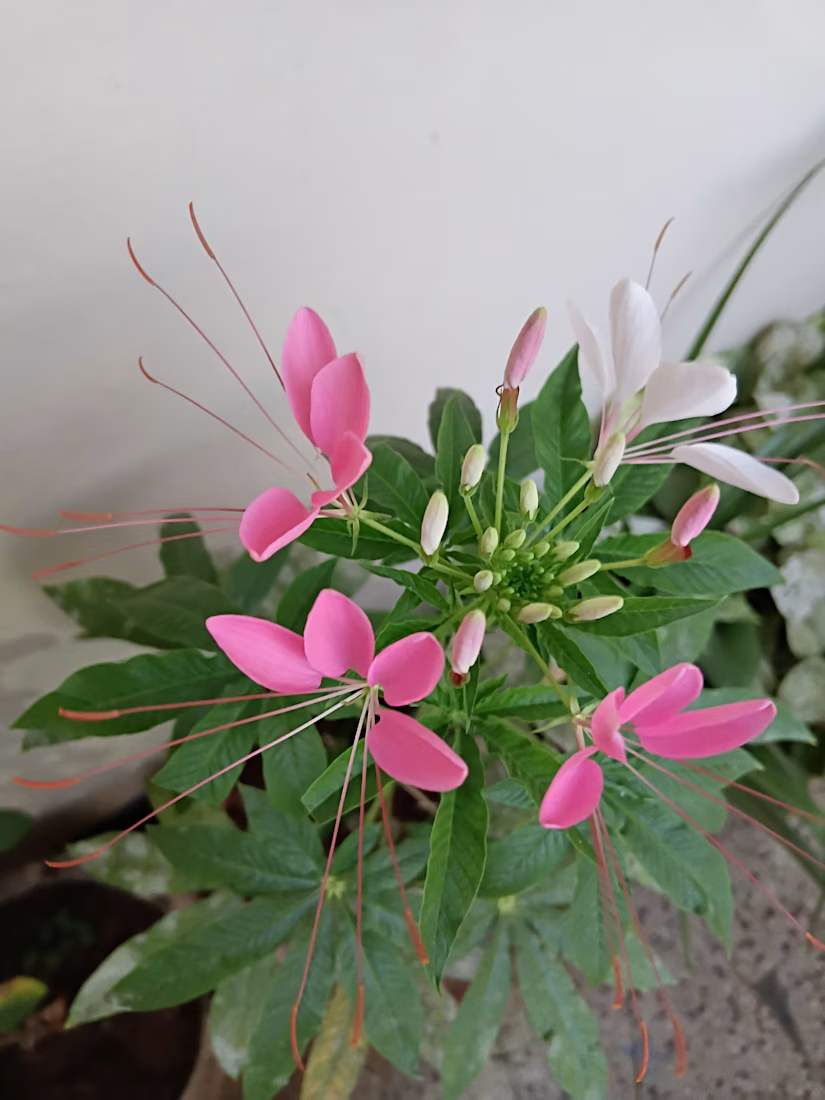

Colours doesn't make difference, understanding does
The network for creativity
Join 1.25M professional creatives like you
Connect with clients, get discovered, and run your business 100% commission-free
Creatives on Contra have earned over $150M and we are just getting started





Related posts

1286 CRAFT | Exploring Form, Nature & Experimental Design
Three distinct visual explorations, each with its own creative language.
From bold geometric typography and expressive color layering to intricate botanical compositions, this collection explores how structure, contrast, texture, and imagination shape powerful visual identities.
Every composition is an experiment in balancing artistic expression with thoughtful design.
Different styles. One creative vision.
#1286CRAFT #GraphicDesign #VisualDesign #ExperimentalDesign #Typography #CreativeDirection


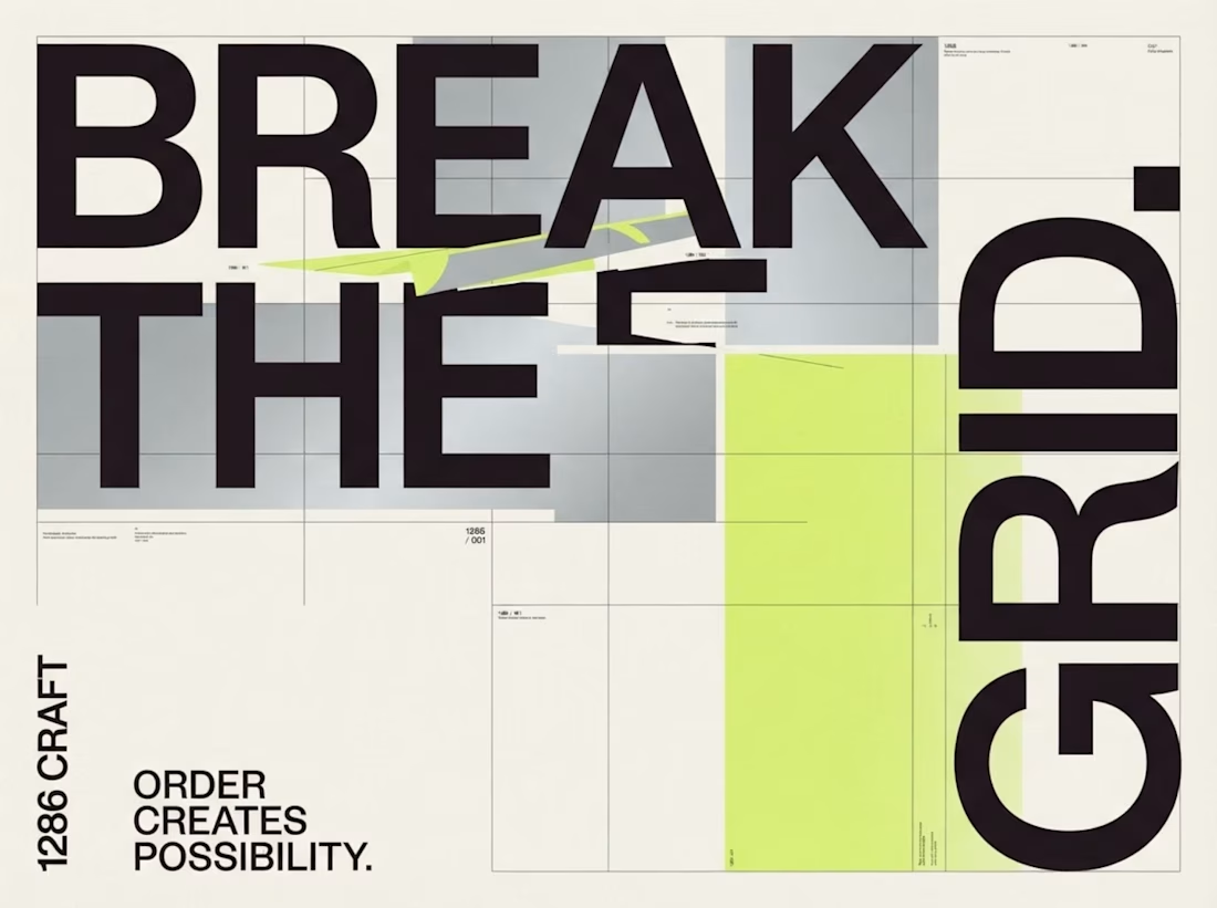
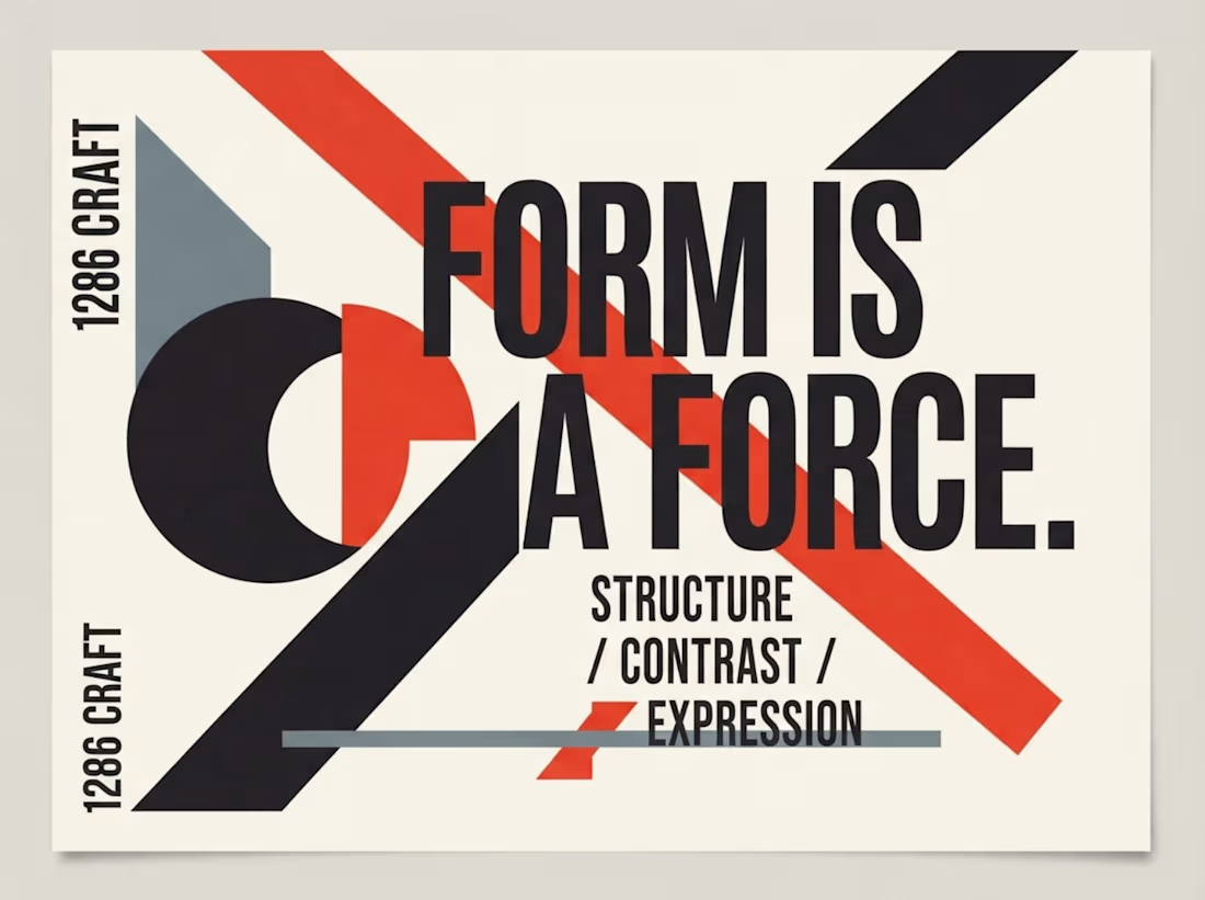
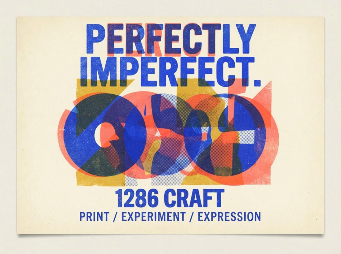
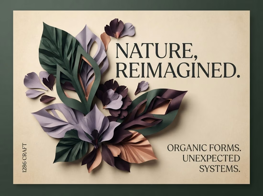

The botanical composition part caught my eye - layering those leaf textures against the type creates a surprisingly tactile contrast.

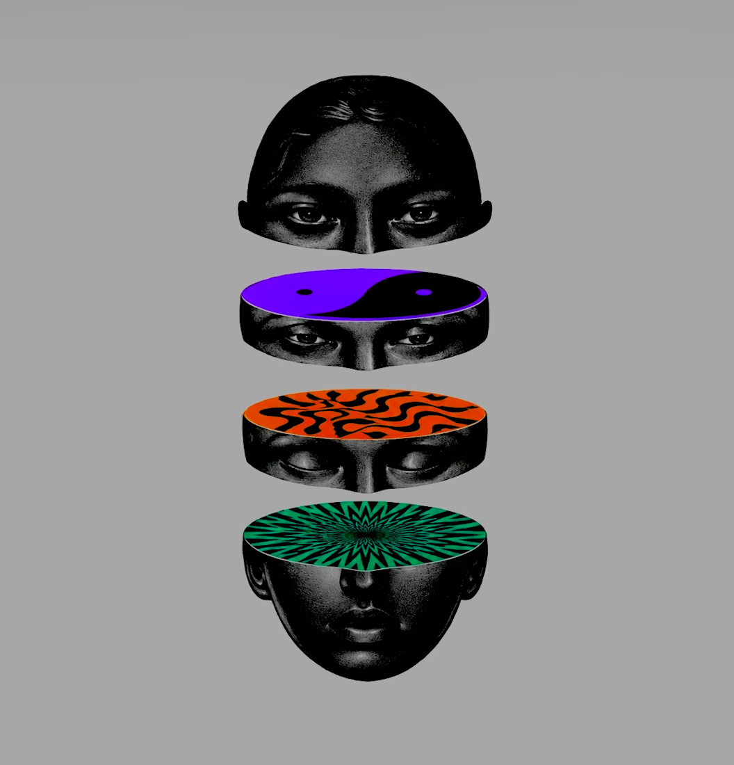
What If Identity Could Be Reimagined?
An exploration of faces, patterns, and visual perception, where monochrome portraiture meets bold colors, geometric forms, and optical illusions.



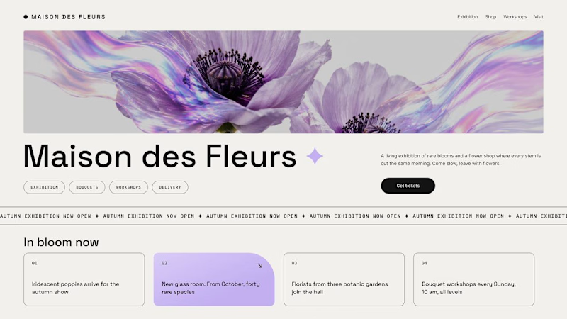
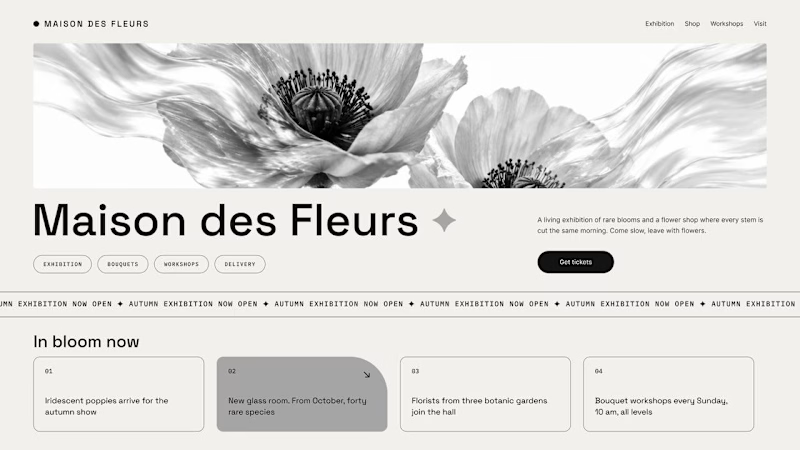
Should a flower shop ever go black and white?
Same flower house, same layout. We only took the color out.
1. Full color. The iridescent petals do the selling: lilac, pink, a little shimmer. The photo is the brand, and every accent on the page borrows from it.
2. Monochrome. No color at all. Shape, texture and typography have to carry everything, and the page suddenly reads like a gallery catalogue.
Color sells the flower. Monochrome sells the exhibition.
Which one would get you through the door?
67 voted
91%
7 voted
9%
74 votes
Closed

The problem with monochrome is that, throughout computer history, it has conditioned users to associate gray and monochrome with being disabled, dysfunctional, or something to ignore and avoid.