The network for creativity
Join 1.25M professional creatives like you
Connect with clients, get discovered, and run your business 100% commission-free
Creatives on Contra have earned over $150M and we are just getting started
Back to feedPost

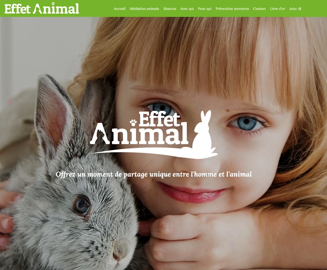
Effet Animal is an animal therapy company that helps seniors and children. I designed their logo and website (which could really use a modern redesign!).


The network for creativity
Join 1.25M professional creatives like you
Connect with clients, get discovered, and run your business 100% commission-free
Creatives on Contra have earned over $150M and we are just getting started







Related posts

I wanted to see how far I could take a static hero with a little motion and some help from Claude.
So I’m experimenting with scroll animation on a dental website concept. I design the layout and motion direction, then work with Claude to bring it to life.
A quick screen recording of where it’s at. Still tweaking, but this part is fun.


Great concept I like how everything managed with animations great job 🎉🔥

One brand, very different variety products. 👀
BASYX is one of my favorite projects because the packaging had to work across categories, from skincare to food, while still feeling like one cohesive brand.
That’s the fun challenge of multi-product brands: creating a visual system flexible enough to grow without losing its identity.


wow amazing


Hear the sound 🎧
An experimental exploration of bringing AI conversations to life through motion. ✨
Tool stack: Figma × Claude × After Effects


Really impressive