The network for creativity
Join 1.25M professional creatives like you
Connect with clients, get discovered, and run your business 100% commission-free
Creatives on Contra have earned over $150M and we are just getting started
Back to feedPost


Of a Feather - Brand Identity & Visual World
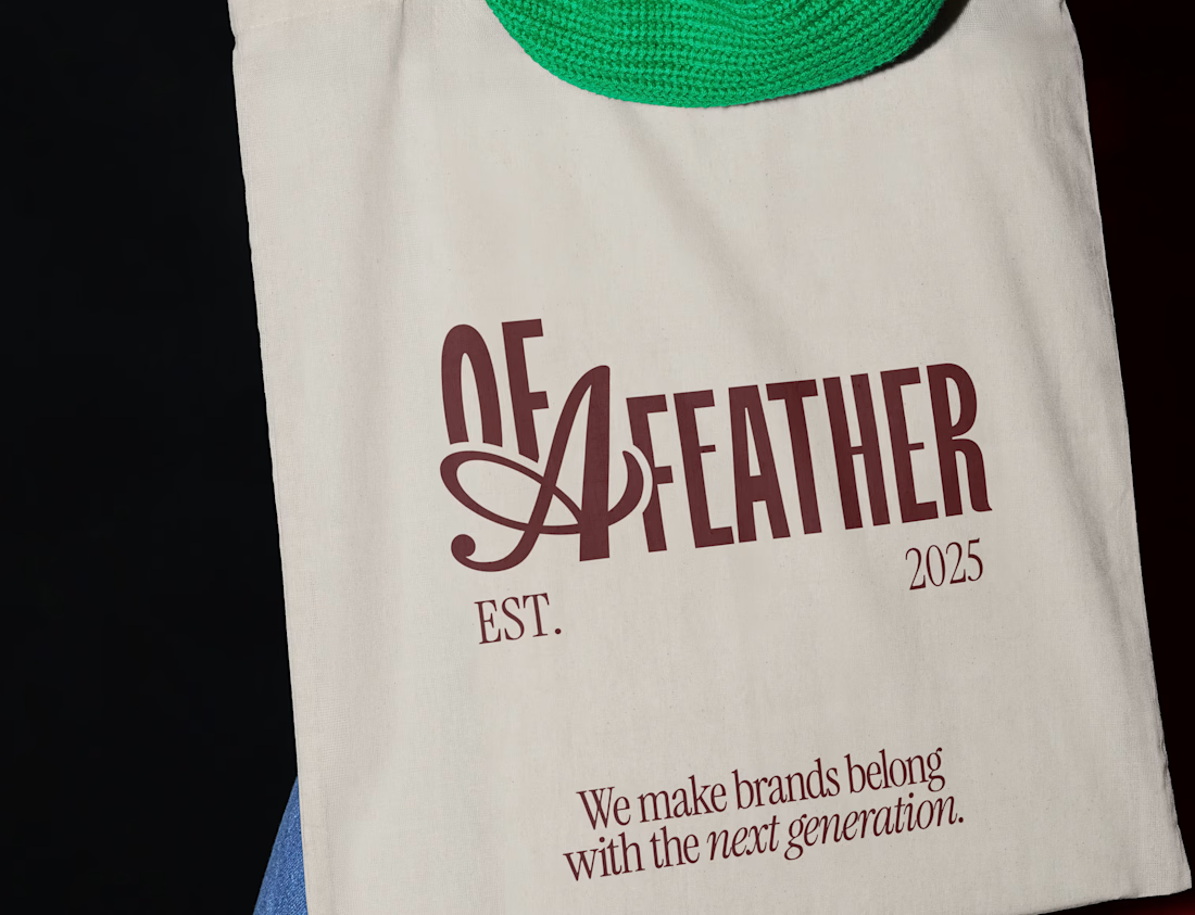
Of a Feather is built around the idea that the right people always find each other - a poetic twist on "birds of a feather," where belonging and connection run through every element of the brand.
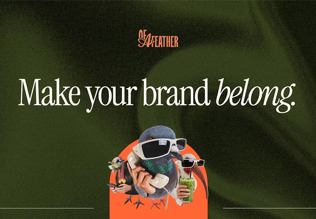
Strategy and tone of voice came first, then colour, typography, and the part that made this project unforgettable: custom Australian bird characters, full of personality and warmth, that brought the brand to life in a way no logo alone ever could.
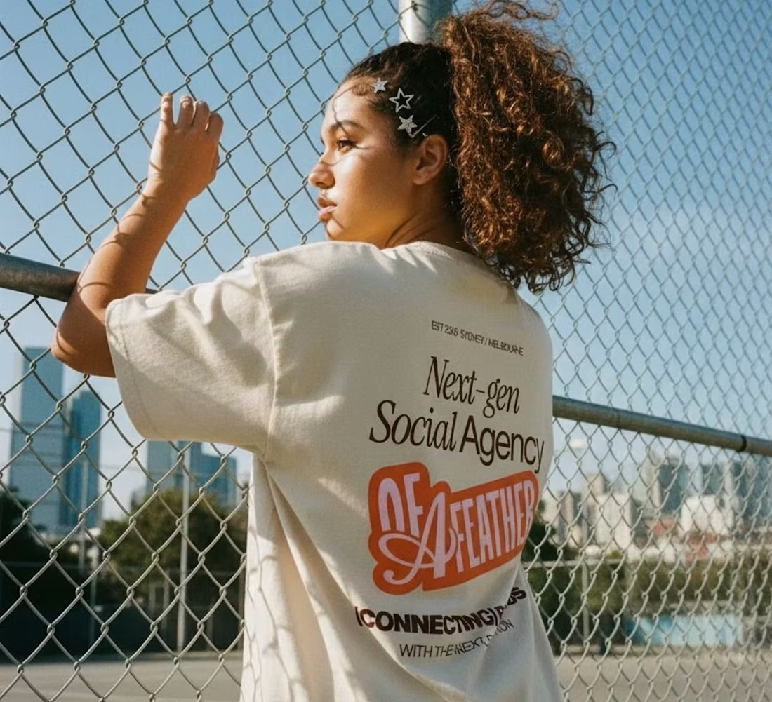
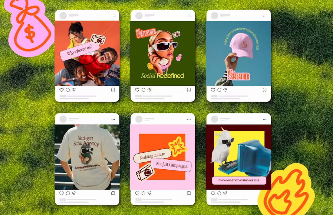
From there, a full universe - logos, social media, credentials deck, merch, and website. When strategy and personality work together properly, the result speaks for itself.

The network for creativity
Join 1.25M professional creatives like you
Connect with clients, get discovered, and run your business 100% commission-free
Creatives on Contra have earned over $150M and we are just getting started





Related posts


Beautiful work.

The Rebranding Challenge - Season Investments
One of the key challenges was deciding what to change and what was worth preserving.
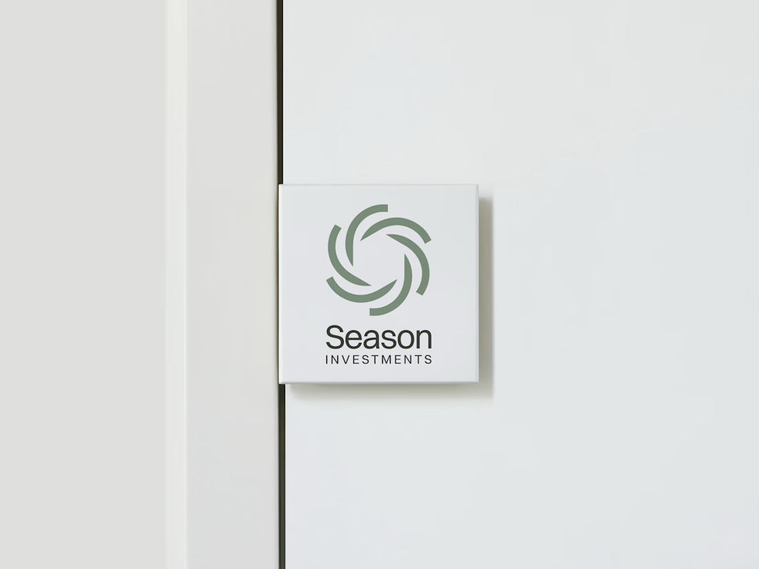
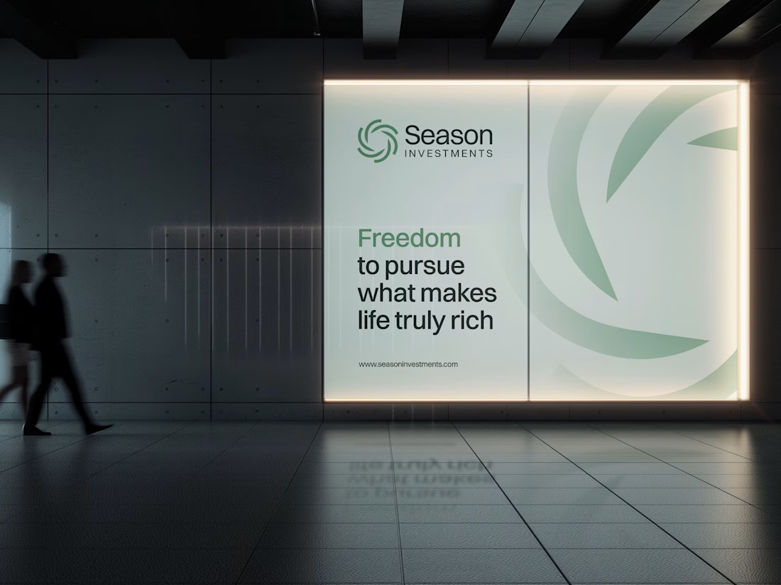
Rather than starting from scratch, the new identity retains a visual connection to Season Investments’ heritage, but reframes it for a more contemporary and flexible brand system.
A major improvement was creating a symbol that can work independently from the wordmark. This gives the brand a stronger presence across investment platforms, digital interfaces, profile images, and other compact applications where the previous identity was difficult to use.
The result is a more adaptable system that moves the brand forward without losing its familiarity.




Love how adaptable this feels across compact digital spaces. Really well done. Any plans to post the original before version for comparison?

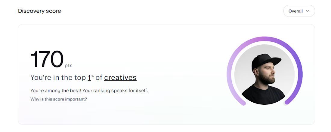
Top 1% on Contra. 🎉
A little milestone, but a reminder that showing up and doing good work consistently actually pays off.
If you're just starting out and wondering if it's worth it: it is. Keep going.
Thanks to all my clients and everyone here who's been so supportive.

That's Legendary bro congrats 🔥🔥🔥🔥