The network for creativity
Join 1.25M professional creatives like you
Connect with clients, get discovered, and run your business 100% commission-free
Creatives on Contra have earned over $150M and we are just getting started
Back to feedPost
Perplexity AI logo redesign concept
A fast-growing AI company with a visual identity that felt somewhat generic relative to the sophistication of its product. My goal was to build upon the existing visual DNA while introducing greater clarity, authenticity, and distinctiveness. The result is a more scalable and reproducible identity system that better reflects the brand's innovative nature across digital and physical touchpoints.
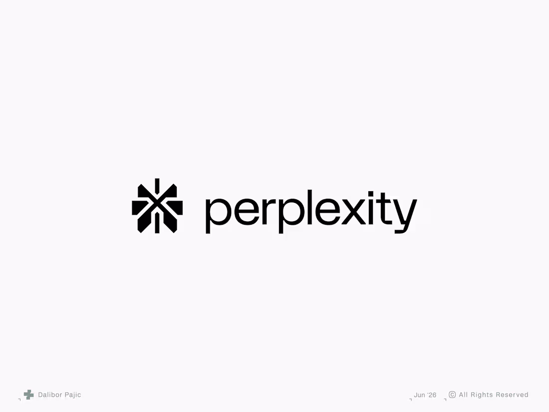
Smart approach to keep the asterisk and just refine it rather than scrapping it entirely. The original mark had equity, it just needed more precision to match the product's maturity.
Much appreciated!
Interesting. My gaming head sees a crosshair/hitmarker instead of an asterix. While I love the current mark's 4-sided meaning, I appreciate how filling in the "windows" makes it simpler and more premium, and a bit bolder. I wonder how it would work in motion.
Thanks! Yeah, there’s definitely some crosshair DNA in the spark, which is why I emphasized the diagonal elements to move it away from cross/plus iconography. I also felt the four-directional spark was holding the mark back a bit, so I decluttered the center and redistributed the visual weight around the symbol.
You really nailed it.
Thanks!
Love the logo shape, style, and clean typography. The minimal approach highlights the brand's innovation.
Great logo bro!
Thanks! 😊
The network for creativity
Join 1.25M professional creatives like you
Connect with clients, get discovered, and run your business 100% commission-free
Creatives on Contra have earned over $150M and we are just getting started
Trending
Claude
Claude has entered the design space. How are you using Claude Design?
Contra University
Learn from expert creatives how to earn more using next-gen AI tools.
creativeaiflow
Creative AI workflows are evolving. What tools do you use, and what are their strengths and weaknesses?
freelancerlife
Freelancer life is wins, pivots, and everything in between. What’s yours right now?
Related posts
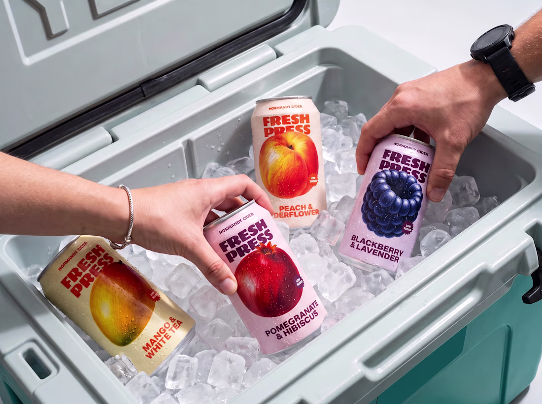
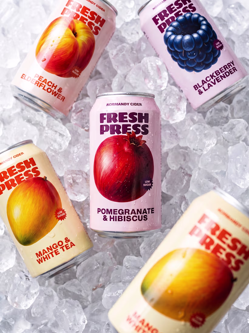
New summer drop for Fresh Press 🫐🥭
Four new flavors, custom illustrations, and packaging design by me
Can I get one? 🔥
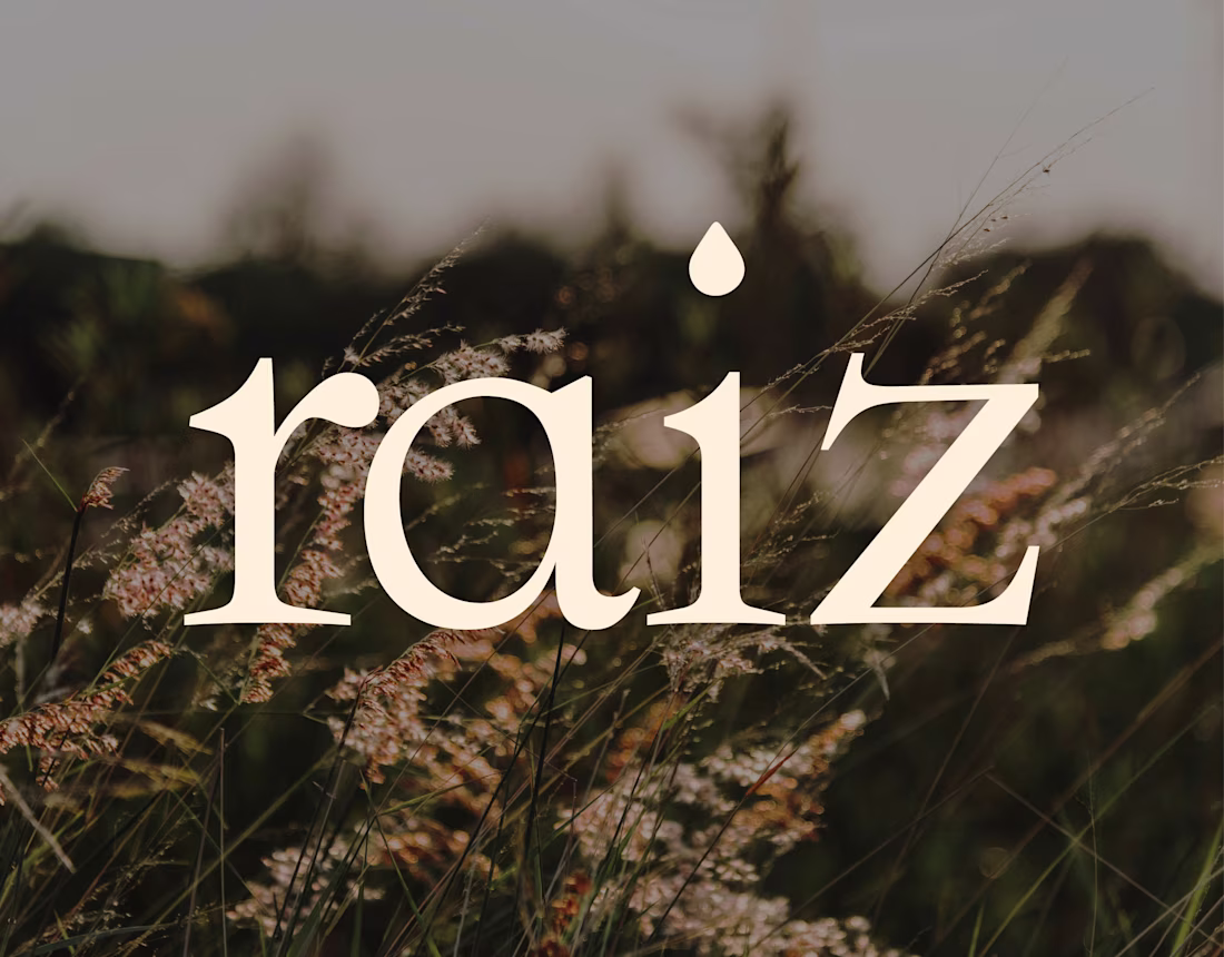
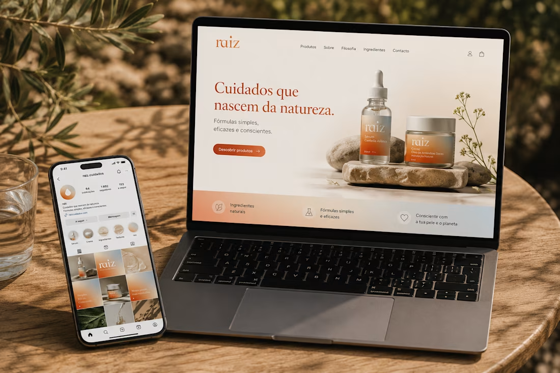
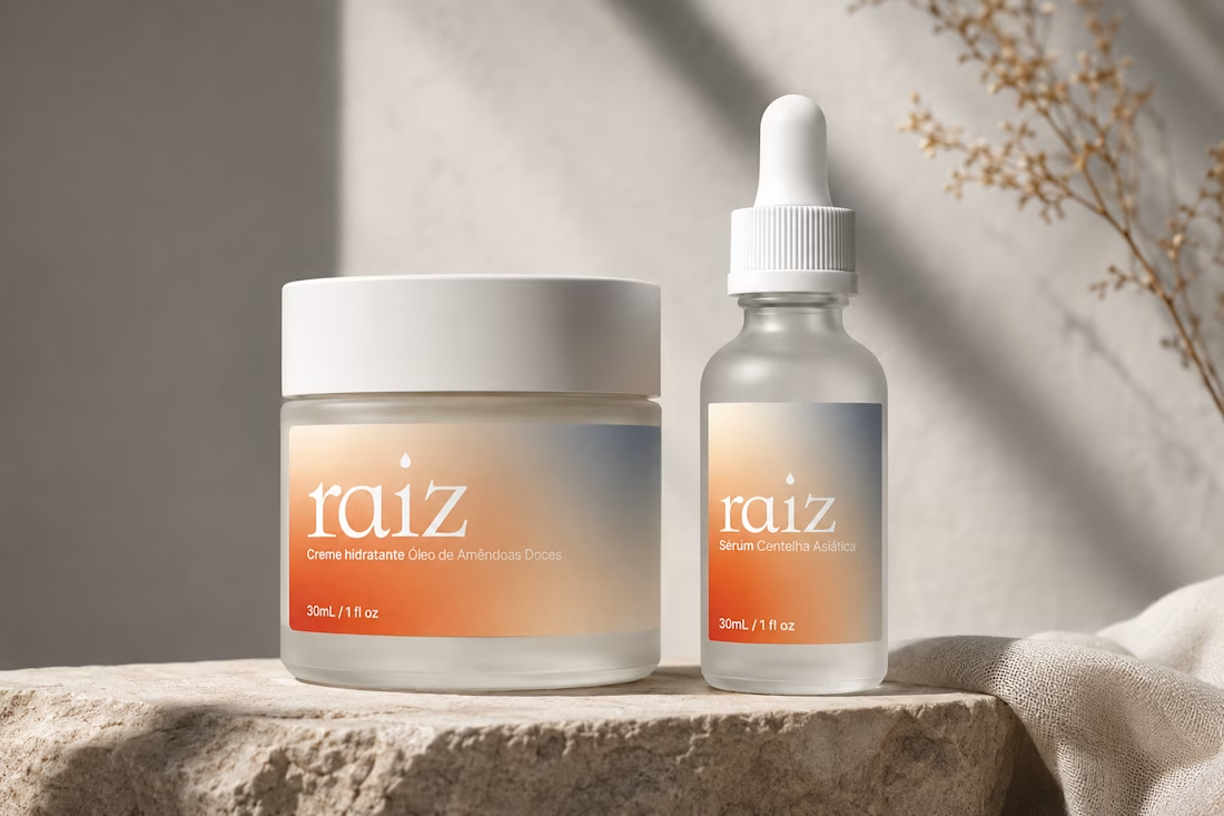
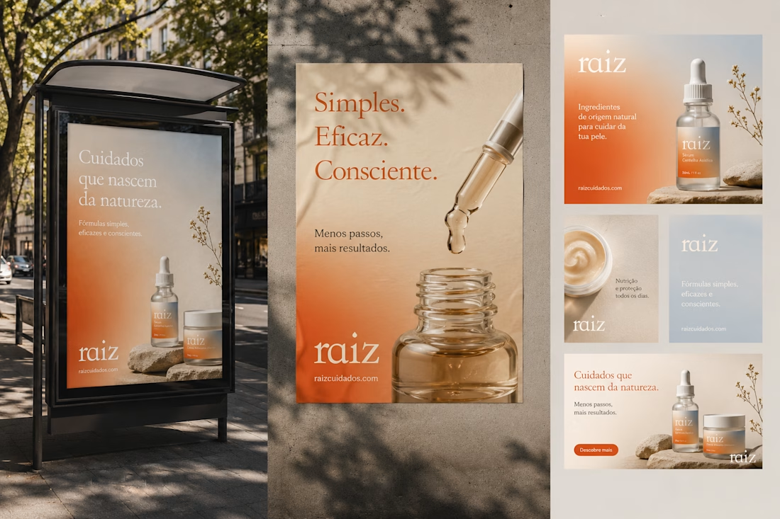
Fictional Project for a Portuguese Skincare Brand focused on botanical beauty and scientific research.
Amazing work!
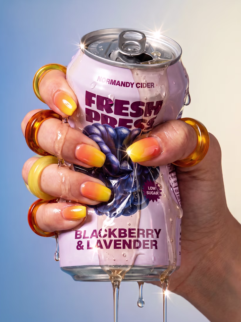
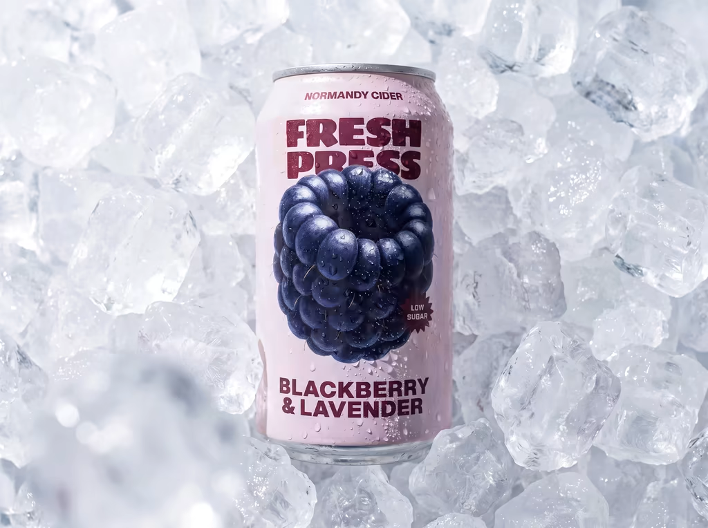
New drop for Fresh Press Craft Cider 🍇
Meet Blackberry & Lavender — the newest addition to the Fresh Press collection.
I wanted this can to feel fresh, bold, and instantly recognizable on the shelf. The oversized blackberry illustration became the hero of the design, while the soft lavender background creates a clean contrast and lets the fruit take center stage.
One of my favorite parts of this project was creating the custom fruit illustrations from scratch. I love how they bring personality to the packaging while keeping the overall identity simple and modern.
Packaging design, art direction & custom illustrations by me.
Great animations and smooth design i love it feels refreshing!