The network for creativity
Join 1.25M professional creatives like you
Connect with clients, get discovered, and run your business 100% commission-free
Creatives on Contra have earned over $150M and we are just getting started
Back to feedPost

Remember Figmatelia? The stamp-making app I built during the Figma Make x Contra hackathon?
Well... it's real now. 🎉
stampbook.art is live — a web app that turns your photos into collectible digital postage stamps. No app download, works on any device.
When I posted the prototype here, 177 of you liked it, 49 left comments, and 5,700+ checked it out. Some of you literally said "I want to use this!" — so I spent the past weeks rebuilding it from scratch as a real product.
What's new:
Real accounts (Google login or email)
Improved stamp cutting engine
Your own stamp collection
Works beautifully on mobile
Pay once ($15), use forever — no subscriptions
Founders deal: The first supporters who believed in this idea deserve something special. Use code FOUNDERS to get lifetime access for just $5 (instead of $15). This code won't last forever.
Huge thanks to everyone who commented, liked, and messaged me about the
prototype. You literally made me build this. 🙏
Try it → stampbook.art
Original figma makethon post: https://contra.com/community/rPYO4Miw-discover-figmatelia-innovative-stamp-collection-tool

The network for creativity
Join 1.25M professional creatives like you
Connect with clients, get discovered, and run your business 100% commission-free
Creatives on Contra have earned over $150M and we are just getting started











Related posts

A clean and modern food delivery app concept designed with a focus on simple navigation, clear layouts, and a smooth user experience.
Designed in Figma.

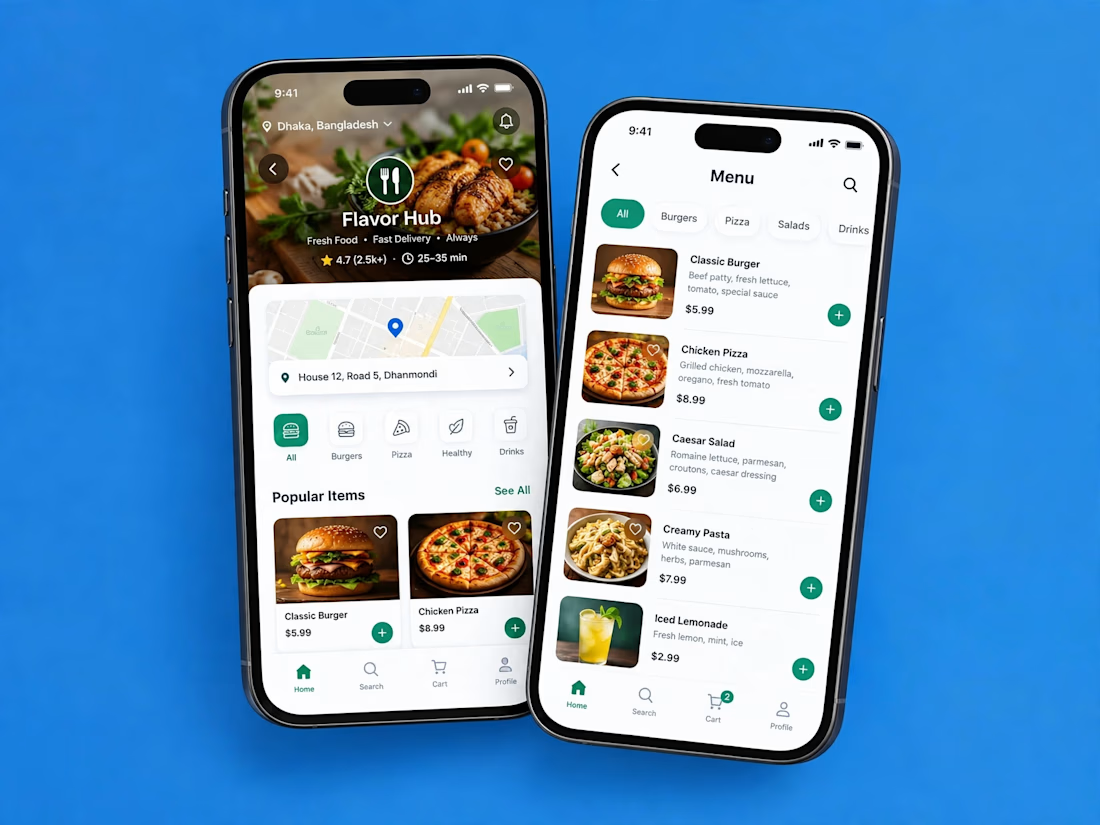

Love how clean and intuitive this feels, the navigation looks super smooth and the layout is really well balanced

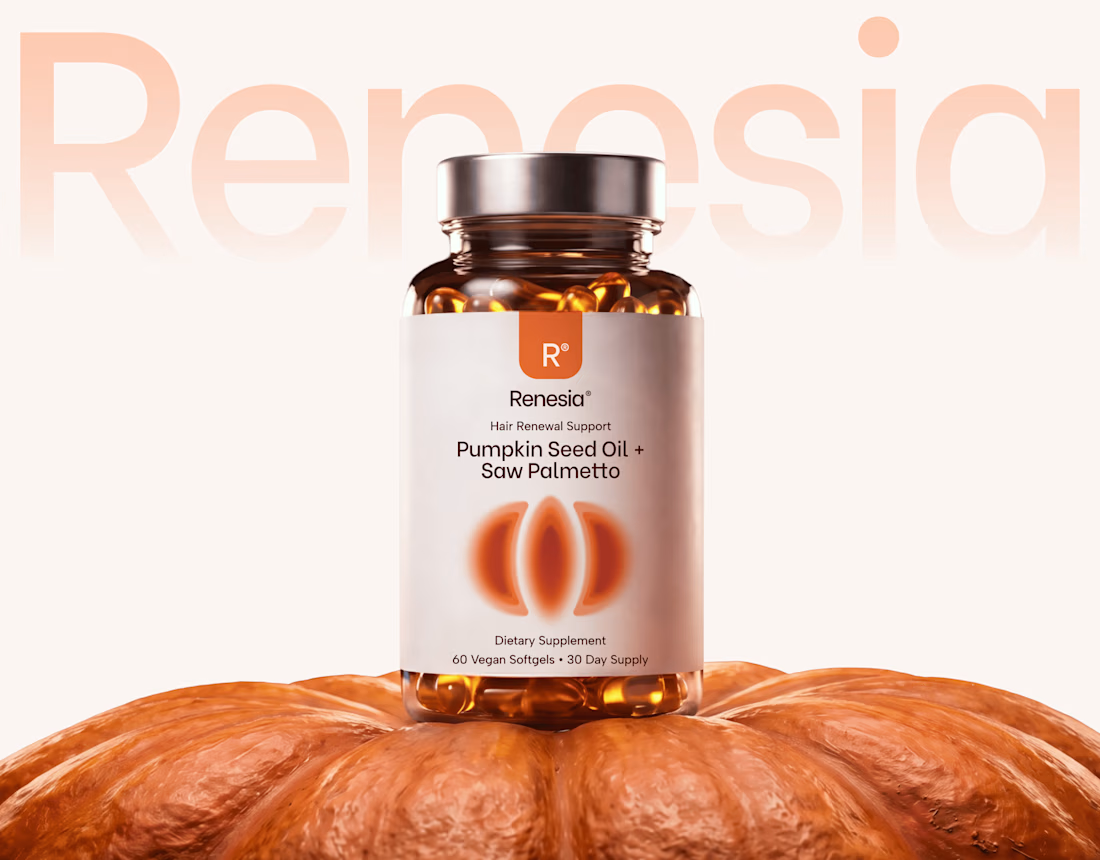
Here we go, check the full case study, I think you will love it! 🎃


Love this! 🎃 The pumpkin concept for Renesia is super creative - perfectly matches the Pumpkin Seed Oil story. Clean work in Illustrator & Figma!


Lovely cohesive work, Alex. The motion is spot on!