The network for creativity
Join 1.25M professional creatives like you
Connect with clients, get discovered, and run your business 100% commission-free
Creatives on Contra have earned over $150M and we are just getting started
Back to feedPost
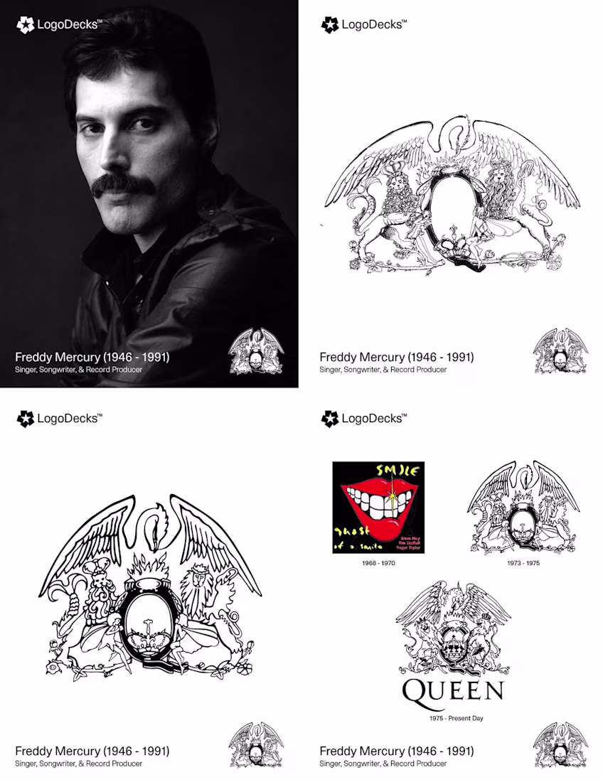
🚀 DAY 11- POSTING LEGENDARY DESIGNS HISTORY - FOLLOW FOR MORE 🚀
Before Freddie Mercury became a rock icon, he studied Graphic Art and Design at Ealing Art College — a background that directly shaped Queen's visual identity. In 1973, Mercury personally designed the band's "Queen Crest," a regal emblem steeped in personal symbolism: each element represents a band member's zodiac sign.
Two Lions stand for Leos John Deacon and Roger Taylor; a Crab above the central "Q" represents Cancer Brian May; two Fairies below reflect Mercury's own sign, Virgo. Presiding over it all is a Phoenix with wings spread, symbolising immortality and rebirth. First appearing on their debut album, the crest remains one of the most recognisable logos in music history.
The network for creativity
Join 1.25M professional creatives like you
Connect with clients, get discovered, and run your business 100% commission-free
Creatives on Contra have earned over $150M and we are just getting started
Related posts
I really like the visuals and the exclusive community vibe they give
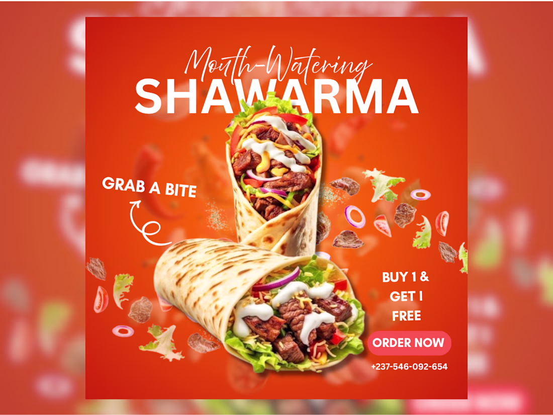
This social media food promo design designed with canva was created to help a food brand promote its shawarma offer in a way that instantly captures attention, increases cravings, and drives more customer orders online.
This design combines bold brand colors, high quality food visuals, clean typography, and a strong promotional message to create an engaging and mouth watering advertisement. The layout was carefully arranged to keep the product as the main focus while making the offer easy to notice at first glance. This helps the brand look more professional, memorable, and trustworthy while encouraging customers to take immediate action and place an order.
This is what drives sales in minutes. Very stunning
Google should Hire you.
Trending
Claude
Claude has entered the design space. How are you using Claude Design?
Contra University
Learn from expert creatives how to earn more using next-gen AI tools.
creativeaiflow
Creative AI workflows are evolving. What tools do you use, and what are their strengths and weaknesses?
portfolioreview
The best portfolios tell a story, not just show a grid. Share yours for feedback.
freelancerlife
Freelancer life is wins, pivots, and everything in between. What’s yours right now?