The network for creativity
Join 1.25M professional creatives like you
Connect with clients, get discovered, and run your business 100% commission-free
Creatives on Contra have earned over $150M and we are just getting started
Back to feedPost
Taste Test

Which Bull Vector Logo You Guys Like Most?

15 voted
63%
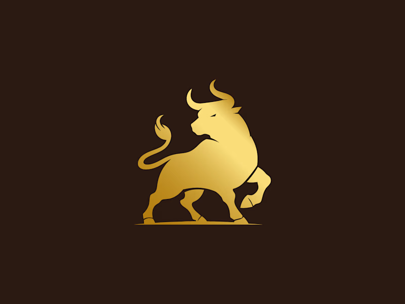
9 voted
37%
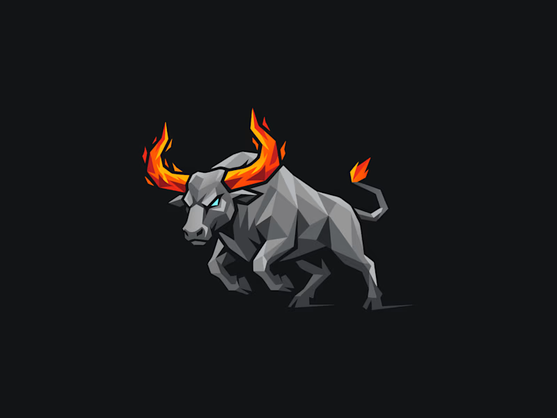
24 votes
Closed

The grey bull with the flame horns (B) has way more attitude than the golden one, feels like it'd work on a streetwear drop rather than a finance client. Which way are you leaning yourself, and is this for a specific client or just portfolio exploration?

Nice. I like it


B, the flame horns win it

The grey one with fire horns, it depicts at typical bull, always fierce

it depends , what is the purpose for it? because if it is for a restaurant brand selling meat, A is the way to go, but for a game/mobile app, B will do it better; what is your personal scenario?

Both can be used for different purposes. Choose A : if brand wants to show royalty or premium figure. Choose B: if it is something related to gaming, sports, racing related or anything other than premium show-off.

i think B is better with it's rude attitude, lols

Definitely B, love the detailed triangles and the blazing horns

This is more realistic than the other one
The network for creativity
Join 1.25M professional creatives like you
Connect with clients, get discovered, and run your business 100% commission-free
Creatives on Contra have earned over $150M and we are just getting started











Related posts

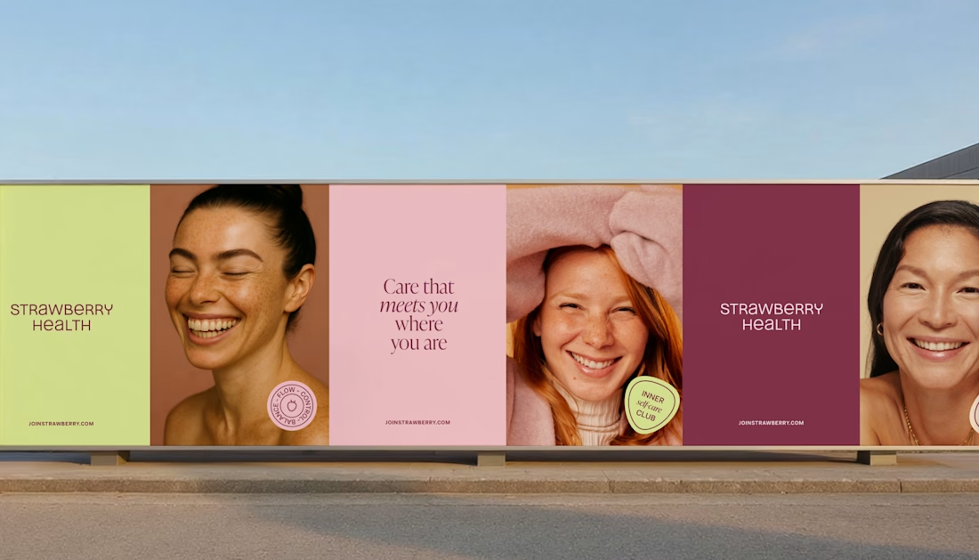
How can branding make people feel part of a community?
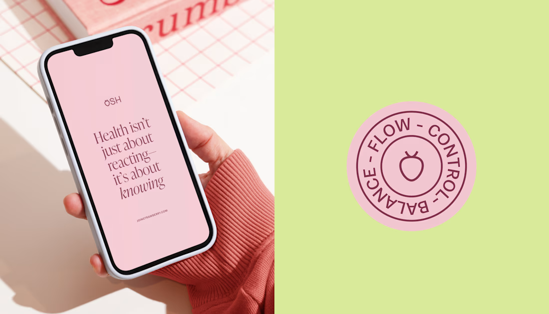
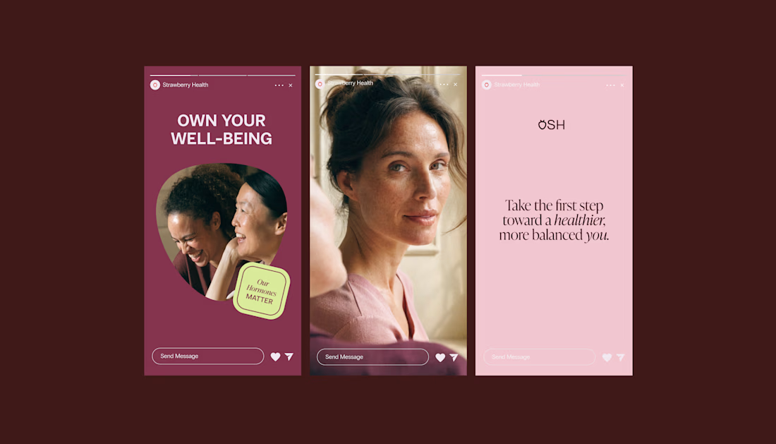
When working on Strawberry Health, we explored how visual identity could make women’s health feel more approachable and collective.
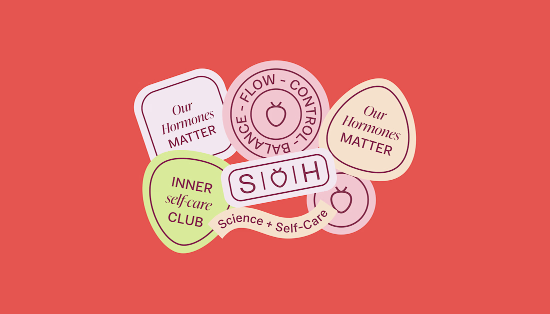
One of the ways was through supporting brand elements: stickers, badges and phrases that could live beyond the logo and become expressions of belonging.
These elements turned the identity into something people could interact with, share and make their own.
It’s a small detail, but I think it’s an important part of building brands around communities: the identity shouldn’t only identify the brand. It should give people something to identify with.

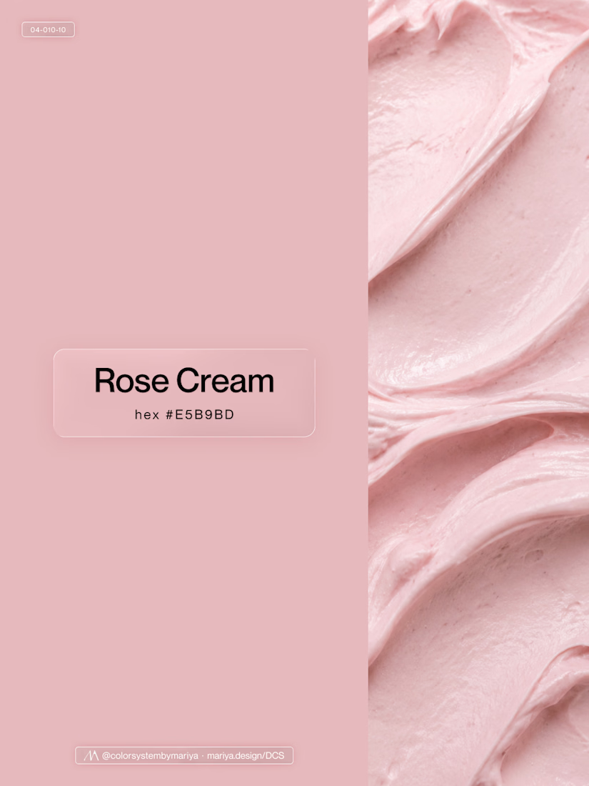
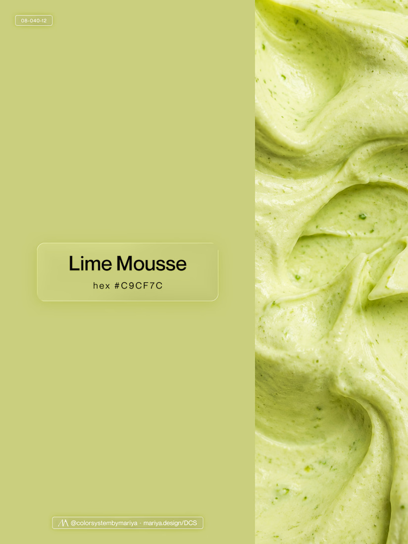
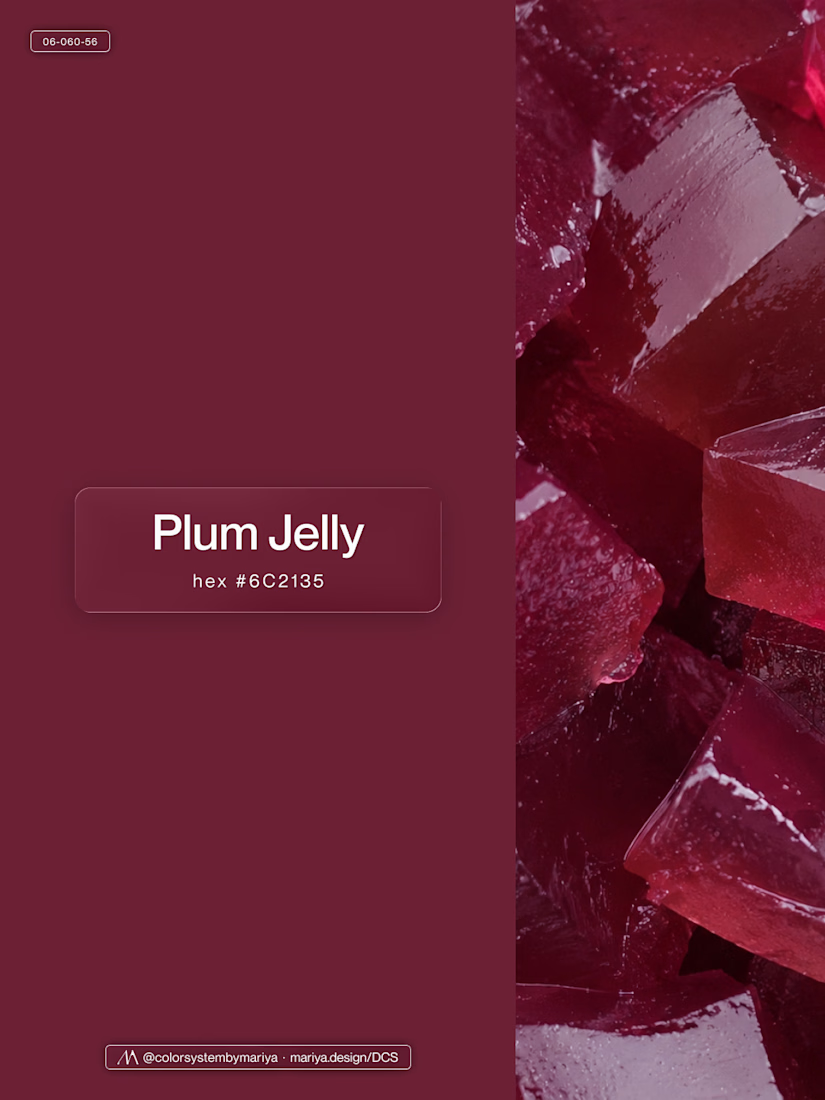
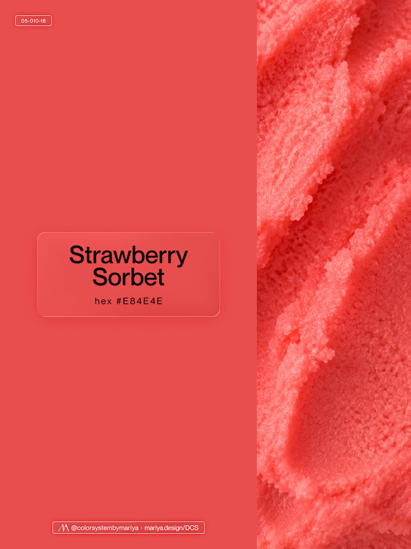
Love, love, love the colors. My mind goes: Rose Cream, Lime Mousse and Plum, hmmmm, which Plum... Plum Jelly. And of course, Strawberry Sorbet.
Let me match the vibe using my delicious swatches 😊


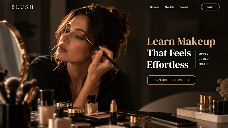
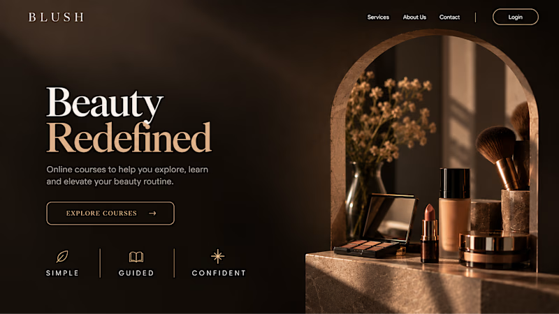
Your Hero Section Has One Job: Be Clear.
You don’t need huge headlines or long explanations. You need the right image + short headline + clear offer.
For the first version, we worked on the branding, the image and the copy together, so at first glance it’s clear: this is a makeup course, and here’s what you’ll get.
The second version is still beautiful and still feels like beauty. But what are you actually getting? A makeup course? Products? A store? That’s the problem with a Hero that looks good but isn’t thought through.
Your first screen doesn’t need to say everything. It just needs to say the right thing.

22 voted
61%
14 voted
39%
36 votes
Closed


Which colour palette would you choose for the banner design for a domain business? 🔥 Fiery or 🧊 Frosty?
20 voted
36%
35 voted
64%
55 votes
Closed

Frosty seems really cool for me!!