The network for creativity
Join 1.25M professional creatives like you
Connect with clients, get discovered, and run your business 100% commission-free
Creatives on Contra have earned over $150M and we are just getting started
Back to feedPost

Las Portuguesas: a concept identity for a Venezuelan bakery with a Portuguese heart. Hand-drawn logotype, two bread-carrying characters and a warm bakery palette, from storefront to loyalty card. Open to new food & beverage projects. 🥖
The network for creativity
Join 1.25M professional creatives like you
Connect with clients, get discovered, and run your business 100% commission-free
Creatives on Contra have earned over $150M and we are just getting started
Related posts

Inspired by, I'm sharing one of my own concepts that wasn't chosen for the final design, but that I absolutely love.
This idea is so good! We all have concepts hiding in our drafts that never get to see the light of day. I think they deserve their moment, too. ✨
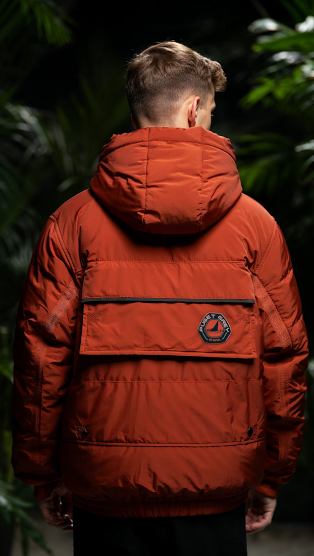
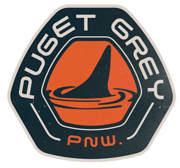
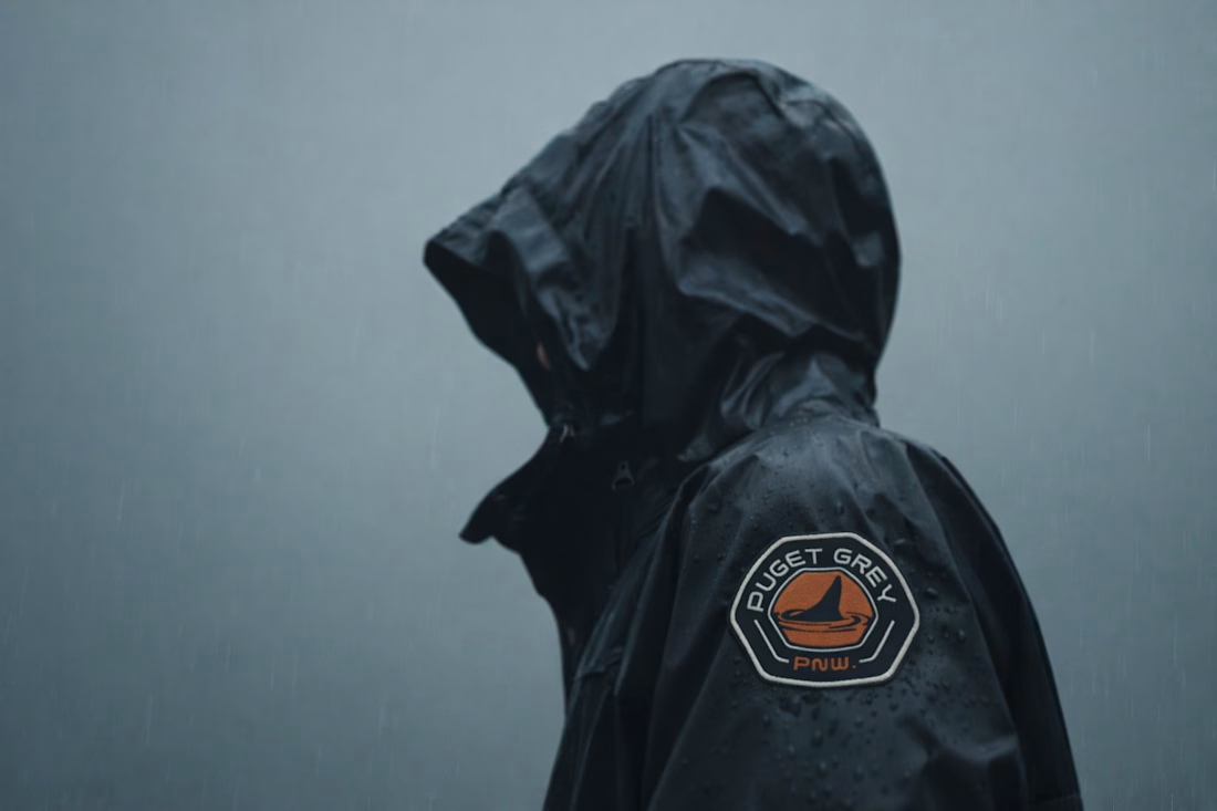

How many concepts die in your drafts folder? 💀
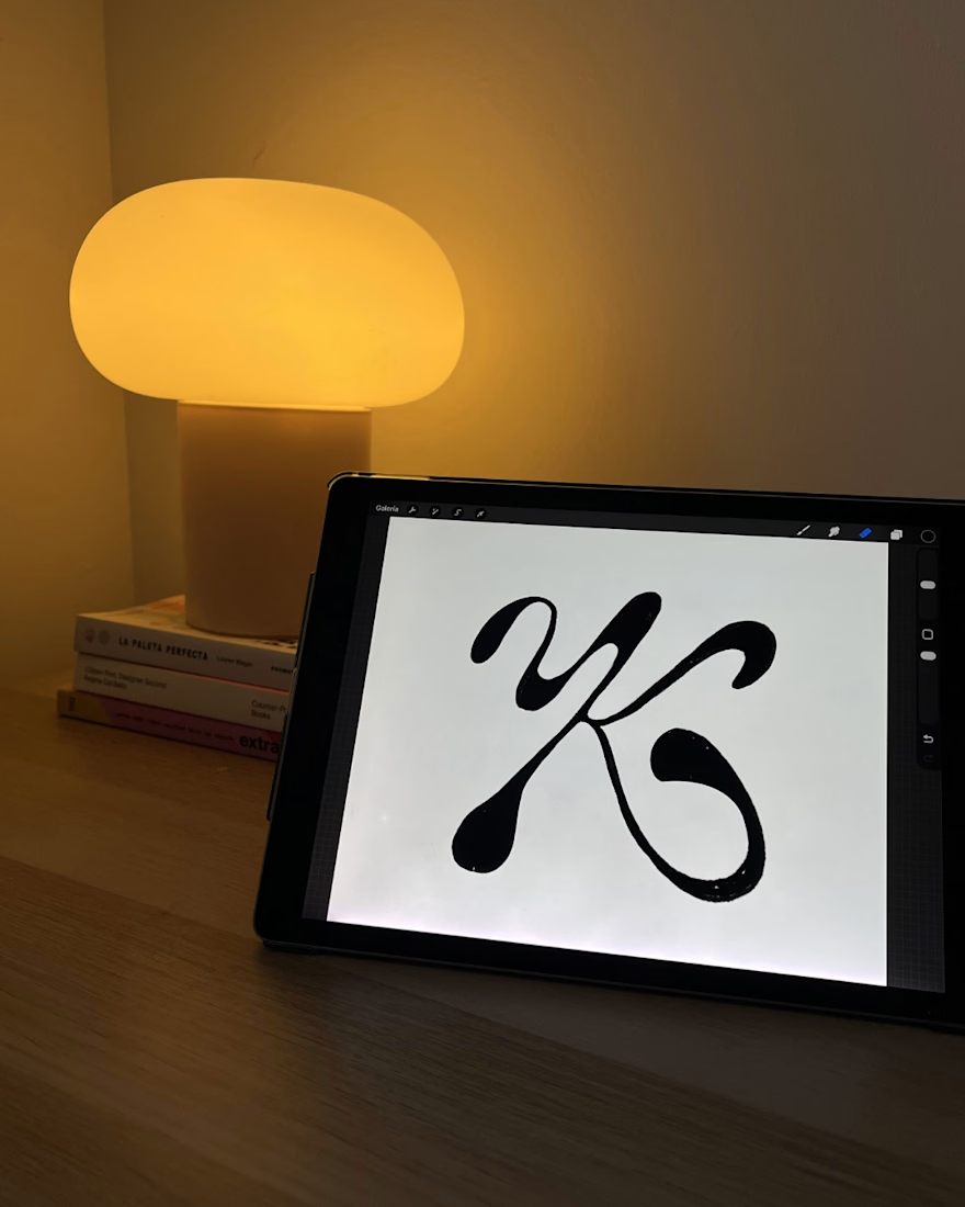
In the spirit of Inktober, a digital sketch that never saw the light.
This was a lettering-inspired brandmark...


How many concepts die in your drafts folder? 💀
In the spirit of Inktober, a digital sketch that never saw the light.
This was a lettering-inspired brandmark sketch playing with the letter K and the movement of hair. I archived it before presenting it. Not because I didn’t like it, but because I felt it wasn’t the right direction for that project.
This is how it would probably have looked, there are still things I’d want to refine.
Has it ever happened to you that you discard a concept even though you like it?
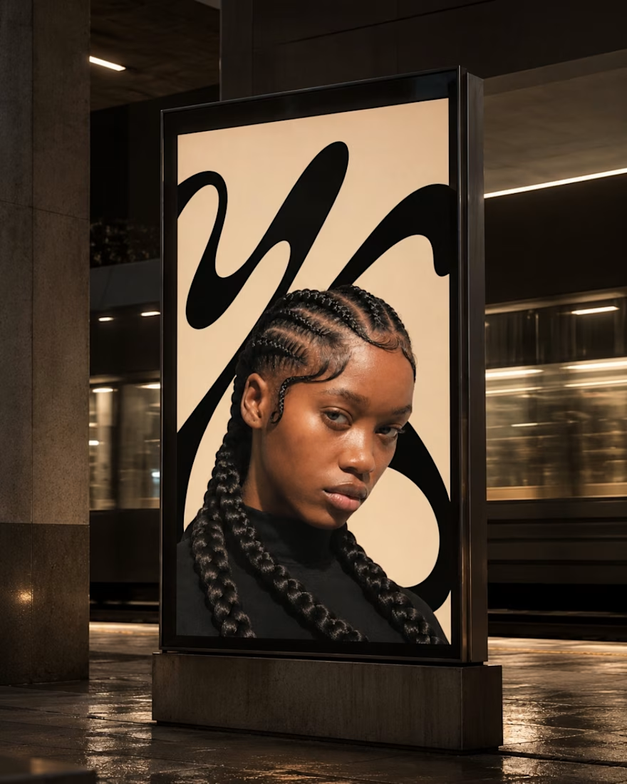
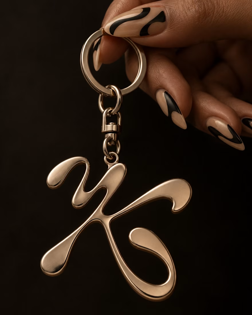

Love the idea of sharing concepts that never made it to the final stage! The K and hair movement is a really interesting direction. Do you usually revisit archived concepts later, or do you prefer to leave them behind?

What if your biggest streaming platform got a Halloween makeover? 🕸️
As Halloween is closing by, I decided to do a short campaign teaser for one of the biggest streaming platforms.
I redesigned their logo and played with the wording as part of their brand messaging in a spooky theme for the upcoming Halloween event.
I retained the brand consistency across the typography and overall logo shape and changed few details within.
Any twitch streamers, viewers or halloween celebrants here?


Fun concept and perfect timing. The spooky wordmark twist still feels on brand, nice one.