The network for creativity
Join 1.25M professional creatives like you
Connect with clients, get discovered, and run your business 100% commission-free
Creatives on Contra have earned over $150M and we are just getting started
Back to feedPost

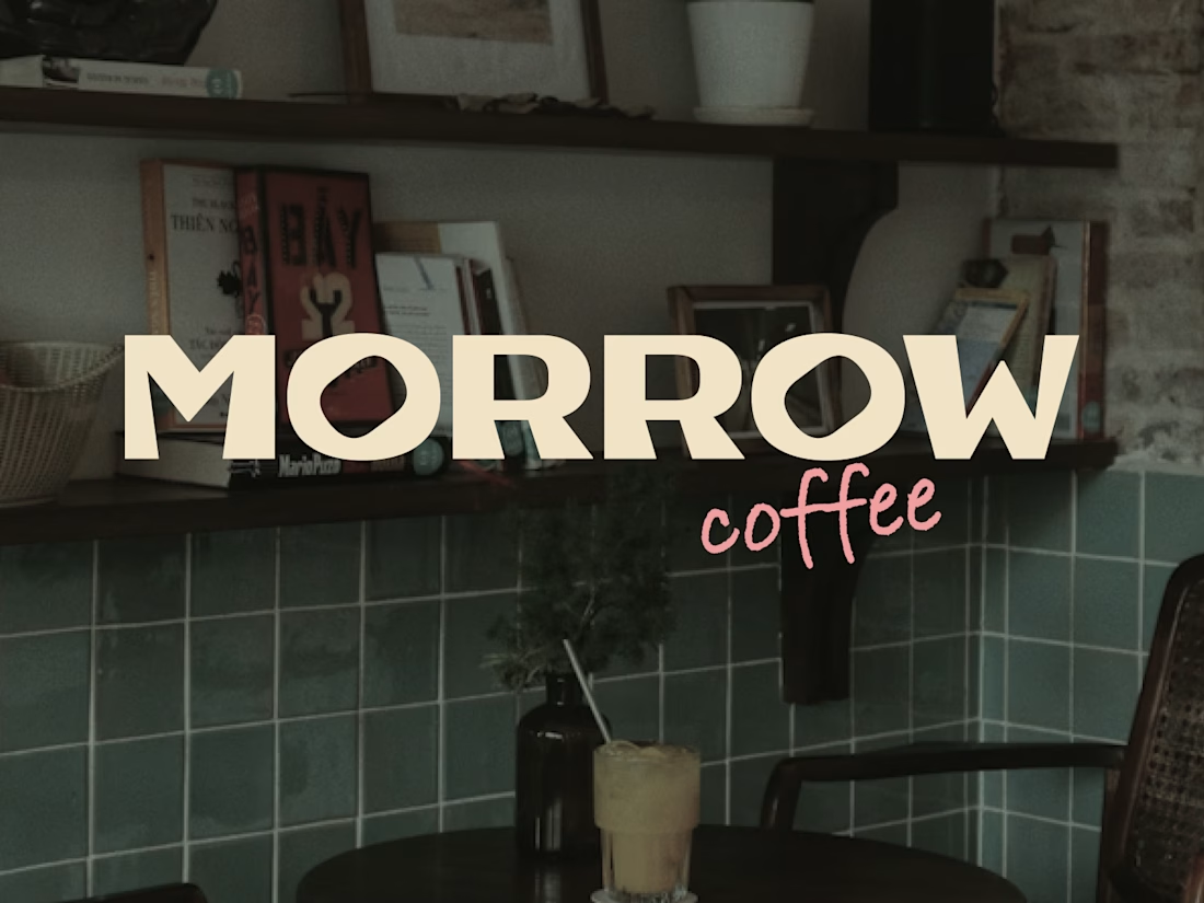
Morrow Coffee was my final project for a branding course, created about six months ago.
To this day, it remains one of my favorite projects. Looking back, I can see how much I've grown as a designer since then, but this project was where that growth truly began.
It was the first time I fully immersed myself in building a brand system – from strategy and visual identity to packaging, merchandise, and customer touchpoints. More than anything, it taught me how to think beyond a logo and create a cohesive brand experience.
This project will always be special to me because it marks the beginning of a major step forward in my design journey. ✨


The tile background in that hero shot is doing a lot of work. The contrast between the rough texture and the clean wordmark is a nice tension.

Keep pushing, you've got this! 🌿🔥
The network for creativity
Join 1.25M professional creatives like you
Connect with clients, get discovered, and run your business 100% commission-free
Creatives on Contra have earned over $150M and we are just getting started






Related posts

What should a creative agency website actually feel like?
For Orvika, we didn't want another agency site built around the same safe layouts and predictable sections.
We pushed the visual direction further with oversized typography, editorial layouts, bold imagery, and stronger contrast, while keeping the experience structured enough to communicate the agency's work and capabilities clearly.
The goal wasn't just to make it look different.
It was to make the agency feel different.
Designed in Figma and built in Framer.
We're sharing more of the websites and digital experiences we've been working on here over the next few weeks.



Very neat man

Some more Midjourney backgrounds.


Tech Startup Brand Identity Design Concept | DYNEXA - Building What’s Next
Designing for technology platforms demands ultimate flexibility across digital screens and app interfaces. DYNEXA’s brand presentation demonstrates how a single, powerful monogram can anchor an entire tech startup ecosystem.
#TechBranding #StartupIdentity #LogoDesign #UIUXDesign #AppIconDesign #VisualIdentity #BrandDesign #TechStartups #Dlogomark
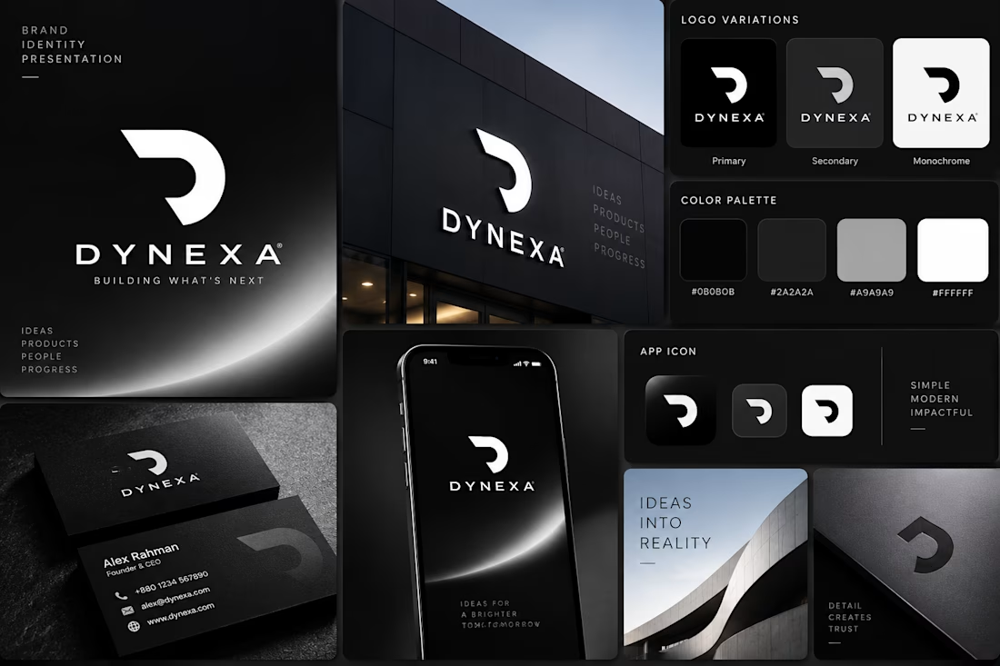

The monogram looks flexible enough to anchor a full digital system.