The network for creativity
Join 1.25M professional creatives like you
Connect with clients, get discovered, and run your business 100% commission-free
Creatives on Contra have earned over $150M and we are just getting started
Back to feedPost
Taste Test




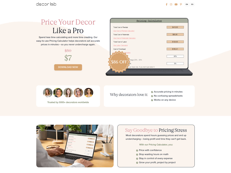
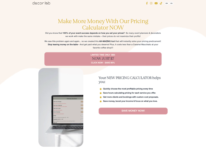

Refined looks ALOT cleaner. good job!

Both looks good tho

Refined seems better


I will go for the refined pricing section

love the update! it looks super polished & professional whereas the other is nice & clean but does give a more beginner vibe off, like a first-time user of a site-building program filling in a template.

Refined looks great 😌

Refined own looks better

refined version is cleann

Refined is good


Amazing job, @Serge Herasymchuk

Going for Refined

I prefer refined one.

Refined one!

Refined looks much better!


Refined looks cleaner, better typography treatment. Personally, I'd A/B test them both, because as we all know - it's not always about how it looks :)

Refined has a clear structure and is sure to build engagement.

There's years of experience between the refined & the original one, great work 👍

The refined one is much better

Good improvement. you didn't ask for it, but some suggestions:
• Drop the 2-column layout after the hero unit - it splits the page in half vertically, and breaks up any feeling of vertical rhythm or hierarchy.
• Left-align the hero content to the logo. Content shouldn't be...

Wow Amazing Work

good work!

Really impressive execution

The Refined one looks better

The refined version is a massive improvement! The cleaner layout with better hierarchy makes it so much easier to understand the offer. Great case study in how structure can transform conversion.
The network for creativity
Join 1.25M professional creatives like you
Connect with clients, get discovered, and run your business 100% commission-free
Creatives on Contra have earned over $150M and we are just getting started
Related posts

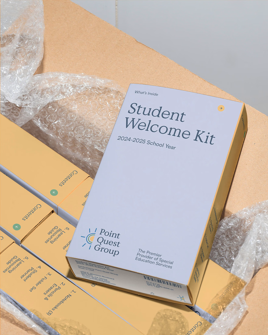
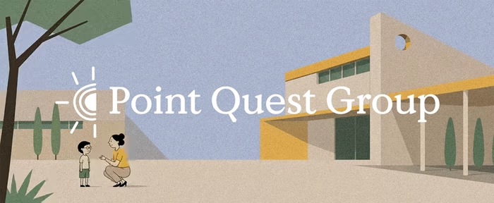
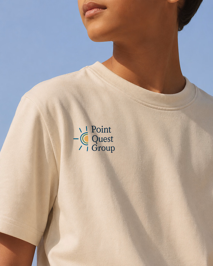
As Lead Brand Designer at Case Study Brands, I led the brand identity for Point Quest Group, an education organization. Starting with positioning and brand strategy, I translated the organisation’s goals into a cohesive visual identity designed to resonate with both school leaders and families. The final identity system balances credibility with warmth while providing a scalable foundation for future growth.




Great Work

I found this skincare brand on Instagram and instantly loved its identity.
After visiting the website, I saw an opportunity to improve the hero experience. I reached out but didn't get a response, so I redesigned it as a personal challenge.
My focus was simple: preserve the brand's premium aesthetic while improving clarity, hierarchy, and conversion.
Here's the
A. Before
B. After
Which version would you rather land on?
Also, i published the case study check comment for link

11 voted
85%
2 voted
15%

13 votes
Closed


Architect of Chaos: Branding Cobalt Analytics for the Envato Challenge
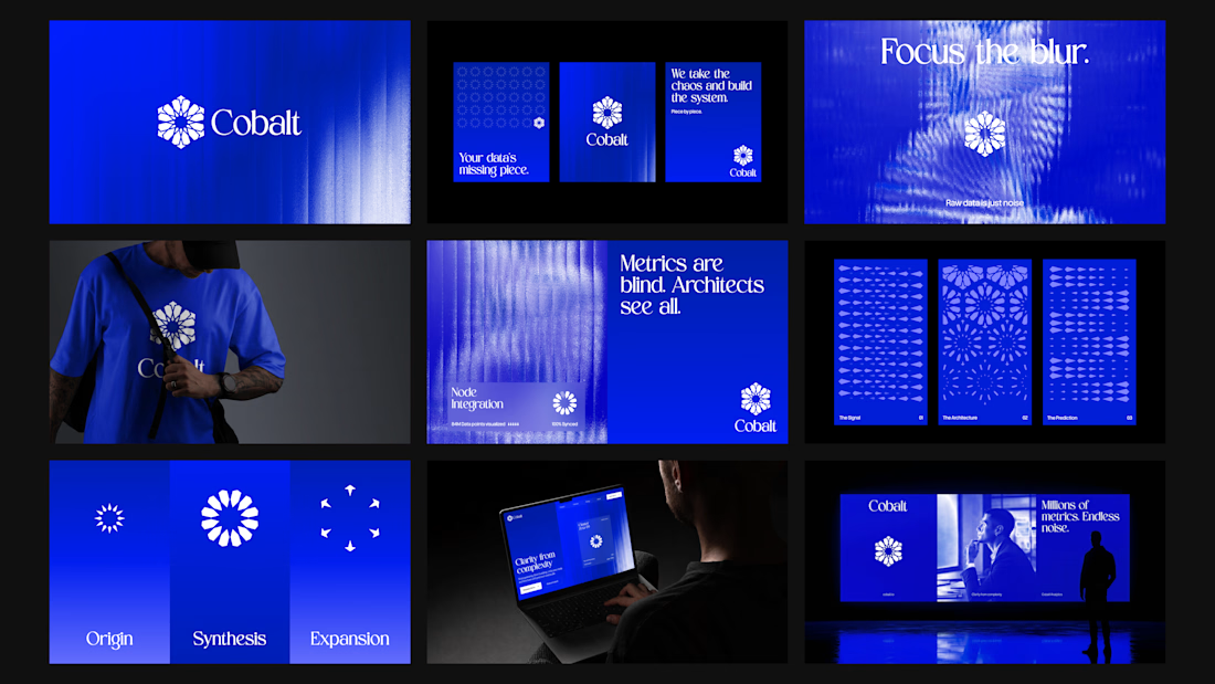
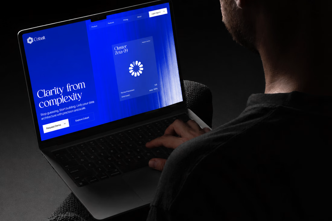
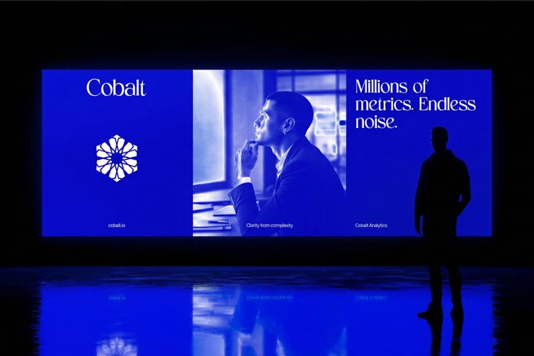
AI has completely changed the creative landscape, but it hasn’t changed what makes a digital product functional. For the Envato Challenge, I set out to design the brand identity and UI concept for a B2B SaaS platform, Cobalt Analytics. The goal was to show the crucial difference between machine generation and human curation.
The Insight: The Azulejo Metaphor
Data analytics is often visually represented by clichéd glowing nodes and neon webs. I wanted a metaphor with history. I turned to Azulejo — traditional Portuguese ceramic tiles. Historically, the art of Azulejo was about taking thousands of fragmented, independent tiles and assembling them into one grand, coherent narrative. This is exactly what a predictive data platform does: it turns chaotic metrics into a clear system.
The Process: AI as the Miner, Human as the Filter
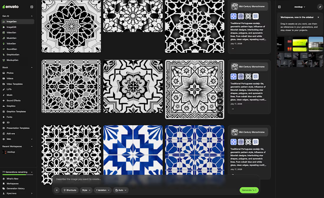
I started by feeding AI historical references of Azulejo tiles. The result? Absolutely stunning, yet completely unusable visual noise. AI generated beautiful chaos, but as a designer, I know that algorithms don't understand scalability, negative space, or modular grids.
The Extraction: I rejected 95% of the AI generations, extracting just one perfect geometric silhouette hidden in the noise.
The Clean-Up: I moved to Envato Elements to source mathematically perfect vector shapes and rebuilt the AI's concept into a clean, scalable brand mark.
The System (Figma): I established a strict modular Bento-grid, paired the complex geometry with a brutalist sans-serif typography, and built out the core UI dashboard widgets in Figma.
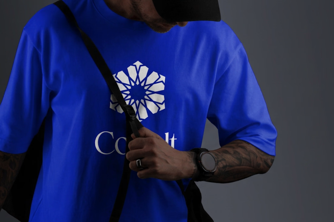
The Execution (Zero Photoshop): To bring the brand into the real world, I utilized Envato’s native mockup generator. I applied my designs directly to premium physical and digital mockups right inside Envato's browser tool—no Photoshop required. A completely streamlined, modern workflow.
The Result: Cobalt Analytics.
A brand identity that is mathematically precise, highly scalable, and ready for development. AI generated the noise, but human judgment built the system.
And for the brave souls, here is the link to the full Figma file. Fair warning: it’s a typical creative mess inside, you know how it is 😅
https://www.figma.com/design/5Du5Sjr7jCCZYNgH5Y9QtB/Envato-Challenge?node-id=17-2181&t=vap8tOu6fACNieNW-1

more detail










Trending

Claude
Claude has entered the design space. How are you using Claude Design?

Contra University
Learn from expert creatives how to earn more using next-gen AI tools.
creativeaiflow
Creative AI workflows are evolving. What tools do you use, and what are their strengths and weaknesses?
freelancerlife
Freelancer life is wins, pivots, and everything in between. What’s yours right now?