The network for creativity
Join 1.25M professional creatives like you
Connect with clients, get discovered, and run your business 100% commission-free
Creatives on Contra have earned over $150M and we are just getting started
Back to feedPost
Taste Test
New to posting in Contra! Breaking the ice with a Brand Identity Battle ⚔️
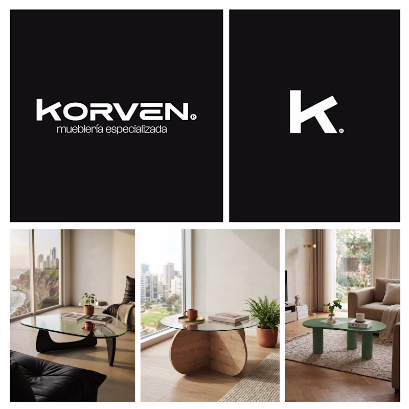
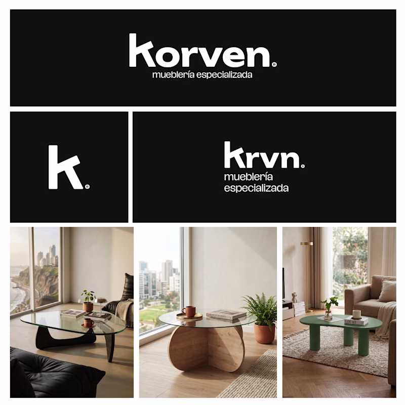
A furniture startup, Korven, recently hired us to build their visual world. Their mission? High-end, sculptural wooden furniture (starting with these Noguchi-esque coffee tables) at an attainable price point ($180–$200 USD). They’re launching with coffee tables but have a roadmap to expand into side tables and full architectural wood elements.
The Dilemma:
We’re split on the visual strategy. Bold, geometric and authoritative vs rounded, modern and tactile.
The Question:
When a product looks like a $2,000 sculpture but costs $200, which identity builds more trust?
👇 Vote A or B. If the answer is "Neither," tell us why. Be brutal!
24 voted
51%
23 voted
49%
47 votes
Closed
B feels very symmetric!
Right?! It’s all about that balance. Glad you noticed it! 💯
Great work, and welcome to the community.
Thanks, Gideon! 😊 Glad to be here. It took me a bit to decide to post, but Korven felt like the right project to start with. More to come from the studio soon! 🚀
Nice, hope to see more later then.
B feels more ownable. The warmth in that direction gives Korven a personality that furniture brands rarely pull off.
That’s the goal! 🙌 Kept it in B&W so the shapes could do all the heavy lifting without the color bias. What do you think is the strongest element in B that gives it that vibe?
Welcome! Great project :)
Thank you, Aida! Glad you liked it. Looking forward to connecting and seeing more of the community's work. 🙌
You'll find great inspiration here 😊
Great work, and welcome to the community.
Thanks, Asif! Happy to join the community. 🎉
I like A
Thanks, Florencio! A lot of people are leaning toward that 'specialized' look. Do you think that extra authority is key to building trust for a $200 sculptural piece? 🧠
UPDATE: 11:11 split! 🤯
The community is just as divided as we are.
Let's settle it: If you had to put this in your home TODAY, which one builds more trust? A or B? 👇
Nice one!!
Thanks, Narpat!! t’s getting a lot of love... 44 votes already and they’re almost tied. Hard to pick. 🤯
I’d go with B. The layout looks more polished and gives a more reliable vibe overall.
Thank you for the insight, Rasid! 🙌 That polished look was exactly what I was going for with layout B.
Welcome to Contra!
Thanks!! Excited to join the community and see what everyone is building here. 🔥
it is so minimal!
That's amazing! Let's goo! Looks amazing!
Really interesting concept. Both directions communicate a premium feel, but I like how the typography keeps the brand minimal while still feeling strong. Curious to see which direction wins.
Very Nice
Awesome work
The network for creativity
Join 1.25M professional creatives like you
Connect with clients, get discovered, and run your business 100% commission-free
Creatives on Contra have earned over $150M and we are just getting started
Related posts
A New York-based founder of a large real estate consulting agency asked me to work on his rebrand.
He didn't want the look of a traditional agency. He wanted to convey the aesthetics and exclusivity of an ultra-luxury hotel.
His budget was $2,000 for "just a little logo touch-up".
But there is a misconception behind requests like this.
You don't get premium market positioning with just a simple logo tweak.
Visual authority is built on consistency.
If a brand looks "expensive" and reliable, it's because every single touchpoint, from the website to the business card, from the pitch deck to the agency's interior design, right down to the scent of the rooms, speaks the exact same language.
Taking an elegant logo and slapping it on an amateur website won't make you look like a luxury brand.
That’s why when I get these requests, I am brutally honest about the result they will get.
We can design a great logo, sure (and I love doing it). But an isolated logo will never justify the premium rates you ask of your clients.
To position yourself at the top, you need a complete and cohesive system.
True
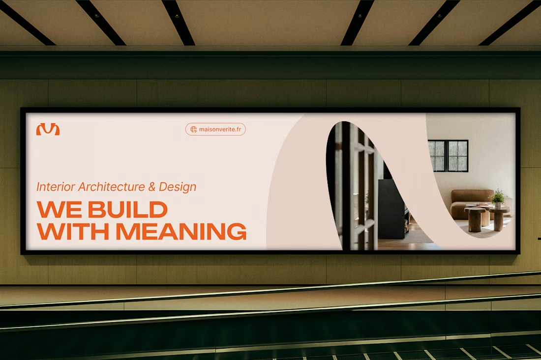
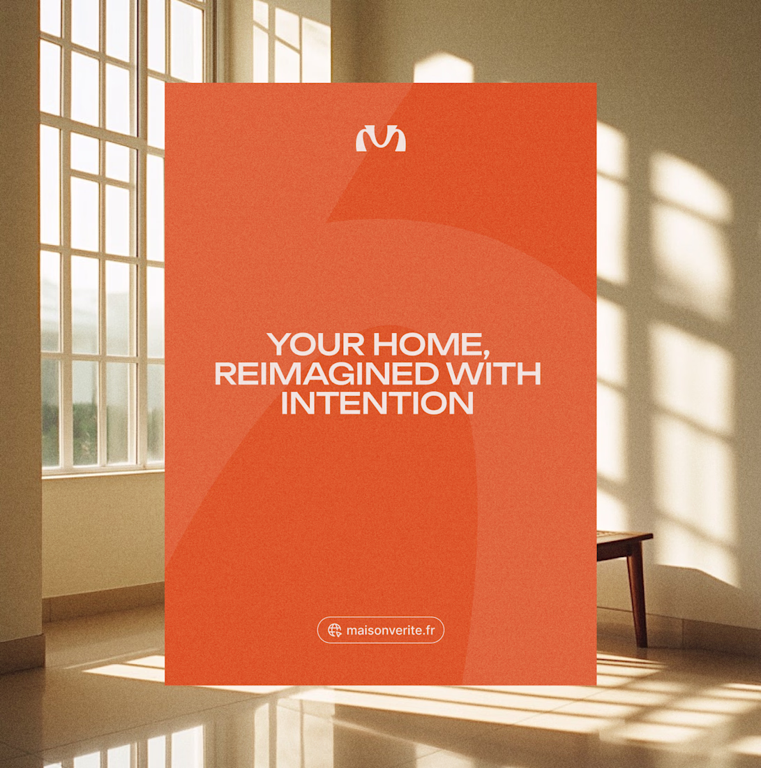
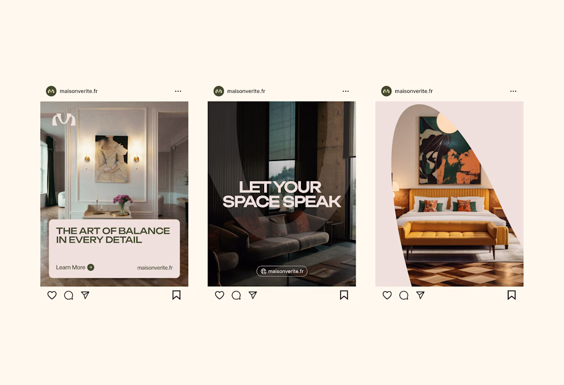
A brief preview of the visual identity for an interior design agency that I've been working on recently.
When Maison Vérité approached me, they wanted a visual system that felt just like their interiors (architectural and deeply intentional)
The concept was inspired by the keystone, the central stone of an architectural arch that holds the entire structure together. Just as the keystone gives purpose and stability to the arch, Maison Vérité gives meaning to the spaces they shape.
If you look closely, the symbol also subtly intertwines the initials “M” and “V,” merging Maison and Vérité into a harmonious form.
Fellow designers and strategists, what do you think of this visual direction?
Cool
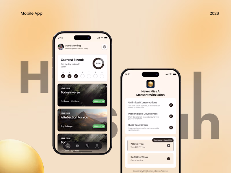
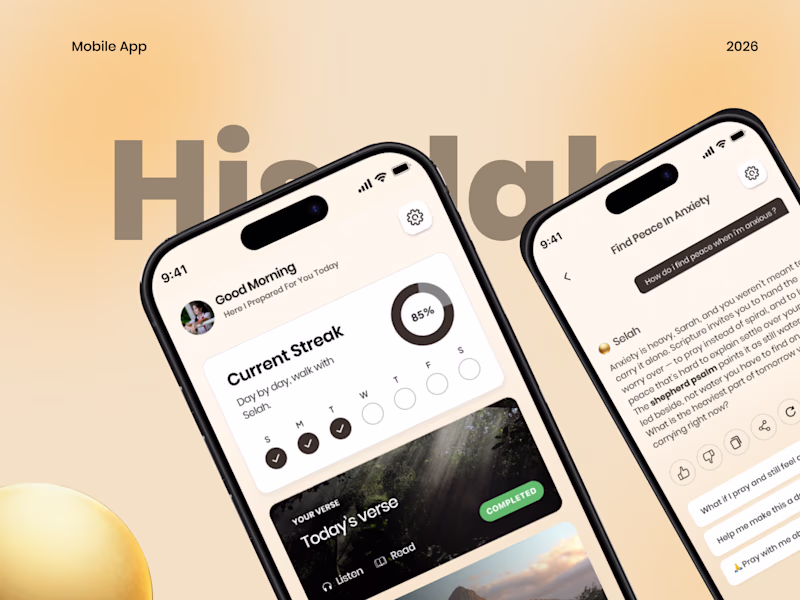
Made a couple of mockup covers for my upcoming religious mobile app case study, but can't decide which direction feels stronger.
Which one are you picking?
24 voted
59%
17 voted
41%
41 votes
Closed
amazing work
Trending
Claude
Claude has entered the design space. How are you using Claude Design?
Contra University
Learn from expert creatives how to earn more using next-gen AI tools.
MagicPath
The canvas is infinite, and exploration is becoming the workflow. How are you using MagicPath?
creativeaiflow
Creative AI workflows are evolving. What tools do you use, and what are their strengths and weaknesses?
freelancerlife
Freelancer life is wins, pivots, and everything in between. What’s yours right now?