The network for creativity
Join 1.25M professional creatives like you
Connect with clients, get discovered, and run your business 100% commission-free
Creatives on Contra have earned over $150M and we are just getting started
Back to feedPost

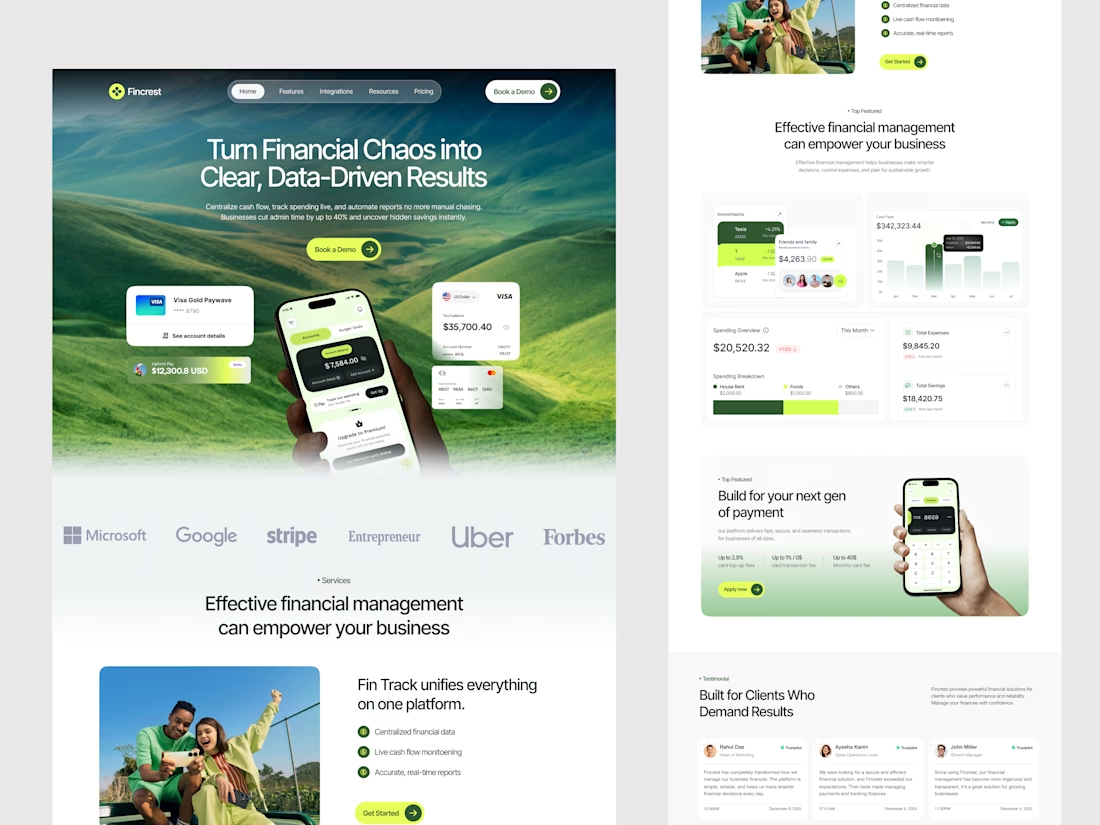
Wrapped up this landing page concept for Fincrest, a finance management platform built for businesses that are done with the spreadsheet chaos.
The core goal was to make financial data feel less intimidating and more actionable. and answer the visitor's question, "Can I trust this?" within the first scroll.
When design and messaging work together, conversion follows.



Clean work 🙌
Thanks!
The network for creativity
Join 1.25M professional creatives like you
Connect with clients, get discovered, and run your business 100% commission-free
Creatives on Contra have earned over $150M and we are just getting started







Related posts


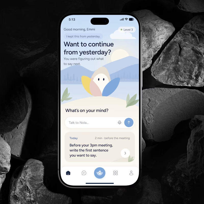
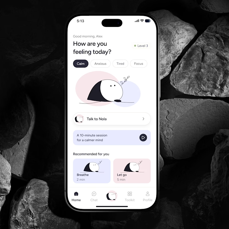
🔥 If you were building an AI Wellness Companion today, would you design a feature or a brand people could actually form a relationship with?
I explored two directions for the same product.
🅰️ Emotional Companion
Built around context, continuity and the feeling that it remembers you.
🅱️ Character Led Companion
A recognizable character that becomes the emotional anchor of the product.
Imagine you’re the founder. Which concept and character would you bet the brand on for the next few years?
Which feels more distinctive, memorable and scalable?
👇 A or B and why?
#AI #WellnessApp #AICompanion #ProductDesign #MobileAppDesign #BrandDesign #UXDesign #HealthTech #AsolDesign

30 voted
39%
46 voted
61%
76 votes
Closed

Character definitely wins here. I think it's like verion2.0 of the emotional one.


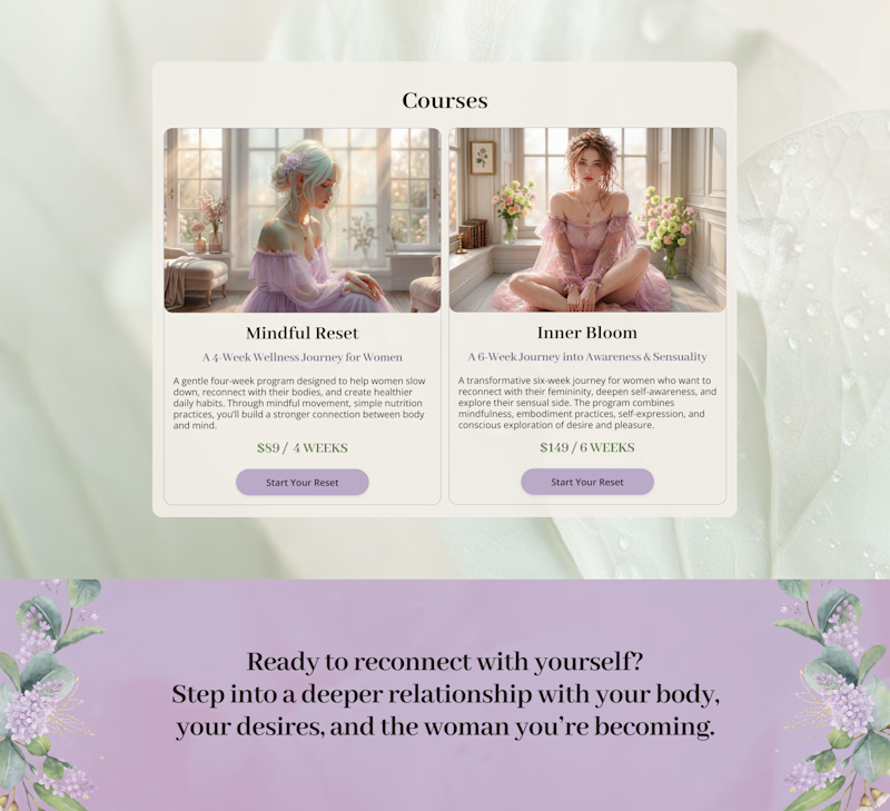
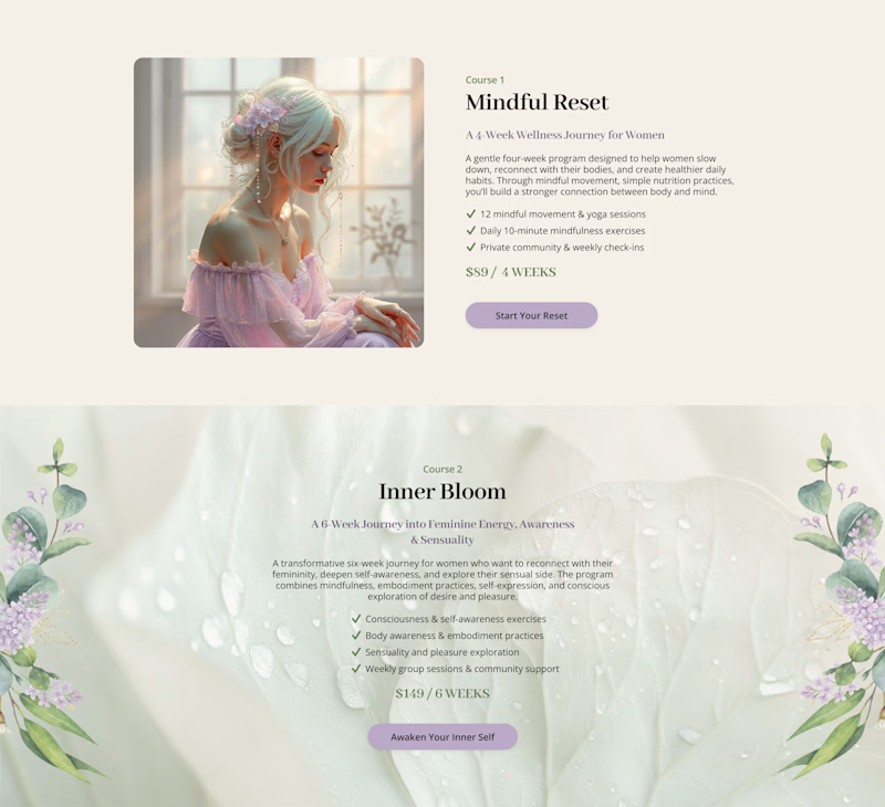
Cards or sections? How should you showcase courses on a Kajabi website?
It depends on what you want visitors to see first.
Course cards are great when you want to show the full picture at a glance – “Here are all the programs we offer.” They make the product range clear before visitors start scrolling.
Separate sections work better when each course needs more attention – its story, audience, benefits, and outcomes.
When we design Kajabi websites, we don’t use one layout for every course.
We choose the structure that makes the offer easier to understand – and easier to explore.

28 voted
65%
15 voted
35%
43 votes
Closed

Cards

Love at first grid!
A short 2D motion study taking the Amorado logo from its construction grid to the final mark. Animated entirely in Spline.
A fictional identity concept for Amorado.

