The network for creativity
Join 1.25M professional creatives like you
Connect with clients, get discovered, and run your business 100% commission-free
Creatives on Contra have earned over $150M and we are just getting started
Back to feedPost

Creator Trend Highlights as part of Creator CMO Approach with Launches whether its with my own brand (or others!) with B2B2C including Brand Outreach, Blogs, Email-Marketing Substack, Long Form, and Short Form,

The network for creativity
Join 1.25M professional creatives like you
Connect with clients, get discovered, and run your business 100% commission-free
Creatives on Contra have earned over $150M and we are just getting started

Challenges
View all


Related posts

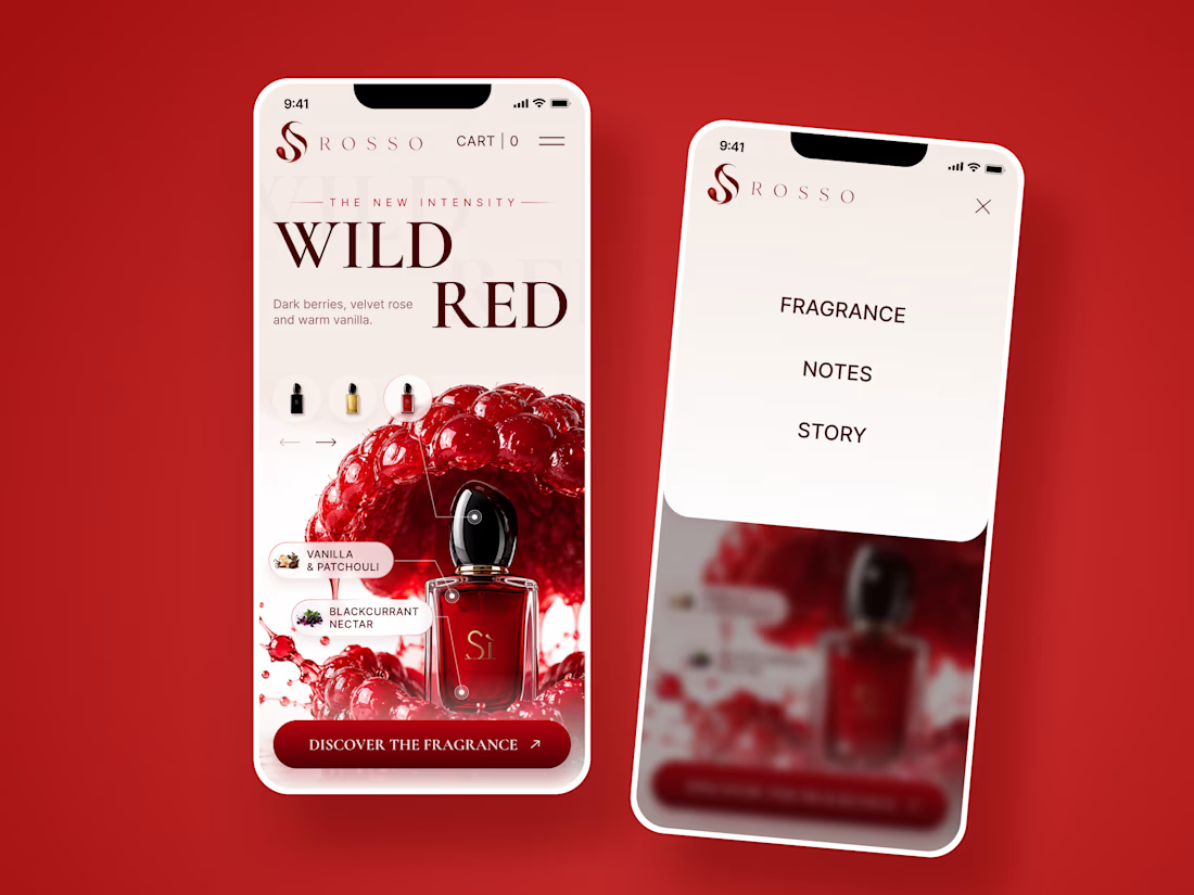
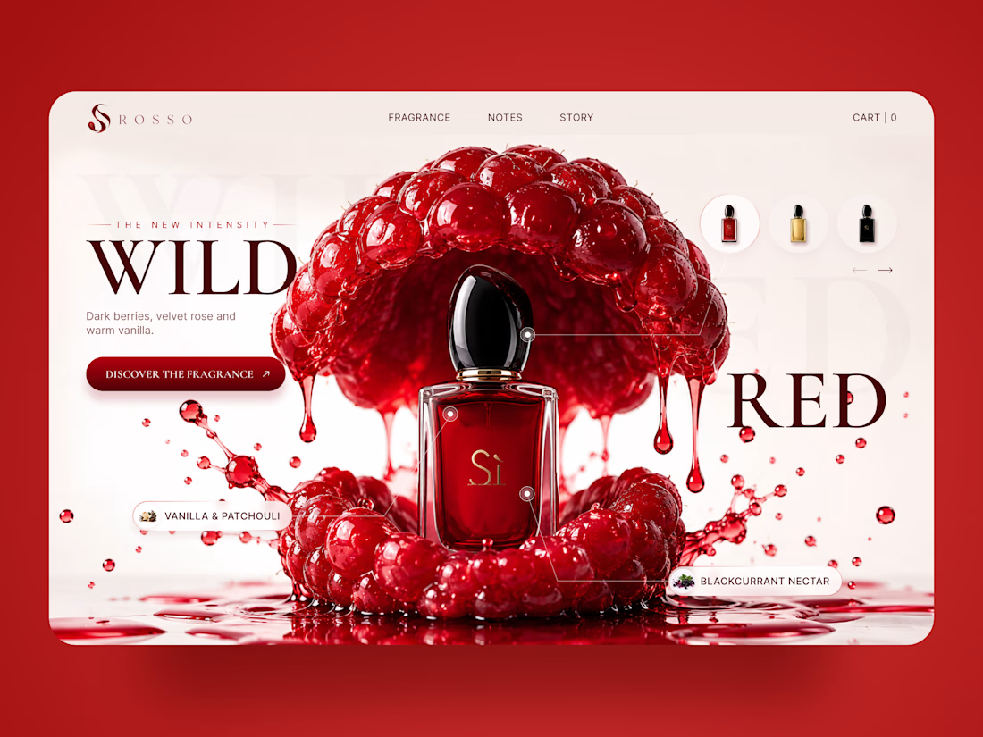
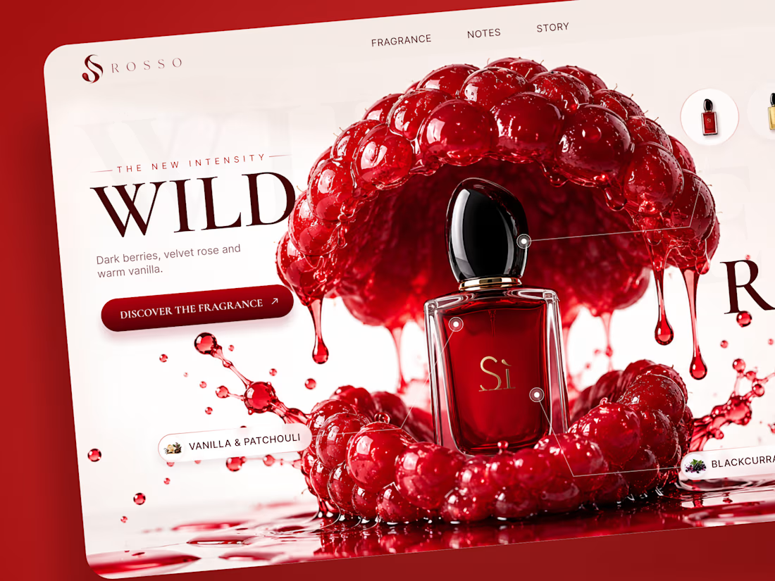
ROSSO — Wild Red Perfume Landing Page 🍒❤️
A bold fragrance landing page concept inspired by rich red berries, sensual notes, and luxury perfume aesthetics
The design combines deep red tones, oversized editorial typography, glossy fruit visuals, and elegant product presentation to create a rich and memorable experience
Special attention was given to:
• Bold product-first composition
• Rich red color palette
• Elegant editorial typography
• Fragrance notes and ingredient highlights
• Product variations and navigation
• Responsive mobile experience
The result is a vibrant, luxurious landing page that brings the fragrance to life through color, texture, and strong visual storytelling ✨
Looking to create a standout website for a beauty, fragrance, or luxury brand? Let’s connect



A movie trailer concept exploring suspense, atmosphere, and cinematic storytelling. Created as a creative sample to show how AI visuals, editing, and sound design can bring a film idea to life.
Available for AI-assisted trailers, teasers, and cinematic promos.


This should continue, what happened to the lady pilot?
Nice storyline by the way.

Light trails, sliced in: a bar reveal from the raw rainy street into my highlight-trail version (Bar reveal). Starting footage: the same 10 s vertical rainy-street clip as my first entry, plus the Highlight Trail shader stack the agent built for it. What I asked the timeline agent: in the half second before the cut, the trail version should appear over the raw street as five thin floating vertical bars, inset top and bottom, popping in left to right with a short white flash each, then a hard cut to the full trail shot. Nothing generated. What the agent did: the Crop effect had no writable controls, so it wrote its own bar_reveal shader with controls for bar count, width, inset, stagger and flash, built a separate 9:16 timeline and checked frames at 3.6, 3.8, 3.95 and 4.2 s. What I refined: pass 1 bars looked milky, so I asked for full-contrast interiors, wider bars (0.075 to 0.10) and a slower stagger (6 to 8 frames). Pass 2 fixed the contrast but turned the street around the bars black. Pass 3 flipped the mask so the raw street keeps playing around the bars and the trails show inside. The walkthrough was assembled by the same agent in invideo Editor. invideo Editor is free to try.