The network for creativity
Join 1.25M professional creatives like you
Connect with clients, get discovered, and run your business 100% commission-free
Creatives on Contra have earned over $150M and we are just getting started
Back to feedPost

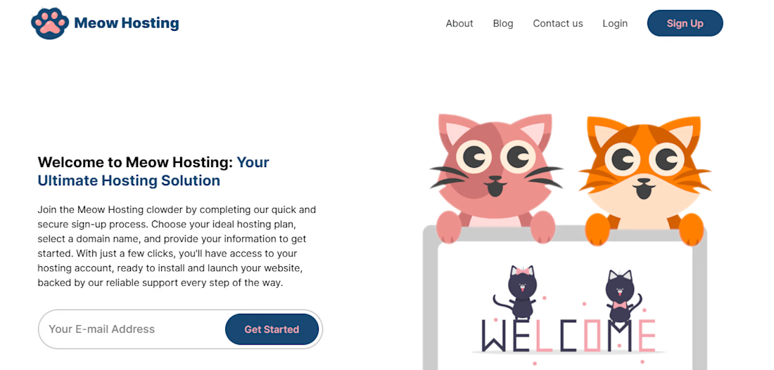
To sharpen my CSS skills, I built a fictional e-commerce site called Meow Hosting. This project gave me hands-on experience with responsive styling while allowing me to explore advanced techniques like Intersection Observer and React refs to enhance user interaction and layout behavior.


The network for creativity
Join 1.25M professional creatives like you
Connect with clients, get discovered, and run your business 100% commission-free
Creatives on Contra have earned over $150M and we are just getting started





Related posts

Which hero visual feels right for this brand?
While working on the homepage for Halfspace, a website design and SEO agency, I explored two different hero visuals for the same headline and layout. Same message, same structure, just a different visual metaphor and mood.
Option 1 - Rocket Launch. Bold, literal, and energetic, visually reinforcing the "launch your business" message with motion and fire.
Option 2 - Glass Cube. Abstract, sleek, and premium, giving a more refined, tech-forward feel without relying on a literal metaphor.
Would love your honest UX/UI take, which direction feels more impactful, memorable, and aligned with a web design/SEO brand, and why?
11 voted
41%
16 voted
59%
27 votes
Closed

Both design are great; it's hard to choose one

How to create a simple cursor tracking effect for your website 👀
Cursor interactions are a simple way to make a website feel more responsive and engaging without adding too much complexity.
In this tutorial, I break down how to create the effect and how you can use it to add more personality to your web projects.
Watch the video, follow the steps, and try it in your next build.

Great work





Option B feels nothing but premium