The network for creativity
Join 1.25M professional creatives like you
Connect with clients, get discovered, and run your business 100% commission-free
Creatives on Contra have earned over $150M and we are just getting started
Back to feedPost


A brand exploration.
The idea was to build a visual system around agriculture without relying only on literal imagery.
Generative patterns inspired by wind, weather, and field formations form the core identity. Vibrant colors bring energy, while dithering textures add a slightly organic feel.
Photography can still carry the human side of farming, while the abstract patterns create a flexible system.


Good work
Thanks Rasel!

this is what graphics designer make and people still says ai will replace designers.
Branding and personality are definitely more important now than ever


Such a smart approach.
Thanks Sahil 🙏


Love the colors! So pleasant to look at
Thanks Aryna, nice site! 👌


Thanks Nagaraj!


Thanks Ayesha!

The concept of using wind and field patterns without literal farming imagery is so clever. Really fresh brand direction!
Thanks Stephanie!

Love this brand exploration!

Brilliant idea and perfect presentation.

building a brand identity around wind and field patterns instead of literal farming imagery is such a clever and fresh approach 🌾 the generative textures are stunning. love this direction!


Amazing work!

The move away from literal agriculture imagery was a smart call. Those generative patterns give it such a modern, sophisticated feel. Really nice work on the textures too!

very nice!

Looks awesome

Great colors!

Very nice work


The illustrations and texture are incredible. Well done, Robin!
Thanks Rita, appreciate the kind words!
The network for creativity
Join 1.25M professional creatives like you
Connect with clients, get discovered, and run your business 100% commission-free
Creatives on Contra have earned over $150M and we are just getting started











Related posts


Three weeks into building the Pasted website, after the design was approved, an 11-page document arrived with a whole new vision.
It was beautiful work, and it described a different project at the agreed price.
I asked them to decide: keep the approved scope, or pause and price the new idea separately. On day six, they chose the original. We shipped two weeks later.


Offering to price the new vision as its own phase also lets the client see what the idea costs without it feeling like a no. Was a change-order process already written into your contract, or did you build that path on the spot?

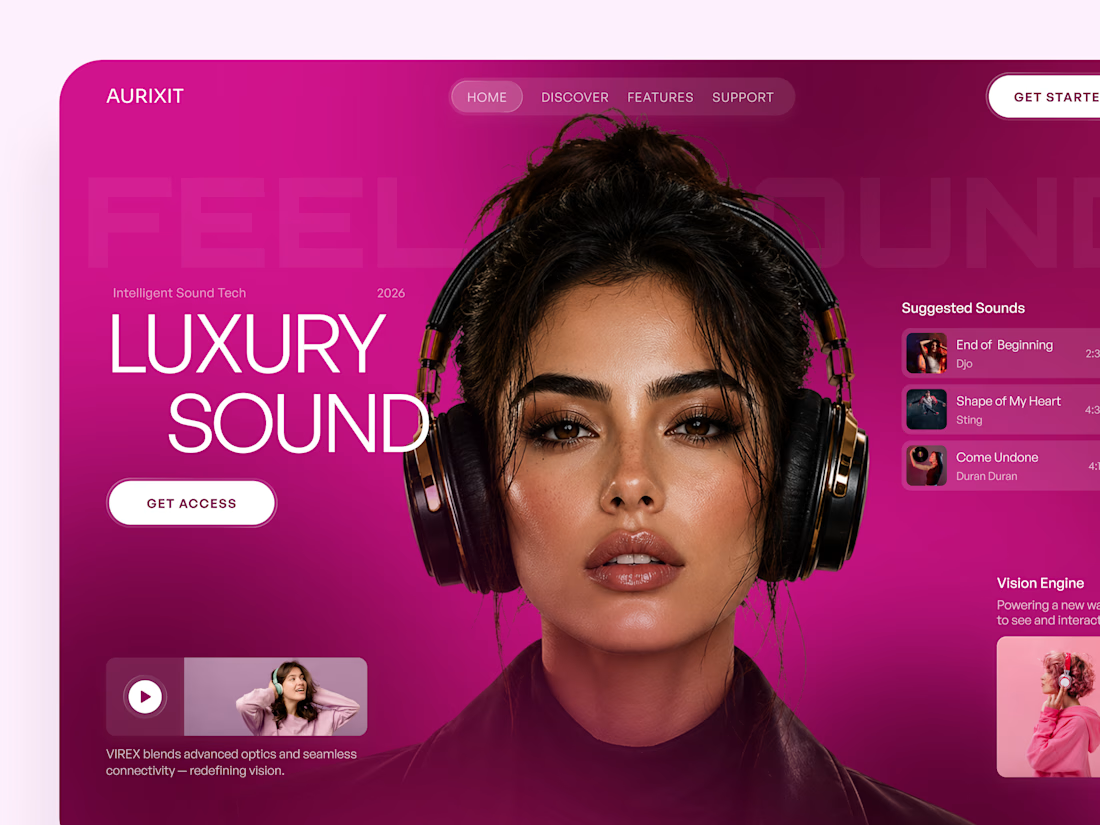
AURIXIT — Luxury Headphones Landing Page 🎧💗
A vibrant landing page concept for a premium audio brand, combining luxury sound, fashion-inspired visuals, and a bold digital experience
The design brings together bright magenta tones, oversized typography, lifestyle photography, and clean UI elements to create a modern, eye-catching aesthetic
Special attention was given to:
• Bold lifestyle-focused hero composition
• Vibrant pink and magenta color palette
• Clean, oversized typography
• Music playlist and suggested tracks
• Premium headphone presentation
• Clear CTA and minimal navigation
• Responsive mobile experience
The result is a fresh, stylish landing page that connects premium audio technology with fashion, music, and personal expression ✨

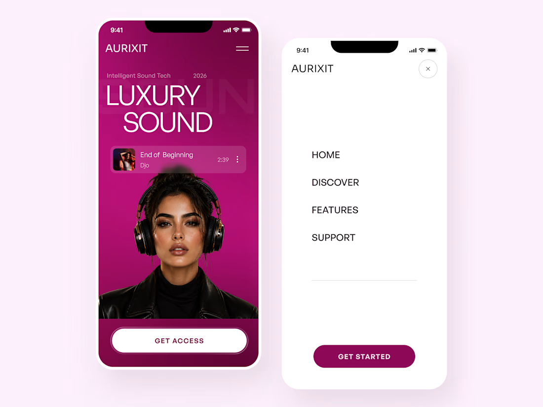
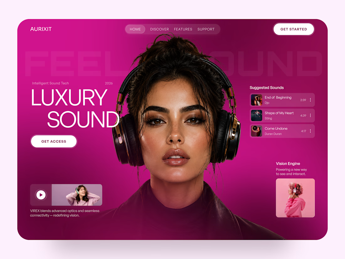

Magenta with the black headphones really pops. Was the small playlist text on pink tricky for contrast?

Shipped my first feature on Delphi last week!
We touched on profiles to add more entry points to a conversation, based off the users life experiences.
Already working on v1.2, stay tuned!

Solid work here can't wait for v1.2