The network for creativity
Join 1.25M professional creatives like you
Connect with clients, get discovered, and run your business 100% commission-free
Creatives on Contra have earned over $150M and we are just getting started
Back to feedPost

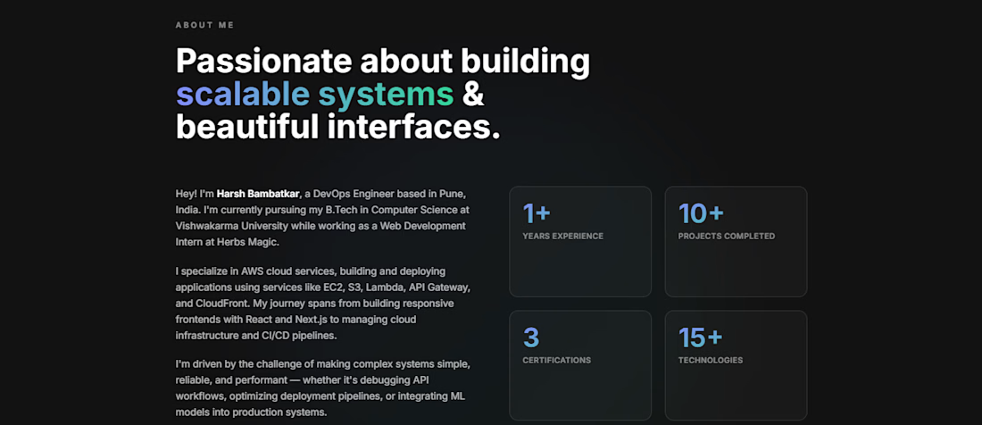
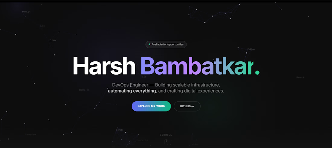
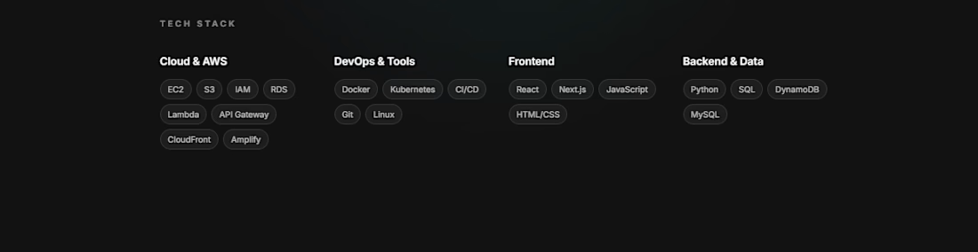
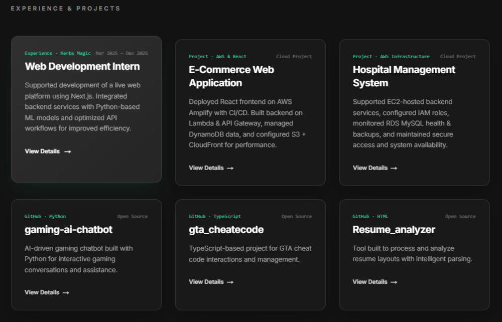
Just launched my developer portfolio! I build fast, scalable web apps using Next.js, React & AWS. Open to freelance projects landing pages, e-commerce stores & full-stack web apps. Let's build something great.

The network for creativity
Join 1.25M professional creatives like you
Connect with clients, get discovered, and run your business 100% commission-free
Creatives on Contra have earned over $150M and we are just getting started








Related posts

Built something that isn’t client work for a change.
Flowkidz. Short games that teach kids design, websites, AI, code and internet safety.


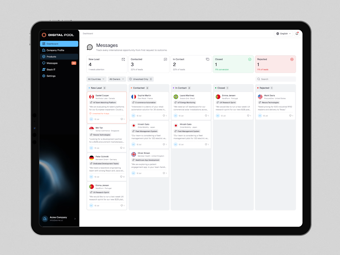
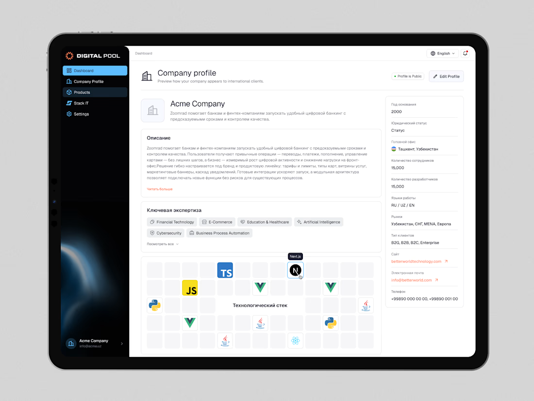
Digital Pool — Website Redesign & Product Dashboard Design
Digital Pool is a digital marketplace connecting businesses with verified software vendors, IT companies, and technology solutions.
The goal was to create a modern, intuitive experience for both businesses looking for technology partners and companies showcasing their products and services.
My work covered the public-facing website and a dedicated company dashboard, including company profiles, product management, application workflows, lead tracking, and account settings.
I focused on simplifying complex workflows, improving information hierarchy, and building a consistent design system across the entire platform.
The result is a cohesive digital ecosystem that makes discovering solutions, managing products, and connecting with potential clients easier.
Live website: https://digitalpool.gov.uz/en

That's really great digitalmarket place dashboard 🎉🎉🎉
Great job 🎉

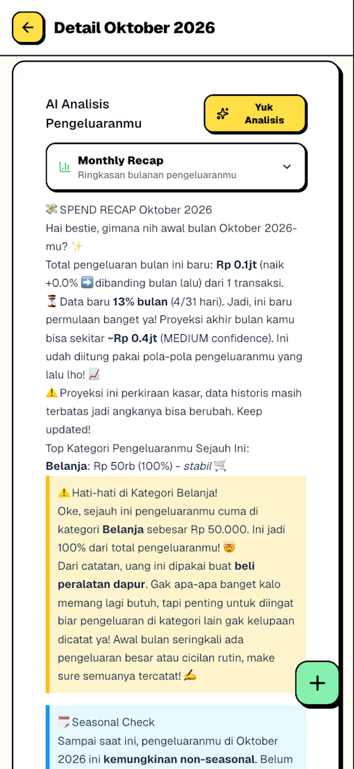
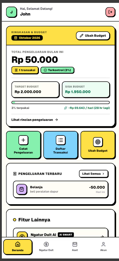
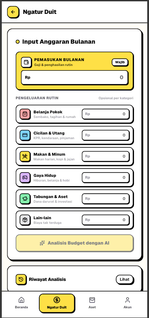
In between my regular work, I’ve been busy with a side project a way for me to learn two things at once: personal finance and coding.
The result? Meet "Temen Ngatur."
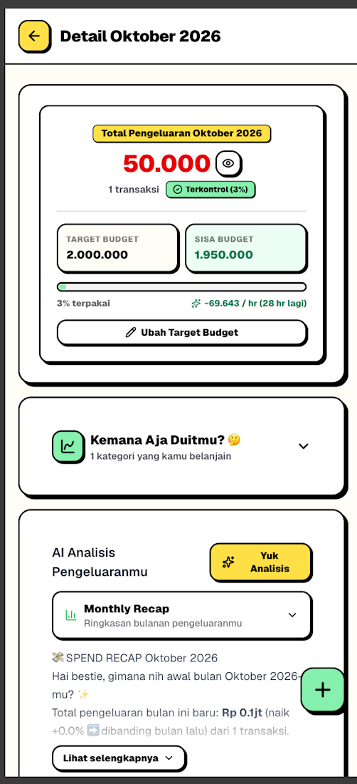
It’s a simple web app designed for personal financial management. I originally built it to meet my own needs, fueled by my genuine interest in exploring assets and financial literacy.
✨ Key Features:
✅ AI-powered smart budget analysis
✅ Setting priorities for financial goals
✅ Daily expense tracking
✅ Monthly history & comparisons I intentionally kept this app simple and personal.
It started as a private project, but who knows perhaps it could end up being useful to many more people down the line.



For expense tracking, I’d store each amount in minor units with its currency instead of relying on floating-point values. Is the app single-currency for now, or can a user track spending across currencies?