The network for creativity
Join 1.25M professional creatives like you
Connect with clients, get discovered, and run your business 100% commission-free
Creatives on Contra have earned over $150M and we are just getting started
Back to feedPost
Taste Test

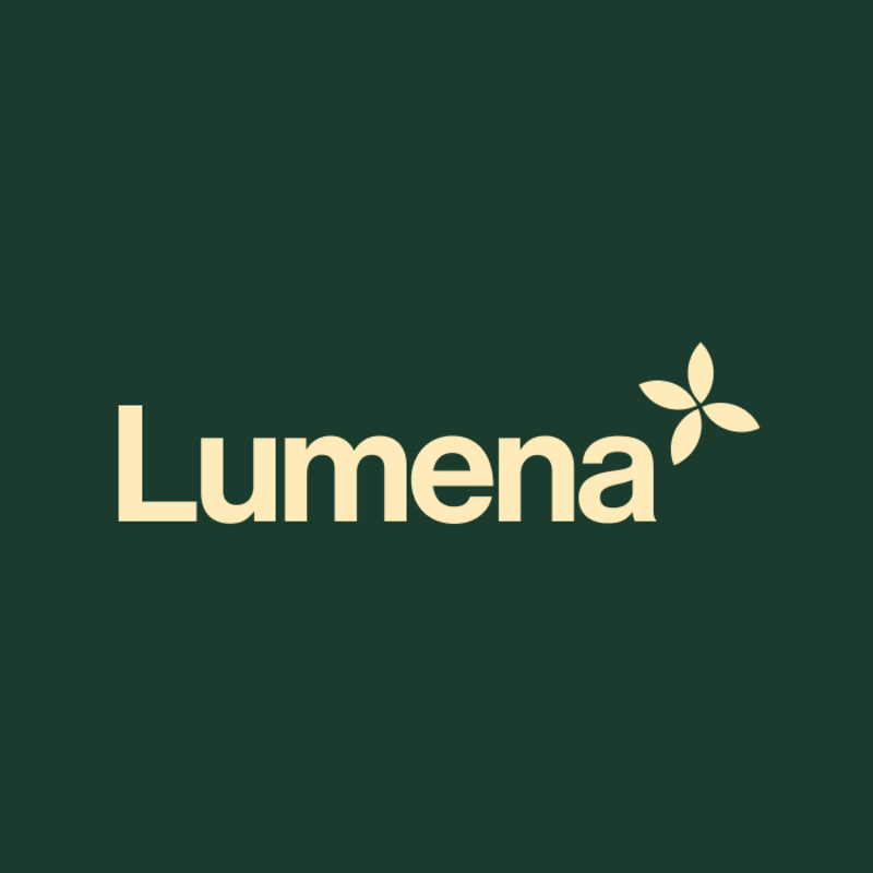
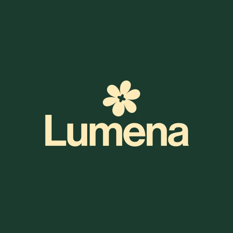
Exploring two identity directions for Lumena Practice—a proactive healthcare brand designed to make care feel personal, clear, and achievable.
Both directions combine wellness with forward movement, but communicate the idea differently:
A — A minimal four-petal symbol that feels calm, modern, and expansive.
B — A softer floral mark with a subtle healthcare cross, creating a more immediate connection between human wellness and clinical care.
The goal is an identity that feels warm and reassuring, with the credibility of healthcare and the polish of a premium digital experience.
Which direction better balances warmth, wellness, and healthcare credibility—A or B?

9 voted
47%
10 voted
53%
19 votes
Closed

Cool!
Thanks

Option A works.
I can’t decide.

Opton B is more balanced and giving me the vibes you're aiming for.
Thanks that is what I’m feeling too.


A, reads cleaner
Yea that’s why I’m so split.

B is calmer to me but A reads more premium and less generic-wellness. Which way are you leaning, or is the client still genuinely torn between the two?
I’m leaning toward B because the calm feels more aligned with the brand, but I’m still refining it to feel as distinctive and premium as A.
Leaning toward B while still wanting some of A's distinctiveness is a good instinct, healthcare brands undersell premium way too often for the sake of feeling approachable. Could a slightly bolder color or type treatment on the floral mark borrow that premium feel without losing the warmth?

Love option A - it looks very delicate and polished!
Thanks


B for me. The healthcare cross adds instant clarity while still feeling warm.
Thank you—that balance of healthcare clarity and warmth is exactly what I hoped B would communicate.
A pleasure

A one
The network for creativity
Join 1.25M professional creatives like you
Connect with clients, get discovered, and run your business 100% commission-free
Creatives on Contra have earned over $150M and we are just getting started

Challenges
View all


Related posts

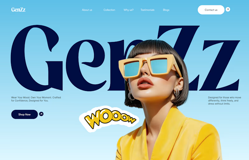
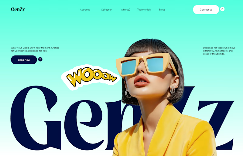
Working on a hero section for GenZz, a bold Gen Z eyewear and fashion brand. Testing two color directions for the landing page and honestly torn between them.
Version 2 has a mint to teal gradient background. Version 1 shifts it to a sky blue gradient. Same layout, same typography, same energy, just a different mood in the backdrop.
Which one pulls you in more and why. Curious if the mint feels more playful and on brand for Gen Z, or if the blue reads cleaner and more premium.
Would love your honest take before I lock this in with the client.

10 voted
59%
7 voted
41%
17 votes
Closed


cool, dmytro stands out. how long did this take?

Working on the homepage for Still Blooming, a wedding and floral studio, I explored two different layout directions for the hero section. Same brand, same copy, just a different structure and visual rhythm.
Option 1 : Left Aligned. Text sits on the left with supporting content beside it, giving an editorial, asymmetrical feel.
Option 2 : Centered. Everything is stacked and centered, giving a clean, balanced, more classic hero layout.
Would love your honest UX/UI take which direction feels more elegant, functional, and true to a wedding/floral brand, and why?
22 voted
41%
32 voted
59%
54 votes
Closed

Great Design :)

Designed a dashboard concept for tracking net worth across every asset type — stocks, crypto, property, pensions, funds, cash, and liabilities — all in one place.
Instead of the usual pie chart or bar graph, the centerpiece is a dial: a single, glanceable gauge showing where your wealth actually sits. Behind it, a quiet grid of every asset category fades in and out of visibility, reinforcing that everything's accounted for even when it's not the focus.
Dark UI, a single confident green accent, and a lot of negative space — built to make a genuinely overwhelming task (seeing your entire financial picture at once) feel calm instead of cluttered.


wow the animation feels super smooth, what is this animation for?