The network for creativity
Join 1.25M professional creatives like you
Connect with clients, get discovered, and run your business 100% commission-free
Creatives on Contra have earned over $150M and we are just getting started
Back to feedPost

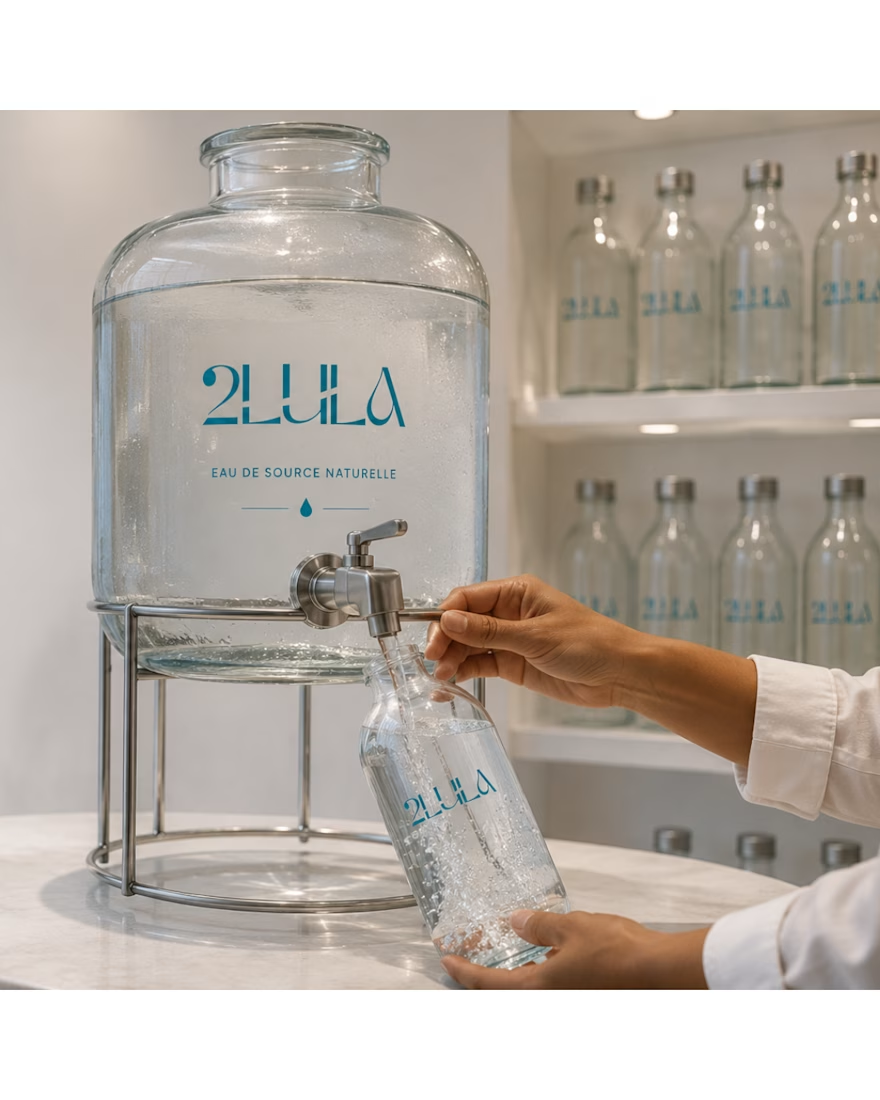
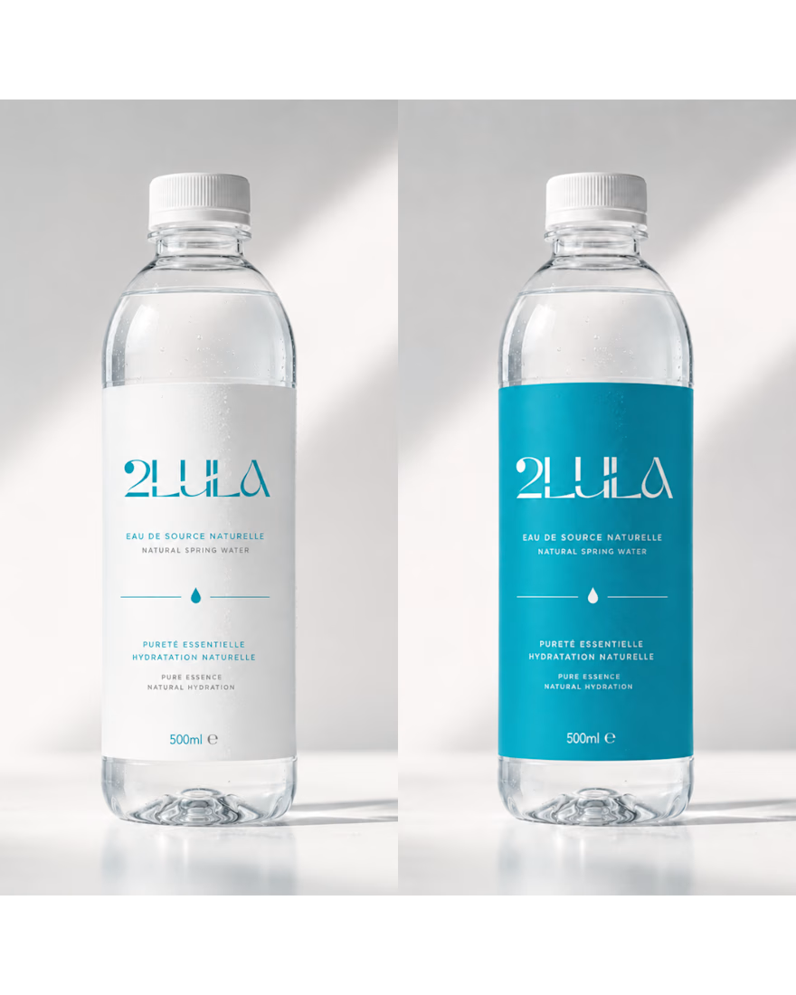
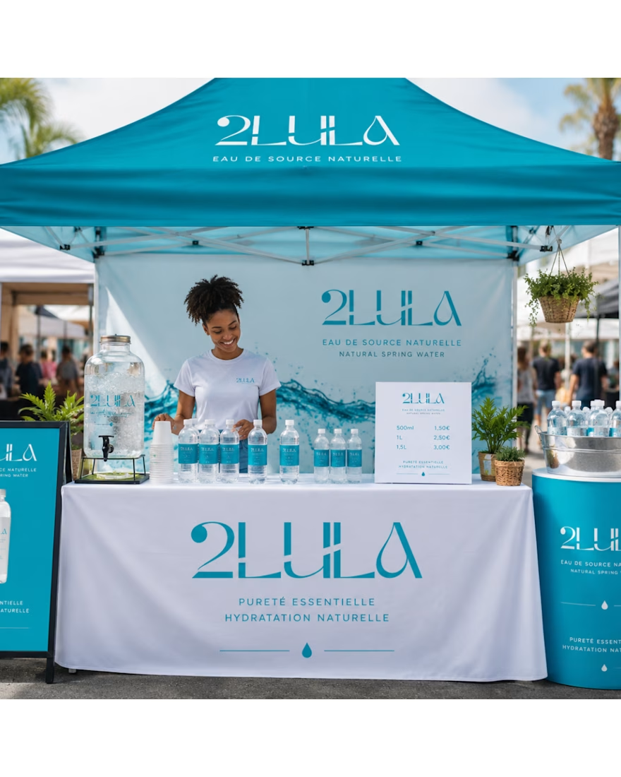
Logo & Visual Identity Concept for a Purified Water Distribution Centre.


The network for creativity
Join 1.25M professional creatives like you
Connect with clients, get discovered, and run your business 100% commission-free
Creatives on Contra have earned over $150M and we are just getting started
Related posts


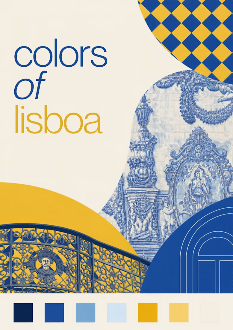
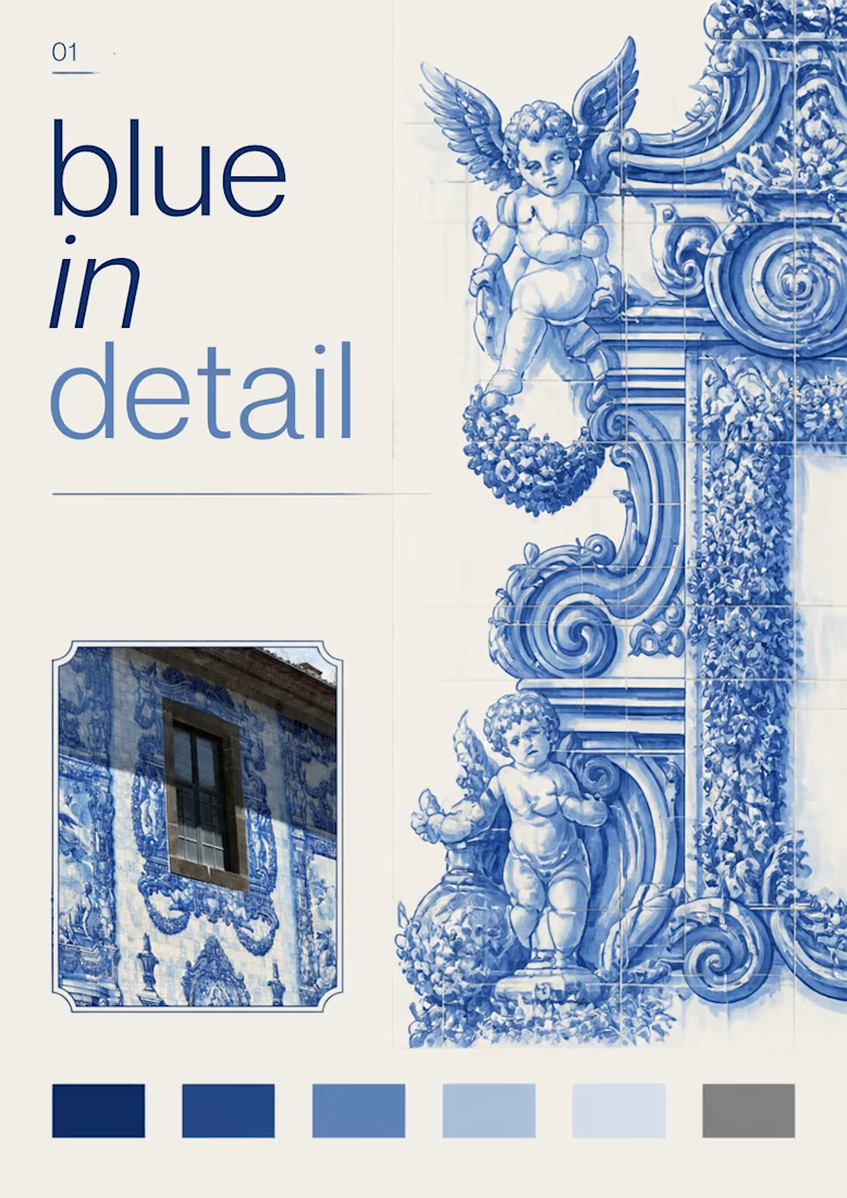
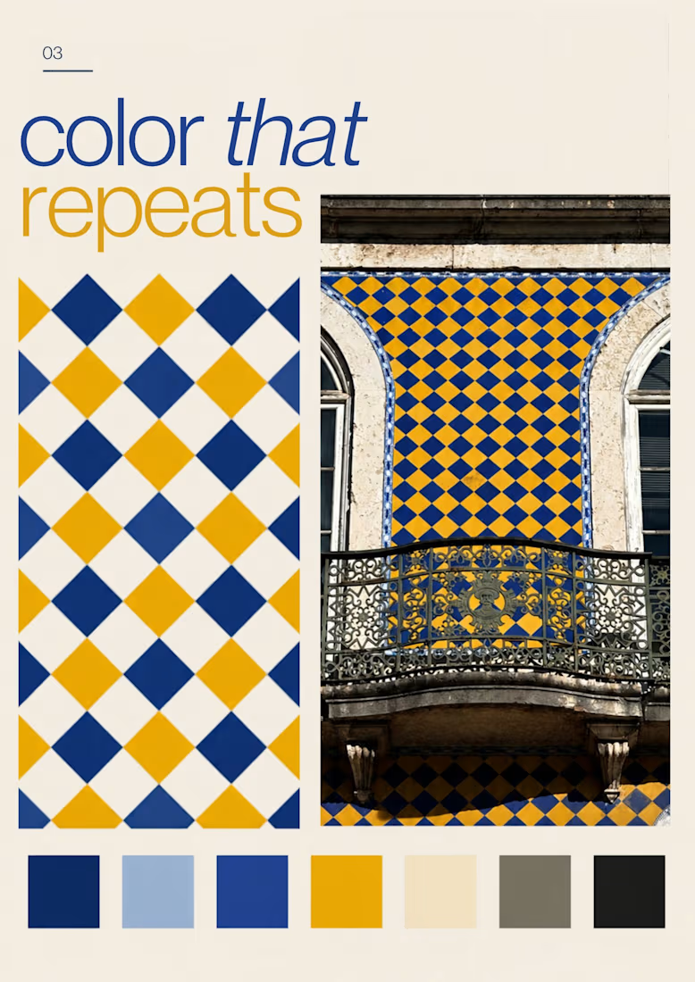
Turning the colors I notice around Lisbon into a series of posters, each inspired by a different photograph.
01 [Blue in Detail] started with the blue Portuguese tiles, exploring their intricate patterns, ceramic tones, and small details.
02 [Color on Repeat] explored the rhythm of blue and yellow tiles, using repetition as the starting point for the design.
I sampled colors from my photographs and used Canva Craft to explore layouts, typography, and graphic elements. Then I refined the designs by hand, adjusting the colors, spacing, and text.

A complete brand identity system that brings visual direction, social media, and web design into one clear, consistent brand experience across every touchpoint.


Colifa is a self-initiated branding concept for a young Argentine criolla wine, created to keep my creativity in motion. It’s my way of designing what I feel when I’m with my people: loud, funny, easy, and open to everyone at the table.


The scribbly hand-drawn tangle against those soft, bubbly COLIFA letterforms gives the label a loud-but-friendly table energy. Was the texture in the background mostly Firefly, or did you draw it by hand in Illustrator?


