The network for creativity
Join 1.25M professional creatives like you
Connect with clients, get discovered, and run your business 100% commission-free
Creatives on Contra have earned over $150M and we are just getting started
Back to feedPost
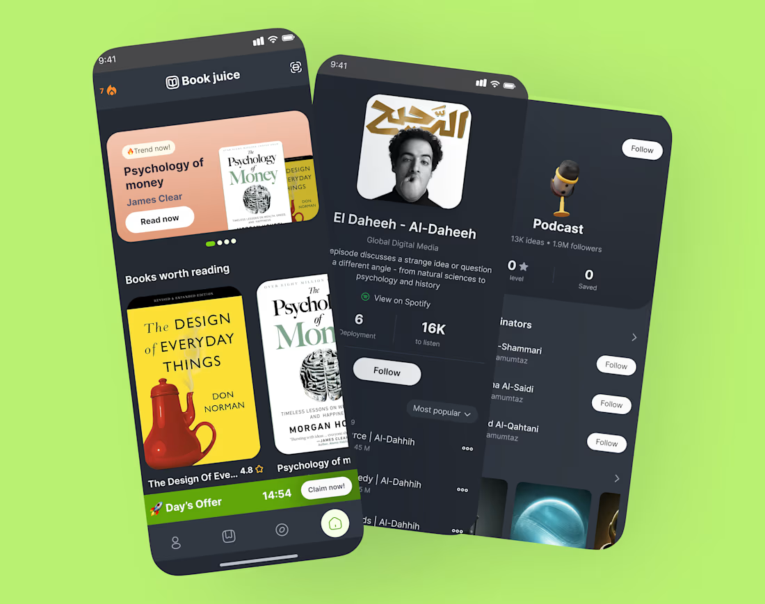
📚 Designing Book Juice — a reading app that actually makes you want to read.
Dark UI + warm book covers = a combo I couldn't stop tweaking.
Here's what drove my design decisions:
→ Dark theme to reduce eye strain for long reading sessions
→ Featured hero card to spotlight trending titles (not bury them)
→ Podcast + book integration — because some people learn by listening
→ A streak + daily offer mechanic to make coming back feel rewarding, not guilt-tripping
The hardest part? Making a grid of book covers look cohesive without looking like a library database.
What's one thing you'd want in your perfect reading app? Drop it below 👇
I'm actively iterating and would love real feedback.
💬 If you've built a reading habit — what made it stick? An app, a ritual, a format?


Stunning!

Ty!❤️
The network for creativity
Join 1.25M professional creatives like you
Connect with clients, get discovered, and run your business 100% commission-free
Creatives on Contra have earned over $150M and we are just getting started
Challenges
View all


Related posts


🎴 TASTY TEST 06/30: Which travel discovery experience would you choose?
Traveling Up is probably my first mobile concept outside client work in almost three years. It was inspired by a trip where not knowing the destination was part of the fun.
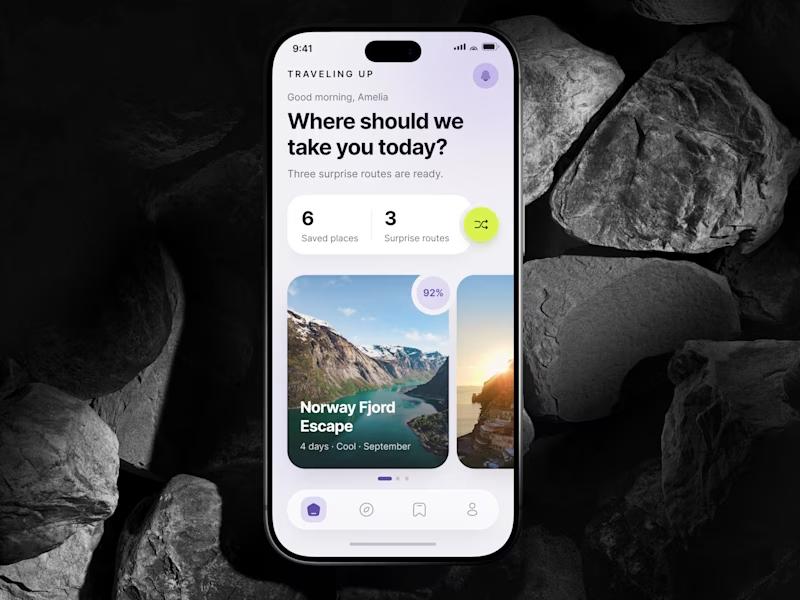
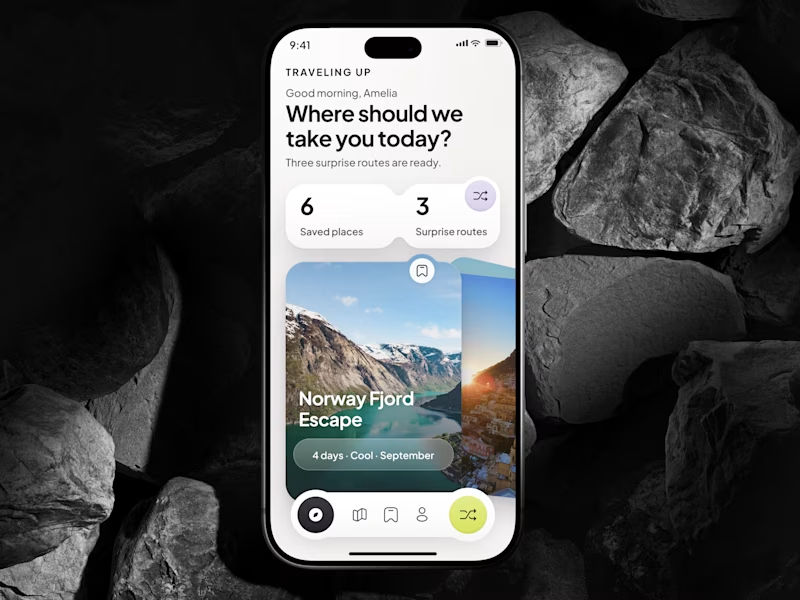
Same app. Same destination. Two ways to discover it.
🤍 A Clean Carousel
Calmer, lighter, more familiar.
💚 B Immersive Deck
Bigger imagery, stronger overlap, more tactile navigation.
Which one makes you want to swipe and see where the app takes you next?
A or B? 👇
#MobileAppDesign #TravelApp #MobileUX #UIDesign #ProductDesign #AsolDesign
23 voted
49%
24 voted
51%
47 votes
Closed


A look at the identity we designed for Vetti, a dog health monitoring brand.
There’s a lot of data behind a product like this but the person using it just wants to know their dog is okay.
That’s the balance in the design with a connected dot system that feels precise and warm colors and photography that keep it close to what people care about.
Also, an excellent excuse to spend far too long choosing dog photos.


Engaging website for a New York–based architecture and construction studio, balancing bold typography, immersive imagery and a minimal editorial layout.


