The network for creativity
Join 1.25M professional creatives like you
Connect with clients, get discovered, and run your business 100% commission-free
Creatives on Contra have earned over $150M and we are just getting started
Back to feedPost
Vitality Fuel — Luxury Cold-Pressed Smoothie Packaging & Brand Identity
Project Overview:
Vitality Fuel was designed to disrupt the standard grab-and-go beverage aisle by pairing cold-pressed nutrition with high-end tactile packaging. Moving away from generic plastic containers, this concept utilizes a custom frosted apothecary glass bottle featuring a ribbed base for ergonomic grip and a brushed gold cap for an immediate luxury shelf presence.
Key Design Highlights:
Typography & Hierarchy: A bold, authoritative wordmark ("VITALITY FUEL") paired with clean, modern sans-serif flavor descriptors ("Mango Sunrise") ensures instant readability.
Tactile Finishes: Textured cream paper labeling with subtle gold-foil accents elevates the brand's organic, small-batch positioning.
Clean Iconography: Custom minimalist line-art icons highlight key functional ingredients (Mango, Orange, Turmeric, Ginger) and dietary callouts (Dairy-Free, Vegan, No Added Sugar) at a glance.
Deliverables / Skills:
Packaging Design • Brand Identity • 3D Product Mockup • Label Design • Beverage Branding • Typography
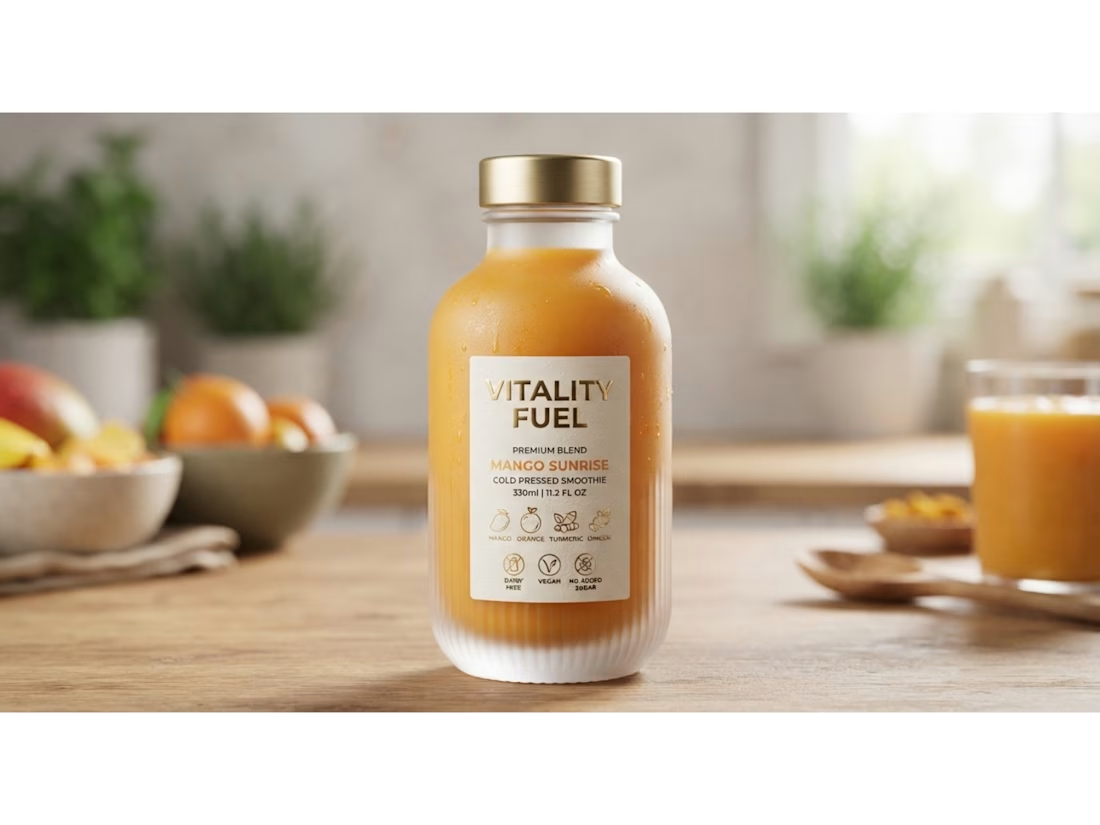

Such a pretty bottle shape, Murad, especially that ribbed glass base

Thanks @Thayline Vargas
The network for creativity
Join 1.25M professional creatives like you
Connect with clients, get discovered, and run your business 100% commission-free
Creatives on Contra have earned over $150M and we are just getting started


Related posts

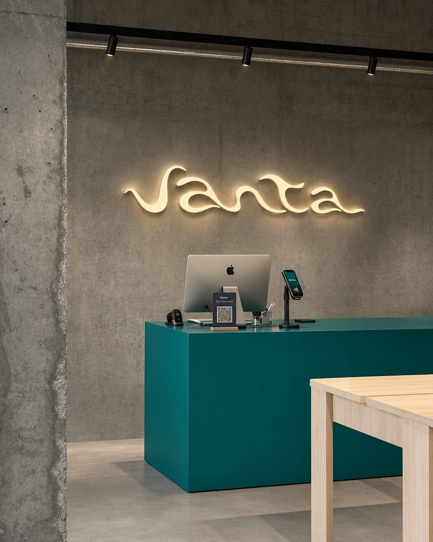
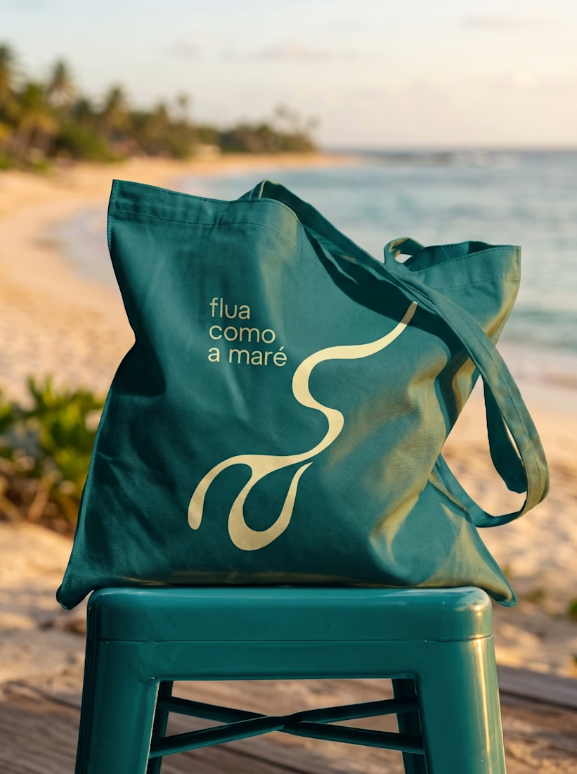
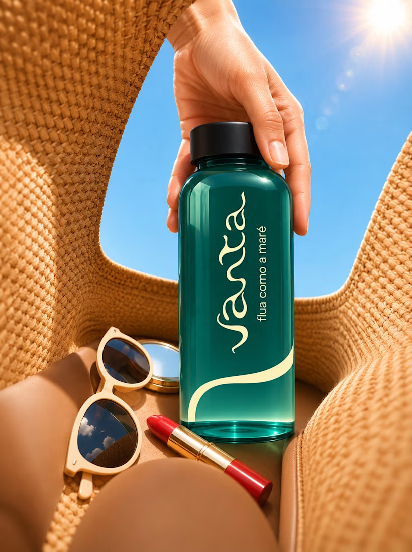
Just wrapped up this brand identity for Vanta and wanted to share a quick peek! Kept the visuals super clean, warm, and fluid, letting the product and textures breathe. Let me know what you think!

Great work!

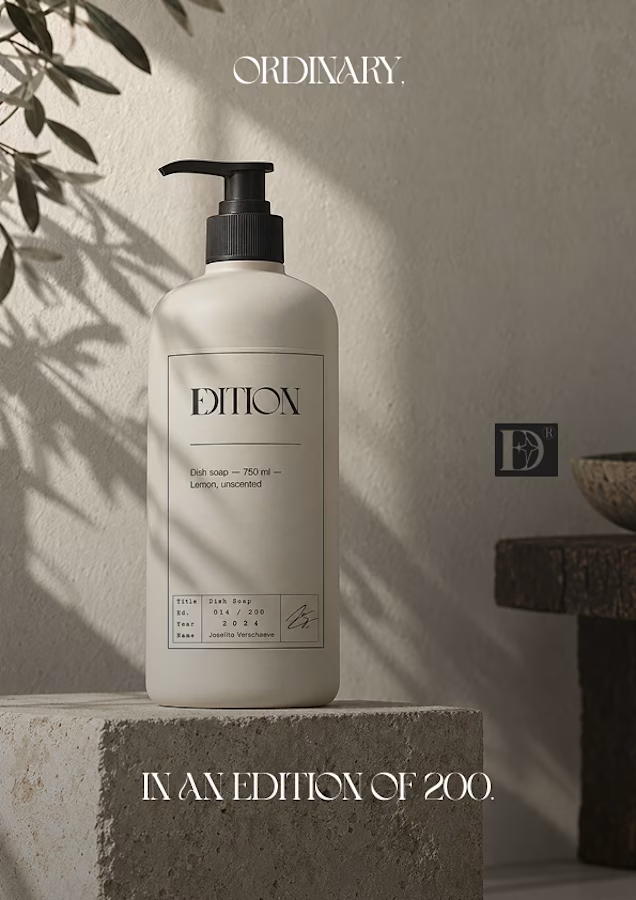
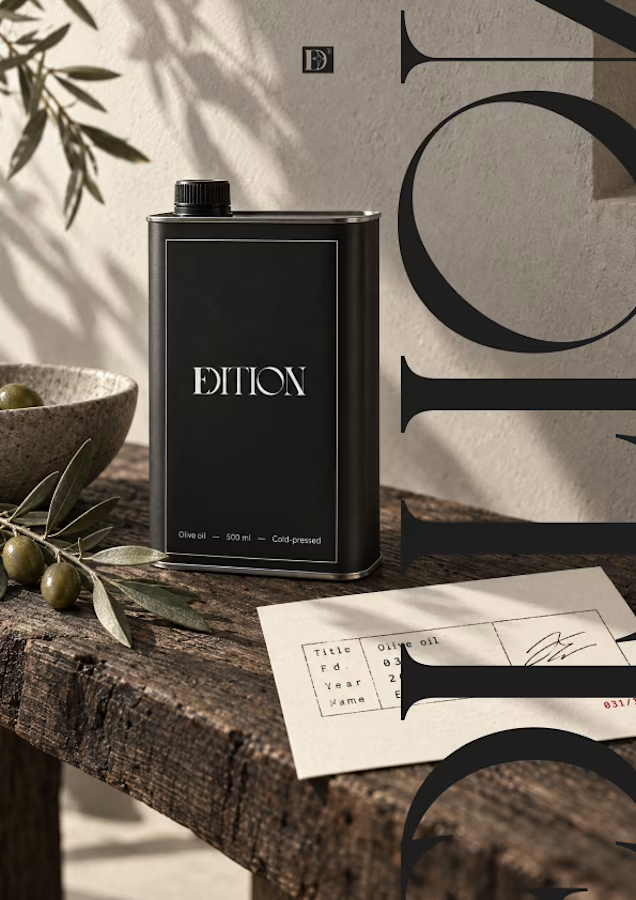
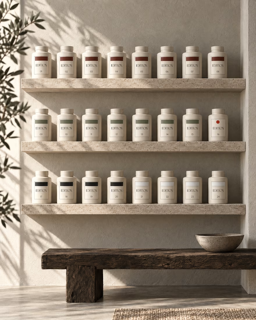
Ever signed for a pack of pasta? Soon you will.
EDITION is a brand where nothing is decorative and everything is numbered.
Case study landing very soon.


Love a good all round project full of branding, merch, fitouts etc
Always fun!
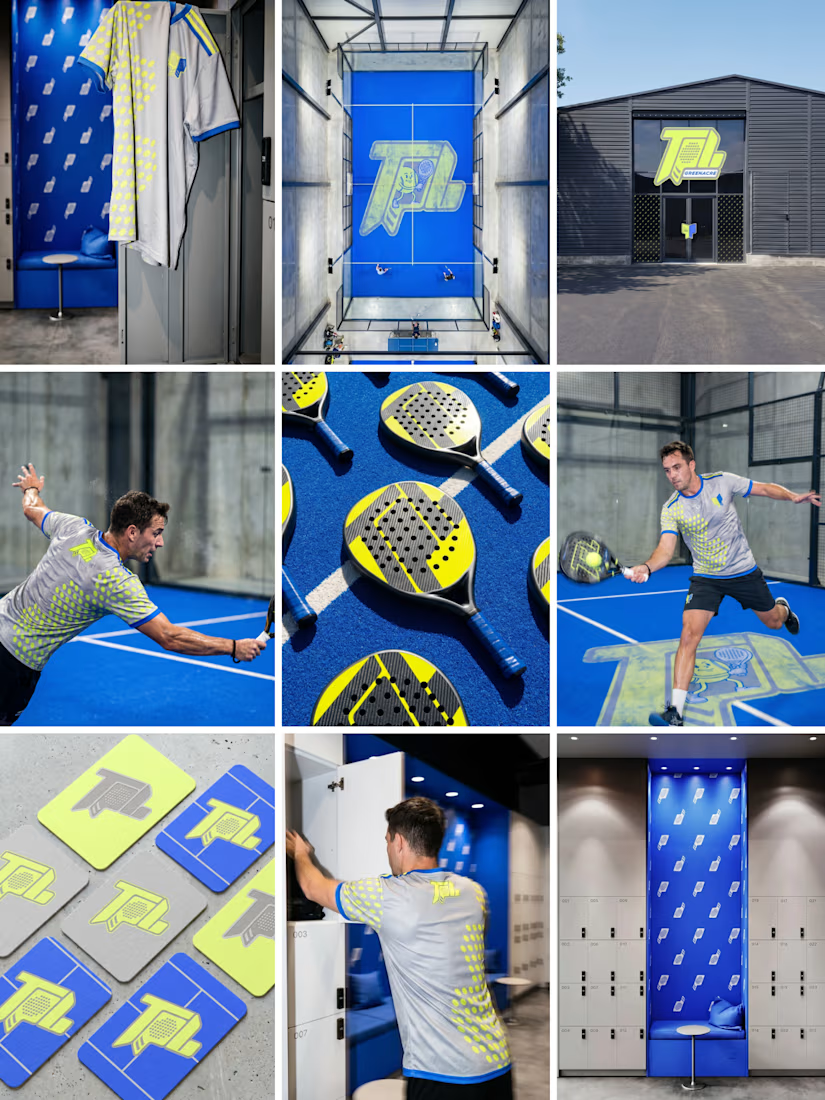

Branding across merch and fitouts looks wonderfully cohesive.