The network for creativity
Join 1.25M professional creatives like you
Connect with clients, get discovered, and run your business 100% commission-free
Creatives on Contra have earned over $150M and we are just getting started
Back to feedPost

Design Dissertation - Rocket Propulsion Systems


The network for creativity
Join 1.25M professional creatives like you
Connect with clients, get discovered, and run your business 100% commission-free
Creatives on Contra have earned over $150M and we are just getting started



Related posts

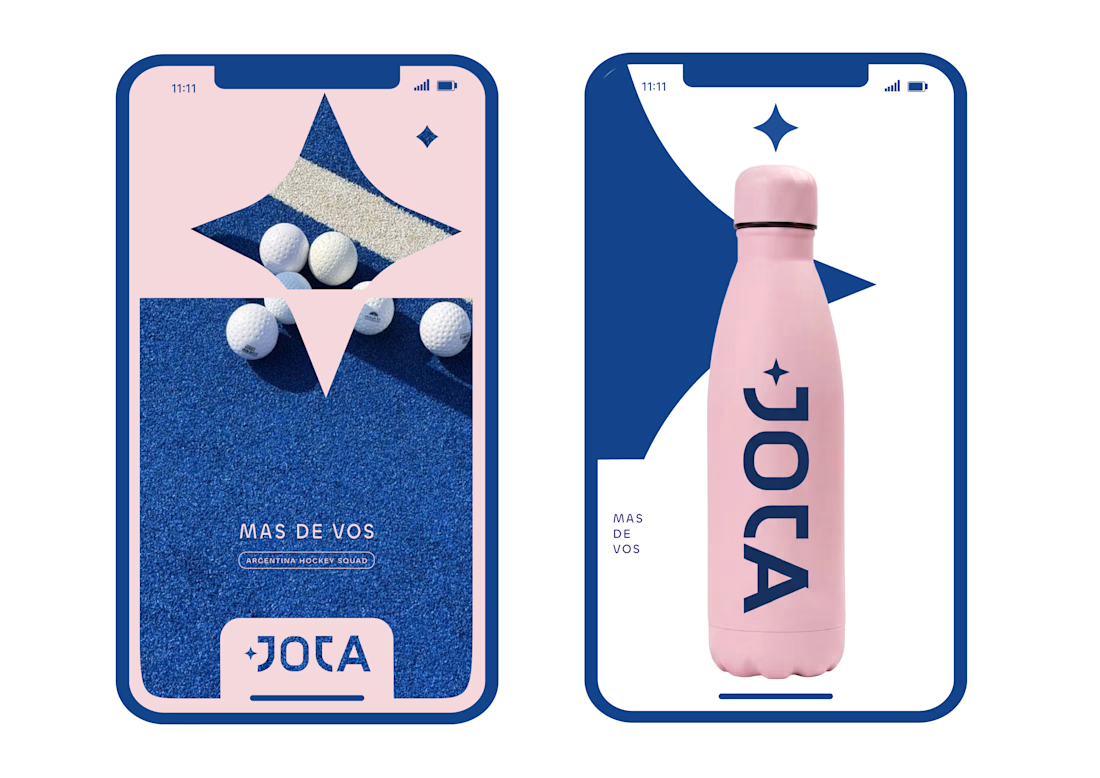
JOTA is an Argentine field hockey brand built for players who play with personality. The founder reached out to rethink how the brand shows up beyond the stick itself.


Wow project

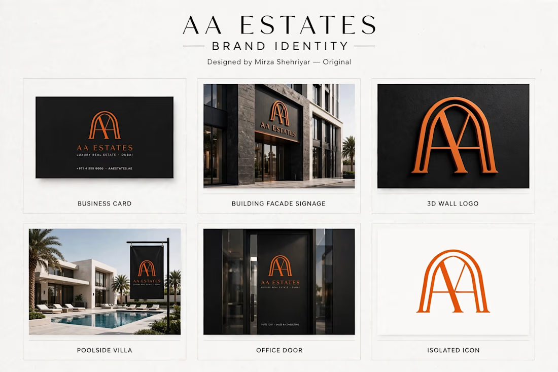
Luxury logo for Dubai real estate brand.
I designed this AA monogram inspired by Islamic arch architecture.
Clean, premium look for high-end properties.
What you see:
Business card, building signage, 3D logo, villa flag mockups.
Made this for my portfolio - open for custom work.
Designed by Mirza Shehriyar



This is a very strong portfolio piece. The clean, minimal typography paired with that bold monogram creates a very sophisticated look. Great job on this.

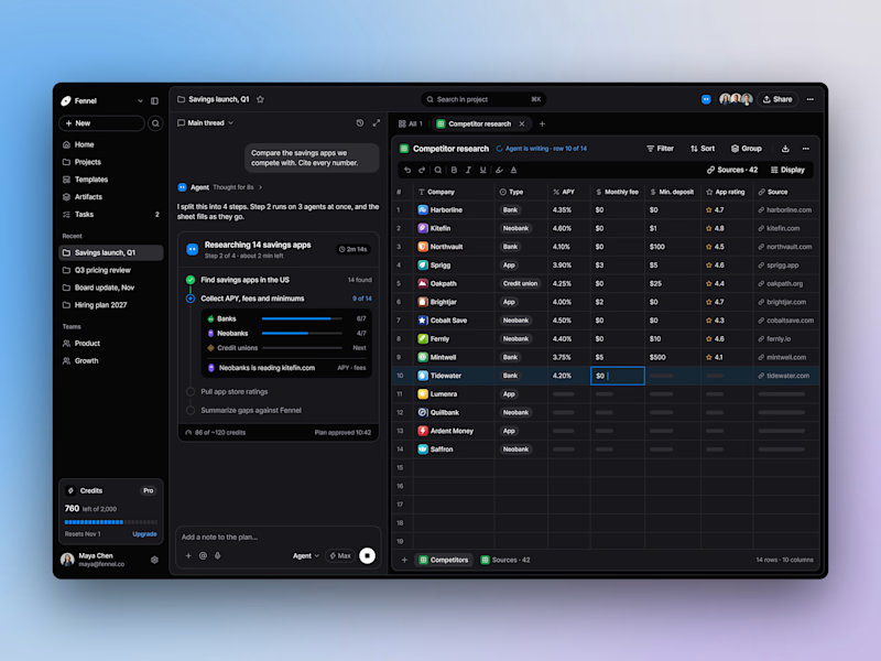
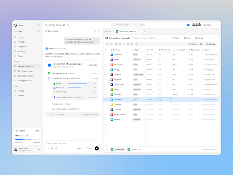
Designed an AI research workspace where the agent plans the work and fills a sheet with cited sources as it goes.
Same screen, two modes. Which one would you work in all day? 👀

13 voted
72%
5 voted
28%
18 votes
Closed

Keeping the research plan and cited results side by side is a useful way to make the agent’s work easier to inspect. I’d lean toward light mode for reading the table in daylight. How do you distinguish a verified source from one that still needs review?