The network for creativity
Join 1.25M professional creatives like you
Connect with clients, get discovered, and run your business 100% commission-free
Creatives on Contra have earned over $150M and we are just getting started
Back to feedPost

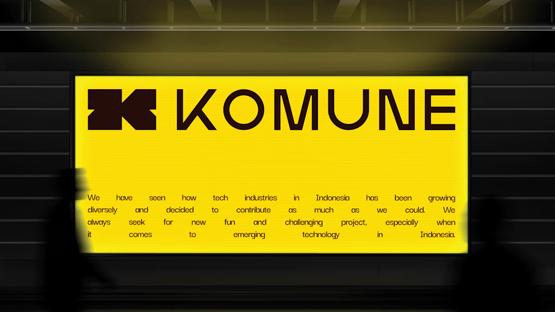
Visual Identity for Komune Studio.
Komune Studio is a digital technology agency that provides cloud-based solutions for clients’ needs.
The new identity uses a bold and modern look to show agility and innovation. The geometric “K” logo represents structure, precision, and seamless integration of technology. The bright yellow color brings energy and optimism.
The design takes inspiration from modular systems, reflecting how Komune Studio’s solutions adapt and grow with clients. Clean lines and solid shapes convey clarity, efficiency, and a commitment to delivering effective results in today’s fast-changing digital world.

The network for creativity
Join 1.25M professional creatives like you
Connect with clients, get discovered, and run your business 100% commission-free
Creatives on Contra have earned over $150M and we are just getting started













Related posts


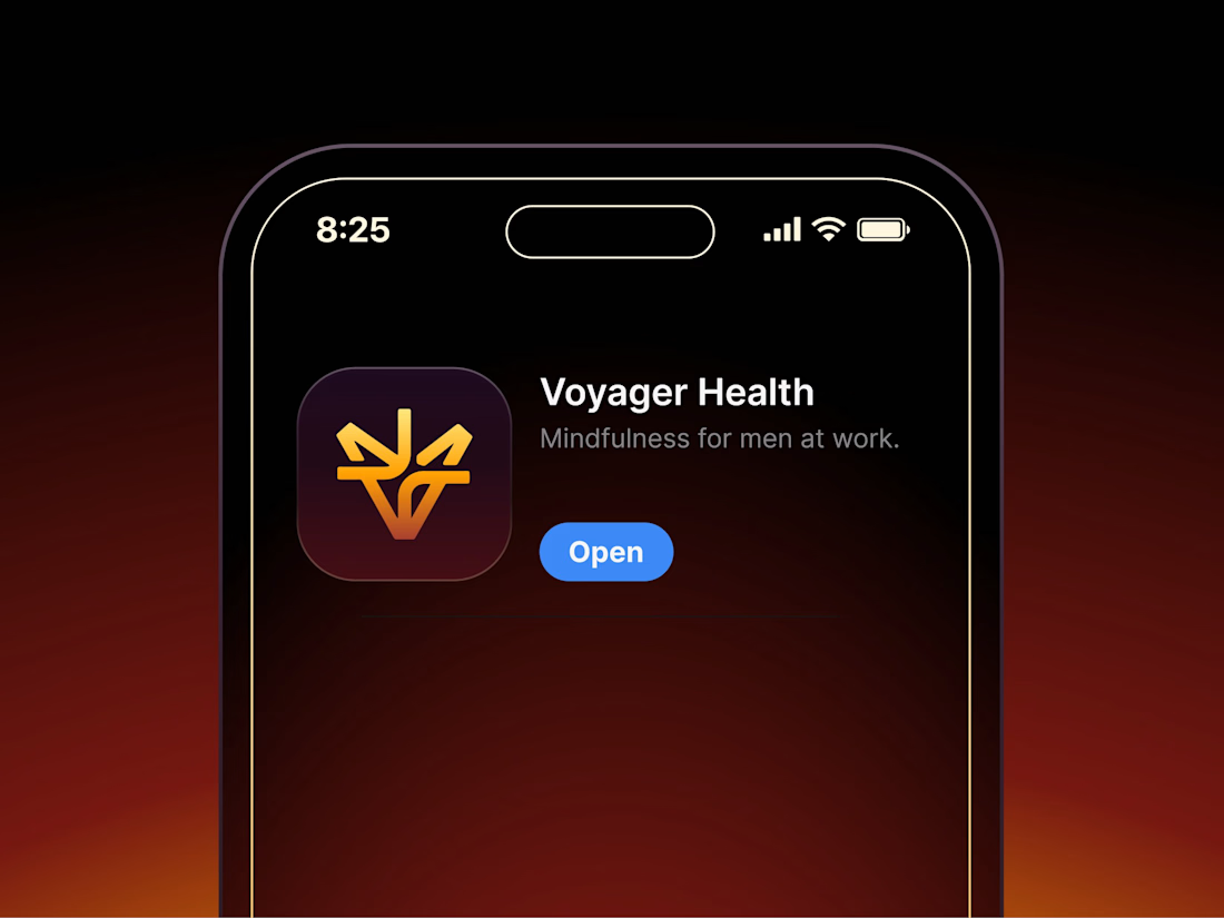

Aryna, that golden symbol pops so nicely against the plum background ✨

It’s been a minute since my last post here on Contra.
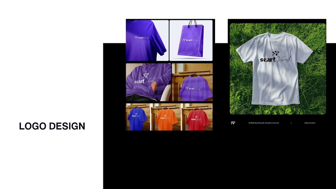
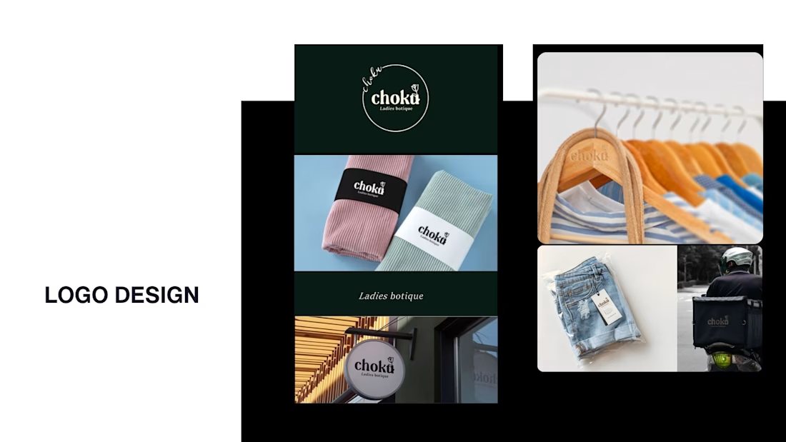
While my main focus usually lives in photo editing and digital design, I was digging through the archive recently and thought it’d be fun to share a couple of branding projects from the past:
Slide 1: Seart Visuals apparel & merchandise branding (1 year ago)
Slide 2: Choku Ladies Boutique identity and mockups (2 years ago)
Brand identity isn't my everyday lane, but tackling projects like these taught me a lot about visual consistency across different mediums. I’d love to hear your thoughts or see any feedback from fellow designers. Great to connect with the community again.



That's really great typography logo design❤️❤️

Not every client comes to me for a brand identity and not all my clients are skincare or cosmetic brands.
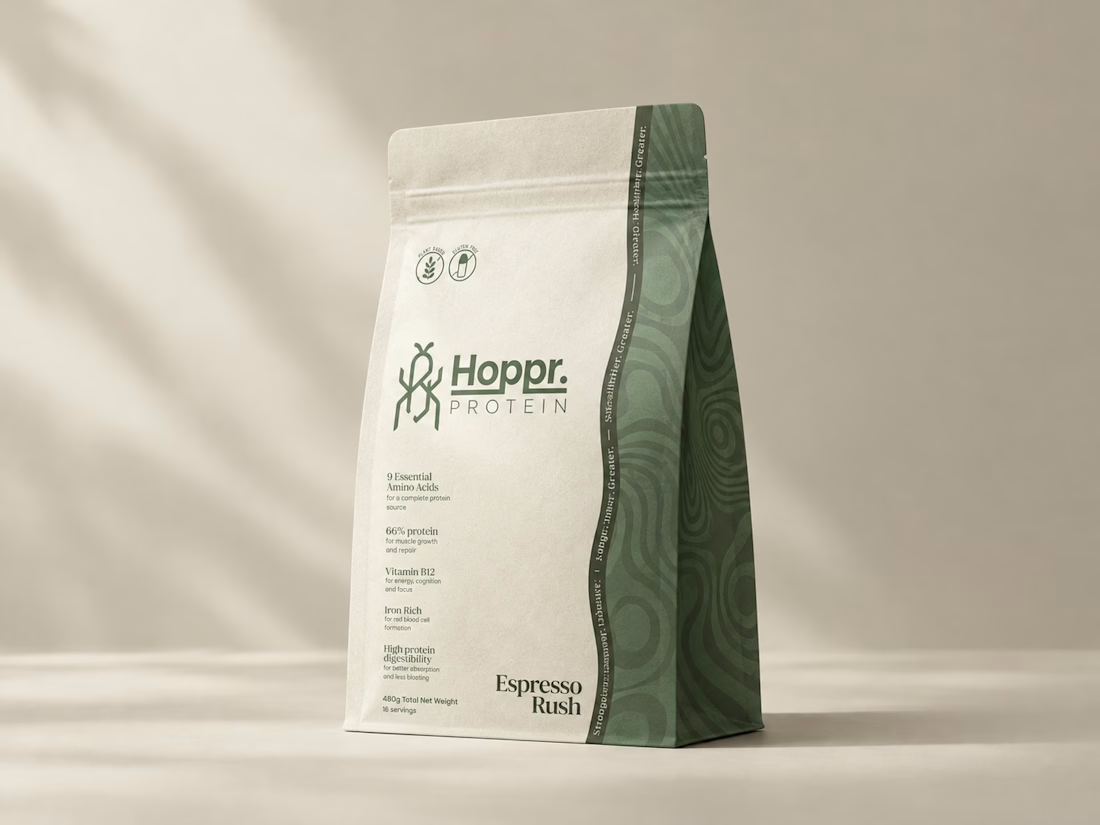
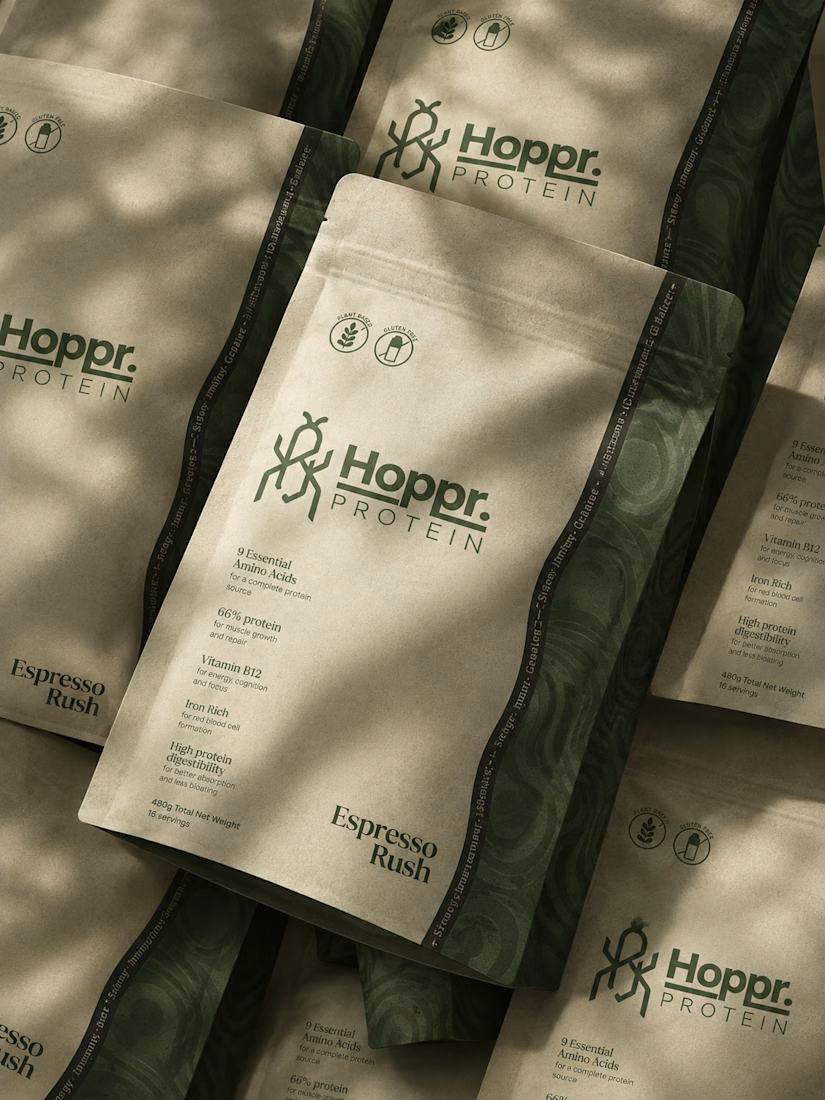
That was the case with Hoppr, a protein powder brand made from crickets. 🦗 YES, CRICKETS!
Sometimes the logo, colors, and visual system are already there and my job is to bring them to life on packaging and see how far I can push them.
I love projects like this because I get to play with typography, layout, and materials while working within an existing identity.
How much freedom do you think a designer should have when working with an established brand?

Great packaging work, nice job