The network for creativity
Join 1.25M professional creatives like you
Connect with clients, get discovered, and run your business 100% commission-free
Creatives on Contra have earned over $150M and we are just getting started
Back to feedPost
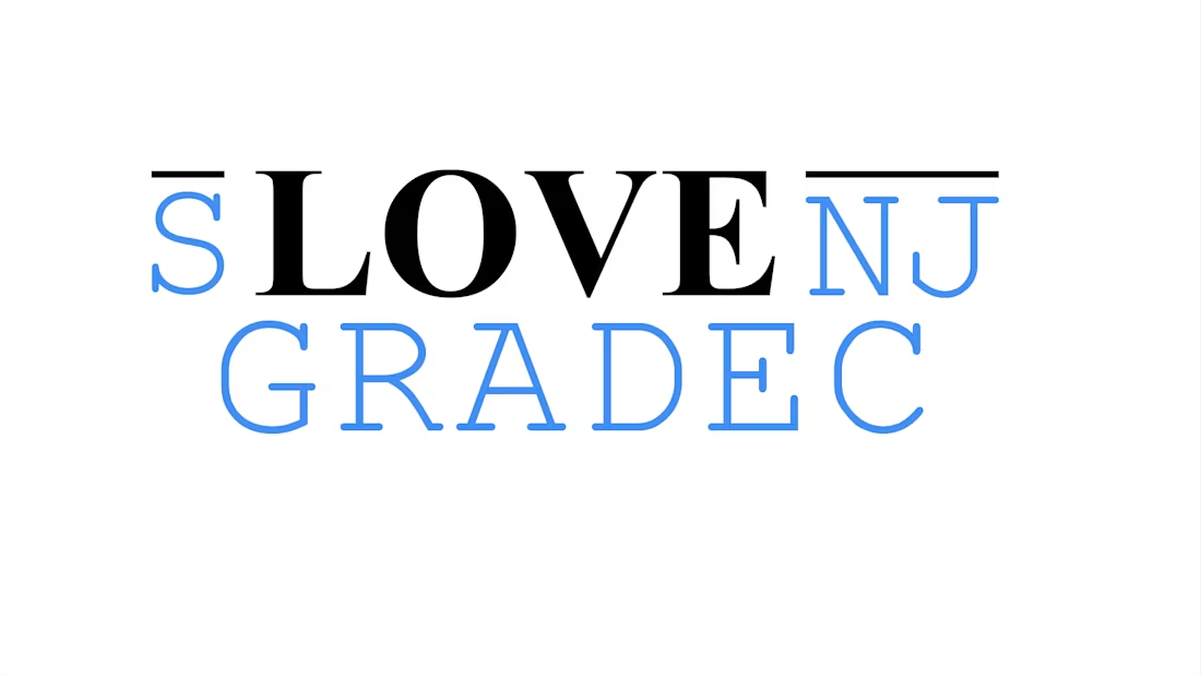
A typographic artwork that transforms a place name into an emotional emblem. The composition stacks three horizontal bands: a stylized top fragment with subtle black bars, a central bold black LOVE that anchors the design, and a lower row of blue geometric capitals completing the toponym. The limited palette of black and blue creates clear hierarchy and immediate legibility, while the horizontal bars add rhythm and a constructed, modern feel. Semantically the piece performs a double reading—both the town’s name and an explicit declaration of affection—making it ideal for civic promotion, merchandise, and digital identity.

The network for creativity
Join 1.25M professional creatives like you
Connect with clients, get discovered, and run your business 100% commission-free
Creatives on Contra have earned over $150M and we are just getting started
Related posts
—From Archive (Pt. 19)
1. HF Logo - Hyatt Film Videography AD Studio based in India
2. Q Lettermark - Quon Cryptocurrency
3. FF Monogram - Videography production based in California, USA.
4. S Lettermark - Manufacturing Industry based in Slovenia
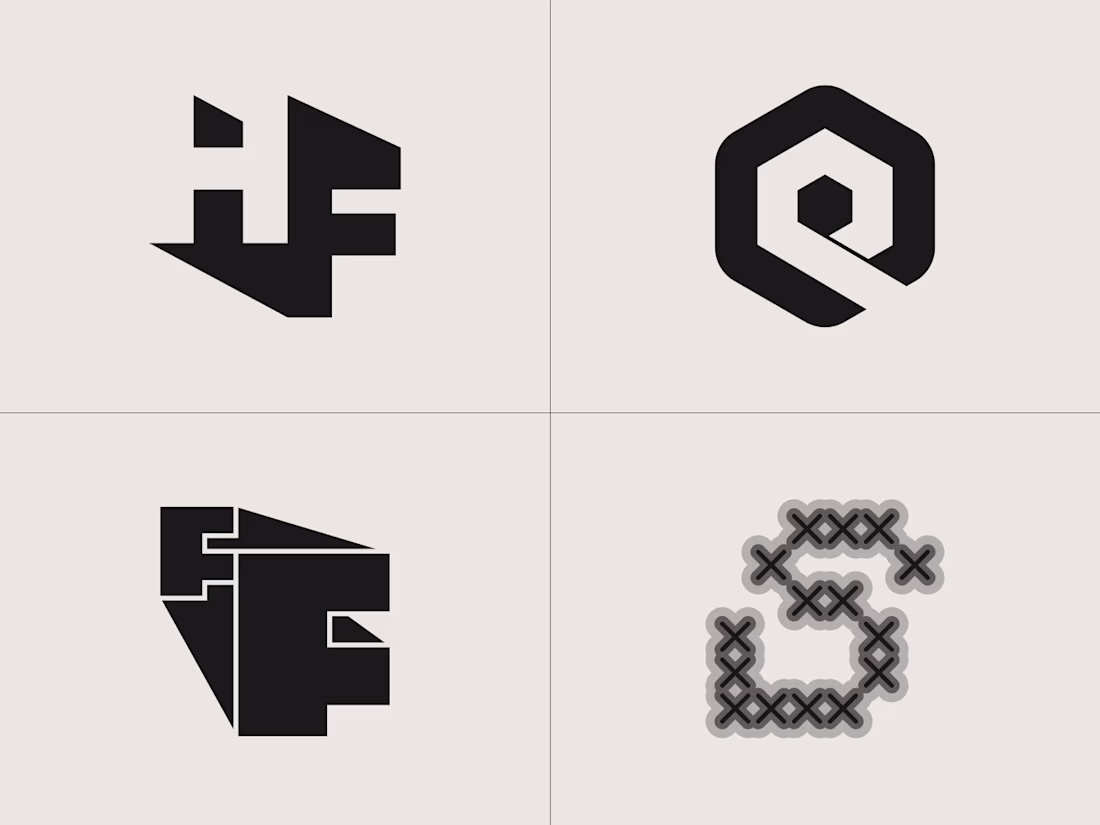

Love how each mark holds its own logic.

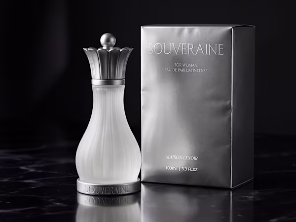
Just released a new case study on my portfolio: Souveraine
A conceptual fragrance project: bottle design, packaging, brand identity, and campaign art direction all built around one idea. The queen chess piece as an object of power and desire.

Amazing work with Flora, feels considered in every single detail.

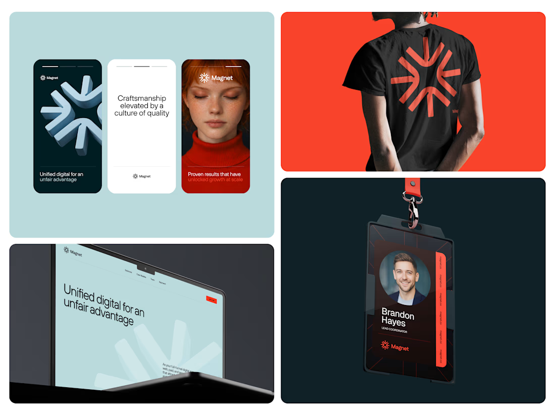
A few more pieces of the puzzle from the rebranding project we've done for good folks at @Magnet.


So gooood ✨


Trending


Figma Make
Go from idea to prototype in minutes. What are you designing?
aivideo
AI video tools are moving at warp speed. Which ones are you experimenting with?
illustration
Handcrafted illustration is bubbling up across the web. What are you drawing lately?
aidesignflow
AI tools are redefining design work. What's your current workflow?
freelancerlife
Freelancer life is wins, pivots, and everything in between. What’s yours right now?