The network for creativity
Join 1.25M professional creatives like you
Connect with clients, get discovered, and run your business 100% commission-free
Creatives on Contra have earned over $150M and we are just getting started
Back to feedPost

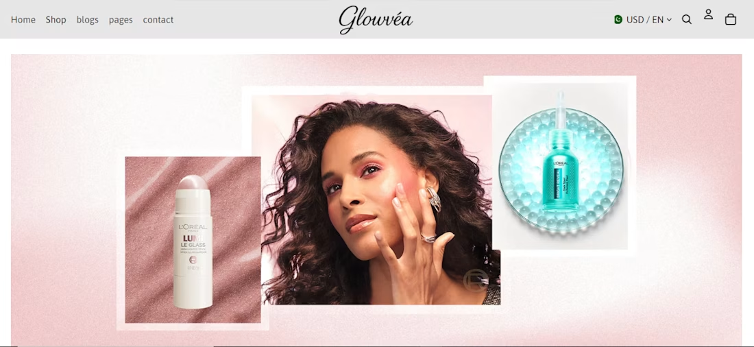
Beautiful and clean design! ✨ The aesthetics are impressive, but in eCommerce, the real success comes from performance. Fast loading speed + seamless user experience = more conversions and sales.
The network for creativity
Join 1.25M professional creatives like you
Connect with clients, get discovered, and run your business 100% commission-free
Creatives on Contra have earned over $150M and we are just getting started





Related posts

Which hero direction feels right for this founder-focused brand?
While working on the homepage for Sean Parsons, a brand focused on empowering non-technical founders to launch tech startups, I explored two different visual directions for the hero section. Same message, same structure, just a different mood and color system.
Option 1 - Warm Olive. Dark, grounded, and editorial, giving a warm, established, expert feel.
Option 2 - Light Purple. Clean, modern, and vibrant, giving a fresh, SaaS-like, approachable feel.
Would love your honest UX/UI take, which direction feels more trustworthy, engaging, and aligned with a founder-focused brand, and why?
25 voted
69%
11 voted
31%
36 votes
Closed

I like worm Olive most because it has different personality


Definitely the new one. Seems more fluid and easier to interact with

LumaClean was losing hours to manual quoting, scheduling, confirmations, rescheduling, and follow-up. LumaFlow turns that entire process into one automated booking workflow.
I built LumaFlow for a fictional Chicago cleaning business, LumaClean.
The problem was simple: too much back-and-forth just to turn a customer inquiry into a confirmed booking.
So I built a workflow that handles the journey:
→ Instant quote
→ Smart availability
→ $40 deposit
→ Booking confirmation
→ Reminders
→ Rescheduling
→ Booking recovery
The goal wasn't to build another pretty booking page.
It was to give the owner less work to do.


Vert nice