The network for creativity
Join 1.25M professional creatives like you
Connect with clients, get discovered, and run your business 100% commission-free
Creatives on Contra have earned over $150M and we are just getting started
Back to feedPost

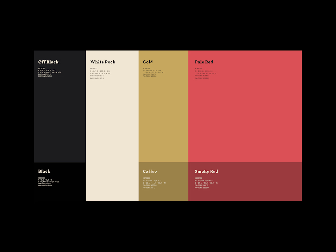
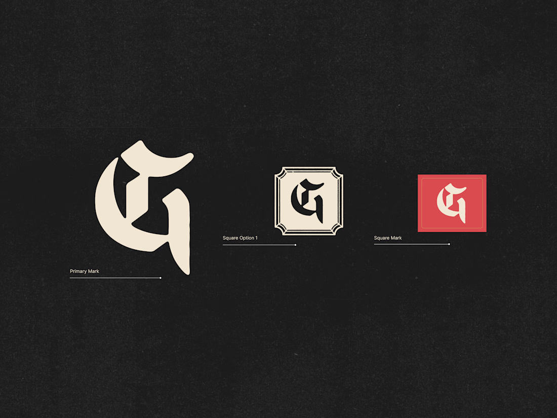
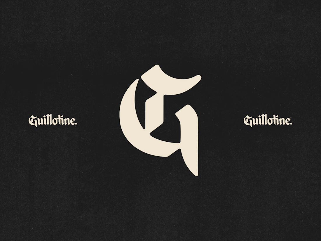
Now the launch of Onimusha is here, I have to chat again about the work with did for guillotine. They have supported Capcom for the release of the new game. It was insane working with Jake on his brand refresh because it was completely different work to our usual day to day stuff.
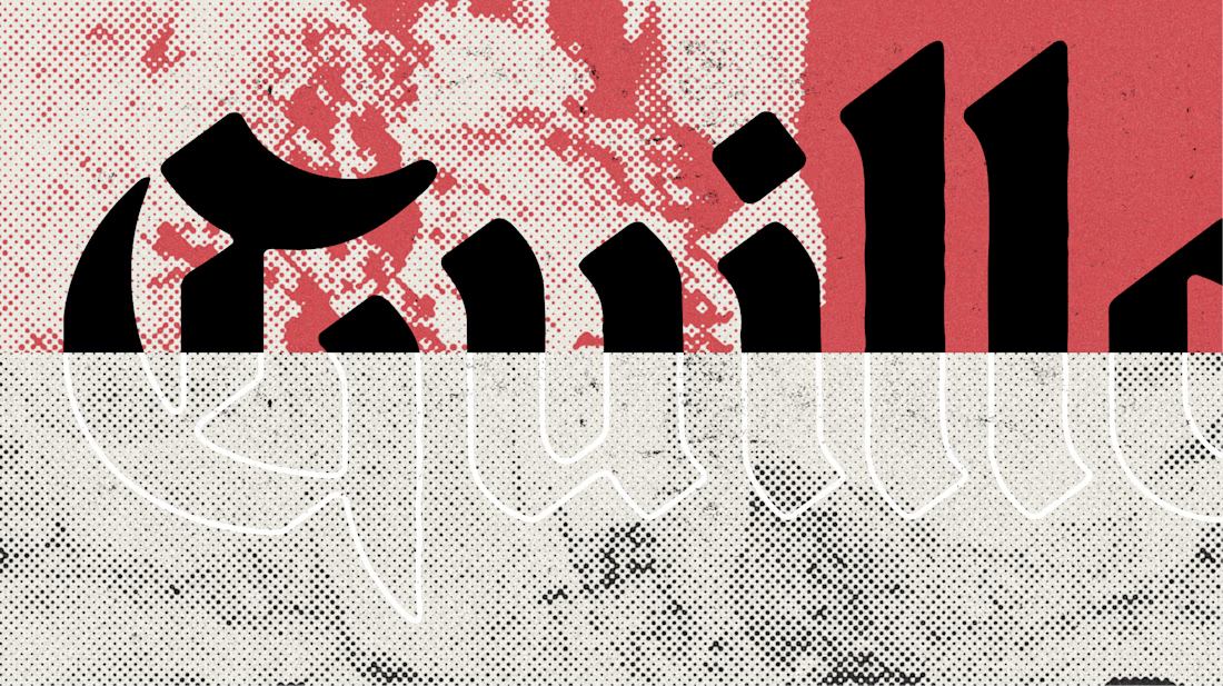
We had so much fun building their new brand world and its insanely satisfying seeing it pop-up alongside the biggest gaming names in the industry!
Don't forget to have a play with the website. It's not your average build.
https://www.guillotine.agency/


Incredible!
thank you

That blackletter G paired with the halftone red texture has real weight to it. Was it tricky keeping something that dramatic from tipping into metal-band territory and still reading as a game studio brand?
Yeah so I tried a few harder logotypes and they definitely edged close to that feeling. but luckily I tried quite a few versions so this felt a good balance.
What the client wanted was something that wasn't to gamey because the feedback from their clients was, we liked you were different in the first place.
Working alongside some of the biggest names in gaming for a Capcom tie-in must come with a very different set of constraints than your usual day to day. What was the biggest thing you had to adjust in your process to fit that world?
Weirdly, their clients looked at them over other agencies because they had such a different brand personality to the others. They literally won so many contracts with X Box, capcom etc... because their original brand stood out (not your traditional gamified branding). so we didn't want to wonder to far away from that.


the red and black type looks so good. nice launch!

i love this premium work

Besides the fantastic logo, I really love the color palette.

Looks so premium😍


capcom project must have been fun

Wow, congratulations on your latest milestone, more to come! 🚀 Supporting Capcom's launch with high-level brand refresh work is huge!

That blackletter G paired with the cleaner mark is a neat way to show two eras of the brand side by side. With a name as big as Capcom attached, how much room did you actually get to push something this bold before it needed sign-off?

beautiful work!
The network for creativity
Join 1.25M professional creatives like you
Connect with clients, get discovered, and run your business 100% commission-free
Creatives on Contra have earned over $150M and we are just getting started
Trending
retrofuturism
Share your favorite designs from the past exploring the distant future. Or your own take on the aesthetic 🚀
halftone
Dots. Texture. Grain. Let's see your designs using the halftone technique.

Midjourney
Creatives are showing off what they're making with Midjourney.
colorgrade
Video editors sound off: How do you enhance the mood of your video in color grading?





Related posts

My X feed filled up with people shipping little games with the new Astra model.
When I finally got access, I started one of my own.
I made three concept images in ChatGPT first. Neon arena. Industrial pit. The kind of Smash TV energy I grew up on. Then I handed those to an agent and let it build.
What came back was playable faster than I expected. Twin-stick arena shooter. Short runs. Waves. A boss. Browser, mobile and desktop.
The first prototype took about 30 minutes and everything after has been fine tuning the gameplay and polish.
The first iterations were too easy, so I cranked up the difficulty which helped a lot.
Bolt Pit is public now if you want to try a run:
I'm working on porting it to Unity now also as I want to take advantage of the unity engine.


this is amazing
it blows my mind what you can achieve now with AI

First look at a new redesign for an award-winning video production company working with global brands and agencies.
Still an early direction. More soon.


Started as a fragrance brand.
Killed it.
Kept the instinct — single-color staged rooms, one hard spotlight, nothing accidental — and built a publisher around it instead.
Brand, ligature type system, 25 campaign pieces, a mask-reveal site. Full breakdown live.