The network for creativity
Join 1.25M professional creatives like you
Connect with clients, get discovered, and run your business 100% commission-free
Creatives on Contra have earned over $150M and we are just getting started
Back to feedPost

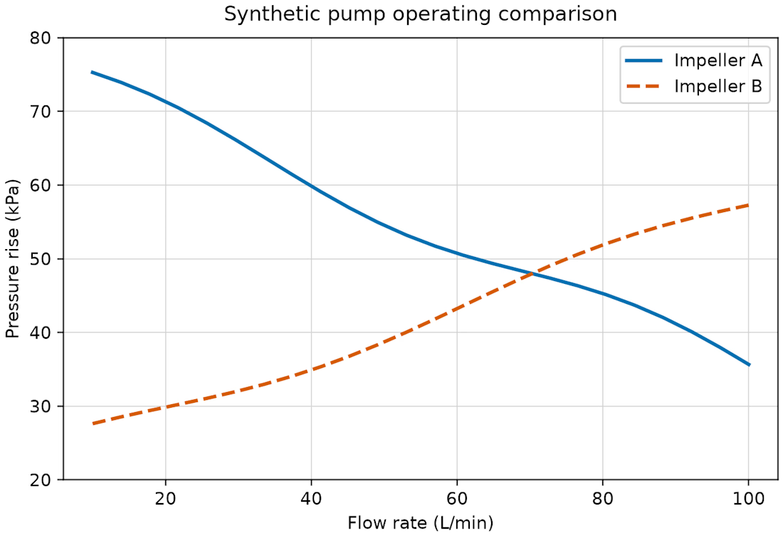
A synthetic engineering chart created in Python and Matplotlib for a chart-to-data extraction benchmark.
Two crossing series stay distinguishable through colour and line style, with units shown on both axes. The underlying clean vector-PDF test recovered all 48 plotted vertices without a segment mismatch. This controlled example does not establish performance on scanned or arbitrary charts, and it is not measured pump data.

The network for creativity
Join 1.25M professional creatives like you
Connect with clients, get discovered, and run your business 100% commission-free
Creatives on Contra have earned over $150M and we are just getting started

Challenges
View all


Related posts

Animated Fintech UI for pie showing portfolio performance, Investment income, Investment advisory, and smart advisory features through interactive financial visualization
A motion exploration for Pie, bringing key wealth-management features to life through animated UI components.
The concept explores how portfolio performance, investment income, investment advisory, and smart advisory can be presented in a clear and engaging way while keeping the overall experience simple and premium.
A look at how motion can make financial products feel more intuitive, modern, and easier to understand.


The motion-led charts make a dense wealth-management story feel approachable; the distinct panels give each metric room to breathe while still reading as one system.


In this design, we simplified the way users compare stock performance by combining price targets, market caps, and live analytics into a single clean interface. With color-coded graphs and intuitive navigation, financial data feels easier to explore and act on.
📩 Collaborate with Us? Contra Cansaas Agency
The decision to compress price targets, market caps, and live analytics into one comparison view is a strong information-design move. The restrained dark palette and color-coded charts keep a dense financial workflow readable without losing its sense of precision.

