The network for creativity
Join 1.25M professional creatives like you
Connect with clients, get discovered, and run your business 100% commission-free
Creatives on Contra have earned over $150M and we are just getting started
Back to feedPost

In this design, we simplified the way users compare stock performance by combining price targets, market caps, and live analytics into a single clean interface. With color-coded graphs and intuitive navigation, financial data feels easier to explore and act on.
📩 Collaborate with Us? Contra Cansaas Agency


The decision to compress price targets, market caps, and live analytics into one comparison view is a strong information-design move. The restrained dark palette and color-coded charts keep a dense financial workflow readable without losing its sense of precision.
Thank you! That was exactly the goal, keeping the information dense but still easy to scan and making the visual hierarchy do the heavy lifting. Glad you noticed!
The network for creativity
Join 1.25M professional creatives like you
Connect with clients, get discovered, and run your business 100% commission-free
Creatives on Contra have earned over $150M and we are just getting started





Related posts


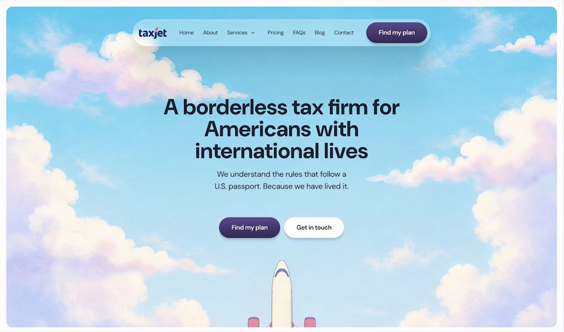
Your homepage should answer one question: what do you do? If a visitor can't answer that in five seconds, everything below the fold doesn't matter.

I just saw Bright Studios’ new website. You guys nailed it! Really like it.

I think this could be my favorite Framer code component I’ve created. Meet Page Transition Studio, you can add animated transitions between pages across 10 styles. My favorites are vertical strips and centre split. What’s yours? Check the live preview here


Good work, like the interaction

September was a good month:
> crossed $10k+ in revenue on Contra
> shipped 3 projects: landing page, brand design, website
> went fully independent as a designer
> got referred to a big client by another designer
Now opening 2 spots for October.

Great work on this