The network for creativity
Join 1.25M professional creatives like you
Connect with clients, get discovered, and run your business 100% commission-free
Creatives on Contra have earned over $150M and we are just getting started
Back to feedPost
ERA Coffee brand
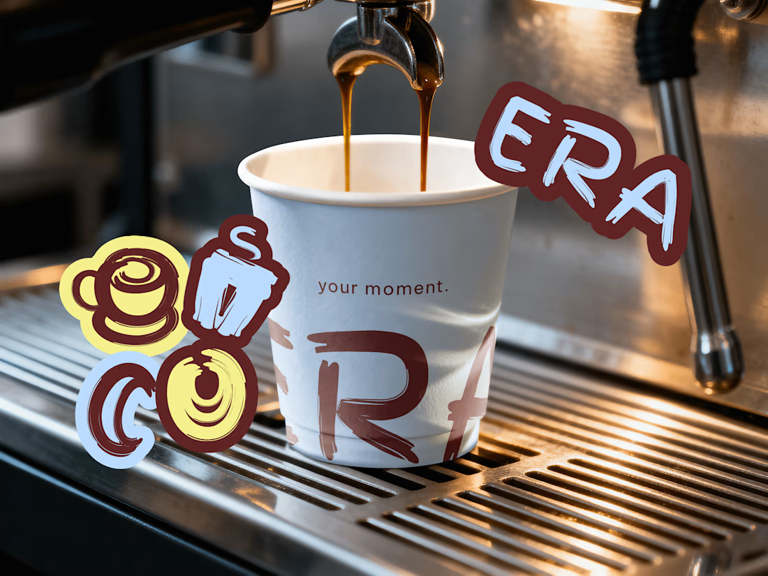
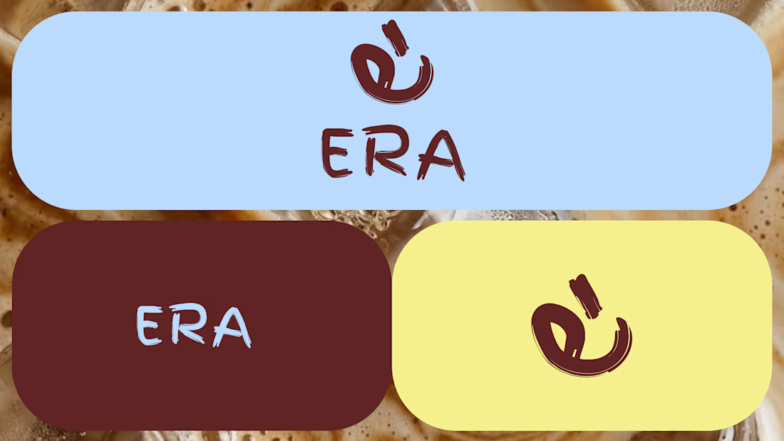
ERA Coffee is a contemporary café concept based in Panama, created around the idea of making everyday moments feel special. Its visual identity combines bold and vibrant tones blended together with expressive typography to create a modern brand that represents an era.



I’m so happy to hear that! That’s exactly what I was going for!

Premium branding
Thank you so much for your feedback!
You are welcome and your execution deserve that feedback


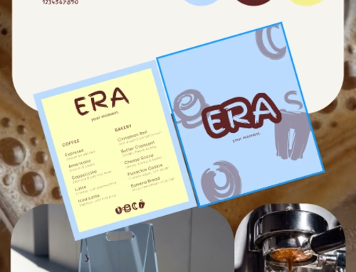
That chunky maroon lettering on the powder-blue menu is such a fun pairing, feels hand-squished in the best way
That's the idea. Thanks a lot for your comment

The expressive type is doing all the talking here, and it works. The bold maroon lettering over that vibrant yellow has such a warm, joyful energy, perfect for a café built around making everyday moments feel special.
You really captured what I wanted to convey. Special moments, the coffee era.

Great colo swatch !! so so clean !

That's really great for a juice brand 🎉🎉🎉
The network for creativity
Join 1.25M professional creatives like you
Connect with clients, get discovered, and run your business 100% commission-free
Creatives on Contra have earned over $150M and we are just getting started

Related posts



One pixel grid. A whole brand.
For Appy, a London product studio for impact-driven startups, the wordmark, icons, 3D smile and Appy Pixel, its custom typeface, all come from the same grid.
Appy Pixel won Typography at the Online Design Awards.
Type first or symbol first: where do you start a rebrand?

thats so nice, i loveee

Need a second pair of eyes 👀
I'm designing the online store for FizzPop, a craft soda brand: all-natural sodas, sparkling waters and botanical tonics.
Flower Fizz(A): eggshell, tiger orange and deep ultramarine, with flower shapes and stacked colour swatches for the flavours
Corner Shop(B): lime, soft blues and navy, editorial layout with a giant wordmark and menu-style flavour tiles
38 voted
44%
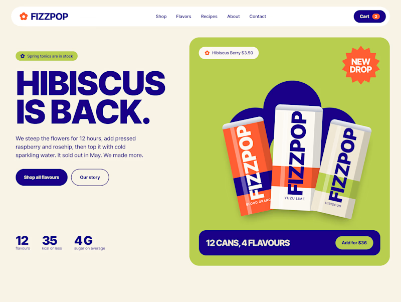
48 voted
56%
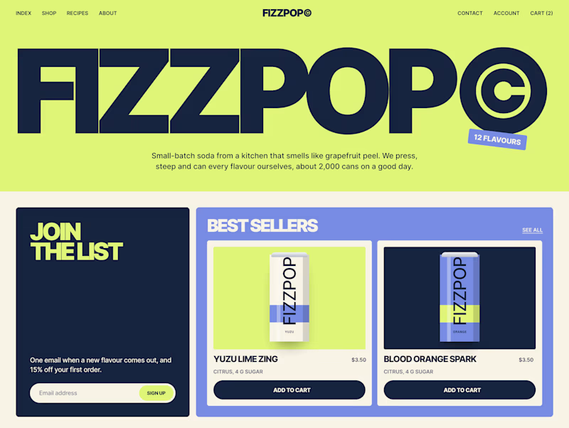
86 votes
Closed
