The network for creativity
Join 1.25M professional creatives like you
Connect with clients, get discovered, and run your business 100% commission-free
Creatives on Contra have earned over $150M and we are just getting started
Back to feedPost

Ambra Travel
Independent by nature. Extraordinary by design.
Role: Creative direction, brand identity, website design, animated brand guidelines
The brief
Ambra is a global platform for independent luxury travel advisors. Its audience sells once-in-a-lifetime experiences, so the brand had to feel as considered as the journeys those advisors create. It also had to support advisors at every stage of their careers, from their first booking to an elite client list.
The idea: Shaped by time
The identity grows from a single image: growth rings, the layers that time leaves in stone, wood and amber. Every journey, client relationship and year in the business adds a layer. The mark is a set of hand-drawn concentric rings, warm and organic rather than corporate.
The system
The mark becomes a language. The rings flex into six motif forms: core, open, tight, flow, stack and fragment. Gold contour patterns carry them across packaging, print and digital.
Ring density shows advisor tier. New to Industry carries a few open rings, Established more, and Elite the densest form, so progression is part of the identity itself.
A palette drawn from Mediterranean light. Amber gold, sand, ivory, terracotta, olive leaf, deep navy and charcoal.
Type with two voices. Cormorant Garamond gives an editorial, literary tone, and Jost adds modern clarity for labels and UI.
Imagery and materials. Golden-hour photography alongside marble, amber, walnut, olive leaf and open water. The tone is quiet luxury, never flashy.
The website
The site opens with emotion, then makes the case for the platform. It starts with "Independent by nature. Extraordinary by design," moves into "A platform built for what's next," then a career-stage selector ("Wherever you are in your career"). It closes on "More than travel. A lasting advantage."
Deliverables
Logo system and seal, color and type system, motif and pattern library, advisor tier identities, imagery direction, website design, and an animated brand guidelines film.

The network for creativity
Join 1.25M professional creatives like you
Connect with clients, get discovered, and run your business 100% commission-free
Creatives on Contra have earned over $150M and we are just getting started



Related posts

Brand work for HauntChain
I'm loving building this brand and the results so far
A deFi platform with some gamification


That's cute ❤️


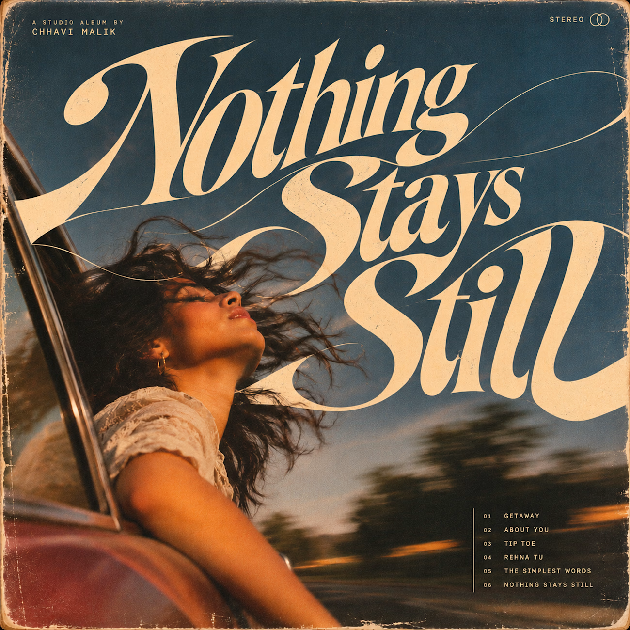
Is text on album covers really tacky?
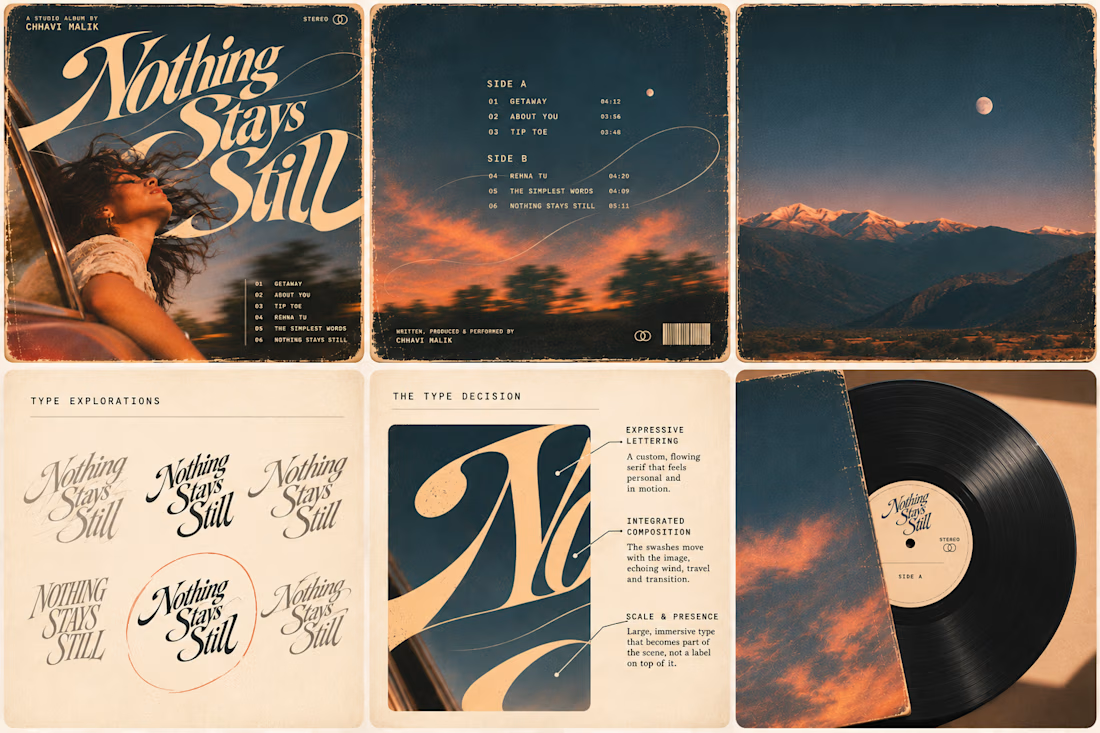
This question has been doing the rounds on X and I have to say, I'm firmly on the other side of that argument. I've always loved seeing typography become part of the artwork rather than just a title sitting on top of it.
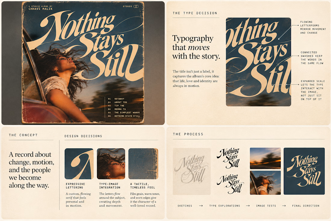
So I wanted to put that idea to the test with an imagined album called Nothing Stays Still, inspired by change, fleeting moments and everything in between:)
I played around with the lettering until it felt expressive, a little restless, and inseparable from the photograph.
Because I think badly considered typography is tacky. Typography itself? Give it a chance :)
What's an album cover where the type really makes it for you?


Behind the wall: a homepage concept for Studio Cesare
I’m testing a new landing page for my studio, made with Brik.
A pixel-brick grid covers the screen. Move through it and the bricks fall away to reveal the person behind the work, mid-coffee, slightly off balance. Then the wall closes again.
It’s a small metaphor for how I approach next-generation branding: a strong system on the surface, with a real person and a real point of view underneath.
Exploring this for the studio site launch. Open to feedback, and to new projects 🤝🏼

This is amazing!!