The network for creativity
Join 1.25M professional creatives like you
Connect with clients, get discovered, and run your business 100% commission-free
Creatives on Contra have earned over $150M and we are just getting started
Back to feedPost

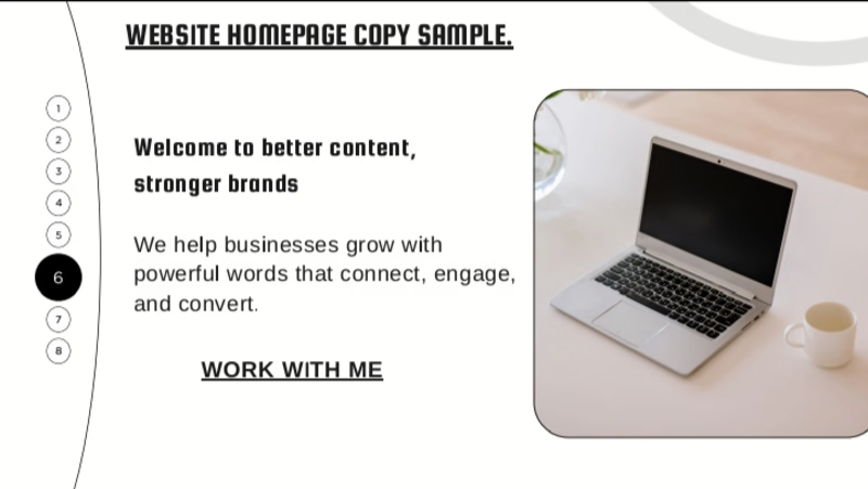
Website Homepage Copy
I created this website homepage copy to demonstrate my ability to write clear, engaging, and audience-focused website content.
The goal was to create copy that quickly communicates what a business offers, connects with its target audience, and encourages visitors to take action.
What this sample demonstrates:
Clear and engaging website copy
Strong headlines and messaging
Audience-focused writing
Persuasive calls to action
Professional and easy-to-read content
A clear homepage structure
Tools used: Canva and Google Docs
This project helped me practice turning a business idea into website copy that is informative, persuasive, and designed to guide visitors toward taking the next step.


The network for creativity
Join 1.25M professional creatives like you
Connect with clients, get discovered, and run your business 100% commission-free
Creatives on Contra have earned over $150M and we are just getting started
Challenges
View all


Related posts

Just wrapped up this clean and professional hiring announcement flyer for KEMETIC SERVICES LLC.
The brief was simple make it bold, corporate, and easy to convert applicants. I focused on strong typography hierarchy, brand colors, and a layout that communicates trust at first glance.
This is the kind of design that doesn't just look good, it gets results.
Need a flyer, social media design or brand visual that actually converts for your business? Let's create something powerful for your brand.
CALL TO ACTION:
DM me "DESIGN" to get started on your project. Available for new clients worldwide.


Clean design. The strong typography makes the hiring message easy to notice.

Always focusing on blending aesthetic visuals with strategic copywriting to drive real engagement. Excited to share my latest design projects!


𝐄𝐯𝐞𝐫𝐲 𝐝𝐞𝐬𝐭𝐢𝐧𝐚𝐭𝐢𝐨𝐧 𝐡𝐚𝐬 𝐚 𝐬𝐭𝐨𝐫𝐲, 𝐚𝐧𝐝 𝐭𝐡𝐞 𝐰𝐚𝐲 𝐲𝐨𝐮 𝐩𝐫𝐞𝐬𝐞𝐧𝐭 𝐢𝐭 𝐬𝐡𝐨𝐮𝐥𝐝 𝐦𝐚𝐤𝐞 𝐩𝐞𝐨𝐩𝐥𝐞 𝐰𝐚𝐧𝐭 𝐭𝐨 𝐞𝐱𝐩𝐞𝐫𝐢𝐞𝐧𝐜𝐞 𝐢𝐭.
For this concept, I focused on creating a short travel motion piece that presents Japan, Greece, Morocco, and Brazil through bold imagery, clean typography, and smooth transitions.
The goal was to make the content feel dynamic, modern, and visually engaging while keeping the information easy to follow. I used a consistent layout and motion style to connect the different destinations while still allowing each location to have its own visual character.
I also wanted the overall look to feel like something that could actually work for a travel brand, tourism campaign, or social media page — polished enough to feel professional, but engaging enough to catch someone's attention while scrolling.
𝙒𝙝𝙖𝙩 𝙙𝙤 𝙮𝙤𝙪 𝙩𝙝𝙞𝙣𝙠 𝙤𝙛 𝙩𝙝𝙚 𝙙𝙞𝙧𝙚𝙘𝙩𝙞𝙤𝙣?
#MotionDesign #TravelDesign #TravelContent #MotionGraphics #VideoEditing #GraphicDesign #SocialMediaDesign #VisualStorytelling #Typography #TravelBranding #ContentDesign #AfterEffects

Love the motion