The network for creativity
Join 1.25M professional creatives like you
Connect with clients, get discovered, and run your business 100% commission-free
Creatives on Contra have earned over $150M and we are just getting started
Back to feedPost
𝐄𝐯𝐞𝐫𝐲 𝐝𝐞𝐬𝐭𝐢𝐧𝐚𝐭𝐢𝐨𝐧 𝐡𝐚𝐬 𝐚 𝐬𝐭𝐨𝐫𝐲, 𝐚𝐧𝐝 𝐭𝐡𝐞 𝐰𝐚𝐲 𝐲𝐨𝐮 𝐩𝐫𝐞𝐬𝐞𝐧𝐭 𝐢𝐭 𝐬𝐡𝐨𝐮𝐥𝐝 𝐦𝐚𝐤𝐞 𝐩𝐞𝐨𝐩𝐥𝐞 𝐰𝐚𝐧𝐭 𝐭𝐨 𝐞𝐱𝐩𝐞𝐫𝐢𝐞𝐧𝐜𝐞 𝐢𝐭.
For this concept, I focused on creating a short travel motion piece that presents Japan, Greece, Morocco, and Brazil through bold imagery, clean typography, and smooth transitions.
The goal was to make the content feel dynamic, modern, and visually engaging while keeping the information easy to follow. I used a consistent layout and motion style to connect the different destinations while still allowing each location to have its own visual character.
I also wanted the overall look to feel like something that could actually work for a travel brand, tourism campaign, or social media page — polished enough to feel professional, but engaging enough to catch someone's attention while scrolling.
𝙒𝙝𝙖𝙩 𝙙𝙤 𝙮𝙤𝙪 𝙩𝙝𝙞𝙣𝙠 𝙤𝙛 𝙩𝙝𝙚 𝙙𝙞𝙧𝙚𝙘𝙩𝙞𝙤𝙣?
#MotionDesign #TravelDesign #TravelContent #MotionGraphics #VideoEditing #GraphicDesign #SocialMediaDesign #VisualStorytelling #Typography #TravelBranding #ContentDesign #AfterEffects


Love the motion

Thanks😊
The network for creativity
Join 1.25M professional creatives like you
Connect with clients, get discovered, and run your business 100% commission-free
Creatives on Contra have earned over $150M and we are just getting started





Related posts

What if you could explore a basketball arena in 3D before booking your seat?
You found the game. But before you pay, how do you know which seat is worth it? A flat seating chart gives you a section and a number, but it can be hard to picture your position relative to the court.
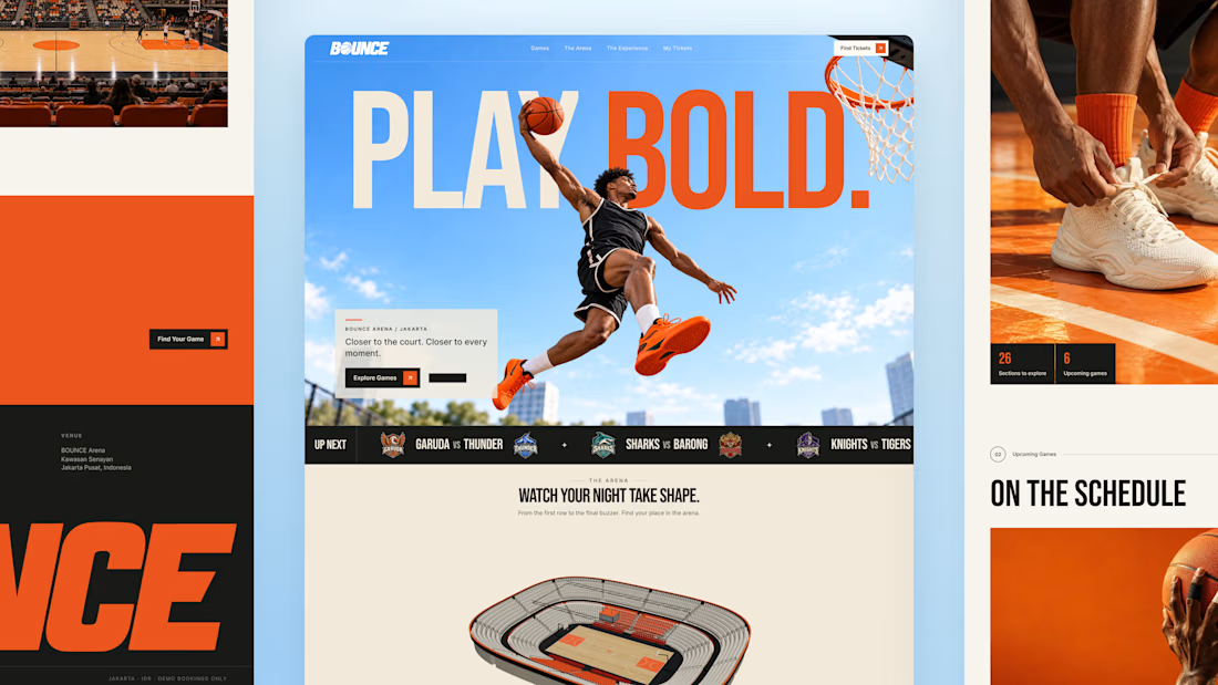
So I built BOUNCE with Lovable, a basketball ticketing concept centered around interactive 3D seat selection.
Rotate the stadium, zoom into the stands, explore different sections, and compare prices before choosing your seats directly inside the 3D arena. The goal is simple: help fans feel more confident about where they’re sitting before they book.
From there, complete checkout and get a ticket you can view, save, or print. My Tickets brings bookings together, with a one-time seat change for the same game and refund requests for eligible bookings.
Bold orange, oversized typography, and scroll driven motion bring the energy of basketball into the experience.
Try the demo: https://bouncebasketball.lovable.app/
Fictional teams. Simulated payments. No real charges.
Less guesswork. More game. BOUNCE. Your game. Your view.


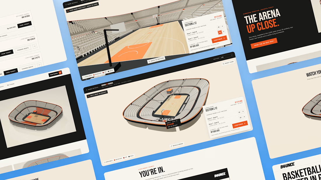

The 3D elements, especially seat pov idea is very interesting🔥

Launch Video for Amidarh.
Launching products in grand style.


Aveo: Brand Identity, Packaging & E-commerce Website for a Skincare Concept
A self-initiated skincare brand built end to end: identity, packaging, and a multi-page store.
Overview :
Aveo is a self-initiated skincare brand concept, designed end to end: brand identity, product line, packaging, and an e-commerce website, presented through a motion walkthrough in After Effects.
The challenge :
Skincare tends to look clinical or quietly minimal. I wanted Aveo to feel playful and confident, built around the idea of skin's "new favourite pop," without losing the credibility a product people put on their face needs.
Brand & packaging :
The identity runs on a saturated palette of magenta, lime, and violet. Each product gets its own color, and a sphere-topped cap gives the range a recognizable silhouette on a shelf and in a thumbnail. Packaging does the loud work so the interface doesn't have to.
Website :
The site gives the products a clean white stage and lets the packaging supply the color. Products are color-coded by category (toner, cleanser, serum), and benefit sections like Barrier Support and Radiance Boost pair one ingredient story with one image and one clear CTA. A drag-driven product carousel and a social gallery keep the page tactile without crowding the shopping path.
Deliverables
Brand identity, packaging system, responsive website, motion presentation.
Tools :
Framer, After Effects, Adobe Photoshop, Adobe illustrator


Carrying one visual system from packaging into e-commerce makes Aveo feel cohesive.