
Tanishka .
UI/UX Designer | Creating intuitive digital experiences.
- 10
- Followers


Aveo: Brand Identity, Packaging & E-commerce Website for a Skincare Concept
A self-initiated skincare brand built end to end: identity, packaging, and a multi-page store.
Overview :
Aveo is a self-initiated skincare brand concept, designed end to end: brand identity, product line, packaging, and an e-commerce website, presented through a motion walkthrough in After Effects.
The challenge :
Skincare tends to look clinical or quietly minimal. I wanted Aveo to feel playful and confident, built around the idea of skin's "new favourite pop," without losing the credibility a product people put on their face needs.
Brand & packaging :
The identity runs on a saturated palette of magenta, lime, and violet. Each product gets its own color, and a sphere-topped cap gives the range a recognizable silhouette on a shelf and in a thumbnail. Packaging does the loud work so the interface doesn't have to.
Website :
The site gives the products a clean white stage and lets the packaging supply the color. Products are color-coded by category (toner, cleanser, serum), and benefit sections like Barrier Support and Radiance Boost pair one ingredient story with one image and one clear CTA. A drag-driven product carousel and a social gallery keep the page tactile without crowding the shopping path.
Deliverables
Brand identity, packaging system, responsive website, motion presentation.
Tools :
Framer, After Effects, Adobe Photoshop, Adobe illustrator
2
6
193
NOCTRA- Digital Archive & Creative Platform
NOCTRA is a curated digital archive spotlighting experimental creative work, a home for artists whose work doesn't fit the usual portfolio mould. I designed the full website experience, from first landing to artist discovery to submission.
My role: UI/UX Design
Scope: Website design (Home, Selection, Artists, Submit)
Most creative-archive sites default to one of two extremes: a sterile gallery grid, or a chaotic mood-board mess.
For NOCTRA, we leaned into editorial energy instead — an arched carousel of work as the hero, oversized wordmark, and quiet negative space around the type — so the platform feels curated and considered, letting the work do the talking rather than the UI competing with it.
3
145
Lumen - a concept site for an interior architecture studio.
2
137
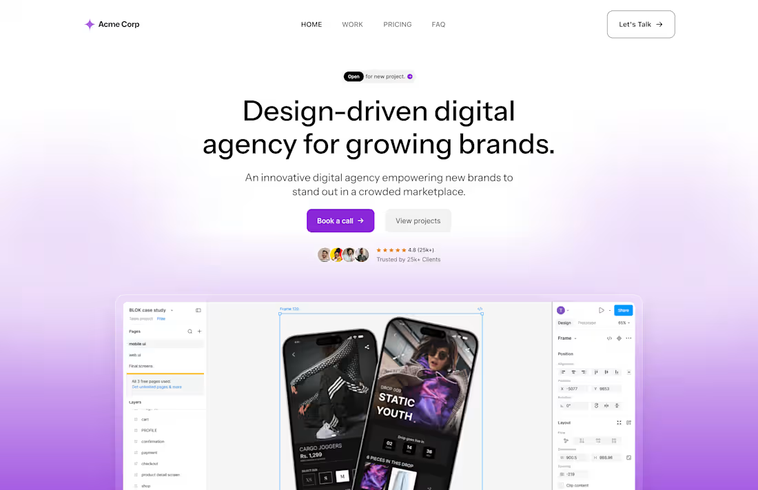
Acme Corp — Design Agency Landing Page
UI/UX Design
Designed a landing page for a design-driven digital agency, focused on converting visitors into booked calls rather than just presenting a portfolio.
3
136