The network for creativity
Join 1.25M professional creatives like you
Connect with clients, get discovered, and run your business 100% commission-free
Creatives on Contra have earned over $150M and we are just getting started
Back to feedPost

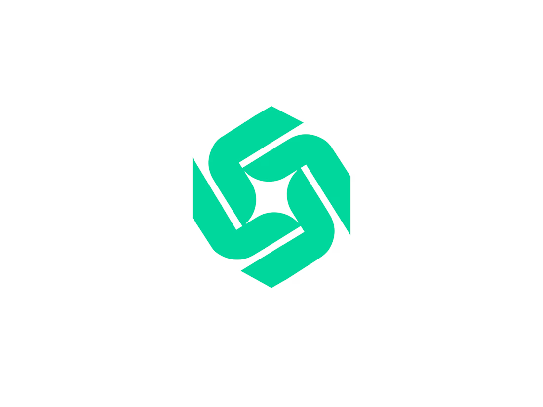
This abstract geometric symbol is designed for a tech-forward brand, a logistics powerhouse, or a collaborative platform. The interlocking teal shapes form a hexagonal vortex, representing movement, efficiency, and a connected ecosystem.
The central negative space creates a four-pointed star or spark, symbolizing the "bright idea" or the "perfect solution" that emerges when different parts of a business work in harmony.
Key Design Features:
Mathematical Precision: A perfectly balanced grid-based design that appeals to the tech and SaaS industries.
Rotational Symmetry: The logo feels balanced from every angle, suggesting stability and a 360-degree approach to service.
Refreshing Colorway: The electric mint/teal hue feels fresh, modern, and distinct from the traditional "corporate blue."

The network for creativity
Join 1.25M professional creatives like you
Connect with clients, get discovered, and run your business 100% commission-free
Creatives on Contra have earned over $150M and we are just getting started







Related posts


Four logo concepts, one direction: calmness, warmth, mental health and professionalism.
Which one feels most aligned with the brief to you?
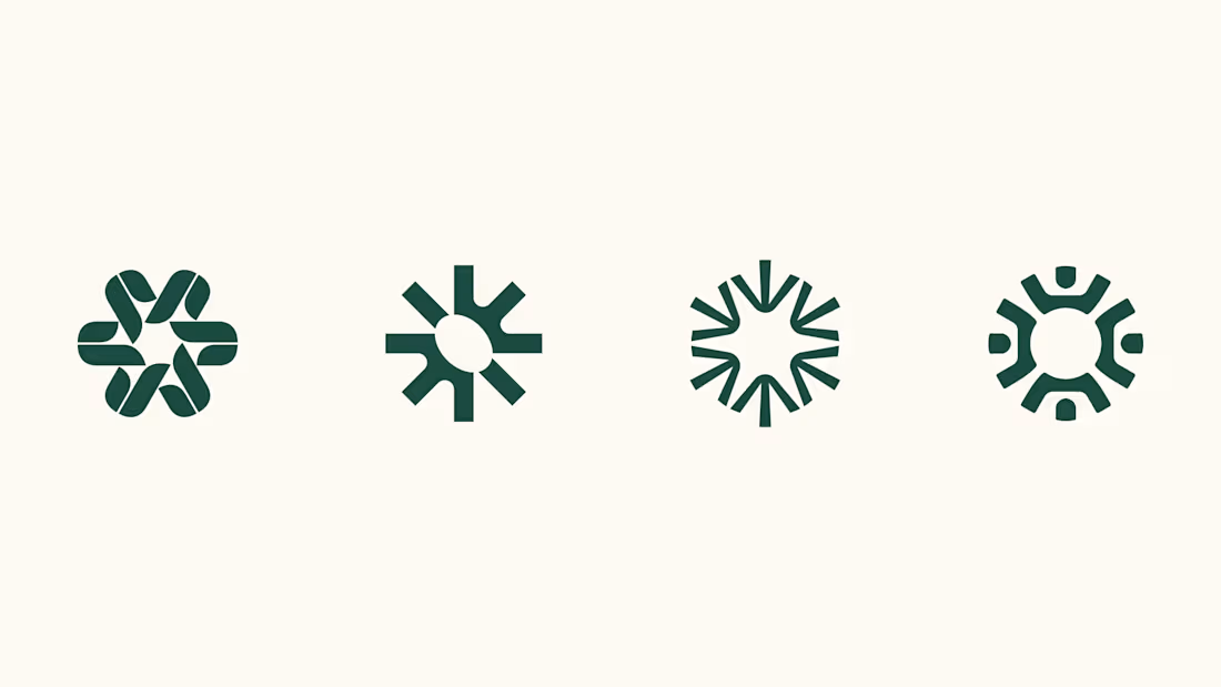

I think 3 or 4 work best. I really like the first one, but it moves away from the "calmness" concept


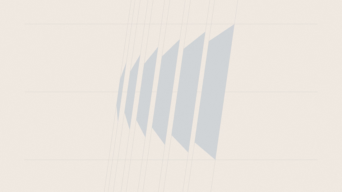
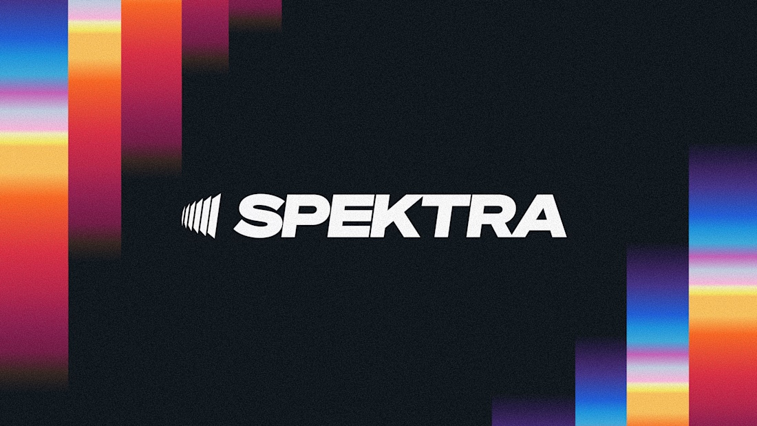
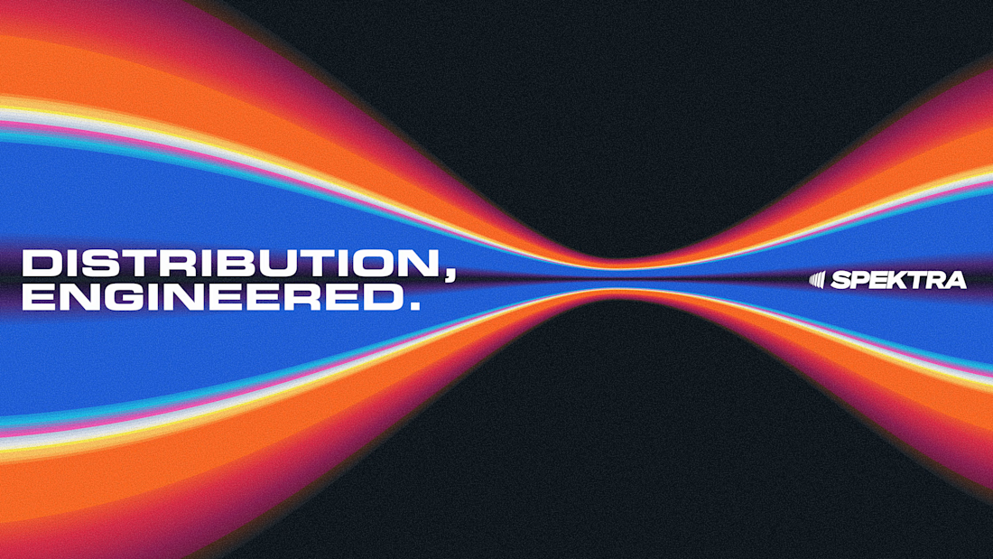
A closer look at the Spektra logo I designed.
The mark fans out from a narrow point, while the wordmark leans forward. together, they give it a sense of movement without needing much detail.
There’s a lot of color in the wider identity, so the logo holds its own in plain white. Simple geometry with enough weight to stand up to everything around it.


This is fire, Daniel
The logo conveys the story

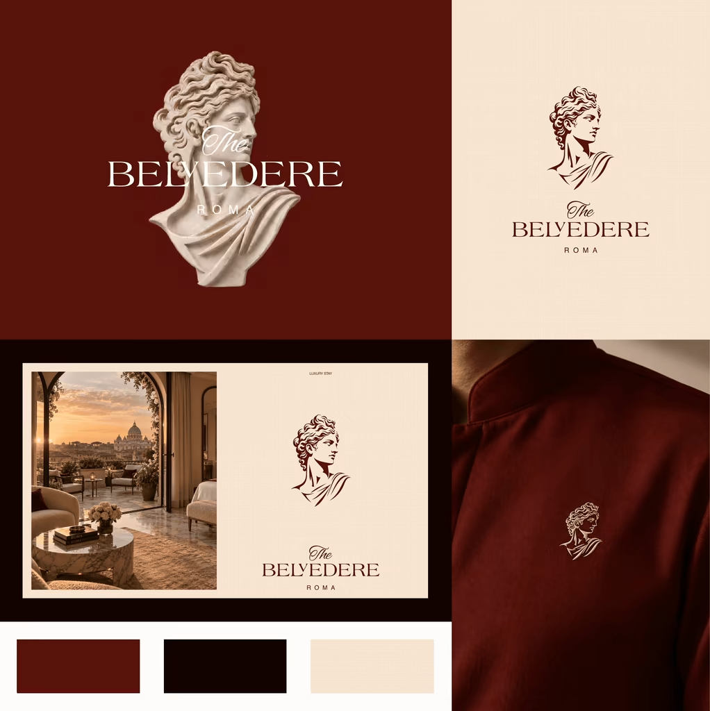
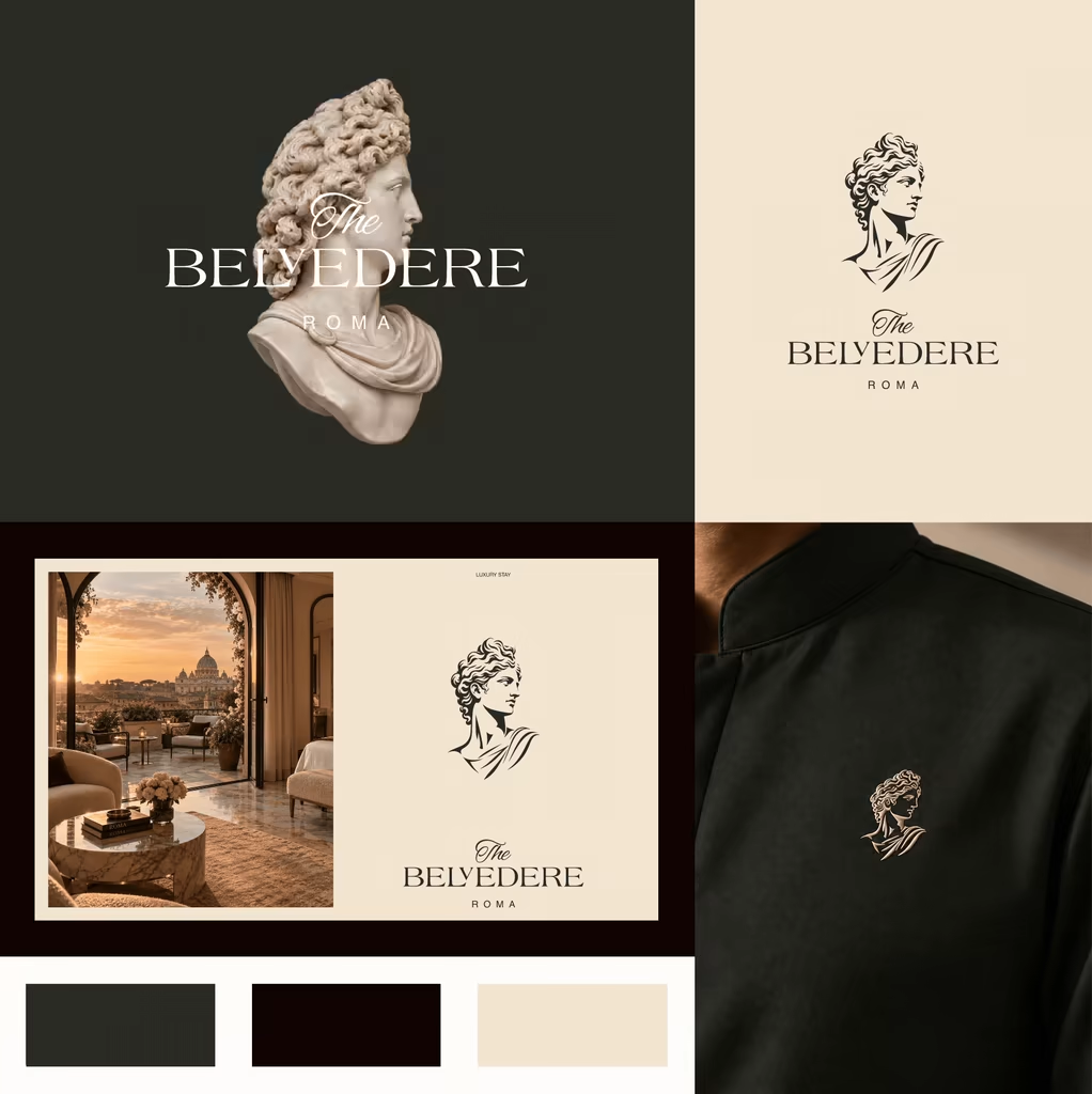
Which color direction feels right for BELVEDERE ROMA?
I’m exploring two visual directions for BELVEDERE ROMA, a luxury Roman hotel identity inspired by classical art, architecture, and contemporary Italian hospitality.
13 voted
46%
15 voted
54%
28 votes
Closed

Burgundy is closer to Rome's own palette — porphyry, cardinal, terracotta — which is exactly why so much classical-luxury hotel work already lives there. The green is the less expected read, and in my experience it holds better against brass and warm lobby light, where burgundy...