The network for creativity
Join 1.25M professional creatives like you
Connect with clients, get discovered, and run your business 100% commission-free
Creatives on Contra have earned over $150M and we are just getting started
Back to feedPost
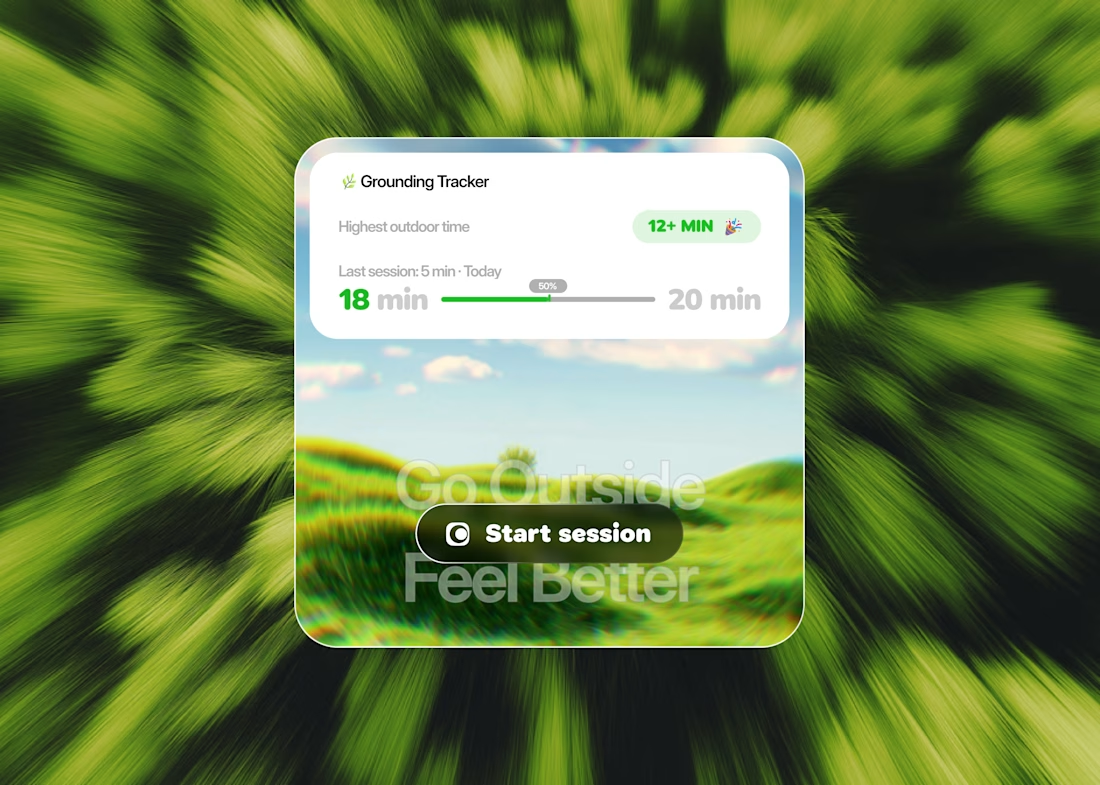
Taste Test
Last week, you really motivated me to keep experimenting. This time, the goal was to apply the Fibonacci sequence to the typography and grid. Let me know what you think, and whether I might have gone a bit overboard with the texture xD
16 voted
47%
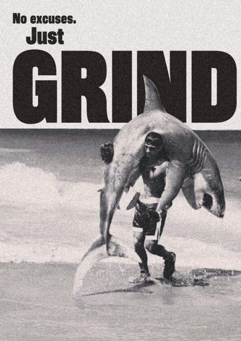
18 voted
53%
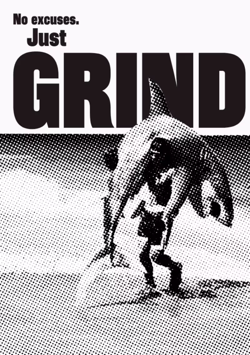
34 votes
Closed


Thank you Ciro, same here!


Brilliant work
Thank you!

Voting 2! The texture actually works in its favour, it adds to the whole energy of the message. And the typography hierarchy is so satisfying to look at.
Thank you so much! I agree with you, I probably should have spent a bit more time fine-tuning the balance of the effect, but it is what it is.

Thank you Karina! I feel the same way!


Thanks Ayesha!

Both look amazing but in this color combo second suits well
Thank you so much Arman!

Going with 2. The extra texture actually adds grit that fits the GRIND concept perfectly. Not overboard at all.
Thank you Stephanie! ❤️

love this!
Thanks!

I usually like halftone texture, but I feel option 1 is for the win
It probably needed a bit more refinement on the halftone to make it perfect. Thank you!
The network for creativity
Join 1.25M professional creatives like you
Connect with clients, get discovered, and run your business 100% commission-free
Creatives on Contra have earned over $150M and we are just getting started
Related posts


amazing good job!

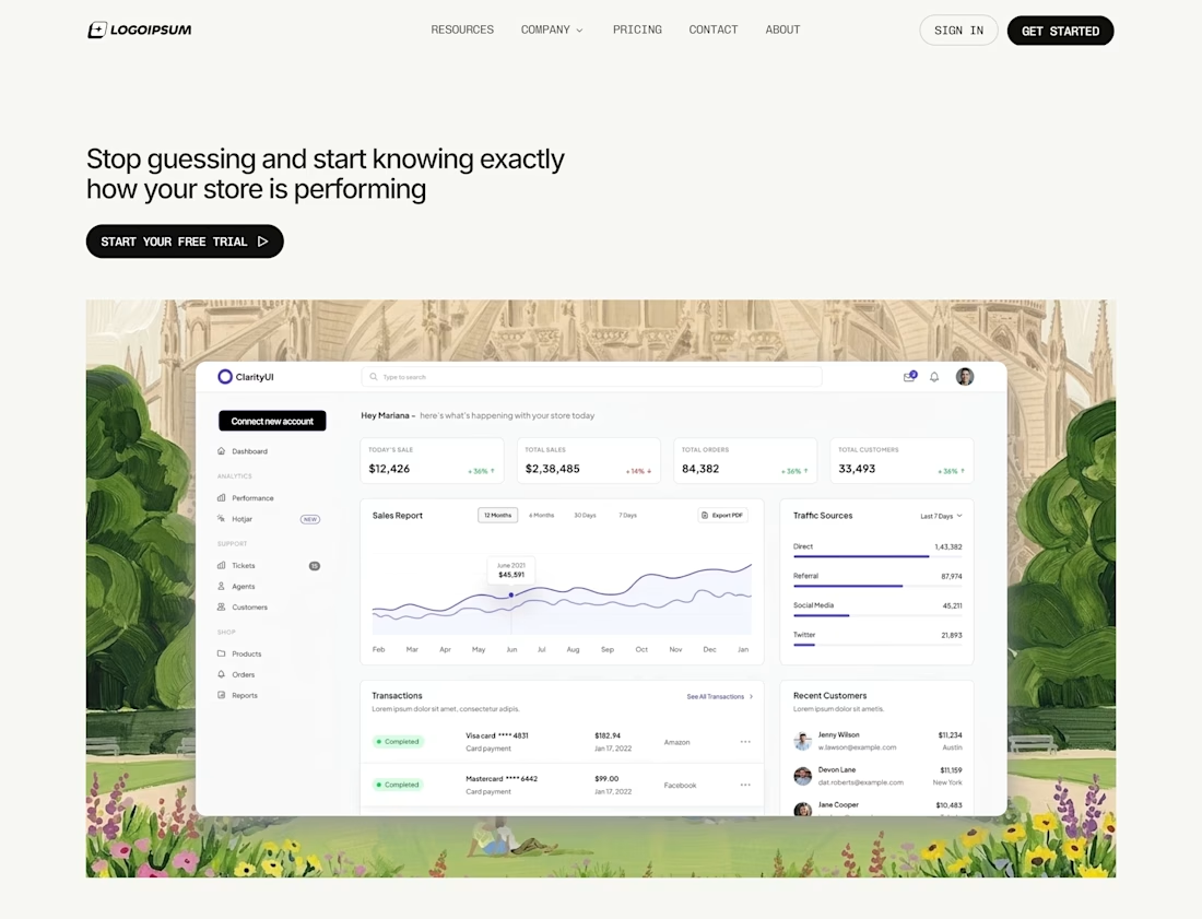
A personal favorite from last week.
Designed a smooth onboarding flow for a finance app — focused on clean UI, quick actions, and effortless navigation.
Simple. Functional. User-first.
If you need a designer who can turn complex ideas into clean, high-converting interfaces, let’s work.

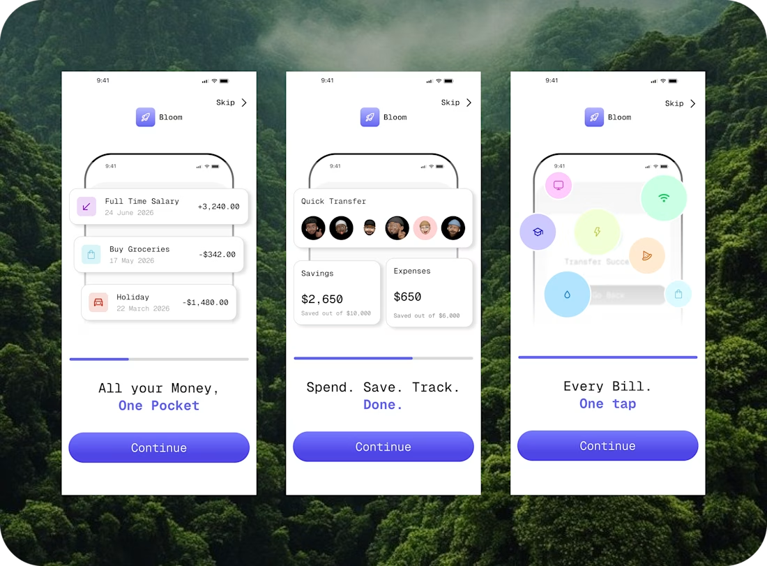
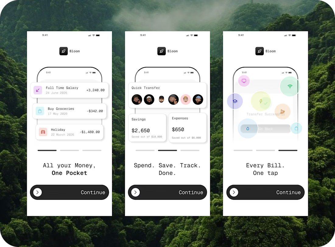

Clean UI


Trending


FLORA
Reusable workflows are replacing one-off prompts in creative AI. Share what you're building in FLORA.

Contra University
Learn from expert creatives how to earn more using next-gen AI tools.
creativeaiflow
Creative AI workflows are evolving. What tools do you use, and what are their strengths and weaknesses?
portfolioreview
The best portfolios tell a story, not just show a grid. Share yours for feedback.
freelancerlife
Freelancer life is wins, pivots, and everything in between. What’s yours right now?