The network for creativity
Join 1.25M professional creatives like you
Connect with clients, get discovered, and run your business 100% commission-free
Creatives on Contra have earned over $150M and we are just getting started
Back to feedPost

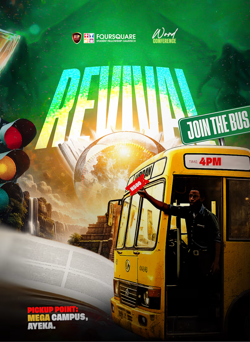
For this concept, I wanted the announcement to feel like an adventure rather than an ordinary event flyer.
The bus became the hero literally taking the viewer somewhere while the surreal environment, oversized typography, dramatic lighting, and layered elements helped build the idea of a journey.
REVIVAL was the heart of the concept, so I didn’t want to change the direction.
I simply focused on strengthening the typography, hierarchy, and overall impact.
The goal was simple: make “JOIN THE BUS” impossible to ignore without changing the message being passed across.
Because apparently, sometimes the best way to promote a conference is to throw a yellow bus into another dimension. 😂
#GraphicDesign #ArtDirection #VisualStorytelling #PosterDesign #CreativeCampaign #TheCreativeSaint


The network for creativity
Join 1.25M professional creatives like you
Connect with clients, get discovered, and run your business 100% commission-free
Creatives on Contra have earned over $150M and we are just getting started







Related posts

So, what is ROSI?
A few cans.
Five colours.
One very simple fish.
A ridiculously large wordmark.
And hopefully proof that everyday products don’t have to look everyday.

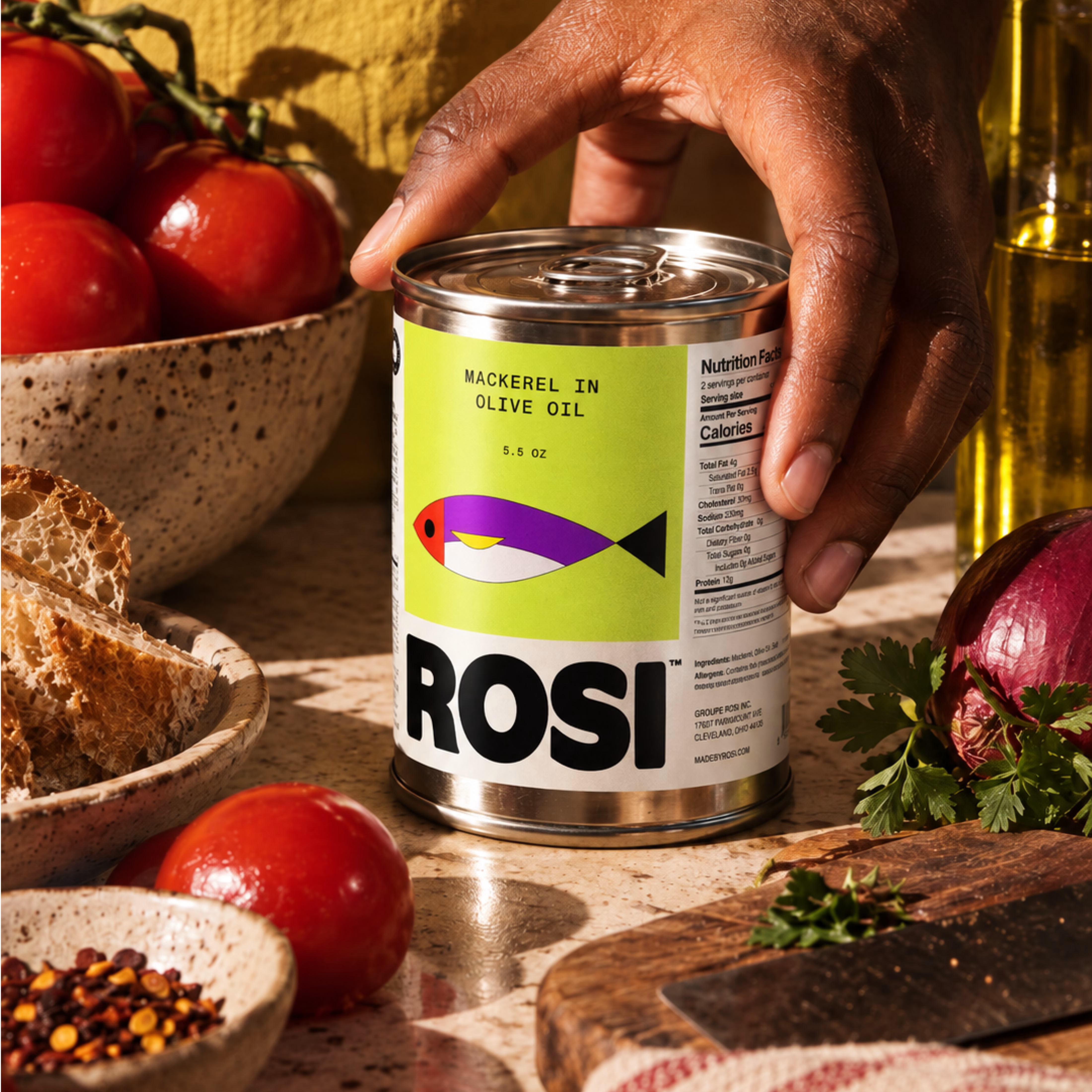
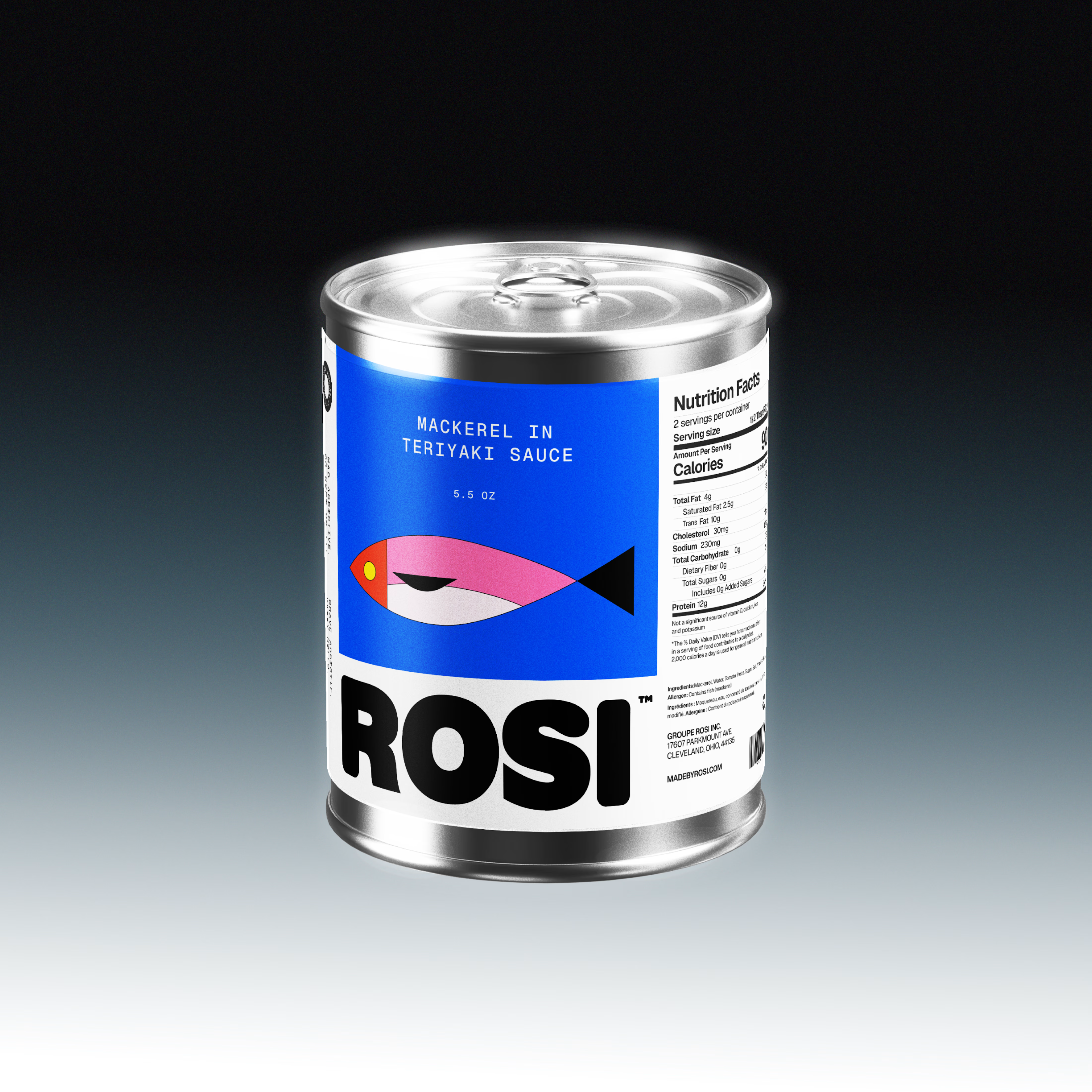
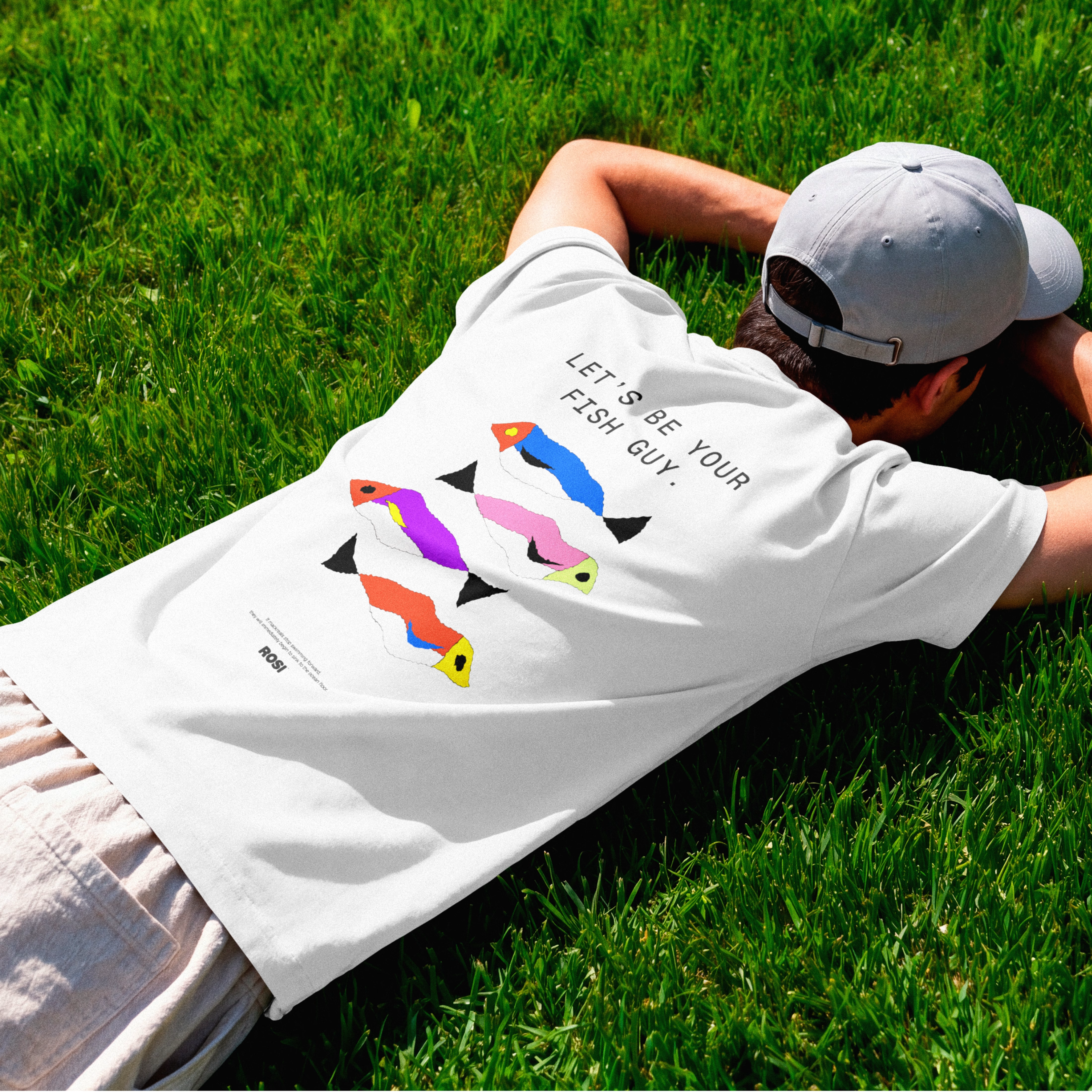

The ridiculously large wordmark is the entire personality, tinned fish has never strutted like this. Proof that confidence is a design decision, not a budget line.

What if Google Maps had been designed in the 1920s? 👀
For the #revival challenge, I reimagined Google Maps through the visual language of Soviet Constructivism.
Routes become bold diagonals, turns become oversized arrows, and ETA and distance become strong typographic statements. Navigation stops feeling like a quiet interface and starts feeling like a piece of graphic propaganda telling you exactly where to go.
Such a fun exercise in taking something extremely familiar and asking how differently it could have been designed in another time.
Your turn!
What modern product would you send back in time, and to which era? 👀


Curious whether the diagonals fought you at phone size — Constructivist posters were built for one long look from across a room, while a nav screen only gets half-second glances from someone already moving. For your question: airline safety cards, sent back to 1960s Swiss...

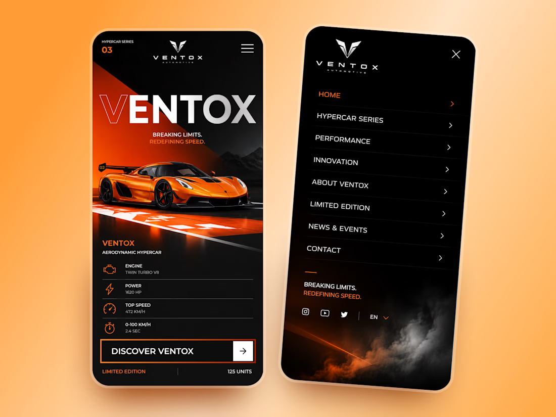
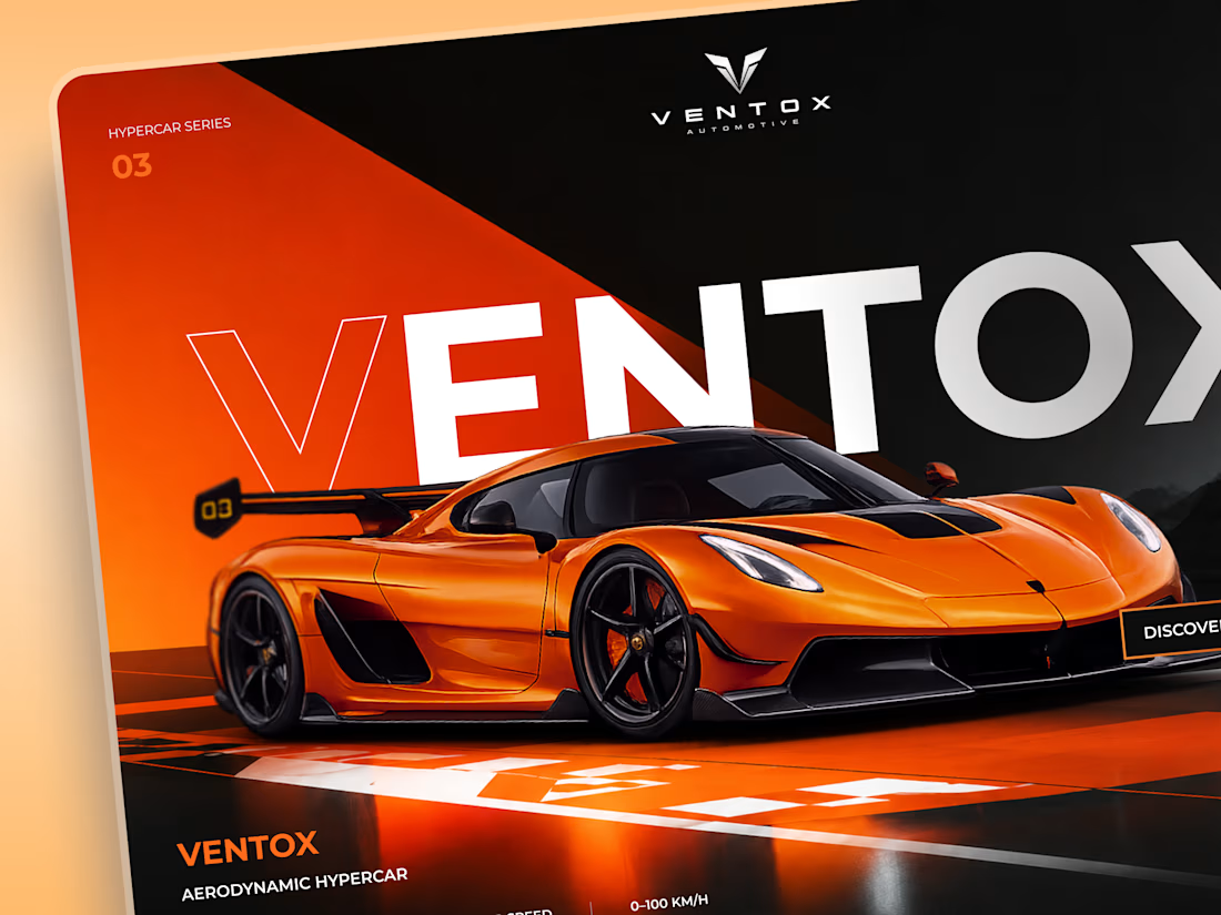
Ventox — Hypercar Landing Page 🏎️🔥
Ventox is a high-performance automotive landing page concept built around speed, exclusivity, and bold visual storytelling.
The design combines a striking orange hypercar, oversized typography, and a dramatic black-and-orange palette to create an immersive digital experience.
Special attention was given to:
A cinematic hero composition that puts the hypercar in the spotlight.
Oversized typography that reinforces the brand's identity.
Sharp geometric shapes and high-contrast colors inspired by speed.
Performance specifications presented in a clean, structured layout.
A prominent CTA that directs attention to the vehicle.
Responsive mobile layouts with simplified content and intuitive navigation.
The result is a bold automotive experience that brings together premium aesthetics, performance-focused storytelling, and clear navigation.
Looking to create a distinctive website for your automotive or luxury brand? Let's build something extraordinary. ⚡