The network for creativity
Join 1.25M professional creatives like you
Connect with clients, get discovered, and run your business 100% commission-free
Creatives on Contra have earned over $150M and we are just getting started
Back to feedPost

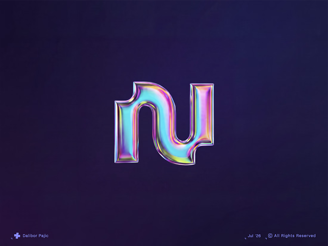
An unused logo concept exploring the letter N through a clean, geometric construction. The mark balances simplicity with a distinctive silhouette, creating a versatile identity that feels modern, confident and memorable.
Although it never made it into a final brand, it's a reminder that strong ideas don't always need a client to exist. Sometimes the best concepts are the ones waiting for the right opportunity.


Nice work!
Much appreciated!

Strong ideas don't always need a client to exist is a great way to frame it, that chrome finish gives it a lot of presence even sitting unused. Do you keep a personal archive of concepts like this to pull from later, or does each one just live and die on its own?
Thanks for the thoughtful comment. I really appreciate it.
In 99% of cases, I build a completely new and tailored direction for each client, based on their specific needs, audience, and goals. Everything that doesn't move forward does end up sitting in my archive, but honestly,...
That client-specific direction makes the archive sound more like a research library than a pile of leftovers. I can see how old explorations still sharpen future decisions.
The network for creativity
Join 1.25M professional creatives like you
Connect with clients, get discovered, and run your business 100% commission-free
Creatives on Contra have earned over $150M and we are just getting started
Related posts


Web concept for bem. The product turns messy documents into structured data, so the brand does the same thing visually. Every image dissolves into pixels, every layout resolves back into grid.

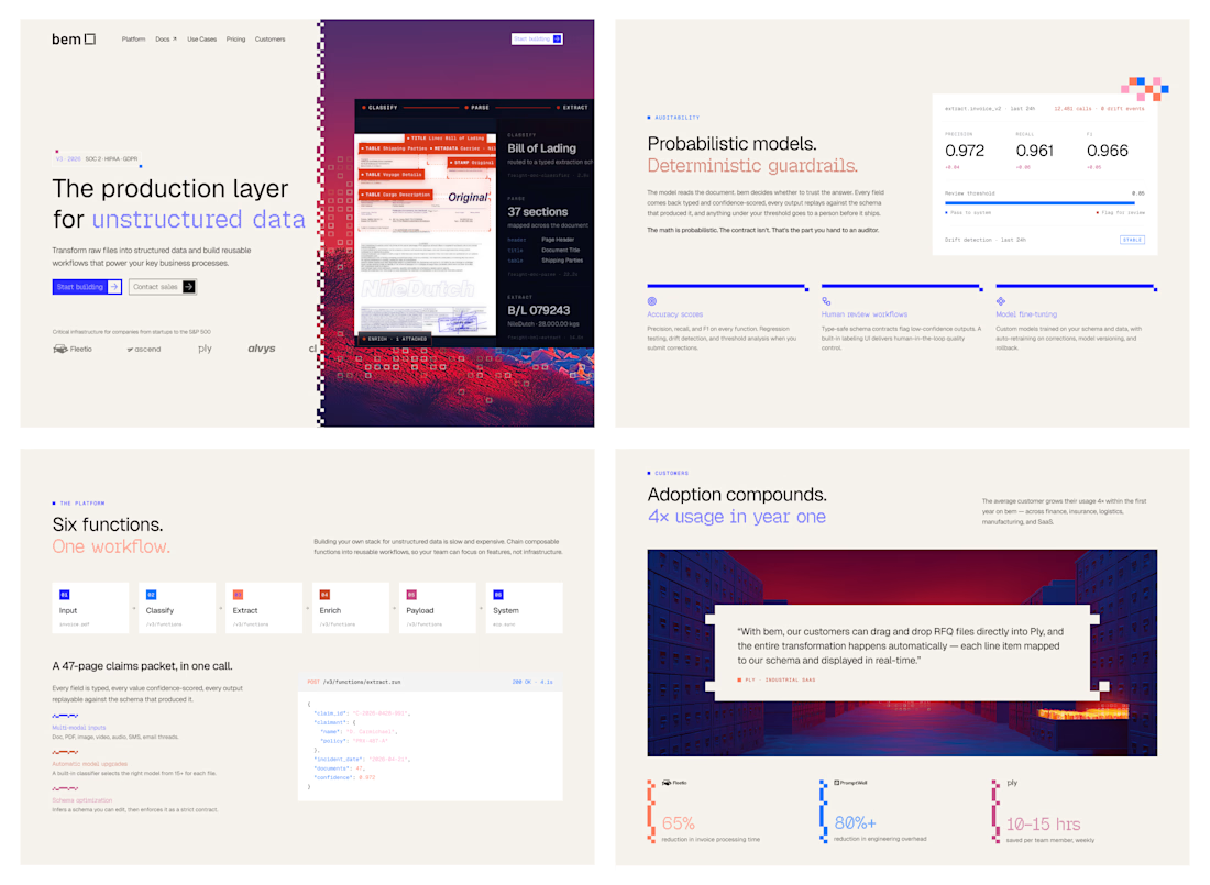

How did you first come up with the idea to use pixel dissolution to represent unstructured data? Did you explore any other visual metaphors before landing on this one?

Can't believe this was already a year ago — finally organized it properly.
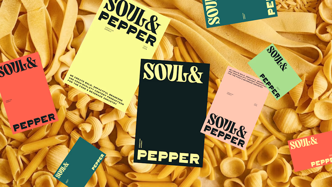
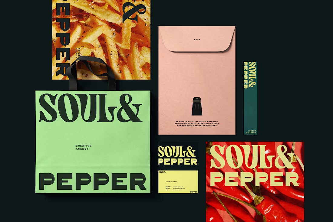
This was a full brand identity for a food-focused creative agency, Soul & Pepper, built from scratch. It's since been paused, which might not look like a "success," but it's still one of my favorite projects from last year. So I went a bit deeper on the process and details — hopefully it shows what we built together and keeps it alive, at least on this page. The ending of the case study even got a little personal, because I was so genuinely involved in this one and it meant a lot to me in all kinds of ways. And that's kind of why I wanted to share it.
Check it out 💁♀️


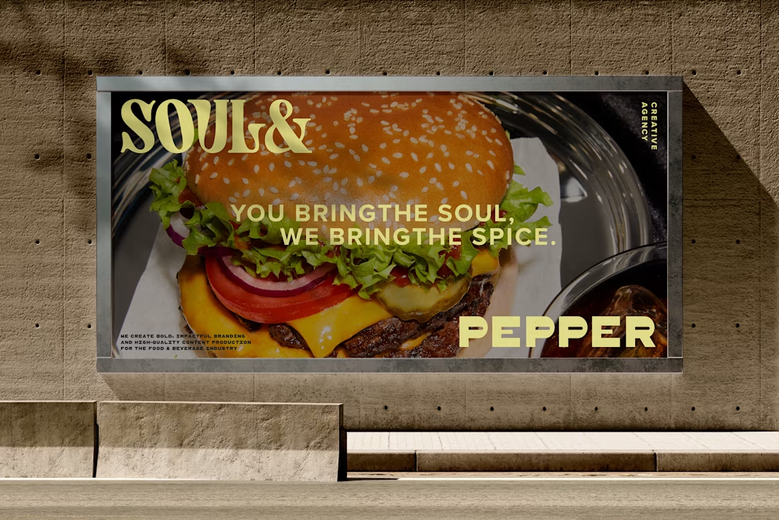
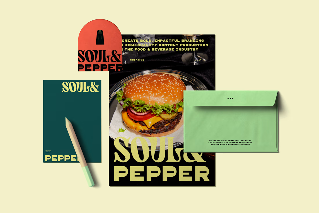

This looks clean and well thought out. How long did it take you to bring everything together?
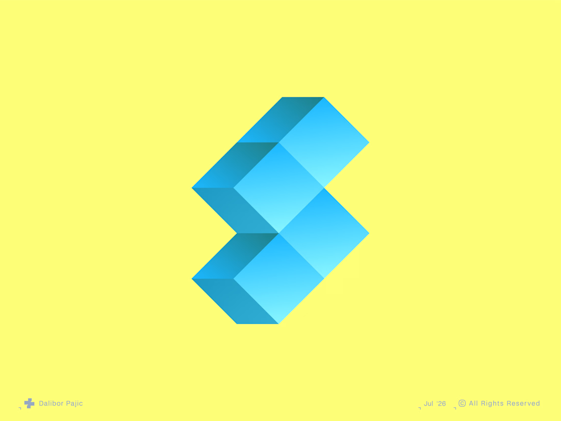


Interesting concept! I can see chevron left and right stacking vertically, i wonder is this intentionally? Or just me? 😊











Trending

Claude
Claude has entered the design space. How are you using Claude Design?

Contra University
Learn from expert creatives how to earn more using next-gen AI tools.
creativeaiflow
Creative AI workflows are evolving. What tools do you use, and what are their strengths and weaknesses?
freelancerlife
Freelancer life is wins, pivots, and everything in between. What’s yours right now?