The network for creativity
Join 1.25M professional creatives like you
Connect with clients, get discovered, and run your business 100% commission-free
Creatives on Contra have earned over $150M and we are just getting started
Back to feedPost

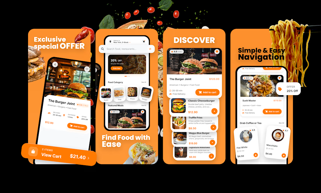
Already shared one of these, here's the other one! Recently made two concept designs exploring different visual styles for food app UI screens. I've always been fascinated by how App Store and Play Store listings use graphics to showcase app screenshots, there's a real craft to making a few frames feel exciting. This was my first time trying something like this, and honestly, it was a lot of fun playing with components and layering everything to make it feel visually rich.
This one leans into a bolder, more energetic street-food aesthetic, floating ingredients breaking out of the frames, high-contrast orange and black, and punchy typography meant to grab attention fast. Screens walk through discovering restaurants, browsing by category, and exploring dishes with quick add to cart actions.

The network for creativity
Join 1.25M professional creatives like you
Connect with clients, get discovered, and run your business 100% commission-free
Creatives on Contra have earned over $150M and we are just getting started






Related posts

From the cover to what’s inside 👀
Thank you to everyone who voted in my cover test. This time, I’m trying two short previews of DCS 654: my library of 654 dessert-inspired colors and matching textures, with ready-made palettes for your own design work.
Which video makes you more curious to explore the library: A or B?
And what made you choose that one?
You can take a closer look here: https://dcs.mariya.design/
36 voted
61%
23 voted
39%
59 votes
Closed


I’d pick B. It makes the colors and textures feel more engaging and makes me want to explore the full library.

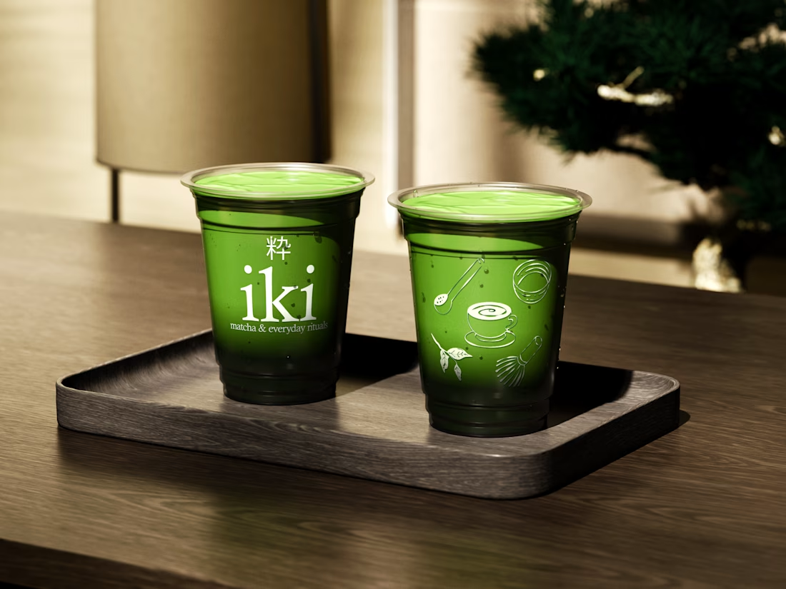
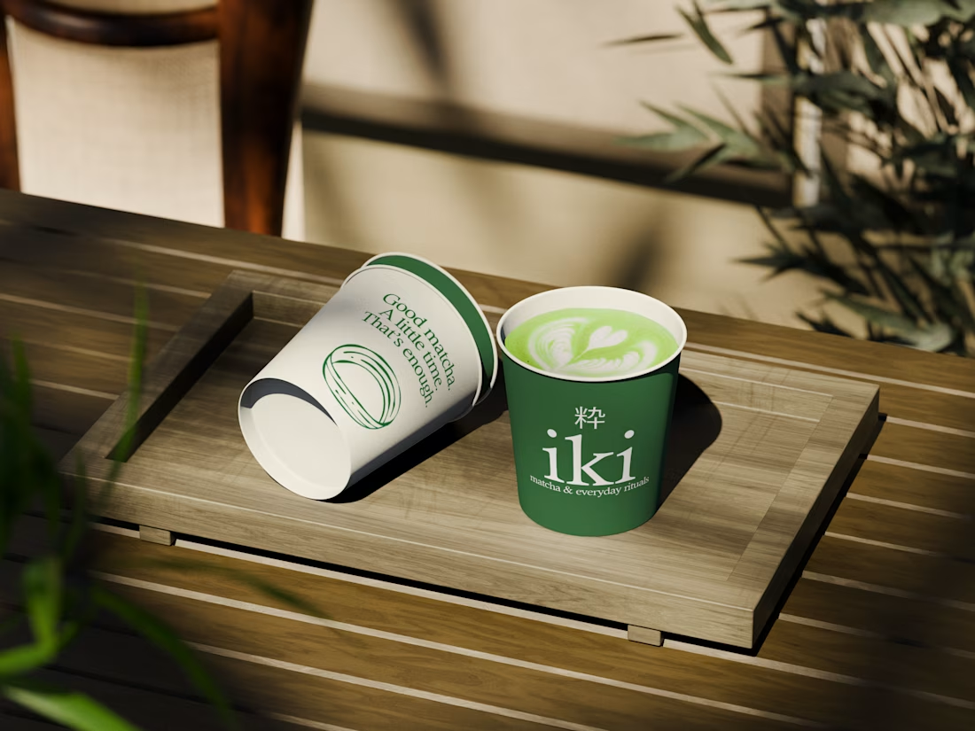
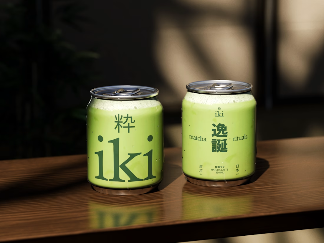
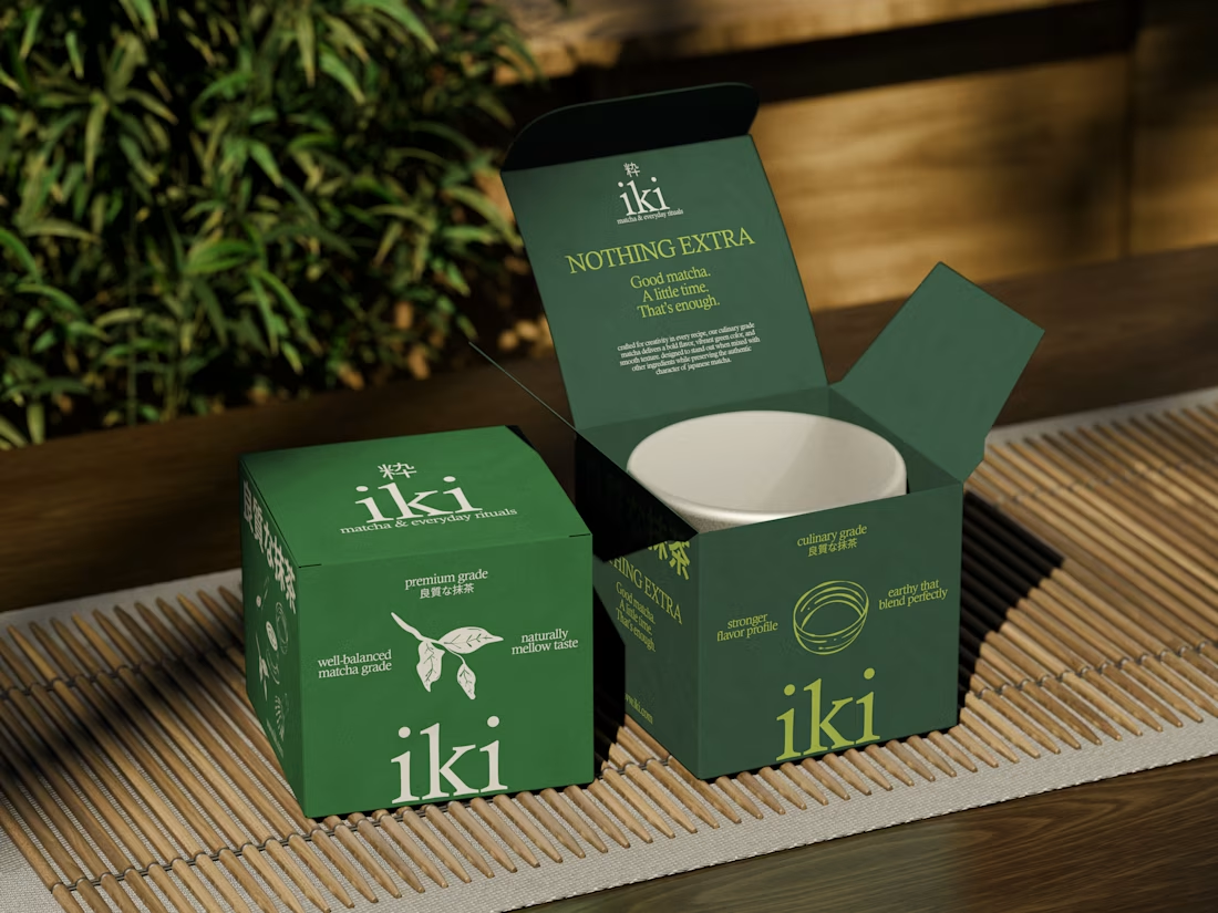
more visuals from iki, a matcha shop i’ve been working on 🍵
the project is getting close to its final stage, and it’s been really interesting to see how the initial concept has gradually turned into a complete brand.
from the strategy to the visual identity, every decision has helped shape a more cohesive and distinctive world for iki.
almost there. excited to share more of the final result soon

Strong concept and thoughtful execution. The logo feels distinctive and communicates the brand identity clearly.

Built something that isn’t client work for a change.
Flowkidz. Short games that teach kids design, websites, AI, code and internet safety.


