The network for creativity
Join 1.25M professional creatives like you
Connect with clients, get discovered, and run your business 100% commission-free
Creatives on Contra have earned over $150M and we are just getting started
Back to feedPost

Ever had a client say, “this color stays”?
That was the challenge with Ultimate Gainz, a women’s fitness wear brand from Malta.
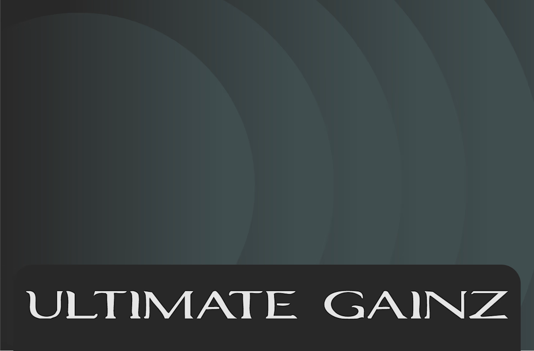
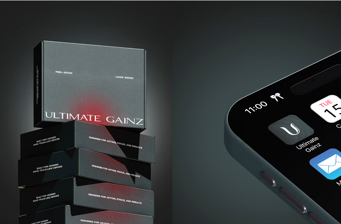
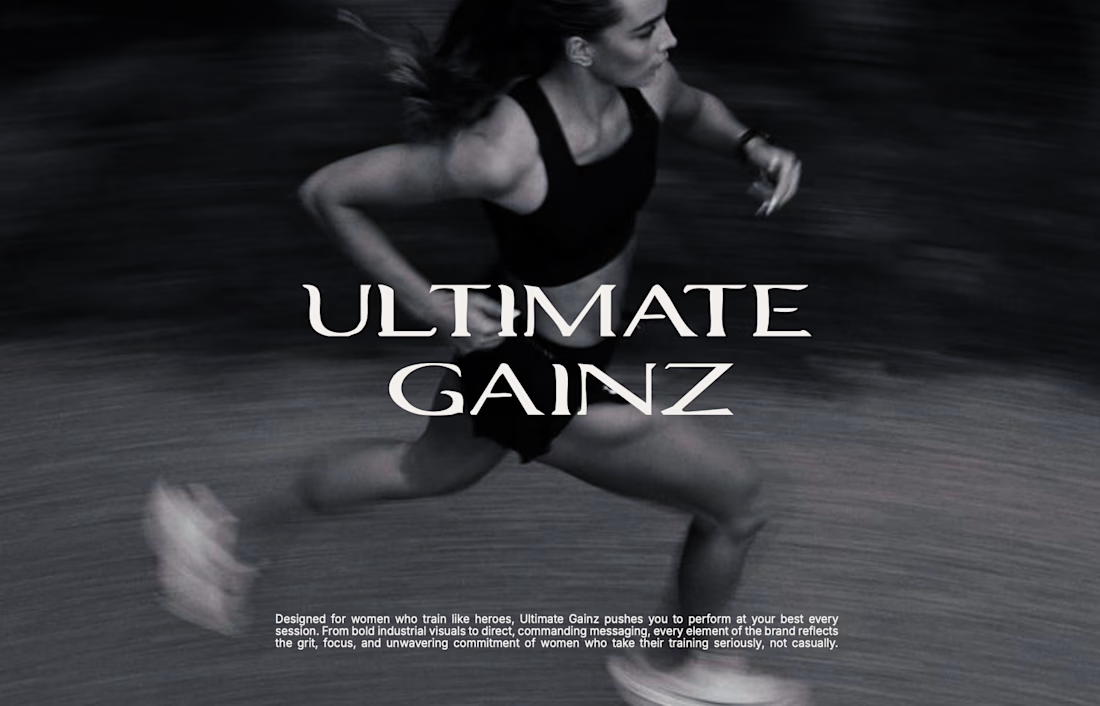
The client wanted to keep Iron Slate Grey as the main color, while making sure the brand didn’t look like the typical women’s fitness brand. No matcha-in-hand aesthetic, no pretty gym-girl visuals, no overly polished feminine look.
That’s where crimson red came in.
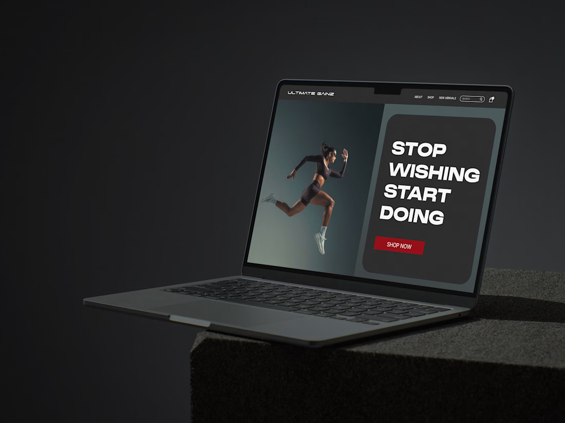
I used it as the accent color to represent hard work, intensity, strength, and the energy behind showing up and putting in the work.
The result became a bold visual identity built around contrast, with the color system, typography, visual direction, and brand guidelines all working from the same idea.
If you’re building a brand with a very specific point of view, my inbox is open for brand identity projects. Tell me more about your brand, I’d love to hear what you’re working on.


The network for creativity
Join 1.25M professional creatives like you
Connect with clients, get discovered, and run your business 100% commission-free
Creatives on Contra have earned over $150M and we are just getting started







Related posts

Introducing MONETA, a digital banking brand concept designed for modern businesses that need a banking experience built around clarity, speed, and confidence.


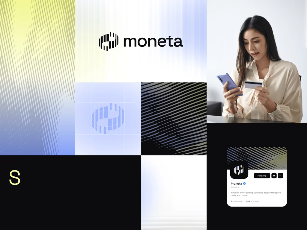

wow the branding is surprisingly premium

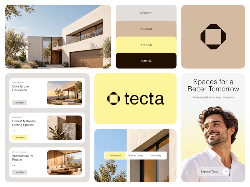
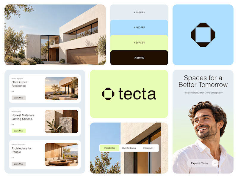
Color Direction Test - Tecta Architecture
Exploring two visual directions for Tecta, a contemporary architecture brand built around clarity, form, and human-centered spaces.
Direction 01 - Warm, calm, and timeless.
Direction 02 - Fresh, modern, and expressive.
Same identity. Different atmosphere.
Which direction feels stronger for an architecture brand - 01 or 02?
21 voted
38%
35 voted
62%
56 votes
Closed

Great branding! The presentation is top-notch. Learned something new from this.

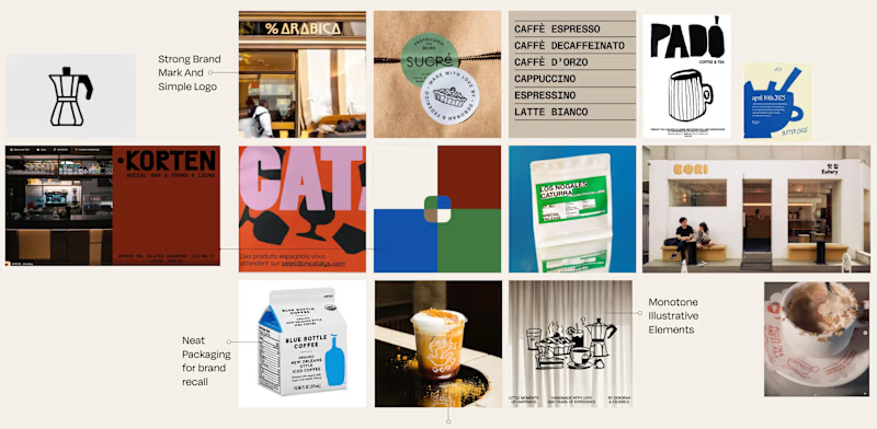
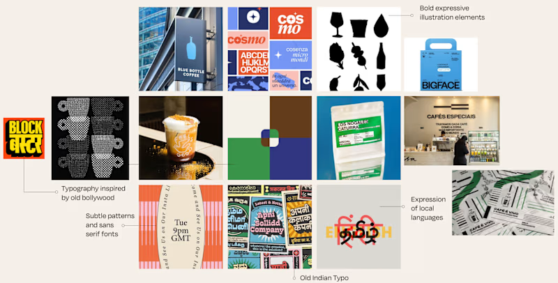
Is it Mood-board 01 or Mood-board 02!
Which mood-board do you think the client selected?

13 voted
76%
4 voted
24%
17 votes
Closed

Going with 01, it feels tighter and more intentional while 02 reads a little busy. Clients usually pick the one that looks safe to sign off on, and 01 has that calm confidence. Curious to hear which one won.