The network for creativity
Join 1.25M professional creatives like you
Connect with clients, get discovered, and run your business 100% commission-free
Creatives on Contra have earned over $150M and we are just getting started
Back to feedPost
What if your brand looked like it belonged five years in the future — today?
Most SaaS brands blur together — same blue gradient, same rounded logo, same "trust us" energy. I build ones that make people stop scrolling.
Swipe through 5 identity systems from this year:
🟡 Stack — bold black-and-yellow, built for developers
🟢 Tradiin — neon fintech energy, "Demand First"
🟩 FlowSync AI — clean, gradient-driven automation brand
🟢 BaiEdu — friendly AI education, chat-first
🟢 Rubble — "Where Automation Flows Naturally"
Each one: full identity system — logo, type, color, app icons, mockups, voice. Launch-ready.
If your brand still looks like everyone else's, let's fix that. 👇

It's really grabbing the attention

Thanks
Welcome, mate. how is going your project? 🙂
It's good here.

Thank you

Played so weel with colors!
Thank you
The network for creativity
Join 1.25M professional creatives like you
Connect with clients, get discovered, and run your business 100% commission-free
Creatives on Contra have earned over $150M and we are just getting started
Trending
retrofuturism
Share your favorite designs from the past exploring the distant future. Or your own take on the aesthetic 🚀
halftone
Dots. Texture. Grain. Let's see your designs using the halftone technique.

Midjourney
Creatives are showing off what they're making with Midjourney.
colorgrade
Video editors sound off: How do you enhance the mood of your video in color grading?





Related posts


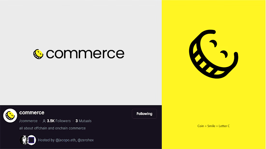
Created this logo concept for an e-commerce community challenge on farcaster back in 2023
The idea was to capture the different sides of an e-commerce focused community in one simple mark: a coin + C + smile.

🔥 🔥

Mosii, a minimal menswear brand identity I designed, was just featured on Contra's homepage.
My portfolio had gotten a bit stale, so this landed at a good time. Nothing like a feature to remind you to keep showing up for your own work.

Amazing, thats a milestone right there to aim for.

When does a hand-drawn logo make sense for a brand?
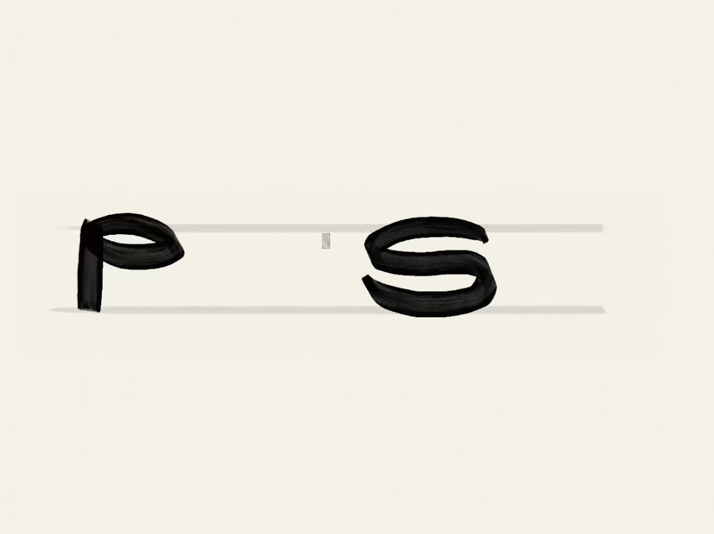
In this case, a Barcelona-based creative studio founded by a team with decades of combined experience approached me wanting a hand-drawn identity that would feel unexpected for a team like them, a way to signal creativity and distinction.
They came with a strong concept: the sediment at the bottom of a wine glass. What stays after everything else fades. A nod to what good work leaves behind after years of experience.
The entire identity is built on hand-drawn illustration, so the logo needed to do something different. With so much personality already living in the visuals, we went for a logotype with weight and presence, something that could anchor the brand and communicate their expertise.
The hand is still there. Just in a different form.
Do you think hand-drawn elements are being used more as a trend than as an intentional choice?


Looks super cool! Love the craft behind every branded element, from type to illustration. I believe it makes the brand very strong and consistent