The network for creativity
Join 1.25M professional creatives like you
Connect with clients, get discovered, and run your business 100% commission-free
Creatives on Contra have earned over $150M and we are just getting started
Back to feedPost

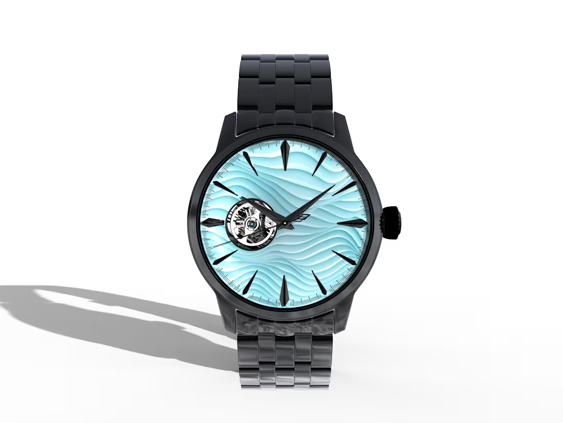
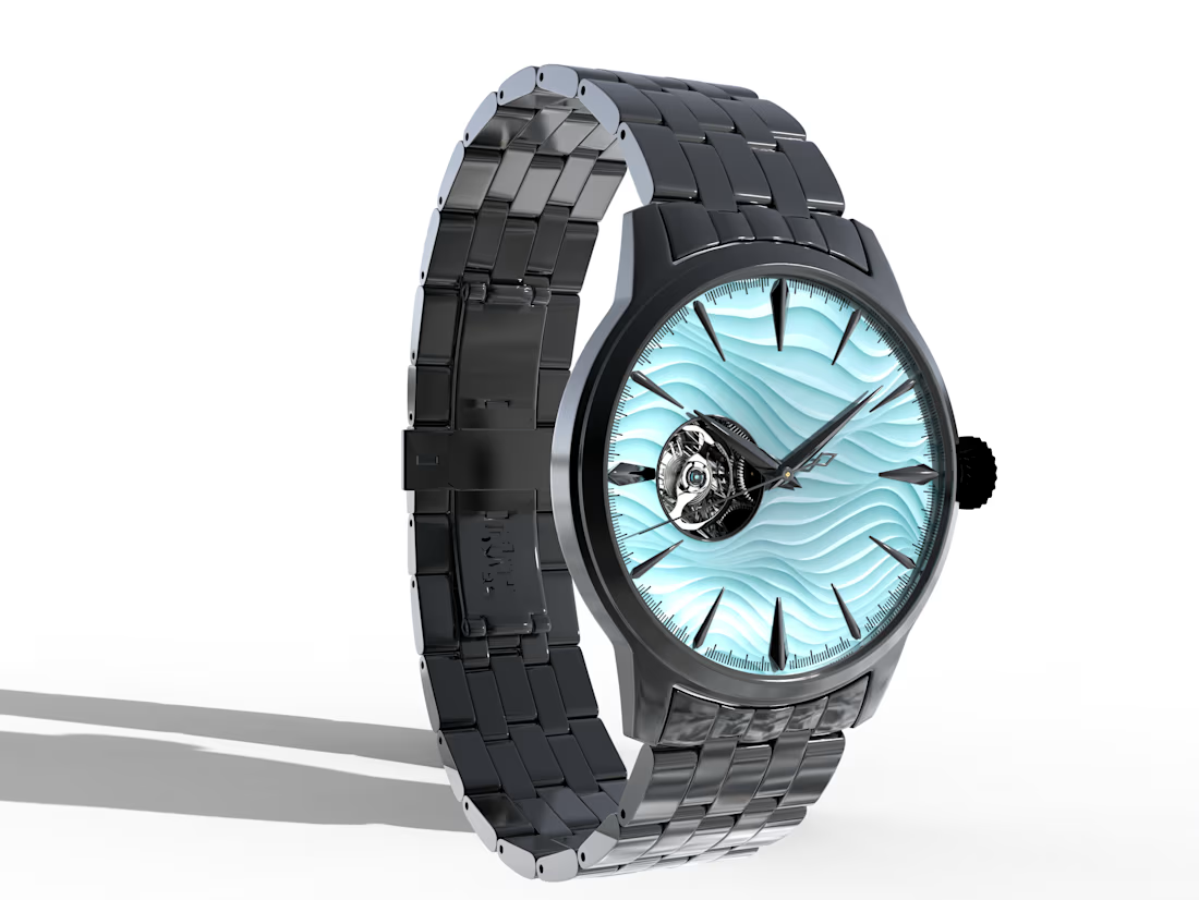
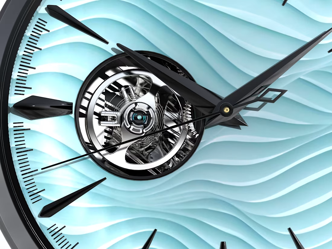
:This conceptual luxury watch was designed around the idea of combining organic fluidity with mechanical precision.
The layered wave-pattern dial draws inspiration from the movement of water, while the exposed tourbillon highlights the beauty of traditional watchmaking. Premium materials, polished finishes, and carefully crafted lighting were used to create a realistic commercial presentation suitable for luxury branding.


The network for creativity
Join 1.25M professional creatives like you
Connect with clients, get discovered, and run your business 100% commission-free
Creatives on Contra have earned over $150M and we are just getting started

Challenges
View all


Related posts

What should a platform for tokenized private equity look like?
Probably not like another traditional bank.
For ICME, the client wanted a visual direction that felt modern, disruptive, and native to a new kind of financial market.
The challenge was finding the balance: make the experience bold enough to feel different, while keeping a complex product understandable and credible.
I developed a digital-brutalist direction with retrofuturist touches - oversized typography, hard contrast, pixel textures, raw layouts, blue gradients, and controlled motion.
I worked with Arash Attar and the ICME team across the landing page and parts of the wider product interface. This video focuses specifically on the landing-page experience.
The goal was to:
— Explain tokenized private-company equity more clearly
— Create a memorable visual identity for the product
— Speak to both investors and founders
— Make financial technology feel ambitious rather than conventional
Would this visual direction make you want to explore the product - or should financial platforms feel more restrained?


This is amazing, man.
Good job!

Most luxury eyewear brands sell frames. Very few sell the feeling of putting them on.
Orelux was designed to close that gap. Not just with product shots but with a world. Editorial campaign photography of real people wearing real confidence. A hero that says "See the World in Style" and means it before you scroll once.
The home screen sets the tone full-bleed lifestyle imagery, an in-app try-on preview, and an "Explore Collection" CTA that earns the click.
Three sections. Every reason to buy answered before the question is asked.
This is what luxury e-commerce looks like when the design respects the product as much as the person wearing it.
Does this feel like an eyewear website that converts browsers into buyers? 👇
Designed by Orbix Studio.
Tools: Figma
#WebDesign #LuxuryDesign #EcommerceUI #UIDesign #ContraFreelance #ProductDesign #FashionDesign #LandingPage


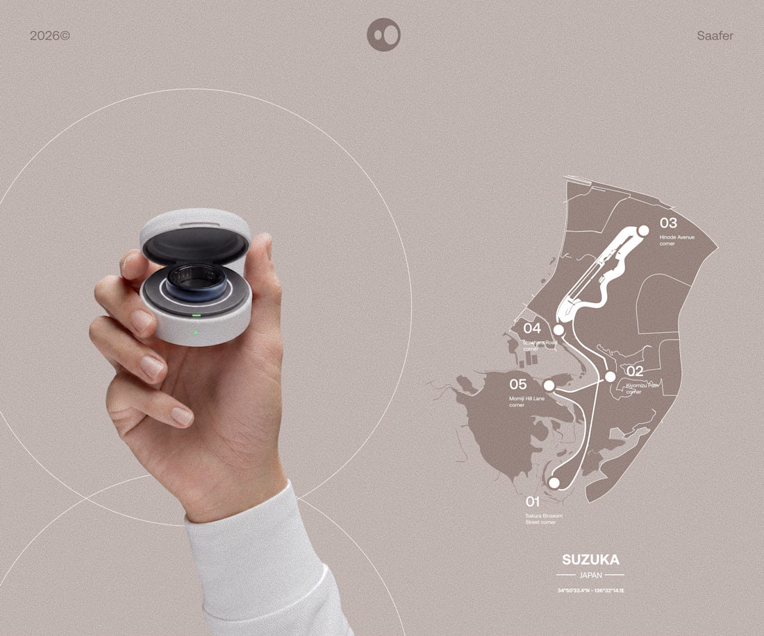
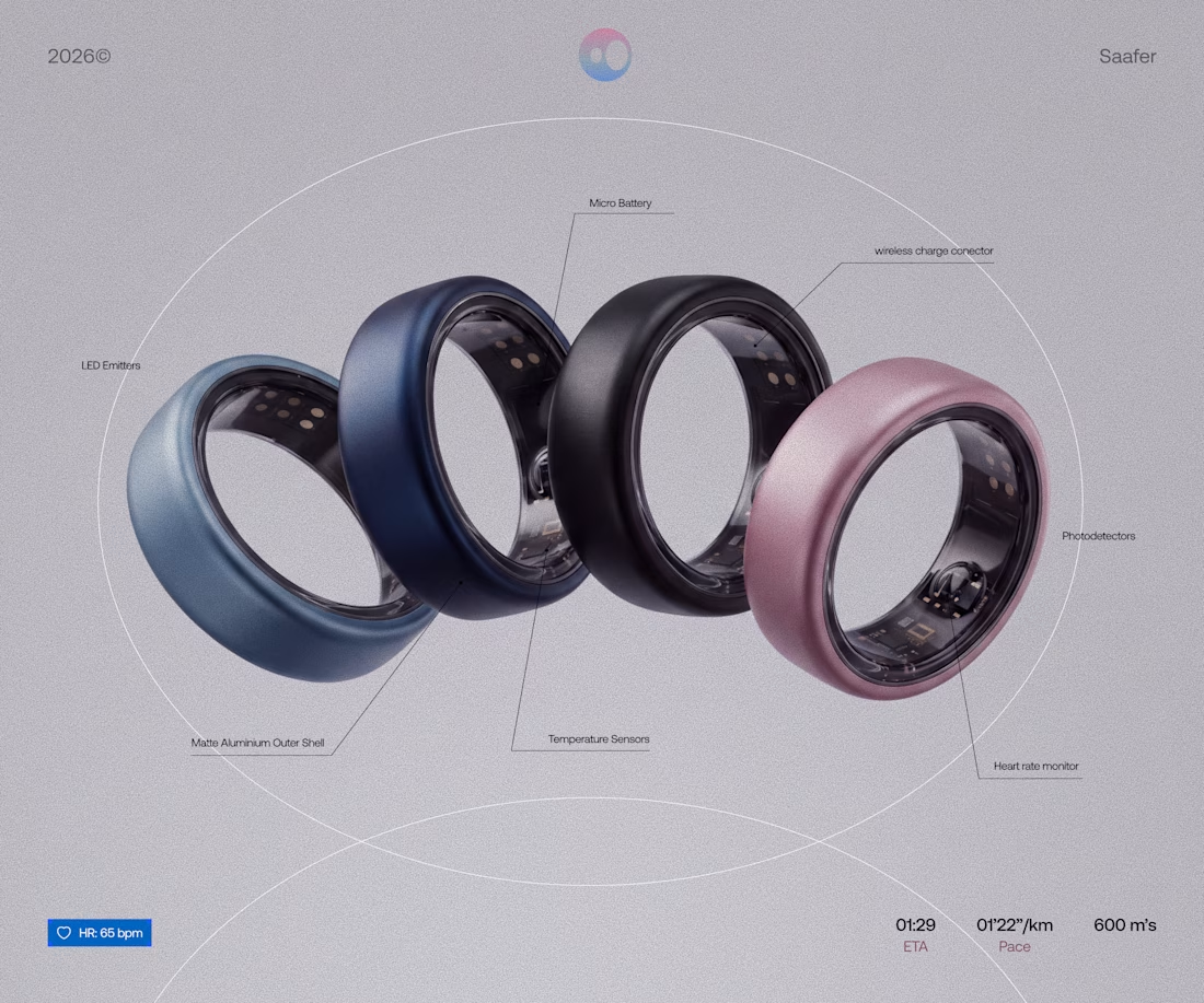
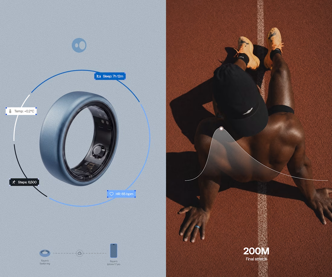
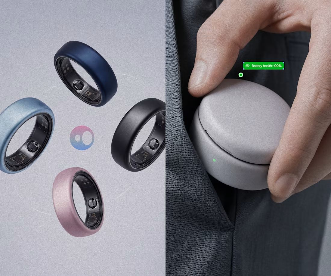
Model rendering and branding done for Saafer's smart ring (Health tech)