The network for creativity
Join 1.25M professional creatives like you
Connect with clients, get discovered, and run your business 100% commission-free
Creatives on Contra have earned over $150M and we are just getting started
Back to feedPost
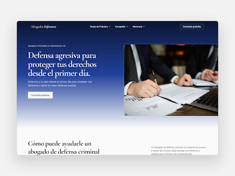
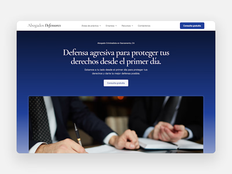
Taste Test
Making some tweaks to one of my law firm retainer client's site to optimize for conversions
Which version do you think looks/functions better?
23 voted
43%
31 voted
57%
54 votes
Closed

Option B feels more bold and authoritative, perfect energy for a criminal defense firm. Nice work on both though!

Thanks Stephanie!

Actually! Liked how you linked the overall motive to the Hero Section! 🙌
Thanks Mehfooz!

Option B feels better to me. I also think that maybe the image radious could be a bit greater so it matched the CTA + navigation action. Or have the rest of the button styles less rounded so direction is more bold/serious to aim the "lawyer" vibes of the page : )
Interesting insight! I'll have to play around with the corner radius' to get more of that professional feel

Loved the B one!

I prefer option A, the subtle white shadow is a great improvement compared to option B

I think the gradient in A makes it pop more


Liked Option A more!

Option "B" looks more better "A" can be improved. Use some bullet points in the "Option A". It will help help with conversion.
I like the bullet points idea! Gives the user greater scalability

I prefer Option A. It seems like realistic

great design

Option B looks professional!

I think playing around Option A, can get a better outcome here

I think you need more tweak on both version
What would you tweak?

Great work
The network for creativity
Join 1.25M professional creatives like you
Connect with clients, get discovered, and run your business 100% commission-free
Creatives on Contra have earned over $150M and we are just getting started
Related posts


Amazing, this is incredible

I would love to get feedback on my portfolio. Here is what I do:
Branding
Website Design and Development
App Design
My website link: www.BThreeDesigns.com

Nice work, please what tools do you guys use to capture or record your work


Trending


FLORA
Reusable workflows are replacing one-off prompts in creative AI. Share what you're building in FLORA.

Contra University
Learn from expert creatives how to earn more using next-gen AI tools.
creativeaiflow
Creative AI workflows are evolving. What tools do you use, and what are their strengths and weaknesses?
portfolioreview
The best portfolios tell a story, not just show a grid. Share yours for feedback.
freelancerlife
Freelancer life is wins, pivots, and everything in between. What’s yours right now?