The network for creativity
Join 1.25M professional creatives like you
Connect with clients, get discovered, and run your business 100% commission-free
Creatives on Contra have earned over $150M and we are just getting started
Back to feedPost
This project was not easy, but we made it.
Gorky Preparty Place is a bar with almost 8 years of history, atmosphere, people, and memories behind it.
Before this challenge, Gorky did not have a proper website. Its online presence was mostly Instagram, photos, posts, and direct messages. Guests had to search separately for the menu, reservations, events, address, and contact options.
For the Base44 Give it a Glow Challenge, I built Gorky Bar Concierge — a complete digital preparty experience for the bar.
The new website brings everything into one place: landing page, reservations, visual menu, guest orders, events, About Us, address, WhatsApp, and phone contact.
The goal was not just to make a website, but to keep the real identity of Gorky: dark, warm, cinematic, elegant, and connected to the atmosphere of the bar.
Before: Instagram and direct messages.
After: a full digital concierge experience built in Base44.
Built for Gorky Preparty Place, Bishkek.


This looks great. The only thing is the nav bar feels a bit cramped with all those menu items crowded in. I love the create your cocktail feature does it recommend matching drinks already on your menu or can people actually design a custom order?

Thank you very much for your opinion, I will fix this issue in the future. As for cocktails, generation comes from the products that are in stock and comes from the technological map of the bar itself.
The network for creativity
Join 1.25M professional creatives like you
Connect with clients, get discovered, and run your business 100% commission-free
Creatives on Contra have earned over $150M and we are just getting started



Related posts

Need a second pair of eyes 👀
I'm designing the online store for FizzPop, a craft soda brand: all-natural sodas, sparkling waters and botanical tonics.
Flower Fizz(A): eggshell, tiger orange and deep ultramarine, with flower shapes and stacked colour swatches for the flavours
Corner Shop(B): lime, soft blues and navy, editorial layout with a giant wordmark and menu-style flavour tiles

38 voted
44%
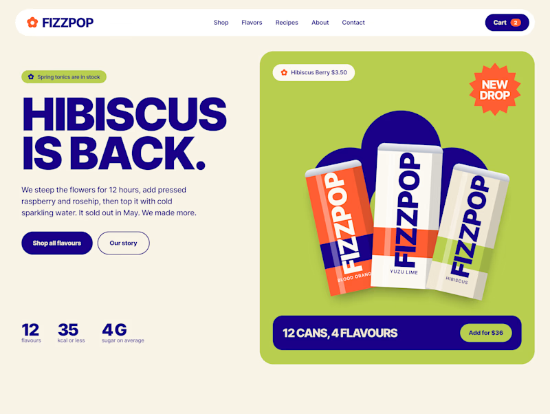
48 voted
56%
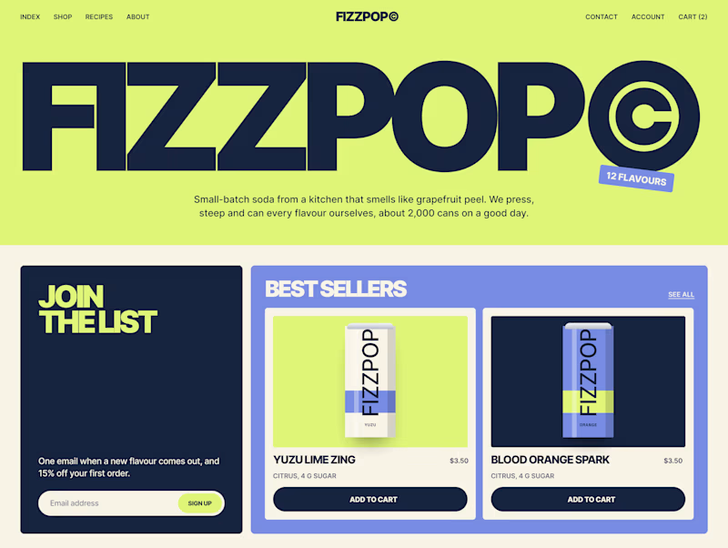
86 votes
Closed


next update on the london architect site.
the homepage hero. you scroll, and instead of the page moving down, you walk up to the house, through the front door and into the living room.


Amazing!!

Deep Focus is a fictional macOS app that silences notifications so people can do deep work. The catch is the audience: people who need a productivity app are already tired of apps. Every competitor promises more features, so this page had to promise relief and turn it into a download within seconds.
What I did
I started from the pain, not the product. The second screen lists what a normal day looks like: push notifications, endless pings, 142 unread emails, context switching. I styled those chips like the four benefit chips in the hero, only white instead of frosted, so the visitor reads before and after without a line of explanation.
The hero section design shows no interface on purpose. This product is about absence, and a screenshot would add noise, so a person alone in a field does the proving. The headline “Deep focus. Anywhere.” is a high-contrast serif because every tool in this category speaks in a grotesque, and a serif sounds calm and human.
I kept one action, Download for macOS, with no pricing and no form. The first job of this landing page design is a download, and everything else can wait until after it.
Would you keep the serif for the headline, or switch to a grotesque so it feels more like software?


Love this!