The network for creativity
Join 1.25M professional creatives like you
Connect with clients, get discovered, and run your business 100% commission-free
Creatives on Contra have earned over $150M and we are just getting started
Back to feedPost


The network for creativity
Join 1.25M professional creatives like you
Connect with clients, get discovered, and run your business 100% commission-free
Creatives on Contra have earned over $150M and we are just getting started





Related posts

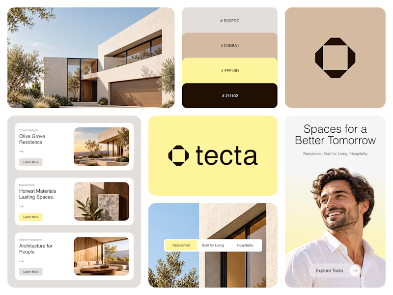
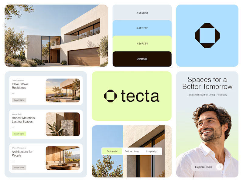
Color Direction Test - Tecta Architecture
Exploring two visual directions for Tecta, a contemporary architecture brand built around clarity, form, and human-centered spaces.
Direction 01 - Warm, calm, and timeless.
Direction 02 - Fresh, modern, and expressive.
Same identity. Different atmosphere.
Which direction feels stronger for an architecture brand - 01 or 02?
21 voted
38%
35 voted
62%
56 votes
Closed

Great branding! The presentation is top-notch. Learned something new from this.

This is such a clever way to turn familiar client feedback into a visual language. The concept and typography make the message really memorable. 👏


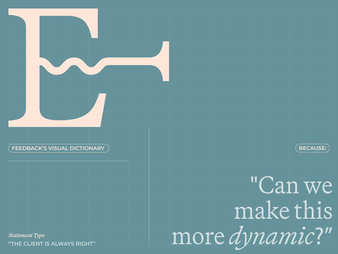
Are clients always right? 😀
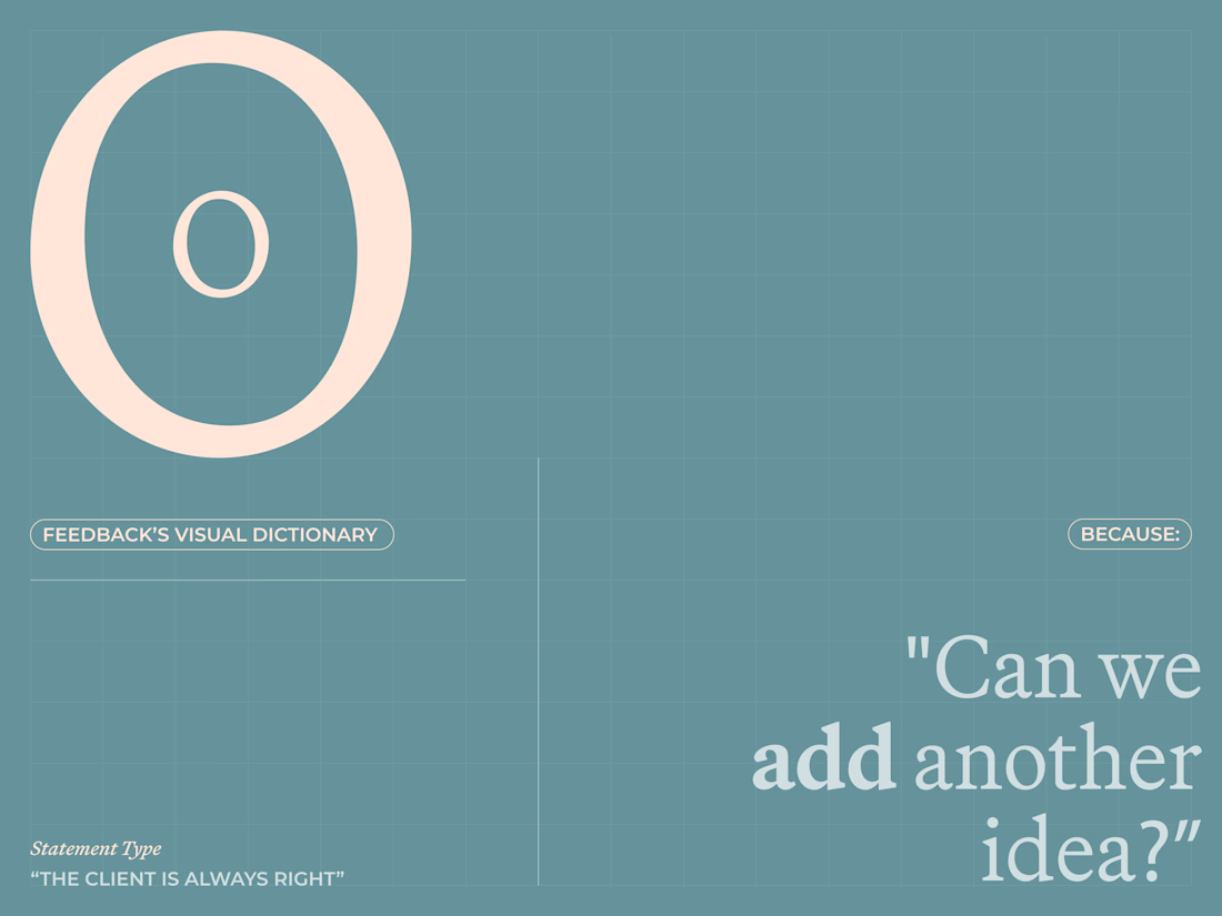
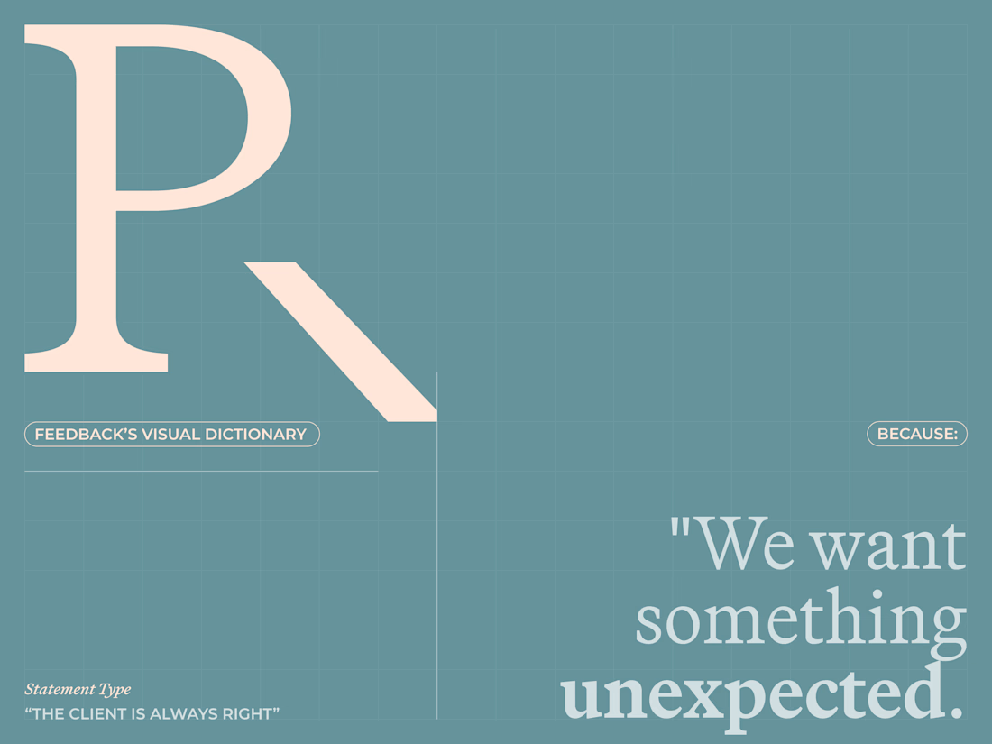
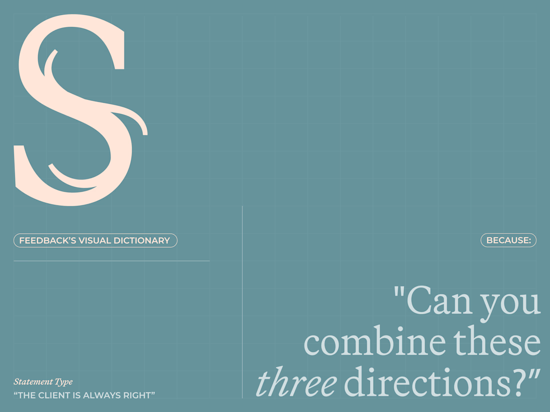
I created a lettering system where every letterform represents one of the things designers routinely hear from clients.
The typeface becomes a visual dictionary of bad creative feedback, that proves the statement wrong.
Give me your worst client...

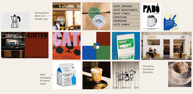
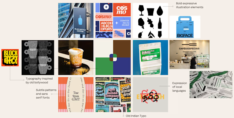
Is it Mood-board 01 or Mood-board 02!
Which mood-board do you think the client selected?


13 voted
76%
4 voted
24%
17 votes
Closed

Going with 01, it feels tighter and more intentional while 02 reads a little busy. Clients usually pick the one that looks safe to sign off on, and 01 has that calm confidence. Curious to hear which one won.