The network for creativity
Join 1.25M professional creatives like you
Connect with clients, get discovered, and run your business 100% commission-free
Creatives on Contra have earned over $150M and we are just getting started
Back to feedPost


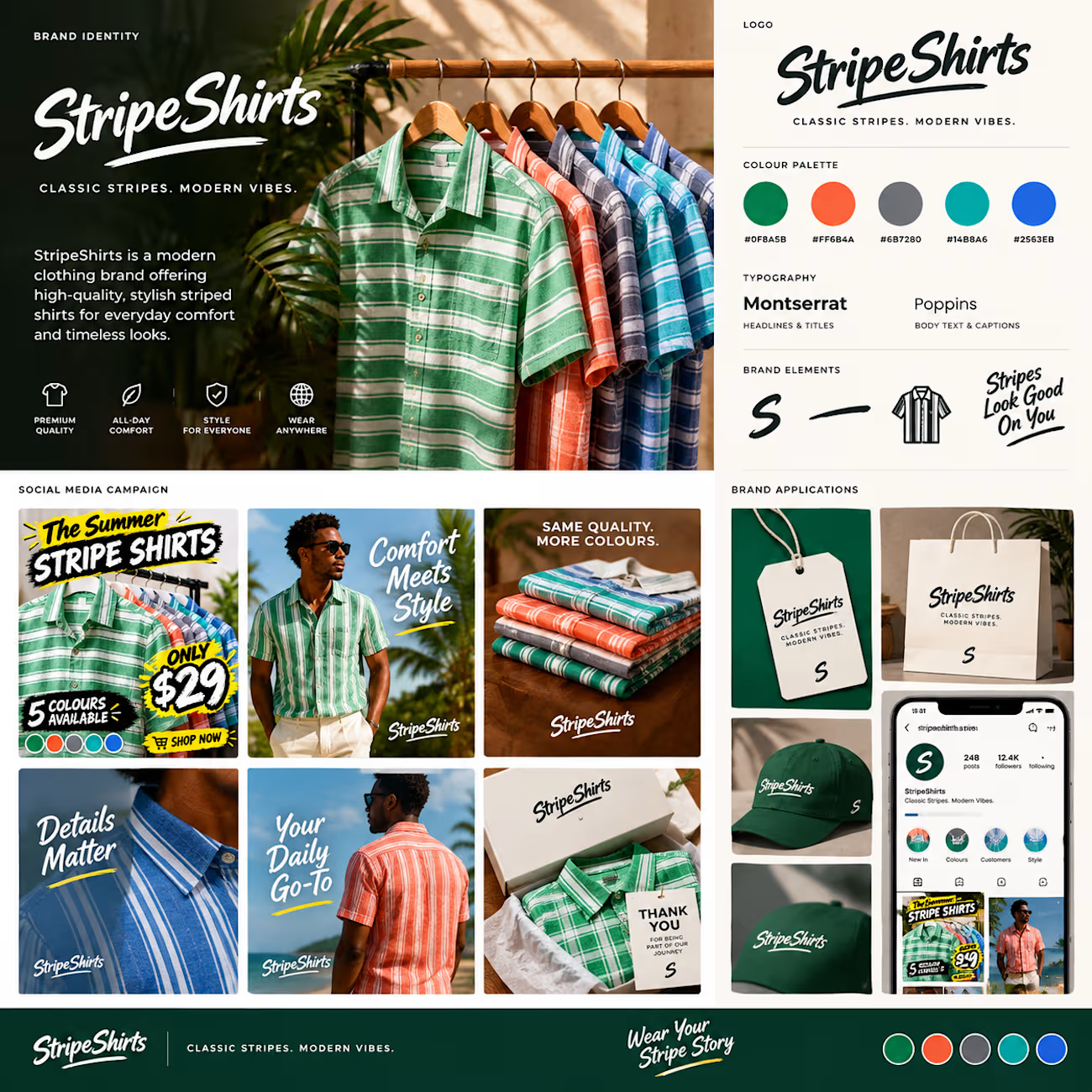
Stripe shirt - brand identity social media company
Brand identity
Colour palatte
Typography
Social media comy
Products promotion
Parkaging/ application concept


The network for creativity
Join 1.25M professional creatives like you
Connect with clients, get discovered, and run your business 100% commission-free
Creatives on Contra have earned over $150M and we are just getting started

Challenges
View all


Related posts

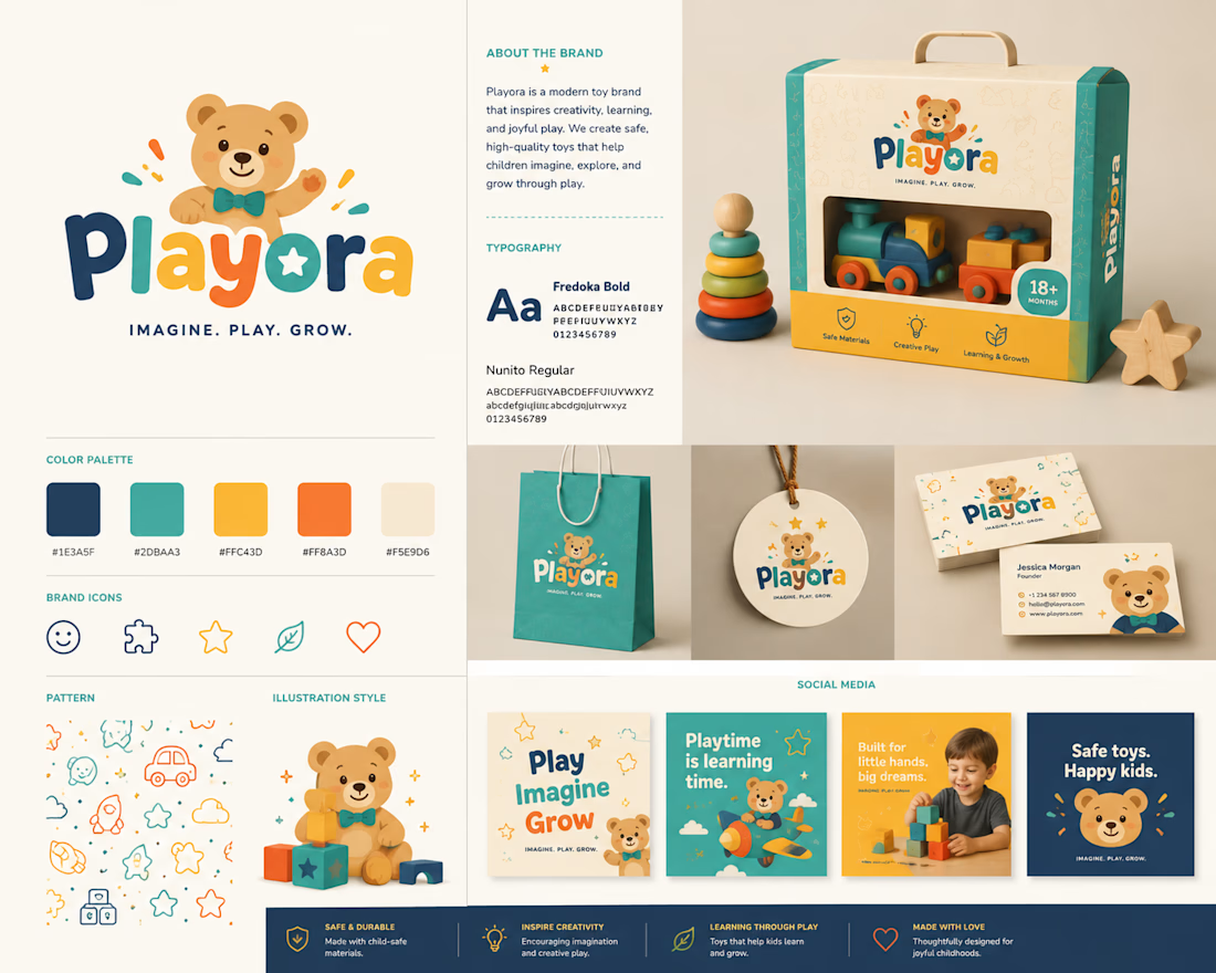
Playora — Toy Brand Identity Design
A playful and colorful brand identity created for Playora, a toy brand designed around creativity, imagination, and the joy of play.
The identity combines a friendly visual language with bold typography, vibrant colors, and engaging graphic elements to create a brand that feels fun, energetic, and memorable for children while remaining polished and appealing to parents.
The system was developed with flexibility in mind, allowing the identity to work across toy packaging, product labels, social media, promotional materials, and digital platforms.
Focus: Brand Identity • Logo Design • Visual Identity • Packaging Direction • Graphic Design
Style: Playful • Colorful • Friendly • Modern
Tools: Adobe Illustrator • Adobe Photoshop • Figma
#BrandIdentity #ToyBrand #Branding #LogoDesign #GraphicDesign #VisualIdentity #PackagingDesign #Playora #ContraPortfolio

I'm working on a store concept mixing art supplies, gifts and tech. I presented two moodboards: one inspired by traditional art supply stores, and another cleaner, modern direction inspired by Japanese gift and tech stores. They chose option 2.
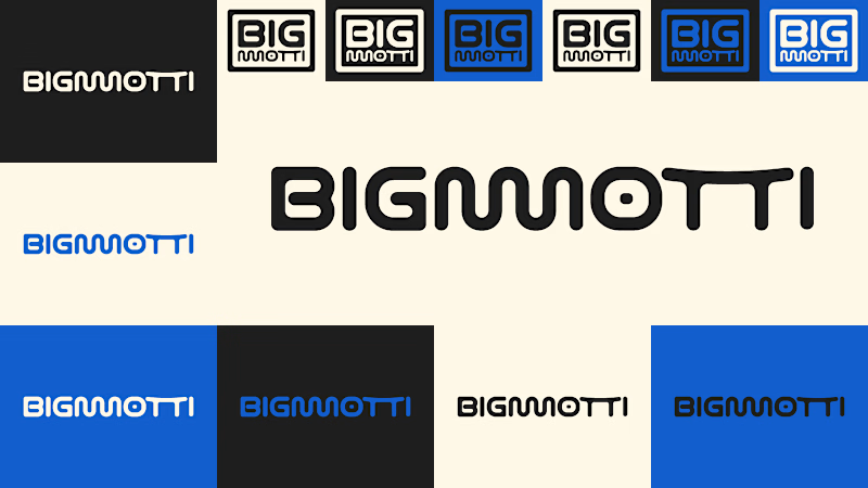
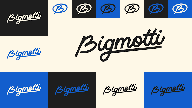
I presented four logo ideas. These two are my favorites and the ones the client liked most.
1_ Based on the second moodboard, with a more neutral and slightly futuristic feel. My favorite detail is the boxed version: its vertical weight balances with the I and O, making it feel tidy and visually appealing.
2_ Inspired by traditional art supply stores, but with a modern, clean style. Handwritten lettering adds a human touch and keeps it timeless.
Which one is your favorite and why?
Which one do you think the client chose?
1 voted
14%
6 voted
86%
7 votes
Closed

I'll guess they picked #1, the boxed Bigmotti reads cleaner next to a gift-and-tech assortment than the handwritten route. That vertical weight balance on the I and O is the kind of detail that's invisible until someone points it out, was there a runner-up logo the client seriously debated before landing on this one?

AI based memory rewinder app. Which design is better as Homescreen?
7 voted
88%
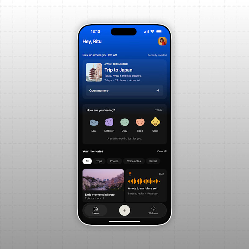
1 voted
12%
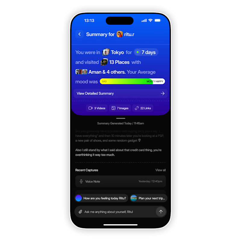
8 votes
Closed

The mood-capture direction feels more distinctive to me—the layered cards give the memory context real personality. I’d keep the summary drawer as a quick-glance fallback for returning users.