The network for creativity
Join 1.25M professional creatives like you
Connect with clients, get discovered, and run your business 100% commission-free
Creatives on Contra have earned over $150M and we are just getting started
Back to feedPost
Mon Petit Chou
Branding as a total act · 2023 · Pachuca
Scope Naming · Brand identity · Interior design · Custom furniture · Construction management · Experience design
Clients Karla and Julio
Karla and Julio were serious about sourdough — the best flour, the right fermentation, no shortcuts. The price would be double any traditional bakery in Pachuca, and they wanted to open between two of the oldest, most beloved panaderías in the city. The only way this could work was to never compete on familiar terms.
The first question I asked was not about the space. It was about them: what were they not willing to compromise on, even if it cost them? The answer was immediate — everything. From that came the name and the philosophy: Sans remords. Without remorse.
While researching sourdough culture we found the conceptual core: real bread has three ingredients — water, salt, flour — and a fourth: air. Not as metaphor but as material. The structure of a sourdough loaf is formed by air trapped in fermentation. Air is what makes bread bread. This became the organizing principle of everything: the recipe, the space, the visual language, the experience of being inside.
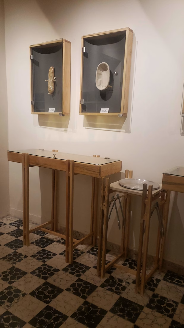
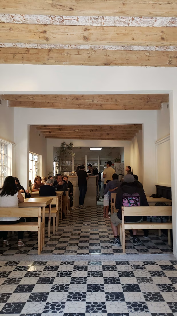
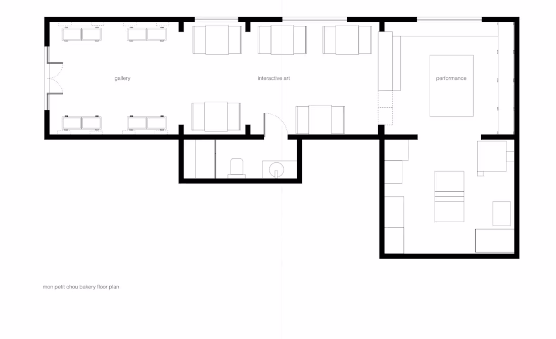
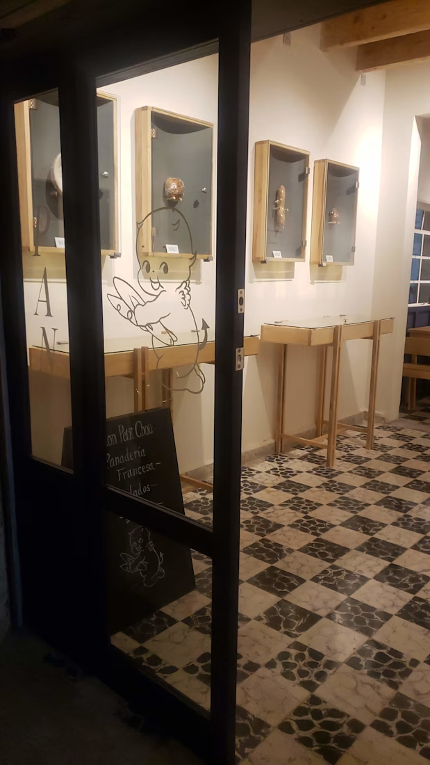
The interior was designed as a gallery in three movements. First room: exhibition — slender furniture, gallery lighting on the bread, display frames mounted on the wall with glass you lift to take your piece and eat it. Second room: interactive — tables where eating is the performance, each lit from above. Third room: open kitchen, fully visible — the baker at work, the craft unhidden, the reason for everything.
The visual identity came from an unexpected place: both clients had a shared passion for tattoo culture. In tattoo practice, apprentices learn technique on cherubs — detailed enough to develop skill, simple enough to begin. We took that figure, stylized it, paired it with a serif typeface for elegance and contrast. A logo that looked Parisian but had been drawn by someone who understood permanent commitment. Pastel tones from the bread itself completed the palette, carried into packaging designed to be kept.
Bread has three ingredients and a fourth: air. The space that holds it should have the same.
nice detailing
The network for creativity
Join 1.25M professional creatives like you
Connect with clients, get discovered, and run your business 100% commission-free
Creatives on Contra have earned over $150M and we are just getting started
Related posts
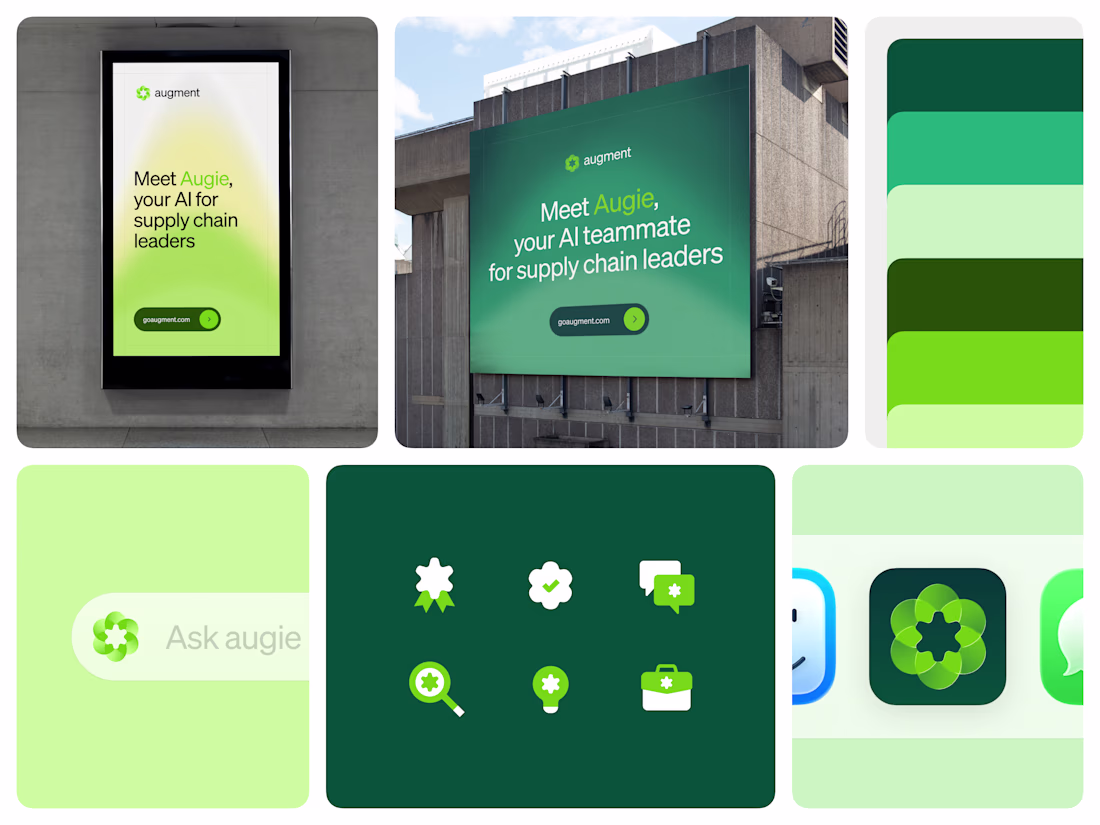
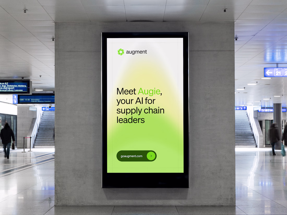
A good brand mark has to work everywhere the product shows up.
The mark was designed to adapt across every medium it appears in. Digital surfaces, product interfaces, and large format interactive billboards at logistics industry events all require different things from a logo. The mark holds up across all of them without modification.
Because the mark is translucent, it reads differently depending on where it sits, lighter and more open on white, denser on dark, bold at large format, and the adaptation works without changing anything about the shape itself.

This is beautiful
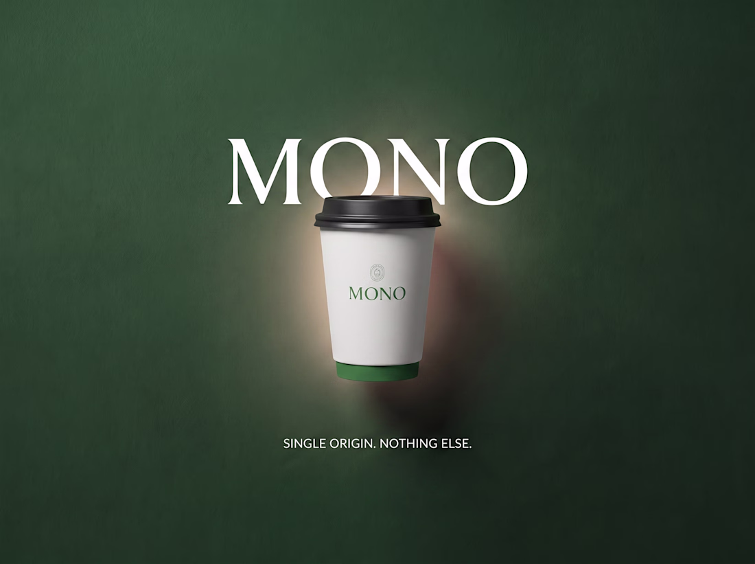
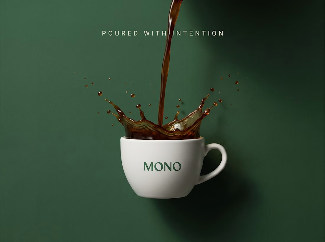
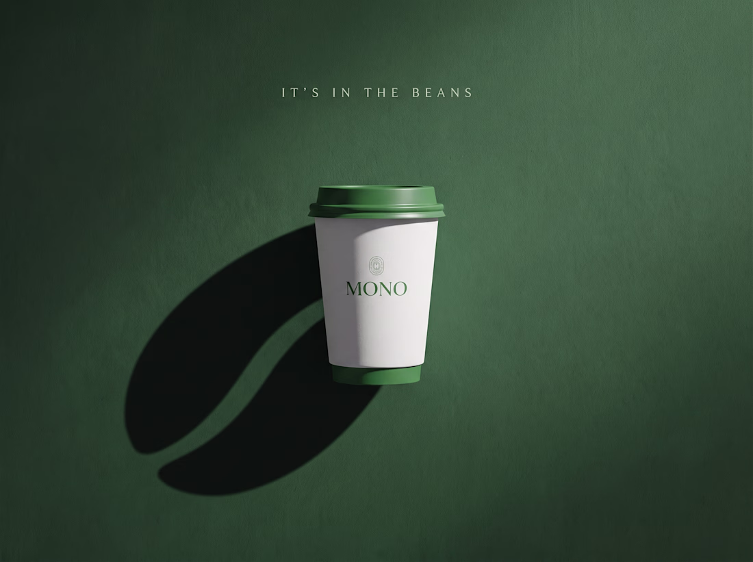
Most coffee brands shout. More flavours. More syrups. More noise.
MONO does the opposite.
The name says everything: one origin, one bean, one intention.
No distractions, no seasonal gimmicks, nothing to hide behind.
Just coffee, poured with purpose.
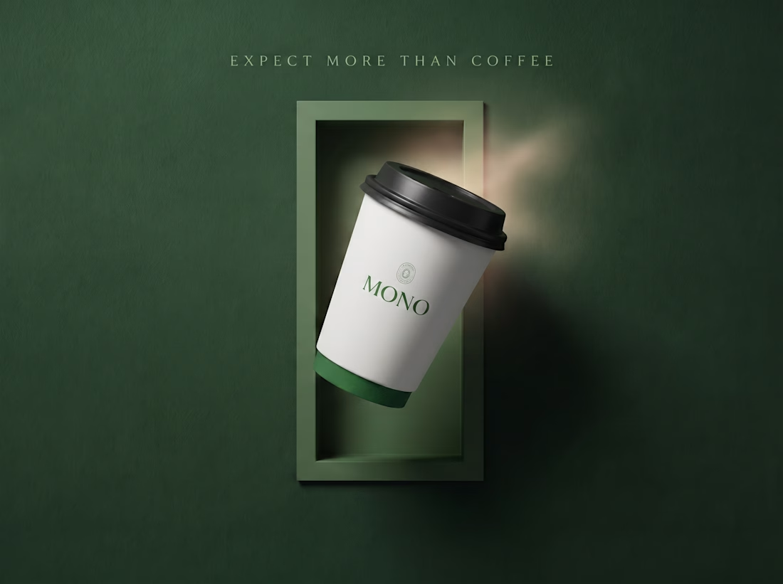
The visual identity had to feel the same way it tastes: deep forest green, clean white, generous negative space.
Every frame gives the cup room to breathe. And in the final shot, the shadow says what words can't, it's in the beans.
This is MONO. Single origin. Nothing else.
#branddesign #branding #visualidentity
Great
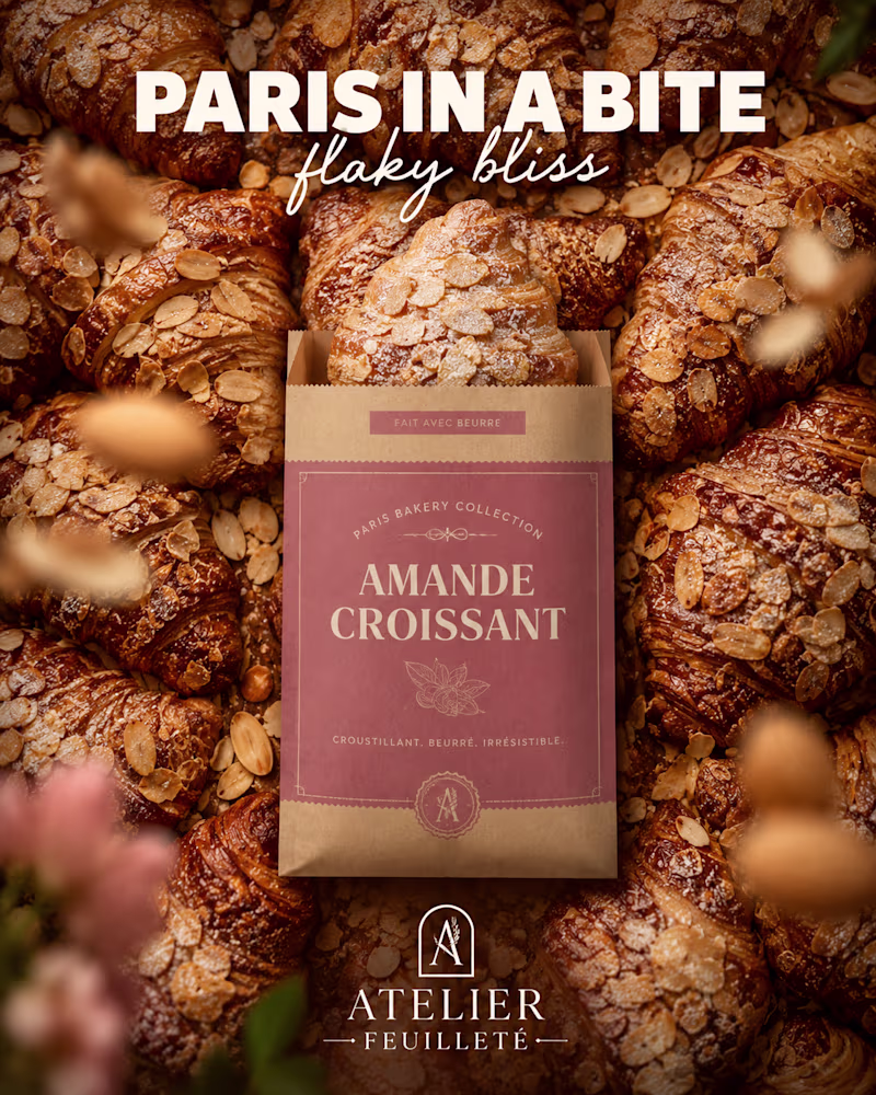
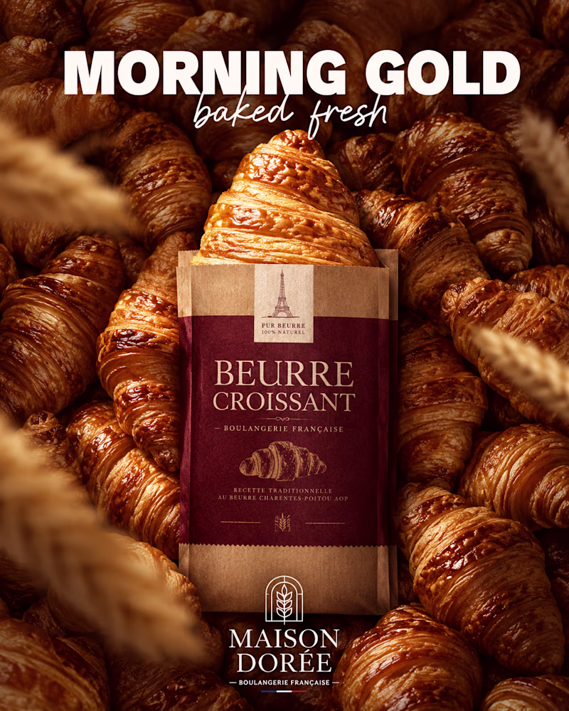
Same craft. Two French bakeries. Two completely different feelings.
One is soft, rosy, almond-sweet, a Sunday morning in a sunlit patisserie.
The other is deep, golden, buttery, a warm loaf pulled fresh at dawn.
Same format, same structure, completely different brand souls.
Which bakery would you walk into?🥐
#branddesign #packagingdesign #visualidentity
0 voted
0%
6 voted
100%
6 votes
Closed
Beurre
Trending
Claude
Claude has entered the design space. How are you using Claude Design?
Contra University
Learn from expert creatives how to earn more using next-gen AI tools.
fifaworldcup2026
The World Cup is here and the whole world's watching. How are you designing for the world stage?
creativeaiflow
Creative AI workflows are evolving. What tools do you use, and what are their strengths and weaknesses?
freelancerlife
Freelancer life is wins, pivots, and everything in between. What’s yours right now?