
Antonio Castañeda
Spatial Strategist and Creative Director
New to Contra
Antonio is building their profile!

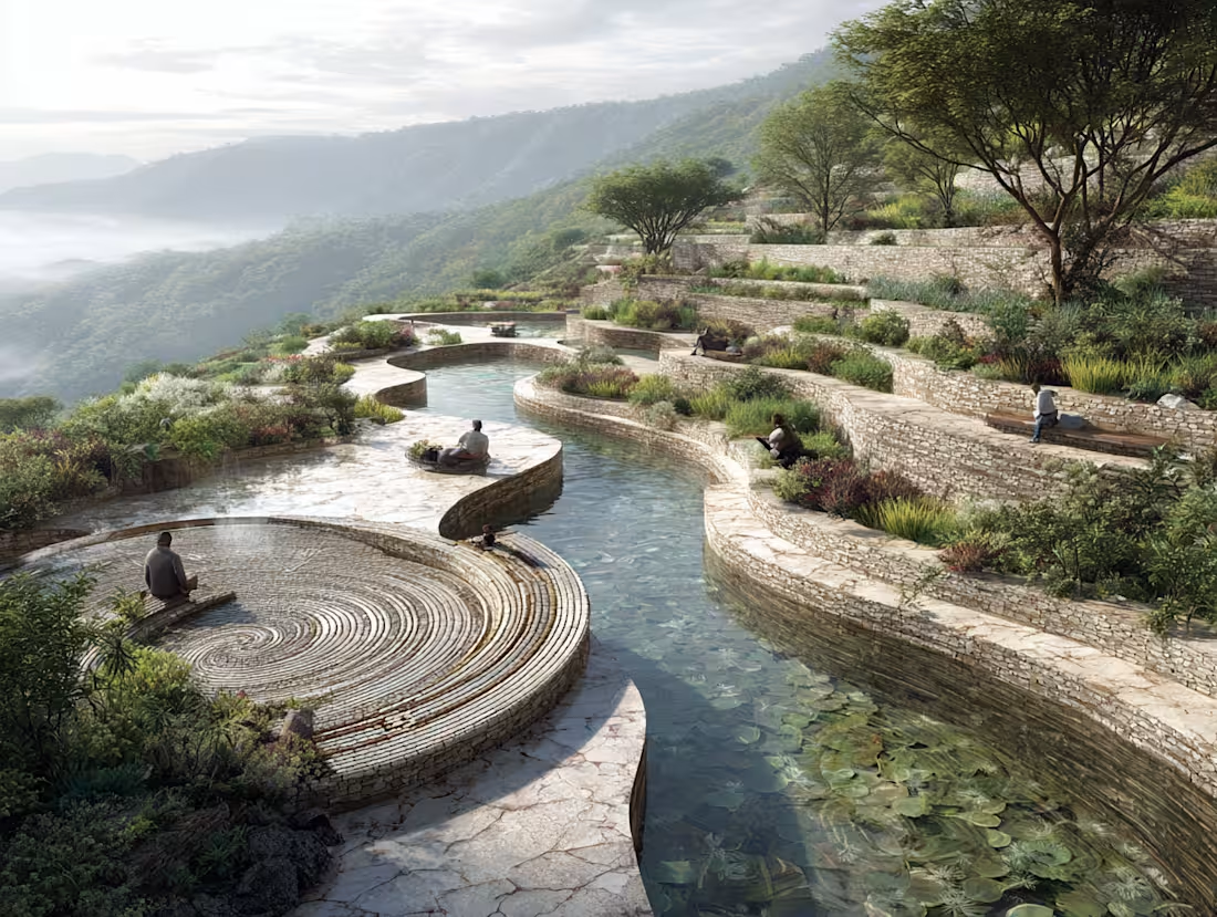
EL QUINTO SOL: Master Plan & Regenerative Territorial Strategy
Zempoala / Zinguilucán, Hidalgo (2025)
Project Narrative:
El Quinto Sol is a Cultural, Agro-industrial, and Tourism Master Plan spanning 140 hectares in a strategic transition zone between industrial corridors and ancient archaeological sites. This project represents a shift from designing buildings to designing ecosystems, acting as a regenerative node that articulates ecology, community, and pre-Hispanic roots.
The strategy was born from a deep territorial diagnosis of oak forests and agricultural lands. Rather than imposing forms, the design "listens" to the landscape—its slopes, water flows, and biological corridors—to define low-impact development zones while preserving fragile areas for environmental education.
The Symbolic Framework:
The master plan is organized around four symbolic axes—Water, Earth, Air, and Fire—which manifest as physical experiences:
Earth & Water: Agricultural terraces and artificial wetlands that integrate production with landscape restoration.
Air & Fire: Observatories, ceremonial forums, and open-air galleries that invite ritual and collective experiences.
Cultural Fabric: The program includes a Maguey Museum, craft workshops, and regenerative housing, all designed to activate local economies through low-impact tourism.
Architectural Impact:
This project allowed me to expand my practice into the territorial scale, understanding architecture as a catalyst for relationships between tradition and modernity, and between intimate space and the collective landscape.
Professional Scope:
Master Planning & Urban Design: Zoning and infrastructure design for a 140-hectare site.
Architectural & Furniture Design: Creating the formal language for key cultural and hospitality structures.
1
130
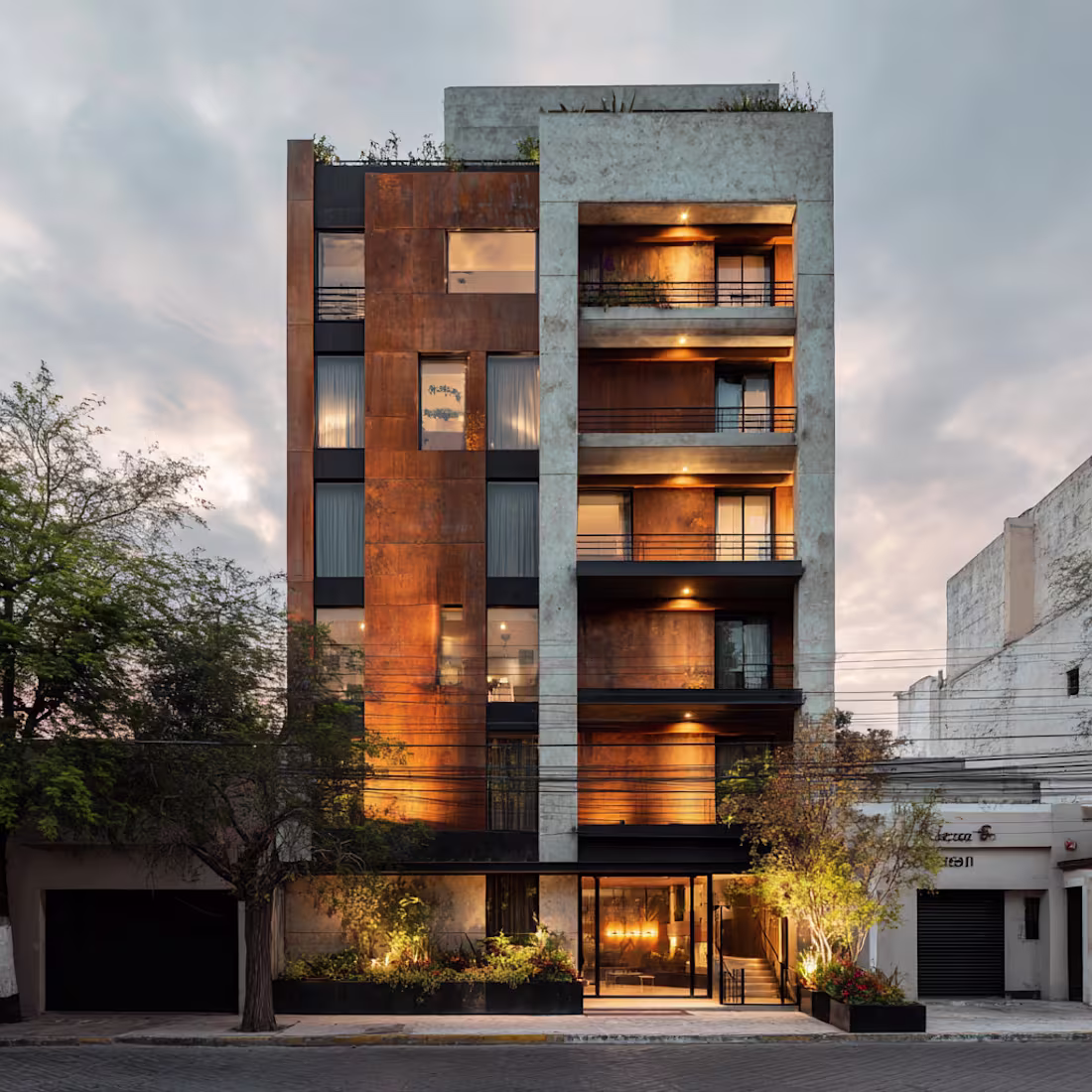
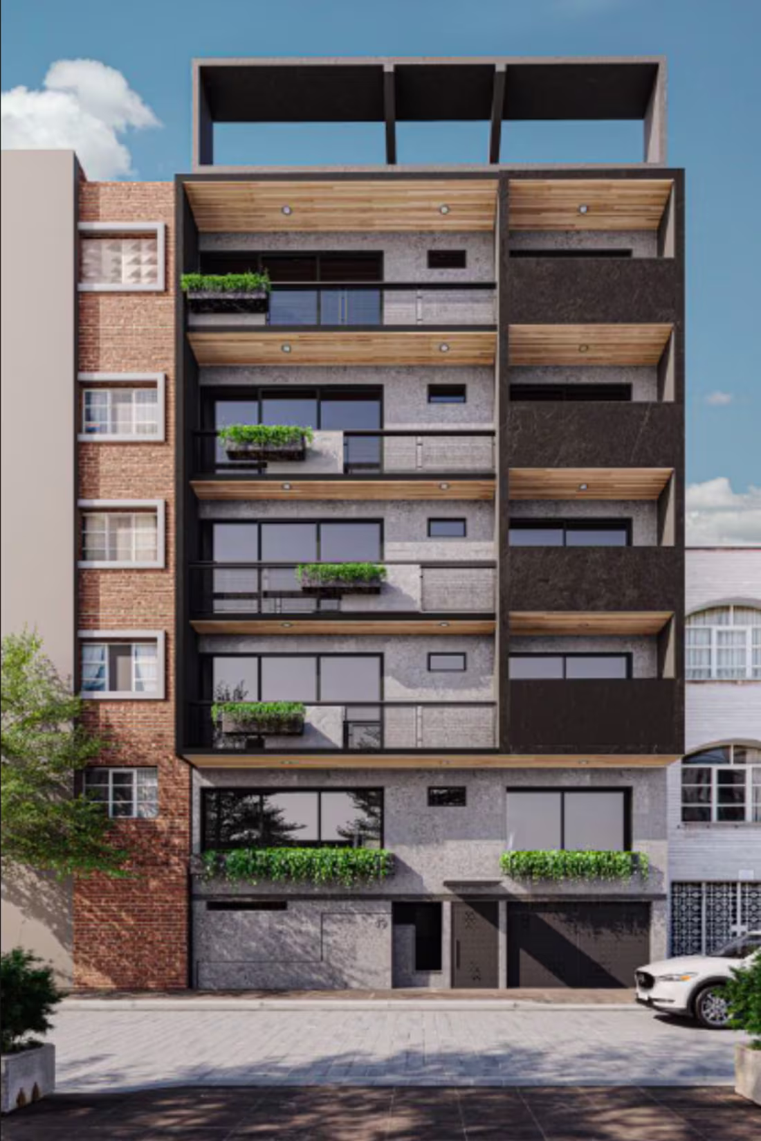
Challenging the local habit of single-family dwellings, this project proposes a shift toward density and urban compactness. The design features 9 apartments ranging from 45–50 m², complemented by a ground-floor commercial unit. By bifurcating the main volume into two distinct towers, a central courtyard emerges as the heart of the project, facilitating both vertical circulation and a constant flow of natural light and air for every unit.
Inspired by the industrial character of Tulancingo, the material palette—concrete, steel, and glass—stands in dialogue with minimalist interiors. More than just a structure, this building represents the architect’s responsibility toward evolving urban landscapes: projecting quality of life within compact programs and fostering a new sense of community living.
1
191
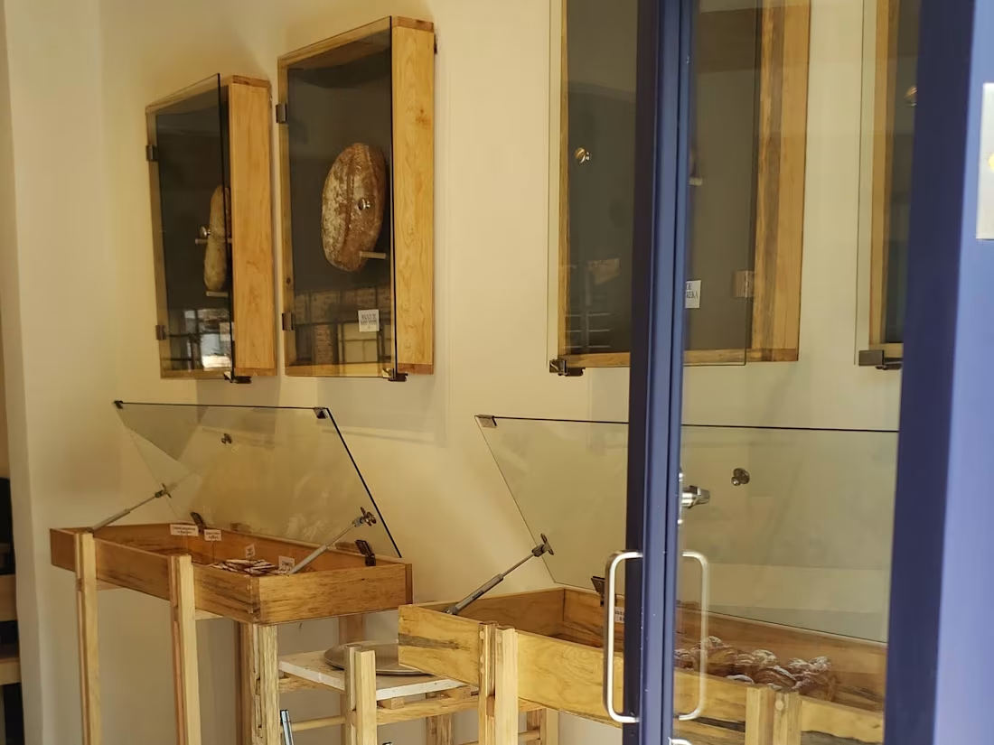
Mon Petit Chou
Branding as a total act · 2023 · Pachuca
Scope Naming · Brand identity · Interior design · Custom furniture · Construction management · Experience design
Clients Karla and Julio
Karla and Julio were serious about sourdough — the best flour, the right fermentation, no shortcuts. The price would be double any traditional bakery in Pachuca, and they wanted to open between two of the oldest, most beloved panaderías in the city. The only way this could work was to never compete on familiar terms.
The first question I asked was not about the space. It was about them: what were they not willing to compromise on, even if it cost them? The answer was immediate — everything. From that came the name and the philosophy: Sans remords. Without remorse.
While researching sourdough culture we found the conceptual core: real bread has three ingredients — water, salt, flour — and a fourth: air. Not as metaphor but as material. The structure of a sourdough loaf is formed by air trapped in fermentation. Air is what makes bread bread. This became the organizing principle of everything: the recipe, the space, the visual language, the experience of being inside.
The interior was designed as a gallery in three movements. First room: exhibition — slender furniture, gallery lighting on the bread, display frames mounted on the wall with glass you lift to take your piece and eat it. Second room: interactive — tables where eating is the performance, each lit from above. Third room: open kitchen, fully visible — the baker at work, the craft unhidden, the reason for everything.
The visual identity came from an unexpected place: both clients had a shared passion for tattoo culture. In tattoo practice, apprentices learn technique on cherubs — detailed enough to develop skill, simple enough to begin. We took that figure, stylized it, paired it with a serif typeface for elegance and contrast. A logo that looked Parisian but had been drawn by someone who understood permanent commitment. Pastel tones from the bread itself completed the palette, carried into packaging designed to be kept.
Bread has three ingredients and a fourth: air. The space that holds it should have the same.
1
3
216
FRAILES HOUSE: A Sanctuary of Light and Raw Materials
2. Role & Services (Lo que hiciste)
Lead Architect
Interior Architecture
Custom Furniture Design
3. Project Description
In Frailes House, the architectural challenge was to create a private sanctuary that balances industrial strength with domestic warmth. This residence is a profound study on the dialogue between light and shadows.
Drawing from the architectural heritage of Mexico, the design reinterprets the traditional central courtyard as the heart of the home. The entire project was born from a single, definitive decision: a central patio with a maple tree at its core. This tree acts as a living witness to the passing of time, changing its colors with the seasons and growing alongside the client’s children.
The courtyard is not just an aesthetic feature; it is a functional engine that generates a private microclimate and strategic separation. It provides the father with a personal corner—a space for a quiet smoke—physically separated from his children by the open air and the rustle of leaves, yet eternally connected through the glass.
Inside, the house features twin rooms, equal in area but deliberately distinct in character. As the only residence in the entire development featuring a central patio, Frailes House stands as a testament to the power of a single courtyard to define privacy, climate, and the rhythm of family life.
1
2
172
EMPRESA 49: Architecture as a Philosophical Manifesto
Yellow Block Developments | Mexico City (2019–2022)
Project Narrative:
Empresa 49 was born from a fundamental question: What happens when real estate development starts from a concept rather than profit per square meter? Under the banner of Yellow Block, this project was founded to deliver more than just units; it was designed to harmonize the user’s life, a distinct identity, and the urban context into a single architectural gesture.
In a market saturated with generic open lofts, Empresa 49 proposes a different logic: the privacy and soul of a house applied to the density of an apartment building. Each space was designed so inhabitants could feel a clear separation between environments without sacrificing urban compactness.
The Ethics of Materiality:
The building speaks a direct language of hammered and board-formed concrete, left entirely visible. By rejecting cladding and coatings, the structure itself becomes the decoration. In a market that often uses finishes to conceal structural mediocrity, choosing to expose the raw texture of the building is both a design decision and an ethical stance.
The 90% Philosophy:
We delivered apartments that were 90% complete, leaving the final 10% as an invitation for the resident to claim. By designating specific walls for the user to paint, tile, or personalize, we ensured that the "soul" of the home remained the resident's job. This approach fosters a deep sense of ownership, turning a development into a true neighborhood where people stay longer and care more for their environment.
Professional Scope & Impact:
Company Founding: Established the vision and philosophy of Yellow Block Developments.
Comprehensive Design: Led the architectural and interior design phases.
Construction Management: Oversaw a workforce of 100+ workers to ensure precision.
Strategic Delivery: Project delivered strictly on time and on budget.
1
4
220
Higher Ground DF
Challenging a market model · 2012 · Mexico City
Scope Interior design · Custom furniture · Retail concept · Sneaker resale hybrid model
Legacy Foundation for Major Sneaker Boutique — today Mexico's largest sneaker resale platform
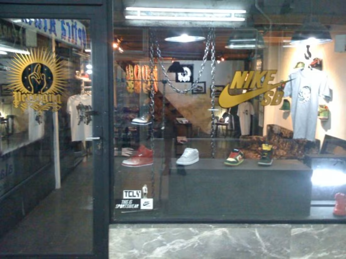
The unwritten rule was firm: if you had a direct brand account, you did not resell. Resale was the opposite of legitimacy. Mario Bernal understood something different. One of Mexico's most serious sneaker collectors, he had been watching Flight Club in New York — studying how scarcity became currency, how certain objects accumulated value over time. He wanted to translate that model to Mexico. He was my friend. Higher Ground was what happened when those two things came together.
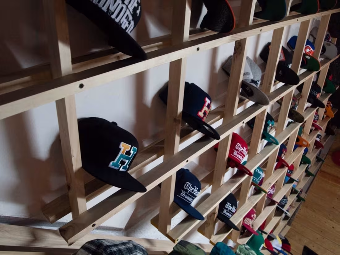
The furniture was built from wood slats — material that at the time cost almost nothing and was easy to find anywhere. Each piece was designed as a system: modular, precise, assembled in ways nobody expected from something so simple. A hat rack in a geometry I have never seen replicated. Display units that held each shoe like a decision, not a product. Industrial designers from New York and Los Angeles asked where I had studied furniture design. I had studied architecture, and before that I had simply built things until they were right.
The hybrid worked: new retail and resale in the same room, each object presented with the seriousness it deserved. Mario left the project early. What he had seen and learned there became the foundation of Major Sneaker Boutique. I say this without claim — it is simply the honest story of what Higher Ground was: a laboratory where a model was tested before anyone had a name for it.
Years later, Moisés Bernal — who now leads Major — and I collaborated on a limited skateboard deck and hoodies under the Persigna name. An acknowledgment across time that the original space had been the beginning of something real for both of us.
The space makes the argument. The object just has to be worthy of it.
1
153
PERSIGNA: The Genesis of a Cultural Platform
PERSIGNA: The First Chapter (Juárez 30)
Co-Founder & Industrial Designer | Mexico City (2007–2009)
Project Narrative:
The original Persigna was an exercise in architectural hacking and urban regeneration. Located at the back of a nearly vacant, historic shopping arcade across from the Palace of Fine Arts (Bellas Artes), the project transformed a forgotten corner of the city center into a magnet for the burgeoning streetwear subculture.
Collaborating with partners from diverse backgrounds, blending "tianguis" street-vending experience with industrial design and retail consulting, we built a space that boosted the surrounding legacy businesses, such as an old optician and a vinyl shop, by introducing a new, specialized demographic to the area.
The Design of Necessity (Upcycling & Materiality):
As an Industrial Design student at the time, the challenge was to create a high-end aesthetic using zero-cost materials:
Textured Walls: We used wallpaper remnants found in neighboring shops, painting them in monochrome black and white to create sophisticated tactile patterns.
Recycled Infrastructure: Clothing racks were crafted from black metal structures with glass shelves salvaged from the building’s own broken facade.
Adaptive Reuse: The mezzanine, built with old beams and wood planks, provided a unique low-ceiling intimacy (2.40m), while we designed custom furniture mimicking hollow skate boxes for integrated storage.
Defensive Design: The massive black plywood counter was engineered with a double-bottom for security and a wide footprint to maintain distance, a necessary response to the urban reality of the city center at that time.
Cultural Hub:
More than a store, the space functioned as a community library and gallery. We featured a curated selection of art, graffiti, and design books, alongside a sofa that invited people to stay, talk about non-mainstream sneakers, and view rotating art exhibitions. The entrance art was created using traditional local sign-painting (rotulismo), bridging the gap between ancient city trades and modern youth culture.
0
88