The network for creativity
Join 1.25M professional creatives like you
Connect with clients, get discovered, and run your business 100% commission-free
Creatives on Contra have earned over $150M and we are just getting started
Back to feedPost

Telco Churn BI Dashboard
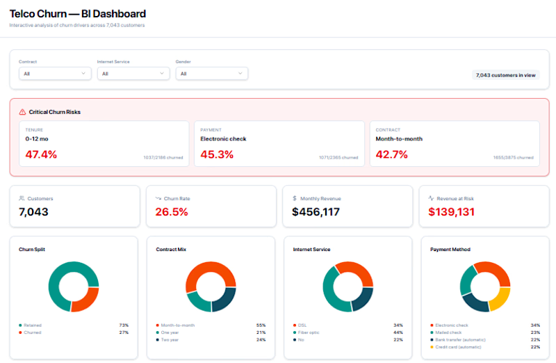
A fully interactive Business Intelligence dashboard built to analyze customer churn drivers across a telecom dataset of 7,043 customers. Designed for data teams, product managers, and business stakeholders who need clear, actionable insight into retention risk.
What's included:
KPI Cards — At-a-glance metrics: total customers, churn rate (26.5%), monthly revenue ($456K), and revenue at risk ($139K)
Critical Churn Risk Panel — Highlights the highest-risk segments by tenure, payment method, and contract type (e.g. 47.4% churn for 0–12 month customers)
Donut Charts — Visual breakdown of churn split, contract mix, internet service type, and payment method distribution
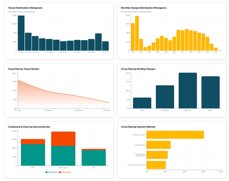
Histograms — Tenure distribution and monthly charges distribution across the full customer base
Churn Rate Trend Charts — Churn by tenure bucket, monthly charges range, internet service type, and payment method — making it easy to spot where customers are most likely to leave
Filter Bar — Segment the entire dashboard by contract type, internet service, and gender
Built for: Telecom analysts, growth teams, and anyone working on customer retention strategy. The design balances clarity with density — surfacing the most critical risk signals without overwhelming the viewer.


The network for creativity
Join 1.25M professional creatives like you
Connect with clients, get discovered, and run your business 100% commission-free
Creatives on Contra have earned over $150M and we are just getting started











Related posts

Sunny Rock — Cinematic Paris Travel Website | Creative Web Development
Experience Paris through Sunny Rock, a cinematic travel website concept designed to combine immersive visuals, elegant UI/UX, and interactive scrolling into a premium digital experience.
This self-directed project explores modern web design through cinematic imagery, scroll-driven animations, glassmorphism, smooth transitions, and responsive layouts.
🛠️ Technologies & Skills
HTML5 & CSS3 — Semantic structure, modern styling, and responsive layouts
JavaScript (ES6+) / TypeScript — Interactive behavior and animation logic
React.js — Reusable components, hooks, and state management
Tailwind CSS — Utility-first styling and responsive design
HTML5 Canvas API — 2D rendering for visual effects and image sequences
Scroll-Driven Animation — Frame-by-frame image sequences synchronized with scrolling
requestAnimationFrame & Linear Interpolation (Lerp) — Smooth animation updates
Lenis Smooth Scrolling — Fluid scrolling experiences
Intersection Observer API — Scroll-triggered reveals and entrance animations
UI/UX & Visual Design — Visual hierarchy, typography, glassmorphism, and interaction design
SVG Graphics — Scalable icons and vector elements
AI Visual Generation & Prompt Engineering — Cinematic visual assets
Cloudinary — Media hosting and image optimization
Performance Optimization — Efficient asset loading and animation rendering
Python & Browser Automation — Development utilities, asset processing, and testing
✨ Design Highlights
Cinematic, immersive visual storytelling
Premium travel-inspired aesthetic
Smooth, scroll-based animation sequences
Modern glassmorphism interface
Responsive layouts for different screen sizes
Interactive elements and refined micro-interactions
Project Type: Self-Directed Portfolio Project
Focus Areas: Creative Front-End Development · Web Design · UI/UX Design · Interactive Experiences · Animation
Designed and developed by Ubaid | Ubaid Web Studio.🔥


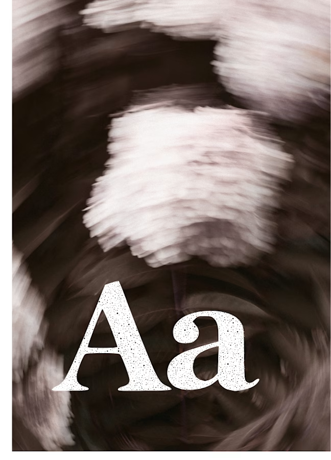
I created this font & it is free to download and use in your free or paid projects. Enjoy 🚀 find it at https://twaperdigital.com/anima-editorial


I like this font
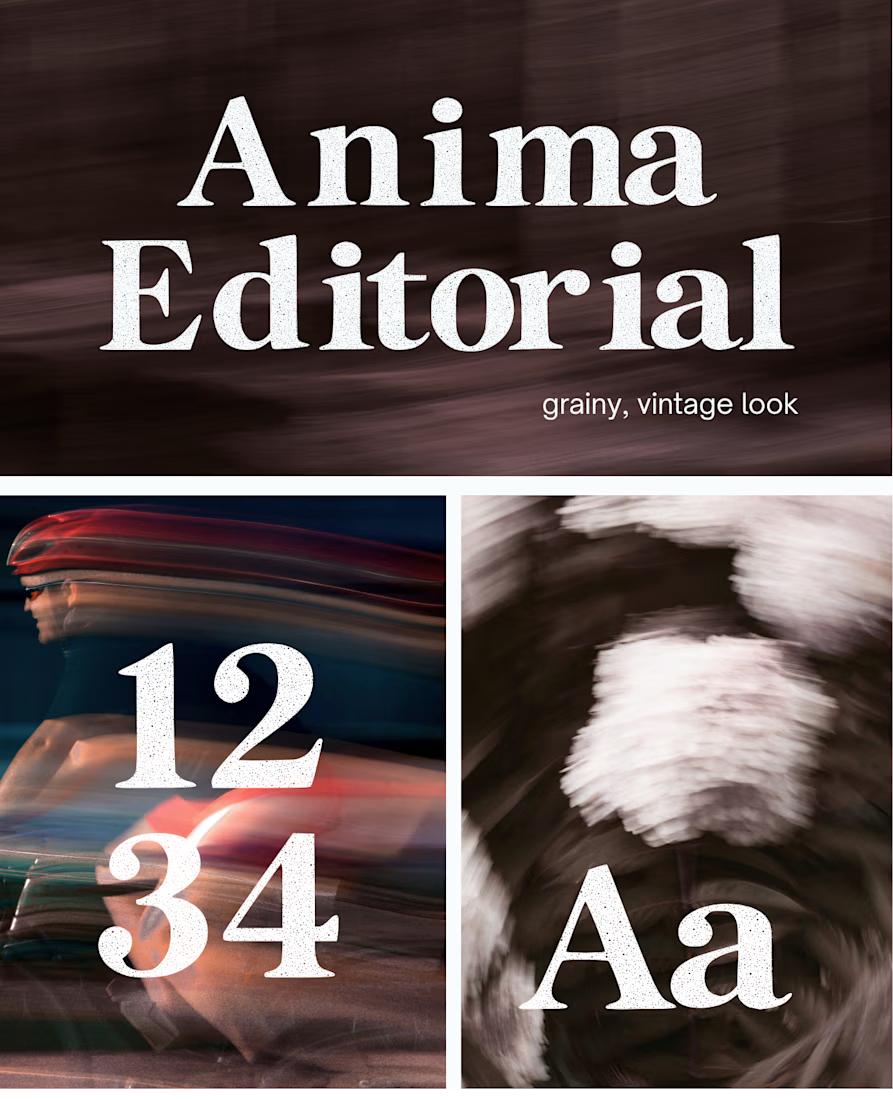
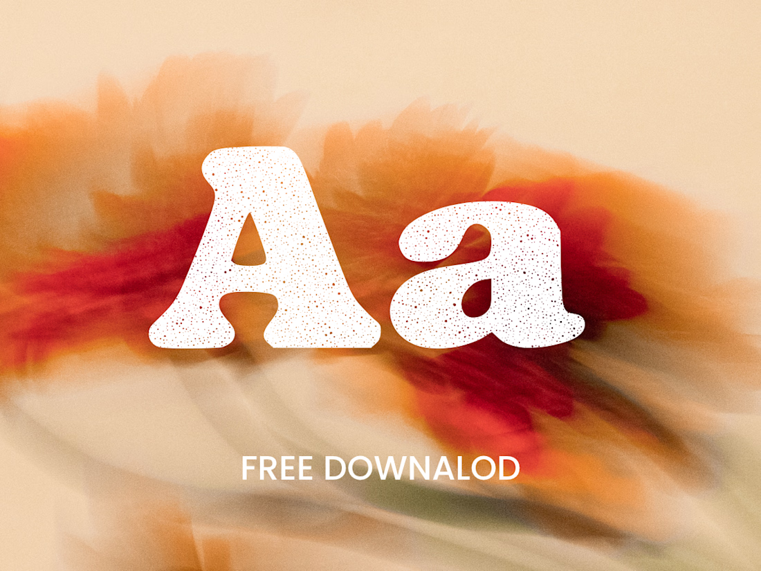
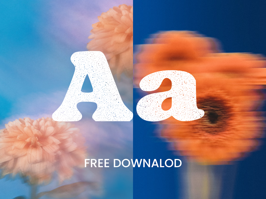
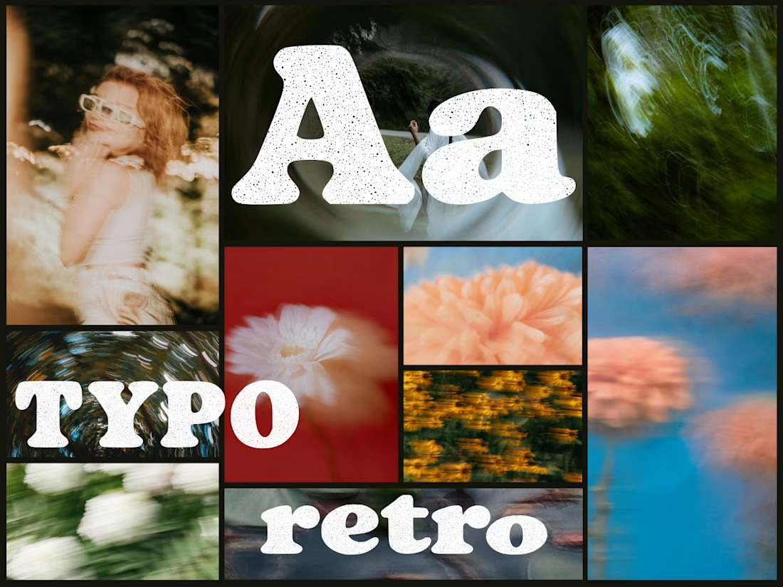
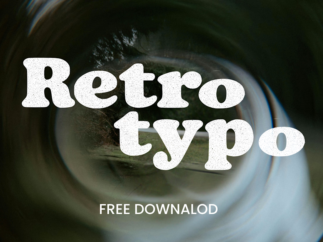
Anima is a self-initiated type design project inspired by vintage print, worn ink and analog photography.
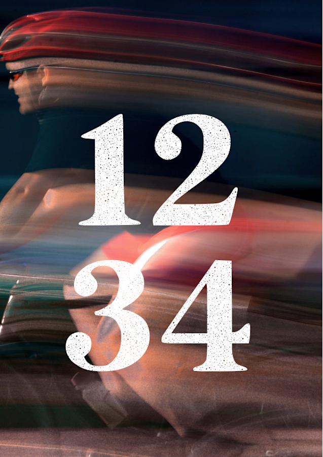
The collection includes two experimental serif typefaces: Anima Editorial, with elegant proportions and contrasting strokes, and Anima Retro, with softer, bolder shapes. Both feature grain built into the letterforms.
I developed the creative direction, custom fonts and promotional artwork, combining AI-assisted exploration with font development. The campaign pairs textured typography with motion-blurred photography to capture a warm, nostalgic mood. FREE DOWNLOAD AT https://twaperdigital.com/anima-retro


Great job Denisa the font style background and it's effects are great 🎉🎉🎉🎉
keep going Denisa🔥🔥🔥🔥