The network for creativity
Join 1.25M professional creatives like you
Connect with clients, get discovered, and run your business 100% commission-free
Creatives on Contra have earned over $150M and we are just getting started
Back to feedPost

Energy dashboards don't have to feel like spreadsheets.
This is a concept redesign of an energy-data platform's overview screen. The aim was to keep it dense enough for traders and asset managers, but calm enough to read at a glance.

Really nice dashboard
The network for creativity
Join 1.25M professional creatives like you
Connect with clients, get discovered, and run your business 100% commission-free
Creatives on Contra have earned over $150M and we are just getting started



Related posts


Well done!

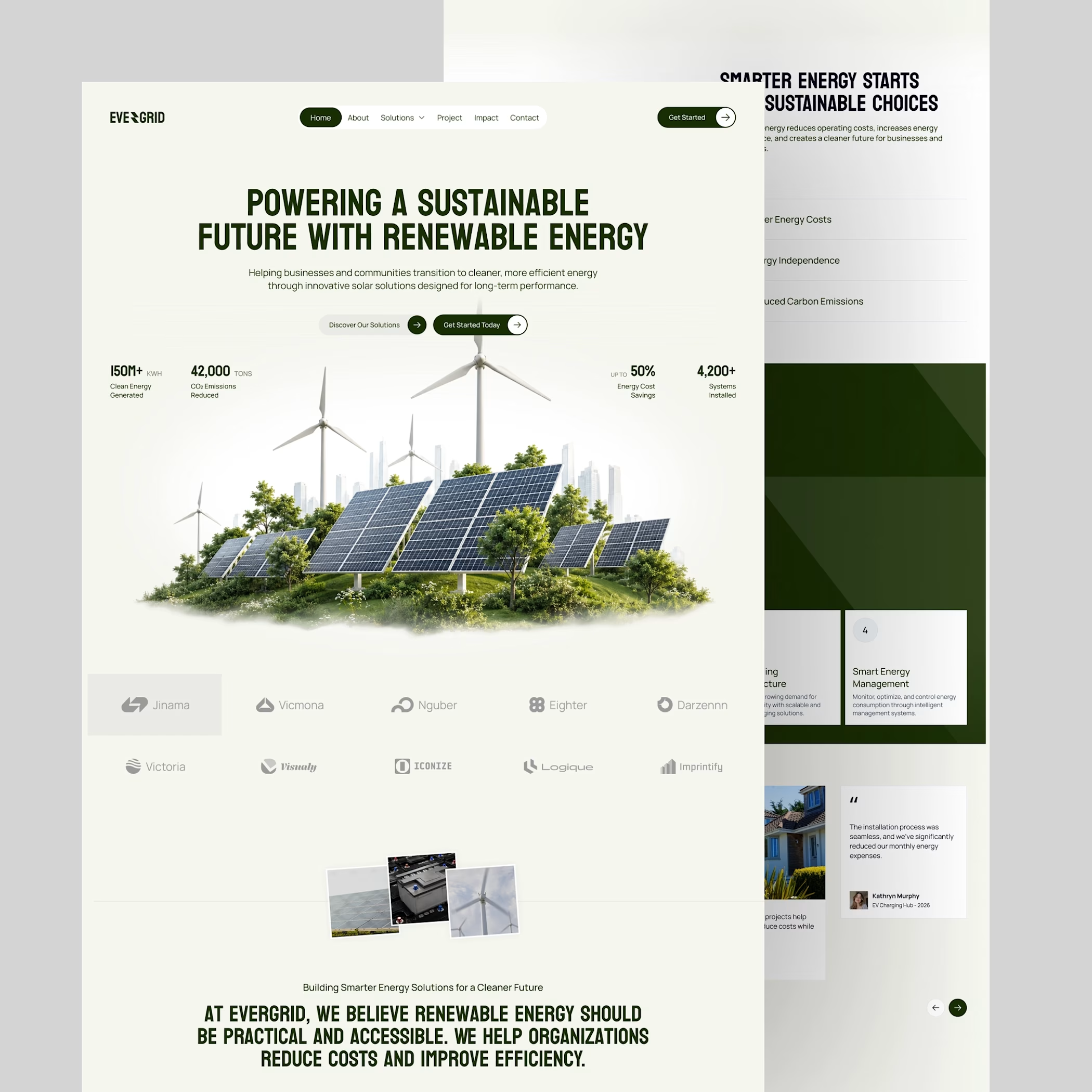
A closer look at the choices behind a cleaner future: lower energy costs, greater energy independence, and fewer emissions. Keeping the story simple while making the impact easy to understand.

How do you show someone where to look on a busy dashboard?
For a manufacturing platform, we tried two ways. A zooms straight into the real interface and highlights what matters. B steps away from the screen and tells the same idea with a simple visual story.
Which one would make you understand it faster, A or B?

5 voted
31%
11 voted
69%
16 votes
Closed

Really interesting comparison! For me, A works faster because it shows the real interface and instantly highlights what matters, so I don't have to guess. B is great for storytelling, but when it's a busy dashboard, seeing the actual UI makes it click right away. Both are beautifully executed though, great thinking behind this!