
Abdullah Bin Musa
AI Data Analyst | CSV & Python


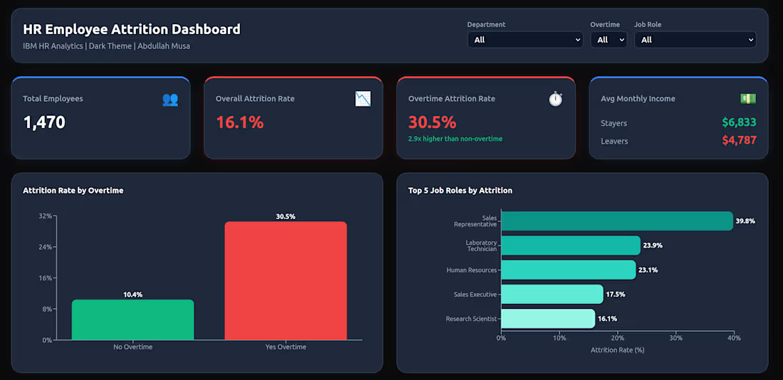
• HR Employee Attrition Analysis
• •Overview
Analyzed 1,470 employees from IBM HR dataset to identify key drivers of employee turnover. Built machine learning models and an interactive dashboard with actionable business recommendations.
•• Key Findings
"Overtime is the strongest risk factor" — employees working overtime are 3x more likely to leave (30.5% vs 10.4%)
"Sales Representatives" have the highest attrition at 39.8%
"Young employees (18-25)" show 34.8% attrition rate
"Income gap" — leavers earn $2,046 less per month on average
"Total annual cost" of attrition estimated at $20.4 million
•• Tools Used
Python (pandas, numpy, matplotlib, seaborn, scikit-learn)
Random Forest Classifier (87.8% accuracy)
Groq API (Llama 3.3 70B) for AI-generated insights
Lovable (interactive dark theme dashboard)
•• What's Included
Interactive dashboard with KPIs, charts, and filters
Feature importance analysis (top predictors: Monthly Income, Overtime, Age)
Financial impact calculation
AI-generated business recommendations
Full Python code in GitHub repository
0
66
Telco Churn BI Dashboard
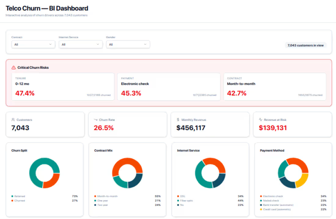
A fully interactive Business Intelligence dashboard built to analyze customer churn drivers across a telecom dataset of 7,043 customers. Designed for data teams, product managers, and business stakeholders who need clear, actionable insight into retention risk.
What's included:
KPI Cards — At-a-glance metrics: total customers, churn rate (26.5%), monthly revenue ($456K), and revenue at risk ($139K)
Critical Churn Risk Panel — Highlights the highest-risk segments by tenure, payment method, and contract type (e.g. 47.4% churn for 0–12 month customers)
Donut Charts — Visual breakdown of churn split, contract mix, internet service type, and payment method distribution
Histograms — Tenure distribution and monthly charges distribution across the full customer base
Churn Rate Trend Charts — Churn by tenure bucket, monthly charges range, internet service type, and payment method — making it easy to spot where customers are most likely to leave
Filter Bar — Segment the entire dashboard by contract type, internet service, and gender
Built for: Telecom analysts, growth teams, and anyone working on customer retention strategy. The design balances clarity with density — surfacing the most critical risk signals without overwhelming the viewer.
0
113
eCommerce Sales Analysis — 1M+ Row Dataset
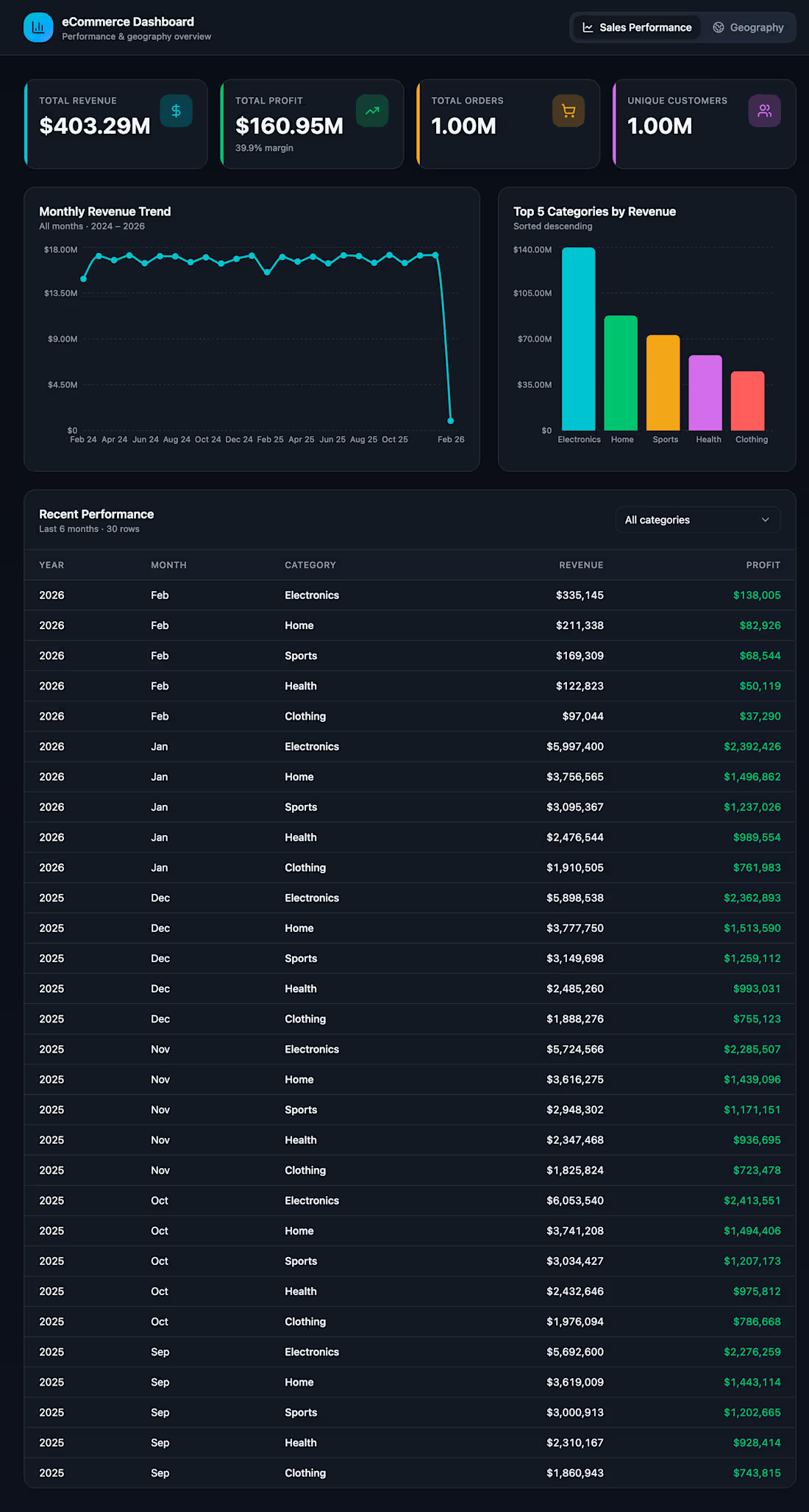
Analyzed a 1M+ row eCommerce dataset using
Python, DuckDB, and Matplotlib. Built an
interactive dashboard showing KPIs, monthly
trends, category breakdowns, and country
analysis.
Key findings:
→ Processed 1M+ transactions
→ Monthly revenue trends identified
→ Top 10 countries analyzed
→ Category performance breakdown
→ Fully verified against raw CSV data
0
145
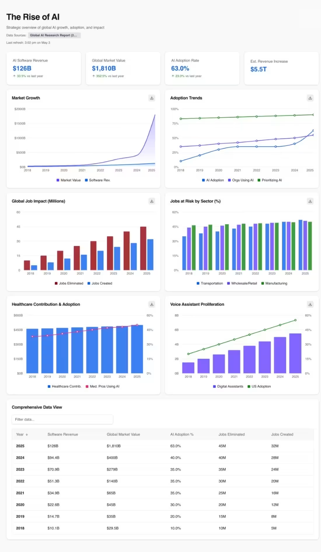
[The Rise of AI — Interactive Data Dashboard & Analysis Report] :
Analyzed 8 years of global AI growth data\
(2018–2025) using Python and AI-assisted\
development. Built a fully interactive\
dashboard that tracks AI market growth,\
adoption trends, workforce impact, and\
emerging technology proliferation.
Key insights uncovered:\
→ AI market value surged 6,035% from\
$29.5B (2018) to $1,810B (2025)\
→ AI adoption jumped from 10% to 63%\
in just 7 years\
→ 45M jobs eliminated vs 32M created in 2025\
→ Transportation sector faces highest\
automation risk at 52%\
→ Voice assistants grew from 1.5B to\
5.5B devices globally
0
158