The network for creativity
Join 1.25M professional creatives like you
Connect with clients, get discovered, and run your business 100% commission-free
Creatives on Contra have earned over $150M and we are just getting started
Back to feedPost
Let’s talk about the typography of premium brands.
Why do some brands instantly feel like they cost $10,000+, while others look like a $50 template, even when using similar clean layouts?
The secret is usually hiding in the typesetting discipline.
In premium brand and editorial design, layout is everything. Mass-market brands prioritize packing information tightly to "save space." Premium brands prioritize spatial rhythm, wide letter-spacing (tracking) on uppercase headers, and strict alignment to an invisible grid system.
Let’s settle a debate for high-end corporate identity: When designing a brand identity or corporate profile for an elite client, which typographic direction commands more executive trust?
The network for creativity
Join 1.25M professional creatives like you
Connect with clients, get discovered, and run your business 100% commission-free
Creatives on Contra have earned over $150M and we are just getting started
Trending
Claude
Claude has entered the design space. How are you using Claude Design?
Contra University
Learn from expert creatives how to earn more using next-gen AI tools.
creativeaiflow
Creative AI workflows are evolving. What tools do you use, and what are their strengths and weaknesses?
freelancerlife
Freelancer life is wins, pivots, and everything in between. What’s yours right now?
Related posts
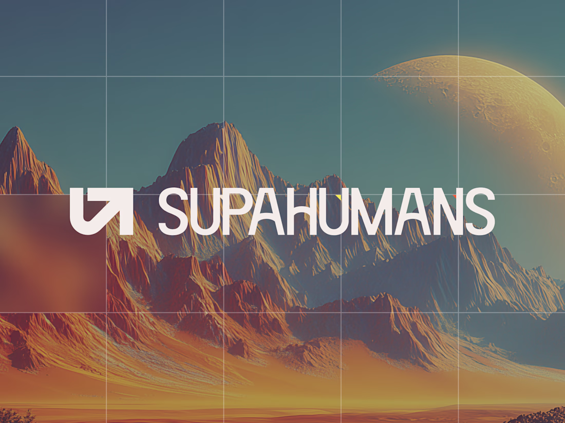
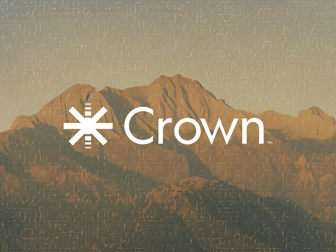
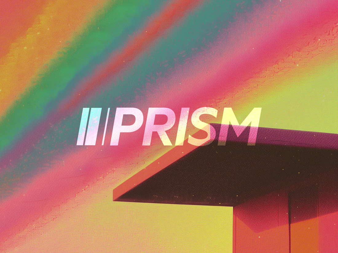
Crown pairs surprisingly well with that mountain texture, most crown marks lean literal but the asterisk treatment keeps it abstract. Prism's diagonal cut mark is doing the most work of the four for me.
Why Editorial Design Is Making a Comeback in 2026
Editorial Design is more than a visual style – it's a storytelling approach inspired by premium magazines and luxury publications.
✨ Best for:
• Coaches and educators with a strong personal brand
• Creative entrepreneurs and artists
• Luxury and high-end service providers
• Course creators who want a premium feel
✨ What makes it different:
• Bold, expressive typography
• More white space and breathing room
• Asymmetrical, magazine-inspired layouts
• Strong focus on imagery and visual hierarchy
• A sophisticated, curated aesthetic
Unlike traditional business websites, Editorial Design feels less corporate and more like an experience.
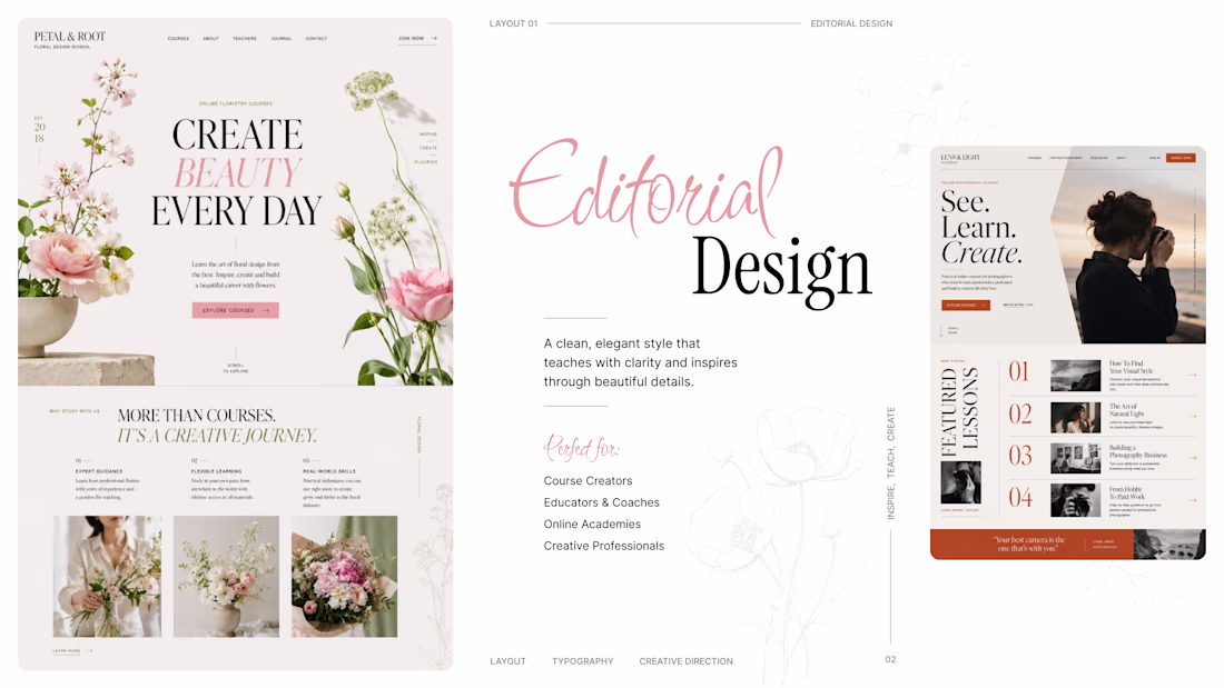
The mix of magazine-style asymmetry and generous breathing room feels like the strongest part of this direction. When you use it for coaches, how do you keep longer sales copy from breaking the editorial rhythm?
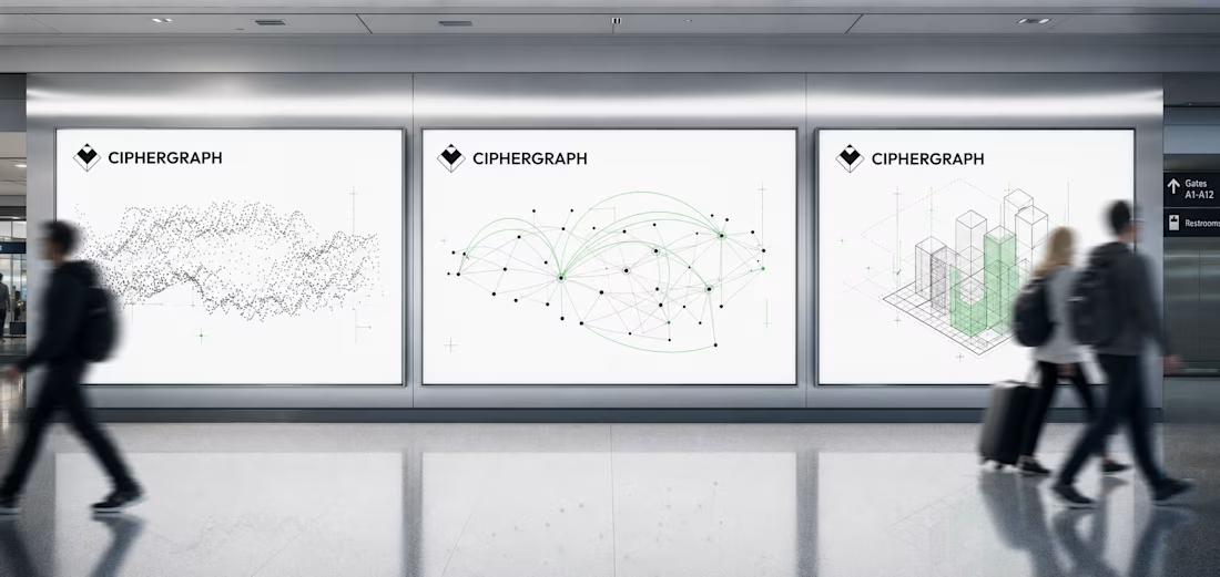
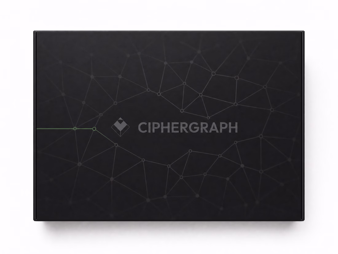
Every hardware wallet looks the same: dark mode, neon glow, a coin rendered like a mobile game icon.
CIPHERGRAPH throws all of it out. One mark. One accent color. Everything else is just the data — signing paths, verified nodes, nothing performed.